
A Haunted Junk Journal
There was a goal I set at the beginning of the year. I was going to see if I could get into a local exhibit called North Shorror. It’s a small art show that has taken place for the past few years in the building where I used to work. I always enjoyed seeing others’ spooky art. Sometimes it has been large and sometimes small, but I wanted to do something.
At first I thought I would just do some calligraphy pages, but I wasn’t super inspired by the idea. Instead I decided to build a journal and then fill it with quotes from different spooky stories. Thus, the Haunted Junk Journal was born. And I am pleased to say it got accepted into the art show (and is actually right in front where you walk in).
I built the notebook with some Halloween scrapbook paper reinforced with paperboard for the covers and the interior pages are JetPens View Corona cream paper. I chose this paper so it would show off the ink properties. I wanted to have the quotes be fairly consistent throughout and tried to think of a fun ink in my collection. I ended up settling on Diamine Good Tidings from the Black Edition of the Inkvent. Despite it being an ink that was released for Christmas, it has good Halloween vibes with the deep black and super green sheen. I used a Kaweco calligraphy 2.3 stub nib for the uncial letters and then different everyday pens for any smaller text.
I decided not to draft anything, but just see where it took me. If I made a mistake that I couldn’t fix, well, I used some ephemera to try again. Ultimately it was a ton of fun to create, and I was really happy to see it on display as a representation of written arts (many of the other exhibits on display are painting or sculpture).
And in the essence of All Hallow’s Eve, here are my spooky pages.


Smaller letters were done in Ferris Wheel Press Phantom Mist. The PET stickers are from AM Paper and Art Co. Washi tapes are from Michaels.
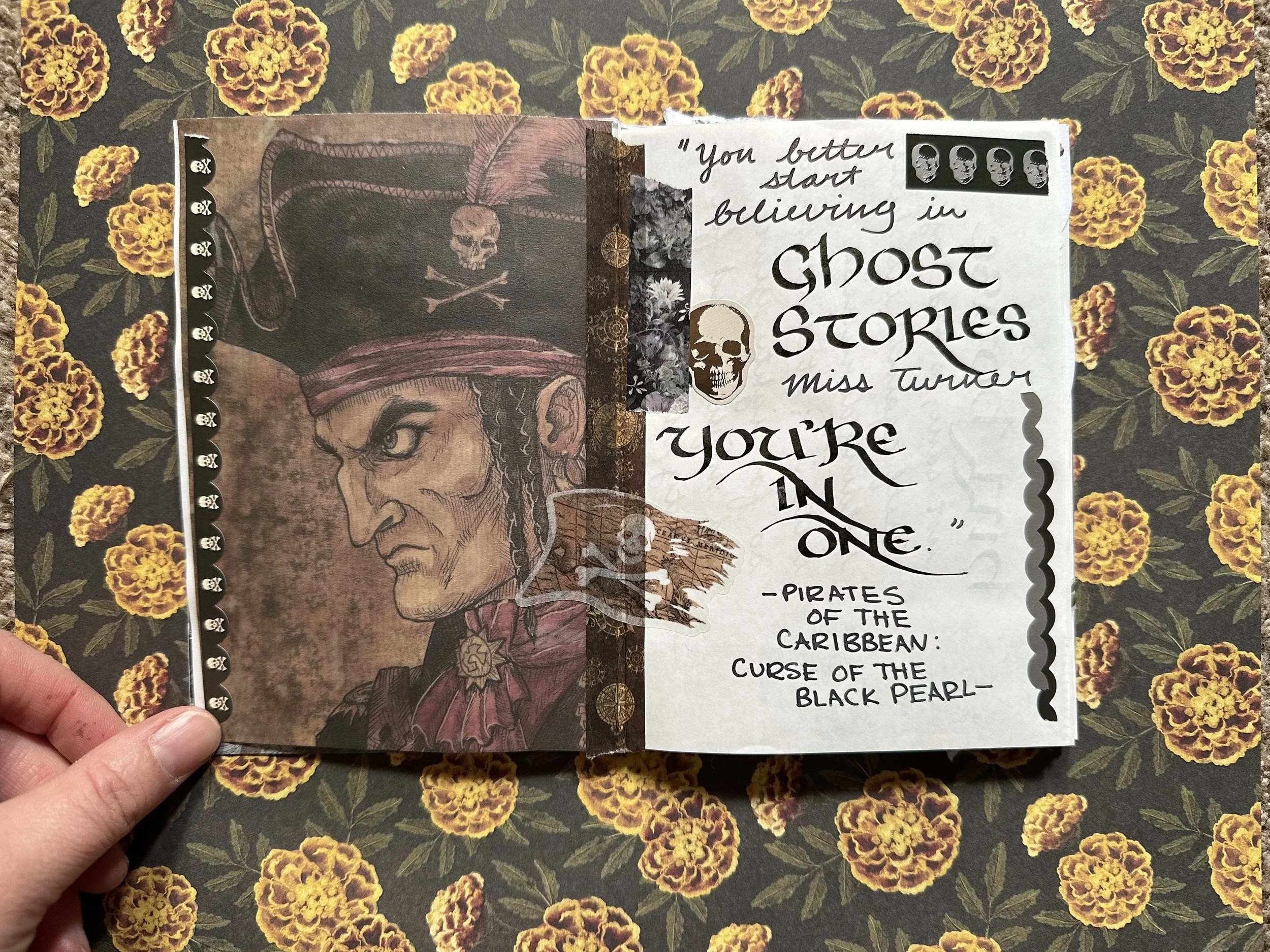
Not a spooky movie persay… but it does have undead and curses. Also gave me an excuse to use some ephemera from CoraCrea Crafts.

I really enjoyed this book and I also really loved the reimagining in the Netflix show. Probably one of the best ghost shows I’ve ever seen. Stickers from Stickii sub and Michaels.
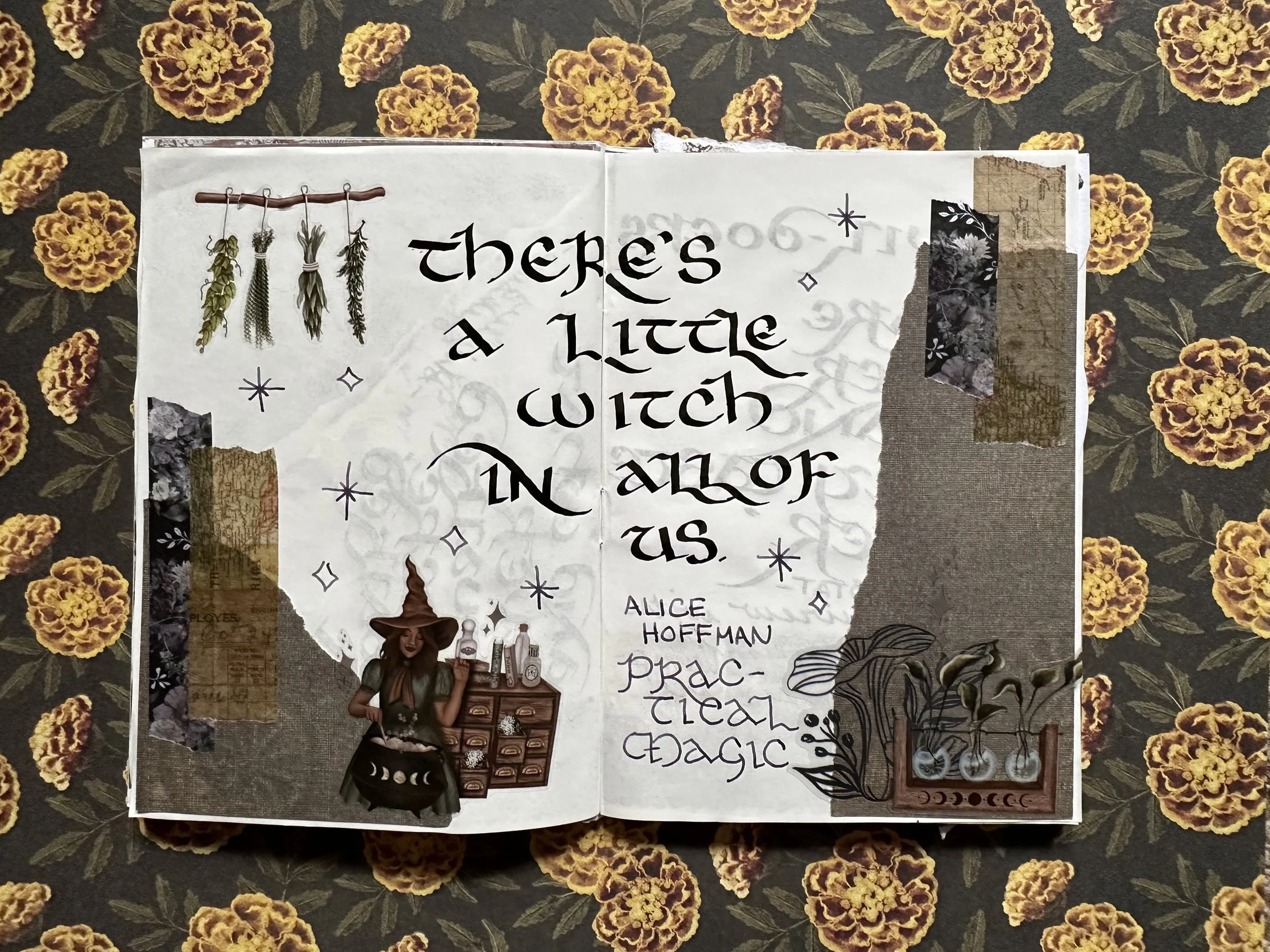
Although it’s a little cliche now, Practical Magic is a movie I watch every year.

Interview with the Vampire by Anne Rice is such an interesting book. And, even though its cheesy I grew up on the adaptation with Tom Cruise and Brad Pitt as Lestat and Louis. I did also really enjoy the reimagining that AMC has produced. Louis is all the drama, all the time. Lestat is too in his own way.

Fun facts about me: I have attempted to read The Shining multiple times and only seen parts of the Kubrick movie. However, the hotel that inspired Stephen King to write the novel was the Stanley Hotel in Estes Park, Colorado. I lived in that town for about six years. Hilariously, the real haunted hotel is bright white and sunny (which is why they filmed the movie in Oregon because Colorado was too “cheerful”. They do a history and ghost tour which I went on with my colleagues one snowy day. For some reason they think Earl Dunraven is one of the ghosts, but I don’t know why considering that he was not fond of the Stanleys and also had property on the other side of the valley. There are some really fun stories there regardless of their historical logic.

Both Disneyland and Disney World are awesome and I have ridden this ride more times than I can count (I was a Disney College Intern years ago so I had a lot of excuses to go to Magic Kingdom and ride it on my days off). I really adore how different the facades are and the stories behind the creation of this ride. The imagineers had a lot of fun with this one. Hurry back, hurry back, don’t forget to bring your death certificate. Added a little flair with a Zebra Mildliner in Grey. Ephemera and stickers from Michaels.

The good ol’ Scottish Play. I remember reading this one in school. Out damned spot! The red ink is Diamine Waxed Seal. Lace washi tape from AM Paper and Art Co.

This was actually one of the first Stephen King books I ever read. Never seen any of the movies. Does anyone else feel bad for Church? He definitely didn’t ask to become an undead, potentially demonic cat. PET stickers are from AM Paper and Art Co. again (she makes some really great stuff!)

I just rewatched this movie a few days ago and it’s so good. Just such a great twist at the end. Film strips were made with Ferris Wheel Press Catnip Cafe and a water brush. The red ink is Diamine Cardinal (I think).

Bly Manor was the first Mike Flanagan show I watched (even though it came out after Hill House). If you haven’t seen it the show is an adaptation of the Turning of the Screw by Henry James. The child actos that played Flora and Miles did such a great job. Sticker is from the Stickii Cauldron and the paper is from an old pack of Tim Holtz paper.

I had the worst time trying to choose a quote from Hocus Pocus. It’s just so quotable. I will admit it took me until I was an adult to realize the cat boy’s name is Thackery and not Zachary.

And the final spread. Another movie that I struggled to decide on a quote. I may or may not be using song lyrics from this movie in another project. All ephemera on this page was from Michaels (various years of Halloween releases). Orange ink is Ferris Wheel Press Pumpkin Patch.
Currently Inked

Still rocking FWP Madam Mulberry and Colorverse Sky-tinted waters.
Also added:
Colorverse Office Brown - Kaweco Sport Macchiato M ‘monoline’ - I think the entire Colorverse Office series is underrated since they are “basic” colors. Office Brown is a red leaning no nonsense brown. It can get a little dry if I leave the pen uncapped for too long, but that’s true of a lot of inks.
Anderillium Piranha Red - Kaweco Collection Sport Mellow Blue B ‘premium’ - This is a great deep red ink. And it’s red red, not red-brown or pink-red like so many other red inks can be. It has a nice wet flow and I’ve never had trouble with it in the times I’ve used it.
Robert Oster x Vanness Charred Hickory - Kaweco liliput copper M ‘imperial’ - I’ve had this sample lying around since at least last year and I’m glad I finally gave it a try. Charred Hickory is like a darker version of Colorverse Office Brown.