
All of the Joy
My favorite part of my job is when I get to tell stories about the past. Especially when I get to learn something new as part of the stories. It’s part of what made me a museum/nature educator in the first place. It’s why I’m going to be trying my hand at teaching community education classes about journalling and handwriting (and eventually about getting started with pens). And it’s even better when everything just comes together. I’ve been doing a ton of creative work over the past few days and my current toolkit is bringing me all of the joy. And here’s why:
The Nakabayashi Logical Prime B5 Notebook is a workhorse.

Wearingeul Othello with a stub nib on the Logical Prime lined grid.
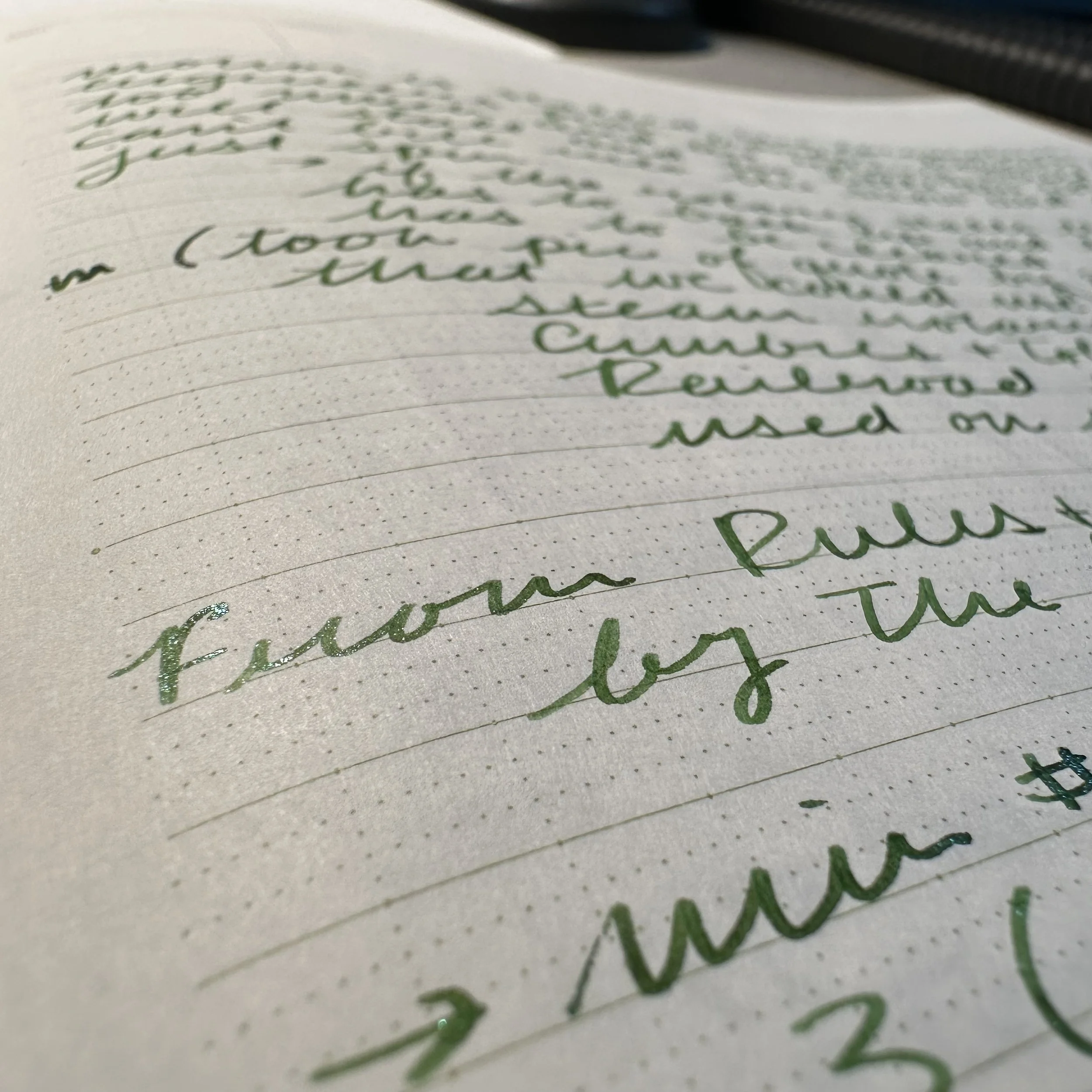
I picked this up on my last trip to Wet Paint in St. Paul right before last year’s Pelikan Hub. After finishing off an Oasis Light notebook that I’d picked up at the same time, I decided that this would be my second work notebook for the year. Although I started it mid-March, I didn’t give it much of a workout until the last three days. I have days where I just cannot stand to look at the computer another minute. It was one of the reasons I got back into pens during graduate school. There is only so much screen time that I can stand. And it was hitting me hard this week. And I have a list of about seven museum signs that I’m in the process of redesigning to both update the way they look and to give the objects more context within history. And between the book research, the notes, and the drafting I filled up about twenty pages of this notebook. And it has been delightful to write in. The paper is smooth and it shows off ink incredibly well. It lays flat when open after a little training. The ruling is incredibly useful for note-taking with vertical lines that allow notes to stack (I’m one of those people that indents notes under headings and main topics). It also has enough bulk that I’ve got a good chunk of notebook still to go despite my feverish scribbling. The price is great too, which means I’ll probably be picking up more after I work down my stash of random B5 notebooks that I’ve accumulated. Wet Paint no longer has them available, but they are available from Gentleman Stationer.
My ink palette is on point this week.

The four pens rocking great ink colors this week.
At the beginning of the month I like to clean out the old ink and start fresh. I always mix up what ink is in my Kaweco Sport Macchiato that has been sporting a 1.5 calligraphy nib for me for at least a year, probably longer. It’s great for making bold headings either by making uncial characters or by simply writing in cursive. I also mixed up my core four - my two Kaweco liliputs and my two Kaweco Art Sports.
I’ll show the shades down below in my currently inked section, but I went with a bright yellow for a header, two sparkly grays, a sparkly green (green has been growing on me), and an old favorite in Colorverse Milky Lavender. I actually had to fill up two of the pens already this week and I only inked them up 3 days ago.
I love having the time and space to slow down and write.
Enjoying some sparkles on my notes about crews on steam-powered snow trains.
While this isn’t always possible due to deadlines or the amount of design work I have to do, it’s great to be able to step away from the computer and create words with a great pen. Although exhibit design is another passion of mine, I love taking a step away from the digital and just feel the creativity. I also generally need fewer drafts because I’m not tempted to keep writing/am more cognizant of how much space my words take up on a page. It’s part of my creative process and I love when I have time to actually do it. I also like having the handwritten notes and drafts to look back on if I have to go back to the drawing board. It’s a little tangible thing that says, “See? I did all of this today.”
I’m myself on paper and I love that feeling.
Currently Inked

Diamine Candlelight - Kaweco Sport Macchiato 1.5 - My selected header color for the month I went with something bright. I was torn at first between a yellow and an orange. Luckily, I was flipping through an old notebook and spotted the last time I’d used this ink. This is a great yellow, extremely readable and has shading in the wide nibs. I’m using a lot of different toned papers at the moment, including a Midori soft gray one, and it pops on all of them.
Wearingeul Othello - Kaweco Art Sport Terrazzo M stub - This might be my favorite ink from this brand (of the ones that I have tried and own). This ink goes down as a cool, green-leaning gray and then turns into a warm gray as it dries. On some papers it becomes a gray-brown tone. The silver shimmer is subtle, but makes it pop when it catches the light. I wrote out this pen in a little more than a day because I was enjoying it so much. A lot of the aforementioned exhibiting drafting was done in this color. If you want to see more pictures, check out my comparison of it with Bungubox Melancholic Grey.
Colorverse Milky Lavender - Kaweco Liliput fireblue 14K M ‘journaler’ - One of my top 5 inks by use. It’s has a really great lavender purple tone with shading. It’s one of those simple inks that makes me smile when I use it. This has been a big driver for the journalling I’ve done this week.
Wearingeul Macbeth - Kaweco Art Sport Tiger’s Eye 14K B - I’ve been curious over this ink for a while, ever since I read @allofthehobbies review on it. It looked like a cool gray version of Othello and with how much I love that ink I wanted to give it a try. I bought a few samples from Vanness the other day and tossed this one into the cart. My instinct was correct and I’m glad that I held off on getting a bottle. Not that I wouldn’t have used it since it’s a beautiful gray ink. I just like Othello more. This was the other pen I ran dry and filled it up with Macbeth again.
Ferris Wheel Press Emerald Garden - Kaweco Liliput Copper 14K M ‘selvedge’ - This is one of Ferris Wheel Press’s new releases for April. Normally, this color is not one I would reach for. Bright emerald greens and I usually don’t get along, but I really like the tone of this one. It’s very rich and the combination with the blue/green shimmer is fun. I’m really enjoying it.