
Chasing Gray Inks

Gray, black, and brown inks have been a place of growth in my fountain pen ink collection over the last year. Gray ink is an interesting category. They can lean toward black or have undertones of purple, blue, pink, or brown. As I’ve learned during my inky explorations, gray ink is crazy diverse. So let’s dive in on some of my favorites as of the beginning of August 2023.
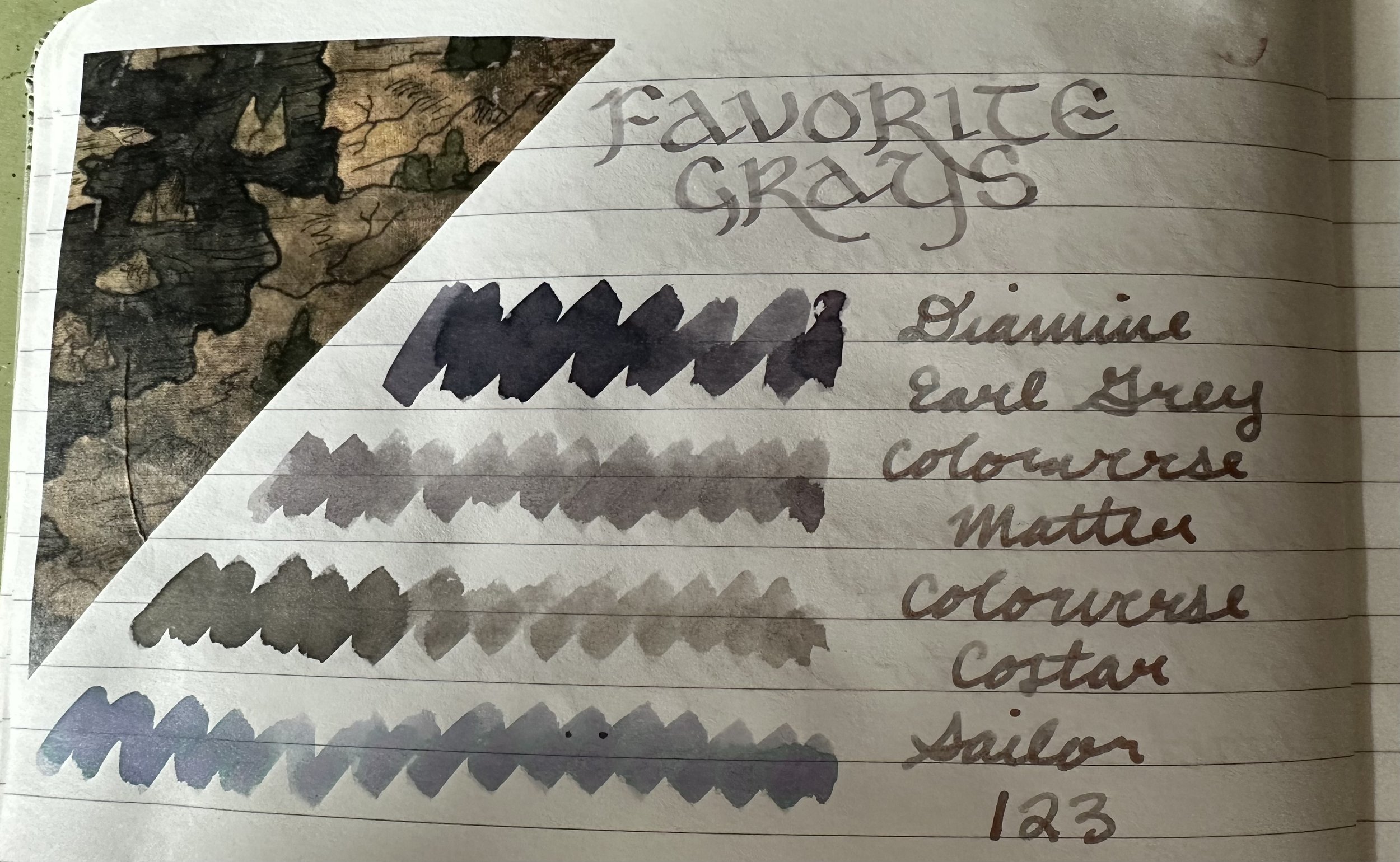
Diamine Earl Grey - This is an ink that is a staple of gray inks that are widely available. It is a dark gray with a purple undertone gives this ink some major character in broad nib pens. In a fine nib this ink provides a more solid colored line, and makes it a great choice for more serious situations such as work.
Colorverse Matter - A warm gray that shows a greenish undertone on some papers. I always enjoy picking up a pen with this ink inside. Great flow and great shading.
Colorverse Costar - An even warmer and darker gray than Colorverse Matter. This is the ink that accompanies SM1 in the Colorverse Deep Space season (one of their best seasons, in my opinion). It is Matter’s moody sibling. The shading in this ink is epic, very dark in the wetter parts of letters and lighter in the rest of the letter.
Sailor Ink Studio 123 - Sometimes I don’t know if I should categorize as a gray, but I feel like that’s the best category for how this ink behaves in writing as opposed to swatches. One of the OG chroma-shading and still a great one. This ink turns purple, pink, or blue where it pools. Different papers yield different results. Just a super fun ink all around.
Swatched on Tomoe River paper in an Odyssey Notebook.
Some future contenders…
While I was flipping through old ink swatches and lists to choose my top four, I found some potential future favorites that need a few more rounds in my pens before I can really evaluate them for a spot in my favorites list.
Van Dieman’s Launceston Fog (sample) - I don’t have a ton of Van Dieman’s inks and I’m still working my through the samples that I have, but this ones is a standout for me. This ink has some really interesting shading, with brown undertones in the gray. I like how well the ink captures its inspiration.
Ferris Wheel Press April Showers (sample) - Another sample I’ve picked up recently. This gray is surprising with its depth. A very pretty cool gray with silver shimmer.
Robert Oster x Atlas Stationers Polar Vortex - This ink is probably one of my favorite inks from the Chicago Pen Show. It’s got shading and color shift and purple undertones. It’s a softer version of Diamine Earl Grey.
Papier Plume Rougarou - This ink has been in the back of my mind for the past month (maybe even two). It’s probably because I am excited for autumn and spooky season. It’s a muddy gray with great shading. I’m starting to notice a theme… I like inks that shade.
Ferris Wheel Press Adventurine - My newest gray and quickly moving up the ranks (my roommate is quite enamored with it). It’s been refilled twice for my own writing. This ink is fascinating in swatches - blue undertones, light grays, and copper shimmer. In writing, it’s fun to see the cool gray warm up in the patches of copper. Very fun and well-behaved for a shimmer ink.

What’s your favorite gray ink?
Currently Inked
Ferris Wheel Press Adventurine - Kaweco liliput copper 14K B
Colorverse Milky Lavender - Esterbrook JR Paradise Purple B - Still going strong with this ink. It’s such a good match for this pen.
Robert Oster Blood Moon - Kaweco Sport Dark Olive BB - It sounds weird to say that a red ink suits a green pen without being Christmas-y, but this dark red looks really nice with this pen. It’s a nice deep brownish red. This is my first round with this ink and so far I really like it.
Kaweco Smokey Grey - Kaweco Sport Macchiato 1.5 - I’ve had these cartridges lying around forever and decided to pop one into my pen that I use for writing headers. This ink is surprising me with its depth and color tone. Goes to show that sometimes standard inks can be surprising.
Ferris Wheel Press Poison Envy - Kaweco Art Sport Tiger’s Eye BB “journaller” - I started with this ink in the fine nib of a FWP Carousel fountain pen and decided to move it to a wide nib because I thought it would show off the ink even better. I was right! This dark purple with pink/green shimmer is so pretty.
Colorverse Office Blue + Wearingeul Healing Light (gold shimmer) - Kaweco liliput fireblue 14K “journaller” - I was thinking about this ink since I wrote about it last week, but I decided I wanted to add a twist and play with some shimmer additive. So far a very fun add-on to an old favorite.

Despite being summer, the natural lighting has been all over the place! I do really love the way the gold shimmer looks in Colorverse Office Blue.