Ink of the Week: FWP Astral Blue Odyssey
Welcome to what I plan to make a more common post here in 2026. Essentially I will go a little more in depth about an ink I have been using that week. If there are any elements you really would like to see me cover in my reviews, please let me know! I want these to be useful for making decisions about what to add to your collection.
From FWP:
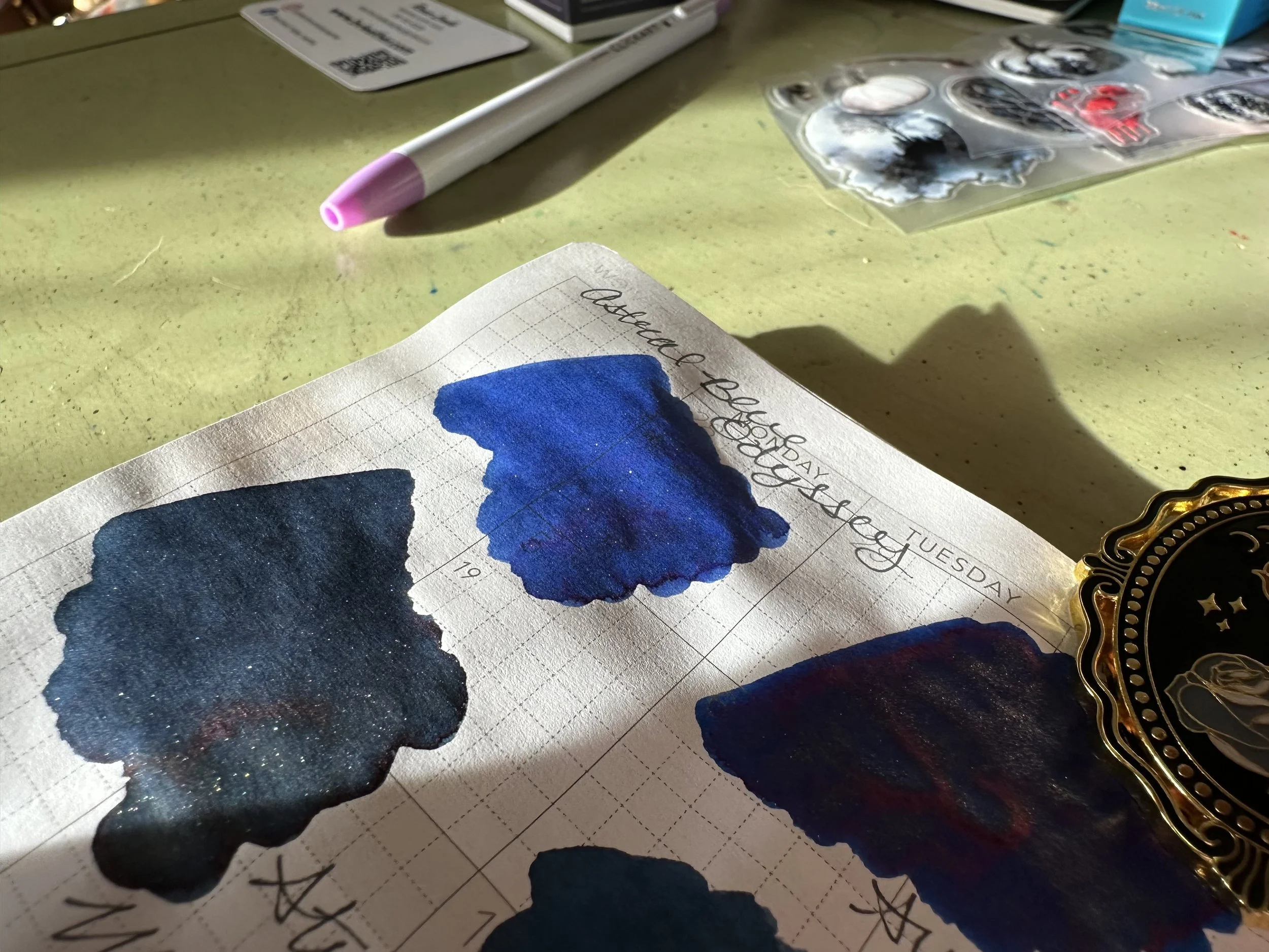
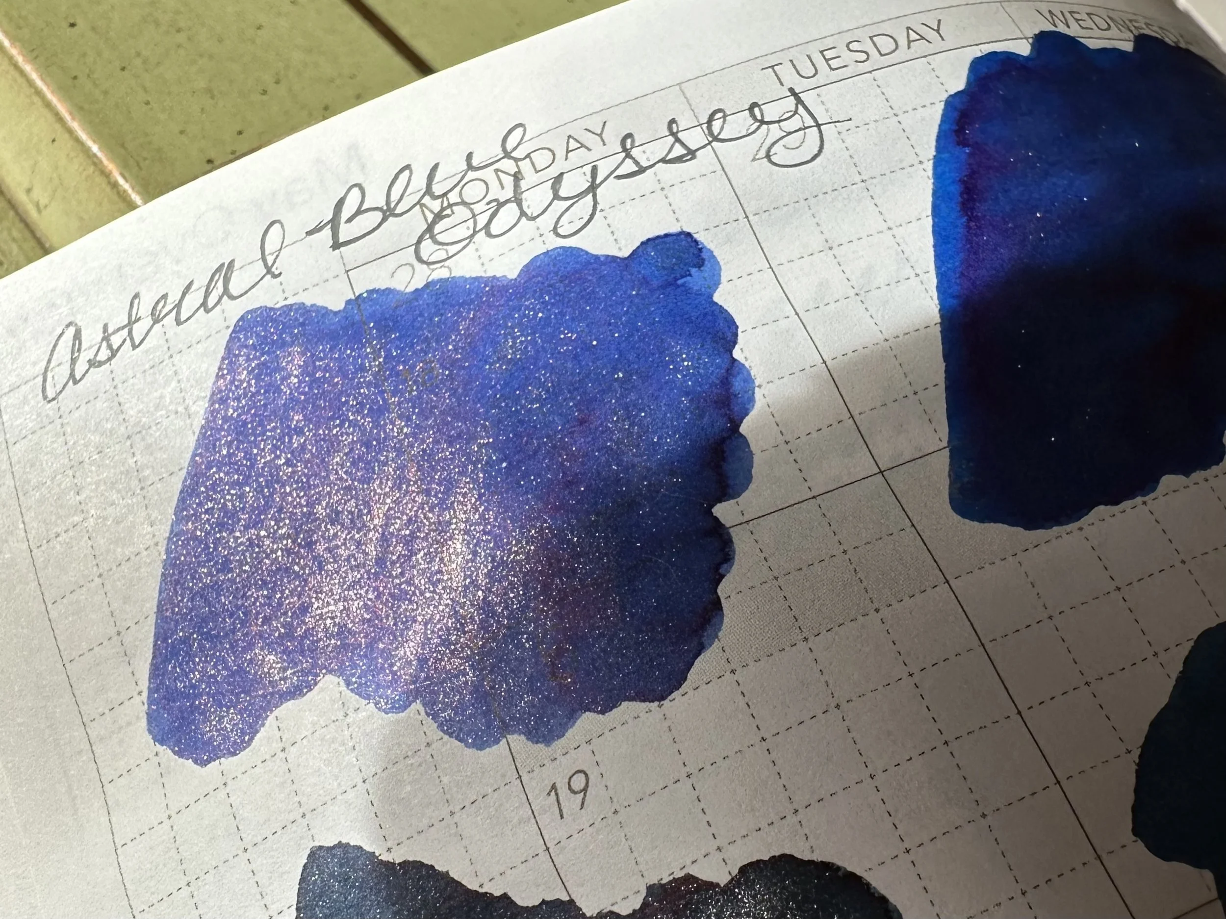
Beneath a sky strewn with stars, clockwork observatories turn and airships drift through the deep blue void… Ink tone: Sheening saturated blue with rose gold shimmer.
It can be said that sheening blues are overdone. Many brands offer them these days. For me, the OG sheening blue was Organic Studios Nitrogen. It was a super sheener and like most super sheeners it had the danger of dried ink particles ending up on any and all surfaces. It was difficult to know if a flake had gotten on something unless it got wet, then there was suddenly blue everywhere. Sheening blues have come a long way from those early days and are generally much more stable and well-behaved. Really long dry times are also down unless laying down a lot of ink.
Despite their common presence, sometimes a sheening blue sticks with me.
I picked up Ferris Wheel Press Astral Blue Odyssey with some loyalty points I had saved up with FWP. I was picking up some inks that I like on clearance and decided to add this one in to round out the cart. It was a gamble sine I wasn’t sure how I would feel about the rose-gold shimmer paired with a more standard blue. Rose-gold shimmer looks great with a lot of inks, but sometimes it doesn’t quite work.
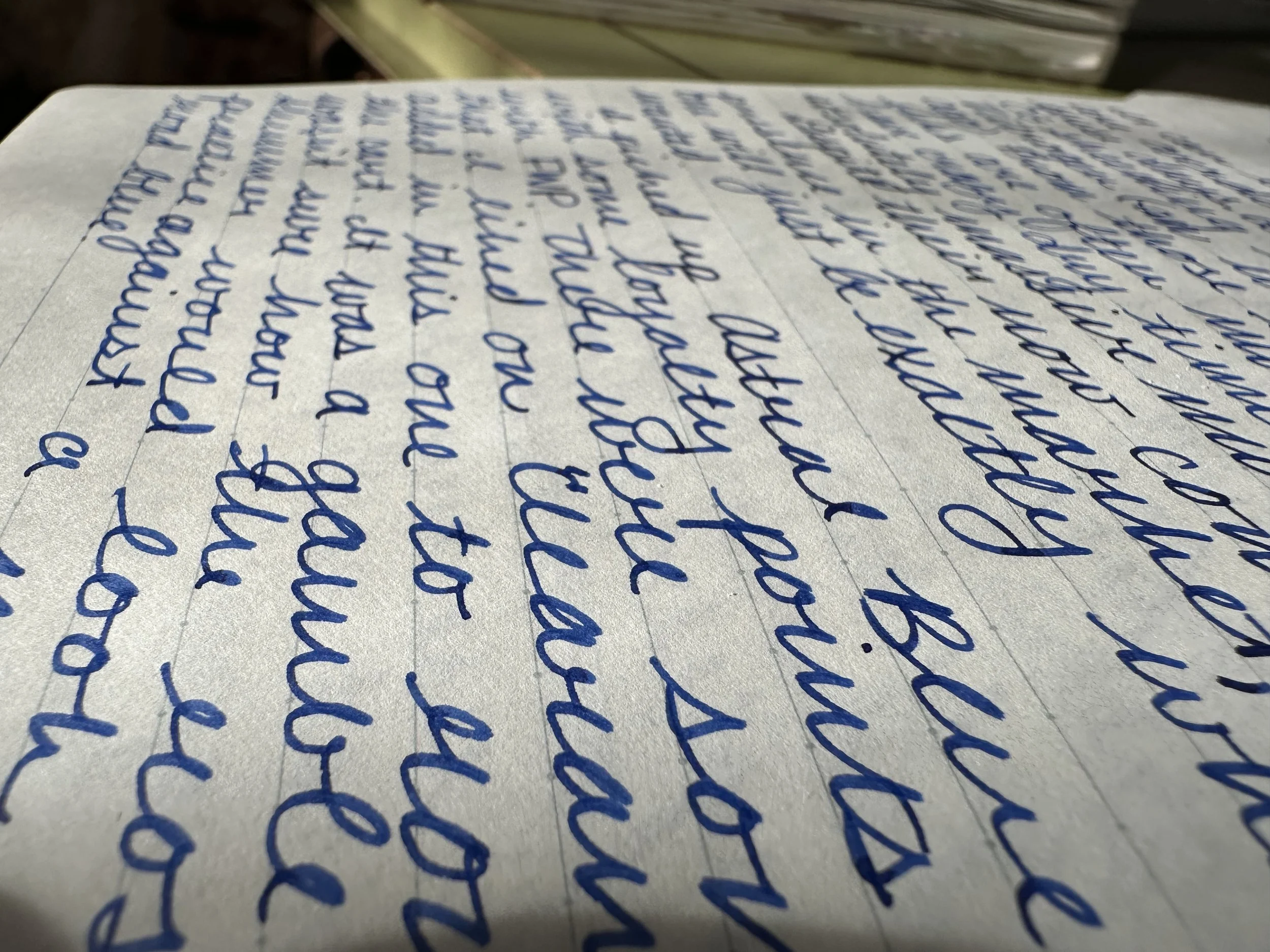
I started off with this ink in a B round nib and later switched it into my B ‘imperial’ grind nib. In both nibs this ink shows off really well.
Writing Experience
On Kokuyo Campus notebook
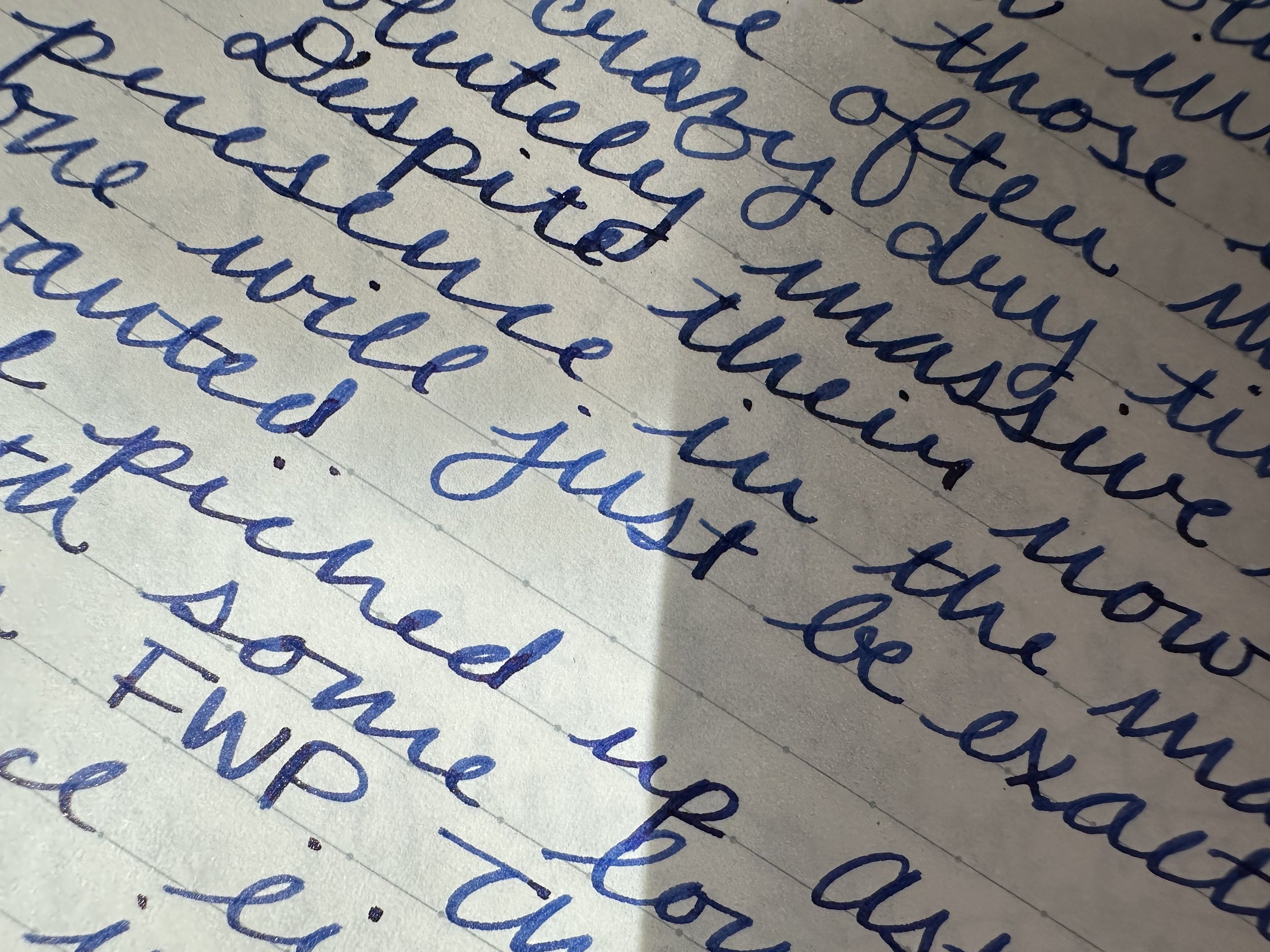
I’ve been using this ink almost non-stop for a few weeks. I’ve probably refilled the tiny converter on my Kaweco liliput copper about 4 times. Overall, the ink has a dry flow and, typical of most shimmer inks, will often have more shimmer at the start of writing rather than further down the page. Without any adjustments, this ink has a dry flow, but I never had trouble with it stopping writing. There were some hard starts if I paused for too long, but if I capped the pen and let it sit for a moment (or added a little moisture to it) writing would begin again right away. This ink fits a lot of my boxes of what I really like in an ink, the rose-gold shimmer adds some whimsy when the light catches it, but otherwise it just looks like a fun blue with a hint of pink sheen. It dries fairly quickly, although I may have to dab with some blotting paper before turning a page.
A little bit of sparkle in the sunlight.
Inking Experience
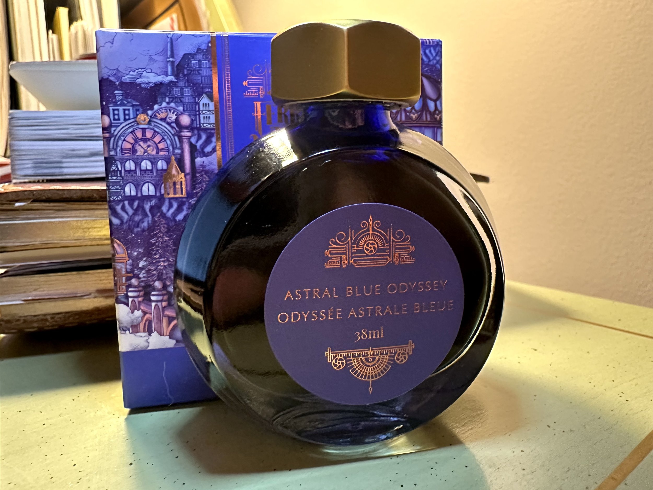
Astral Blue Odyssey comes in the 38 mL standard bottle from FWP, reminiscent of a perfume bottle. I usually make sure I have a finger on either side of the bottle when I am sticking my nib into it for filling, which can lead to some ink on my fingers, especially if the rubber seal didn’t stay in the cap. To get the shimmer to suspend I tip the bottle back and forth until all of the settled shimmer particles are no longer on the bottom.
Aesthetics
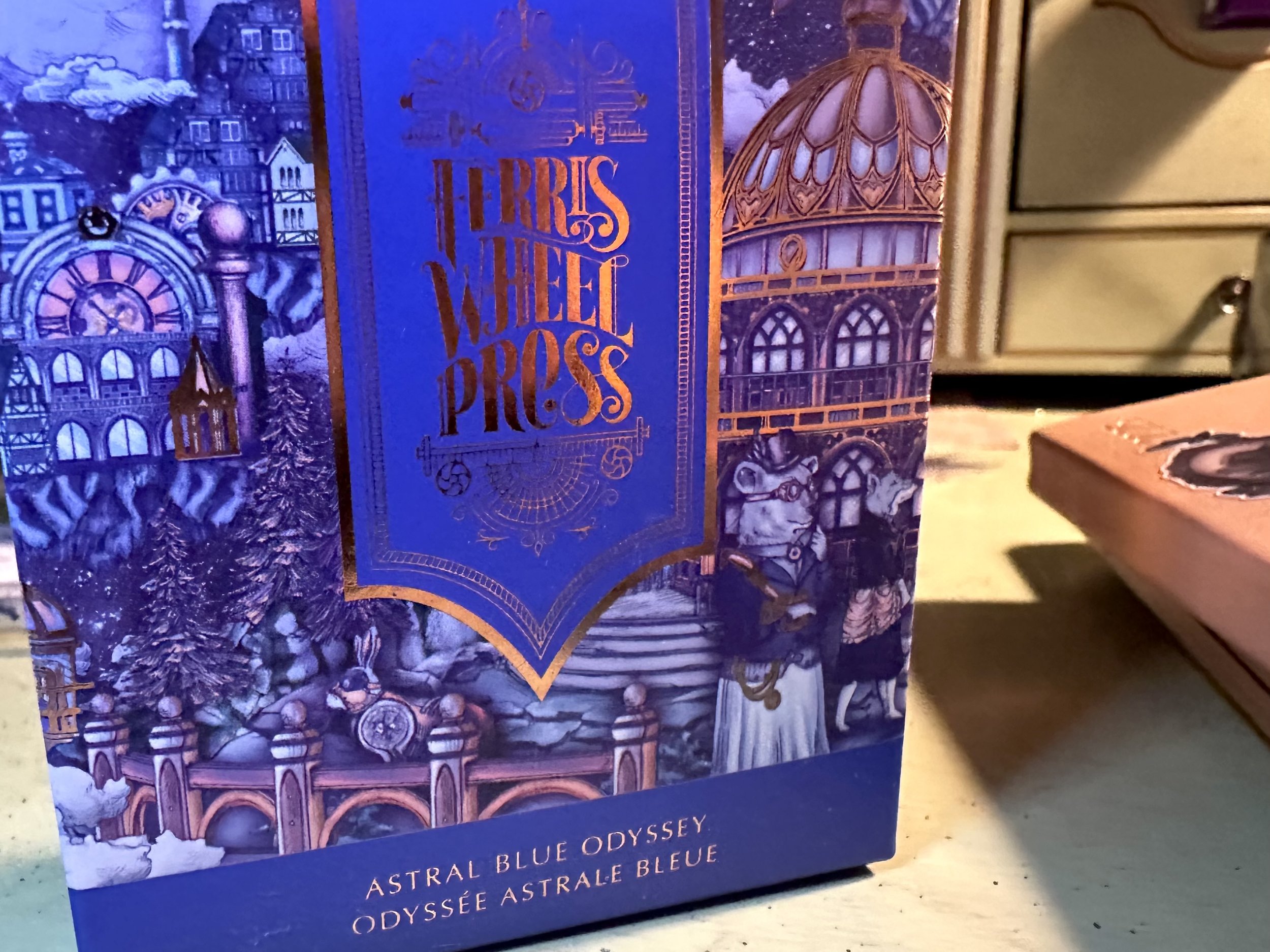
I like thinking of inks and their bottles as both a useful object and an expression of personality (pretty much how I feel about pens as well). I’m a big fan of steampunk stories (something I really need to try my hand at writing one of these days), and FWP has a lot of steampunk styling in both their bottle design and the artwork on their boxes. The art on this box really leans to that with the little elements of vintage tech throughout. FWP does a great job with their presentation and this one looks lovely on the shelf.
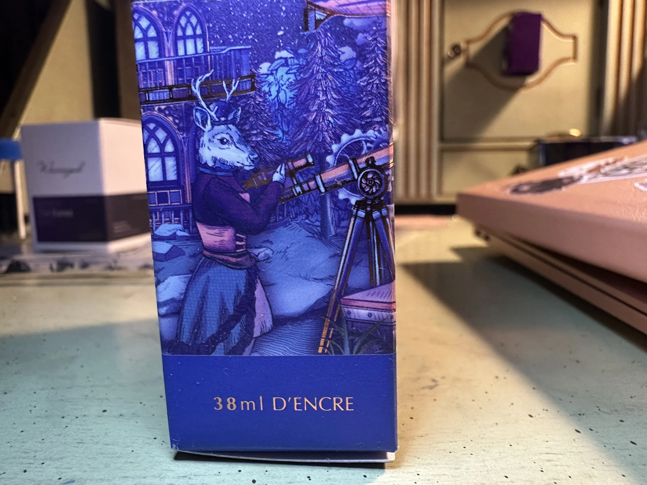
I always like the little details in the artwork. This deer character might be my favorite on this one.
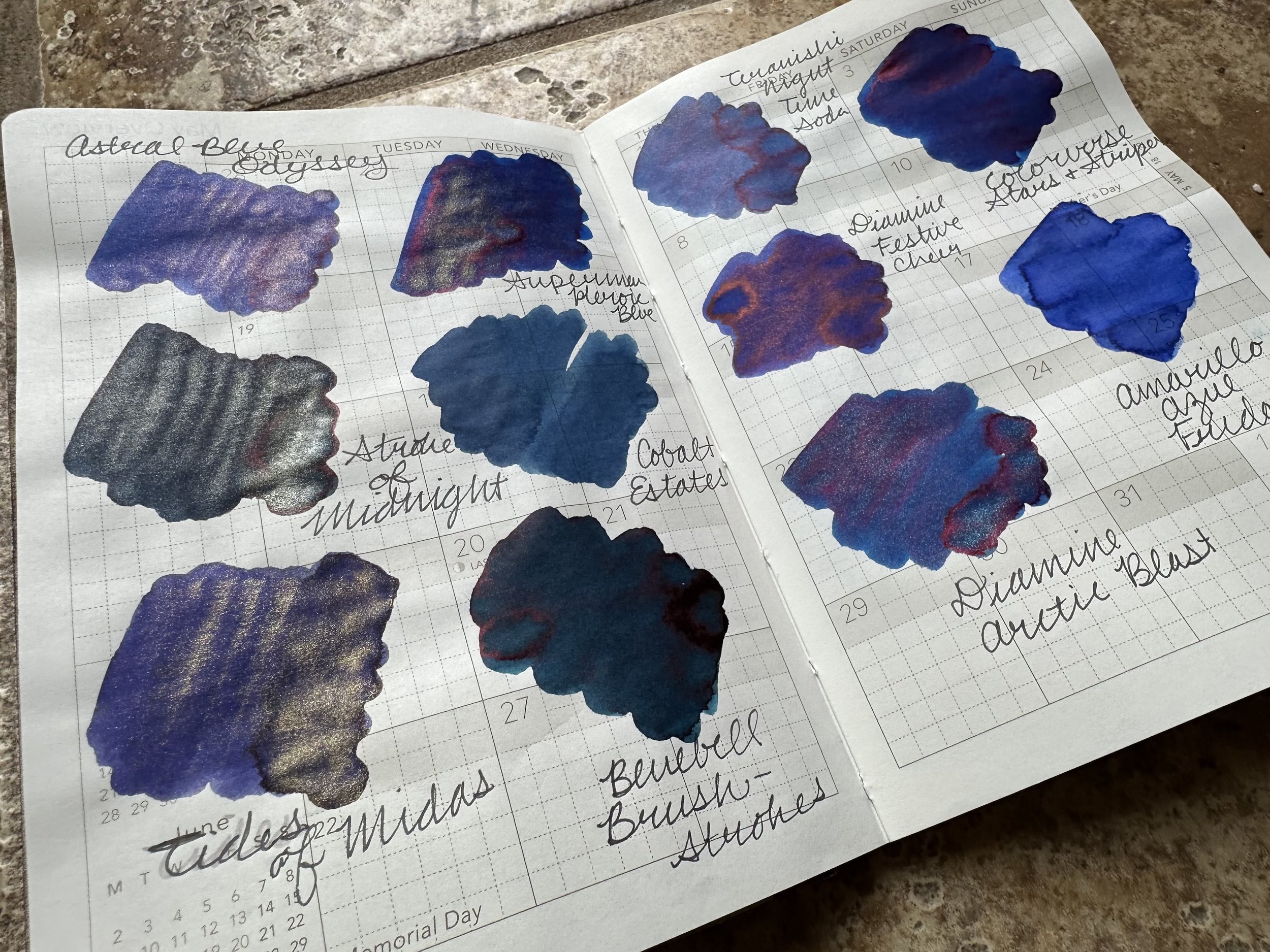
Ink Comparison
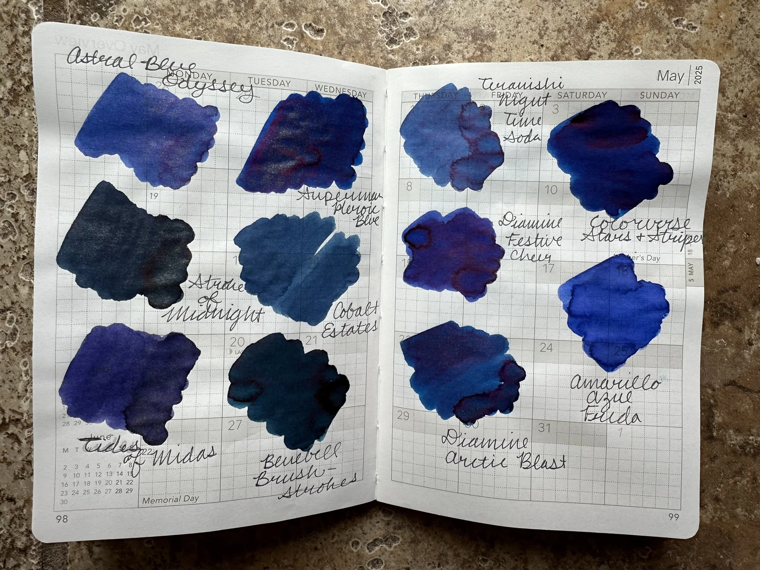
The undertone of Astral Blue Odyssey is just a shade darker than Teranishi Nighttime Soda.
Overall
I really like this ink and have been enjoying writing with it. Sometimes an ink just sticks with me and this was certainly one of those. I think this is one best enjoyed in an italic style nib because it just adds even more character to the writing.