Ink Review: Ferris Wheel Press Velvet Ballet
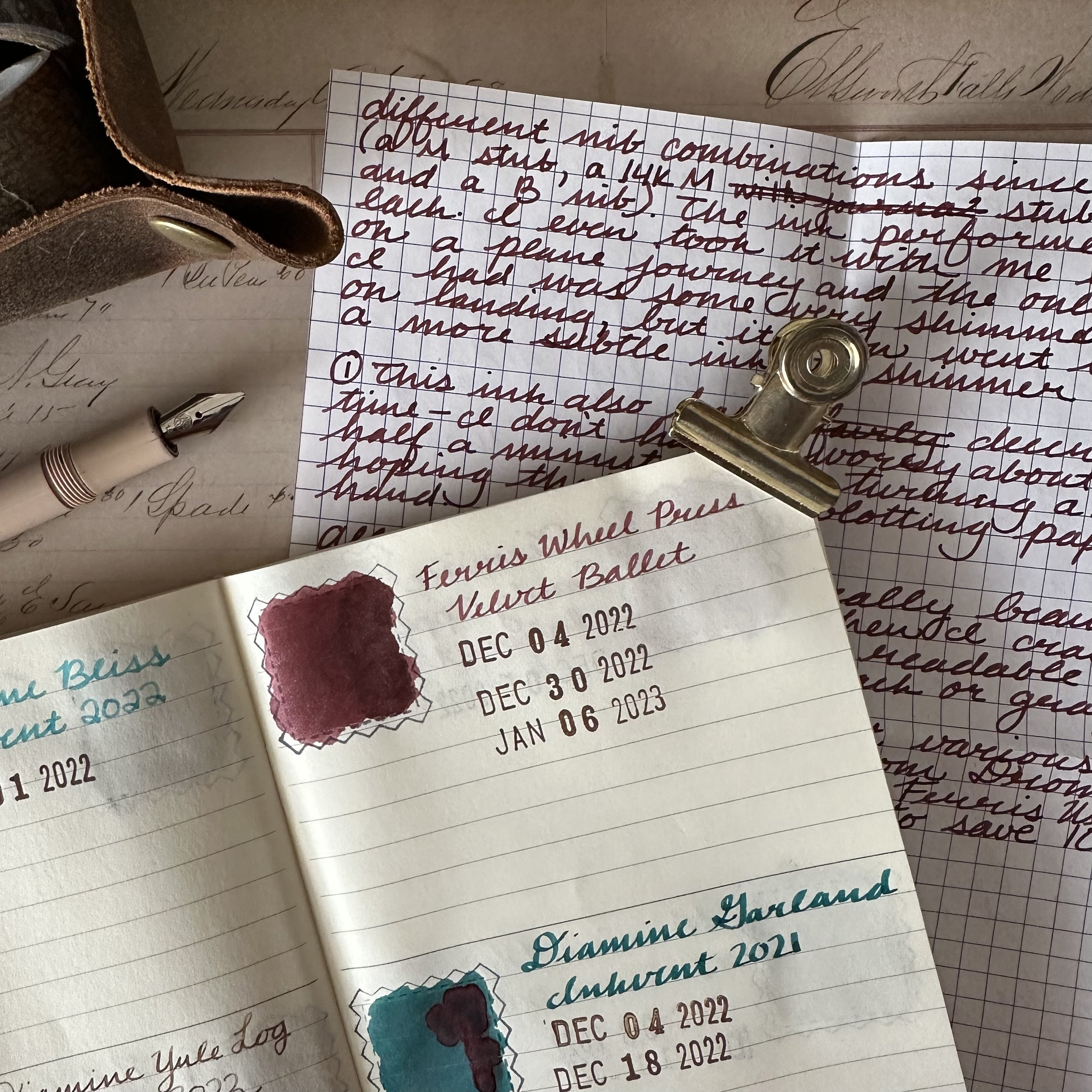
Ink swatch in my “ink passport” on Midori MD paper. Review written with a B nib on Rhodia paper.
As soon as this ink was announced I knew I was going to get a bottle for myself. I am a sucker for burgundy inks and deep reds. Add in the ballet theming and I was sold. I love products that tell a story and the folks at Ferris Wheel Press are wonderful storytellers.
Ferris Wheel Press is a Canadian stationery company producing fountain pens, rollerballs, sketchbooks, and, of course, fountain pen ink. They’ve been on my radar ever since their Kickstarter quite a few years ago now. They have a very whimsical aesthetic to their products from the packaging, the ink bottles, and the names of the inks. Ferris Wheel Press also collaborates with stationery shops to make exclusives which they also offer direct from their website, which is really awesome in my opinion.
Velvet Ballet evokes old velvet seats and stage curtains. As a theater and stage show enthusiast, it was a detail that really drew me in. Fun fact: I spent two summers being a volunteer usher for the Grand Teton Music Festival in Teton Village, Wyoming. Every Friday evening I was there getting to enjoy the orchestra.
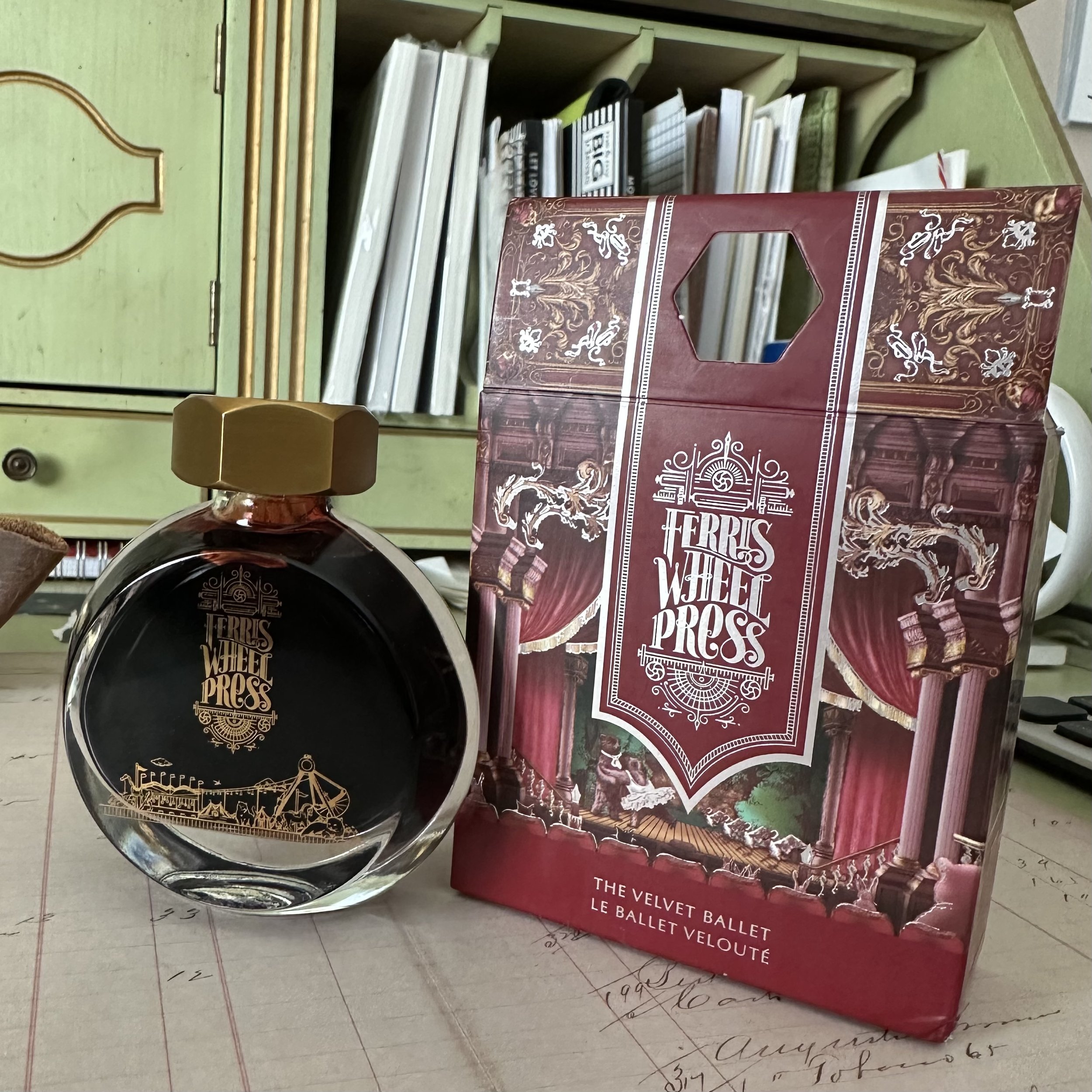
The art on the box tells the story of the ink with Ferris Wheel Press’s cast of animal characters in the audience watching a group of bears perform a ballet. Since this was a holiday release, it’s likely the Nutcracker. The details on both the box and the bottle are visually interesting and very fun to display (something that is an added bonus for me these days where I have my own house). Their brass caps are very unique to the Ferris Wheel Press brand and it gives it an extra dose of elegance. The 38 mL size of the bottle is perfect and it allows the bottles to slip onto shelves or to be stacked when stored.
The ink itself is a burgundy-red with a silver shimmer. Depending on the paper and nib I can eek out some shading. I haven’t experienced any clogging with the shimmer, which is very important as I use my inks for long writing sessions and any pen in my possession must be ready to go when inspiration strikes. Another nice feature is that the ink doesn’t dry super fast on the nib, so if I pause with the cap off while thinking, I can get back to writing without having to let the nib prime again. The ink also dries quickly, I don’t have to wait a long time before turning the page in my A6 notebooks (or hope that I have blotting paper at hand).
On Midori MD Cotton paper pad.
On Cosmo Air Light paper. You can see some of the silver shimmer on the left in the scribble.
On Kokuyo Perpanep Zara Zara paper.
On Kokuyo Perpanep Sara Sara paper.
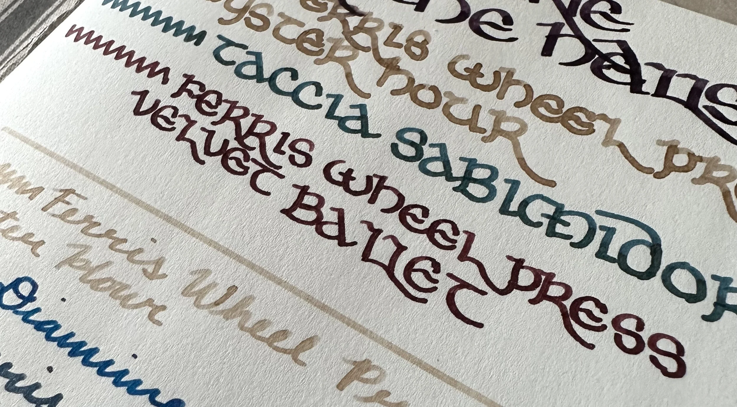
On Sakae Iroful paper. All samples were written with a B nib.
This ink has been used in a variety of nibs in my collection - a M stub, a 14K M “journaller” stub, and a stock B nib. The ink performed well in each. I even took it with me on the airplane to Florida and the only “trouble” came when there was a lot of shimmer in the first few lines when the pen was uncapped on the plane (not untypical of any ink being really wet when the pressure changes). After writing a few lines it quickly returned to the standard ink to shimmer ratio. The shimmer is very subtle and usually takes a tilting of the paper in the light which makes it not as in-your-face as some other shimmer inks.
I’ve used this ink on a variety of papers. Even on the low-quality cardstock of my Christmas cards the ink was pretty behaved. It shows up beautifully on fountain pen friendly papers and then keeps that rich tone even on lower quality papers. All in all, it’s a really beautiful ink and it suits me when I crave something elegant and readable, but isn’t a blue, black, brown, or gray. I will likely be using this ink quite often when I am looking for a red and a touch of elegance to my writing.
You can find this ink at a variety of retailers such as Atlas Stationers (use code DIME10 to save 10%) or directly from Ferris Wheel Press. You can use the code ‘DIME’ to get a free ink charger set with the purchase of any ink bottle, writing utensil, or notebook (Disclosure: I am part of the Jubilee Creative Program with Ferris Wheel Press and do receive a small commission. This particular ink was purchased with my own funds before becoming an ambassador).


