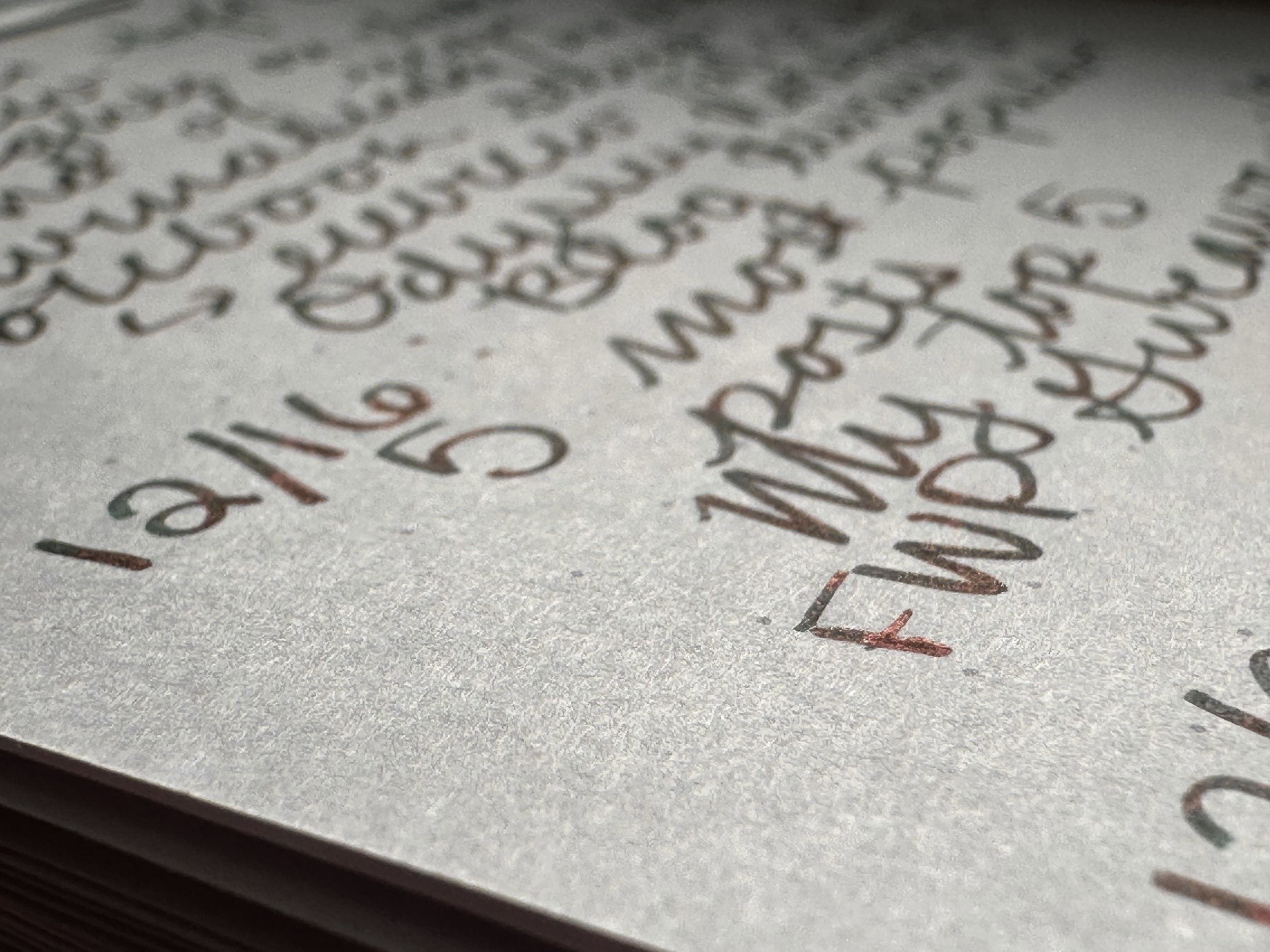
It Shouldn’t Work: Midori Soft Color Notebook
This notebook feels like mad science. It’s a fountain-pen friendly paper that shows off ink properties, but isn’t your typical white or cream. The Midori Soft Color notebooks (JetPens) come in both staplebound and wired bindings with blue, green, gray, pink, or purple paper. The Midori MD lineup is one that I’m very familiar with, but I wanted to try out these when I saw them in a stationery shop in St. Paul. I’ve had a thing for purple in 2024, so the idea of some Midori paper in a color was intriguing. I’ll be honest, I didn’t expect it to work with my fountain pens. However, the results were a lot of fun.
It’s the last month of the year and I am in goal setting mode, so I was digging through my notebook stash looking for something fun. Basically something I could just scribble ideas into with whatever pens might be handy. Essentially, a place to dump all my thoughts and notes about what I’d like to accomplish in 2025. I pulled up the purple one and really wanted to use it - however, an A5 doesn’t fit in my A6 Traveler’s Notebook. Some notebook surgery was required.
Using a craft knife I was able to slice the book in half, effectively creating two A6 reporter style notebooks. There are only two staples in the binding, and everything stayed together after I cut it. After notebook surgery was complete, it was time to start scribbling.
This notebook functions as well as any other Midori notebook I have used in the past. Other than the color, it performs just like the paper in a Midori MD notebook. Only difference is it has dot grid as opposed to blank, grid, or lined. Even with BB nibs and wet inks I have seen no ghosting between pages. I’ve only seen feathering where ink pooled a little too thick, even then it’s not really noticeable unless you are looking very closely.
As mentioned at the start of this review, one of the most interesting aspects of this paper is how well the different colors of ink stay true to their tone. Bright colors especially pop. Shading inks still shade and sheening inks still sheen. Shimmer inks look pretty cool.
If you are on the search for a mix-up on the standard cream or white notebook paper, I would recommend giving these Midori Soft Color notebooks a try! I have seen these notebooks available at most retailers that sell Midori products.
I think I might need to pick up a blue and green one next. They are simply too fun. If you’ve tried them, what did you think?
Currently Inked
Ferris Wheel Press Frontenac Blue - Kaweco x Galen Leather Sport 14K BB ‘journaler’ - A new month means a new header ink. I knew I wanted to do a blue and mentally scanned my ink shelves. I decided on Frontenac Blue because it’s an ice blue with blue shimmer. It looks cold.
Diamine Happy Holidays - Kaweco liliput fireblue 14K M ‘journaler’ - Somehow I have never used the final ink of the Inkvent Blue Edition. It has simply been sitting on my shelf since 2019. Which is a shame, because this ink is pretty fun. Color-wise it sits between Diamine Arctic Blast (lighter) and Colorverse Bow Shock (a little darker). It has red sheen and blue shimmer. I’ve never gone in on a bottle of Arctic Blast (yet), and this one might scratch the itch of a bright blue with shimmer and sheen.
Colorverse Supergiant - Kaweco liliput copper 14K B - The first ink of the brand new Colorverse Colorvent. It’s a deep, true red, not a hint of pink in sight. It has a little bit of bronze sheen. A pretty simple color to start out with, but it is a lovely red not reflected in my other Colorverse inks.
Anderillium Luna Moth Green - Kaweco Art Sport Terrazzo B ‘imperial’ - Still about 1/2 a fill from last week still left. I’ve been using this ink to brighten up my notes at work and brainstorm 2025 work projects. The soft green is just so cheerful.
Diamine Black Ivy - Kaweco Art Sport Tiger’s Eye 14K M ‘selvedge’ - Another ink from a past Inkvent that I never got around to trying. I was expecting more of a green undertone, but Black Ivy is a deep teal with red sheen. It’s another one of those stealth fun, but still professional inks. I’m really enjoying it.


