
LE Paper: Kokuyo Century Edition Thin Paper
If I had to choose a favorite paper brand, at the moment it would be Kokuyo. Kokuyo is a Japanese company that offers a variety of products, including stationery and office supplies. My first product that I ever used from them was the Kokuyo Campus notebooks and I was surprised that such an inexpensive notebook could hold up to fountain pen ink as well as it did. I almost always have a self-made A6 in my TN cobbled together from Kokuyo paper. Right now I have one made of Kokuyo Perpanep Tsuru Tsuru paper (which I wrote about last week) and I recently made a second one out of Kokuyo Century Edition Thin Paper after using up the first.
I have a habit of scanning the New Arrivals sections of the various stationery websites (particularly JetPens, Vanness Pens, and Yoseka Stationery) for what’s new. All of these shops tend to import paper from all over the world and have a wide variety of it. They also sometimes take a chance on a new brand or type of paper to see if it sticks. A trend I’ve been noticing among paper companies is making “special edition” offerings of their paper lineup - and the Kokuyo Century Edition lineup appears to be one of those designed for Kokuyo’s 100th anniversary. I picked up an A5 blank notepad version when it was available at JetPens. I like picking up notepads when I can because I do like to stitch together inserts for my TN and paper pads just make that so much easier.
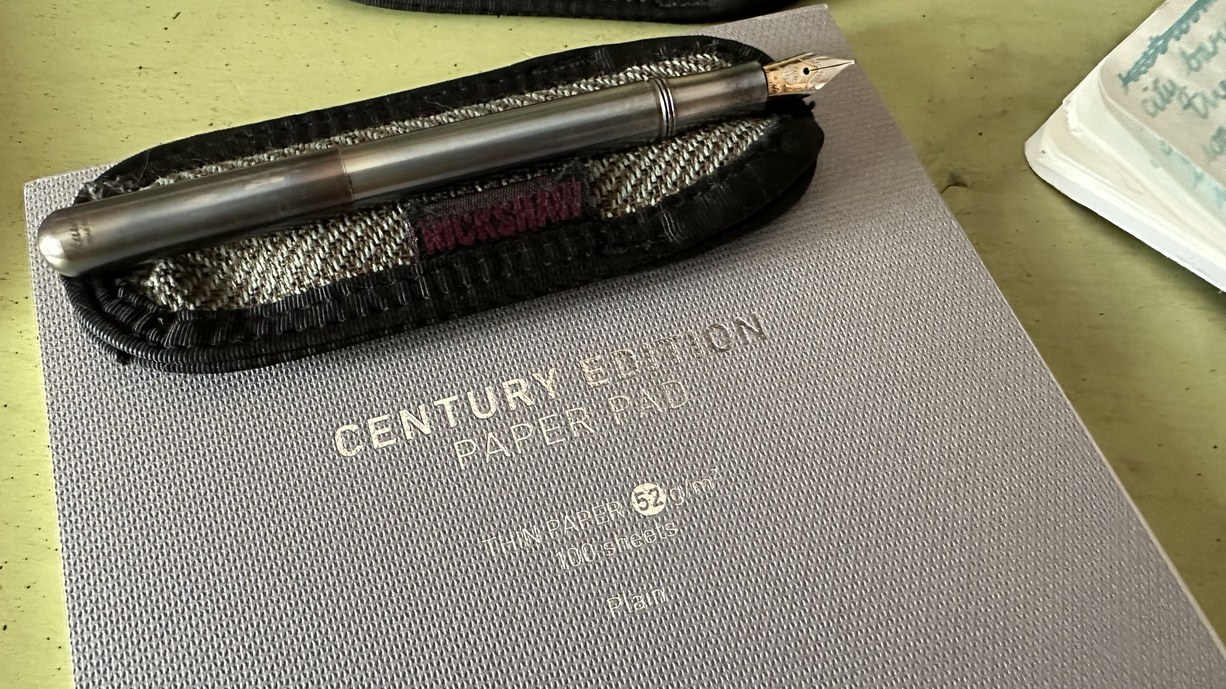
The Century Edition Paper Pad with Thin Paper looks very professional and tidy. It has a gray textured cover that folds back behind the pad and a soft cardboard backing. The cover lacks any adornment other than the texture itself and the name of the pad. On the back Kokuyo has provided a description of this pad. It reads,
“This paper pad uses light and thin Kokuyo original “THIN PAPER” 52 gsm as the inner paper. It is easy to write on both sides, hard to show through or get wavy even when rubbed with an erasable ballpoint pen.”
After using this paper for the past month, I would say that is a pretty accurate description. I can’t personally speak for the erasable ballpoint pen since I don’t use them, but it seems to be pretty sturdy paper that would take a bit to tear through via friction.
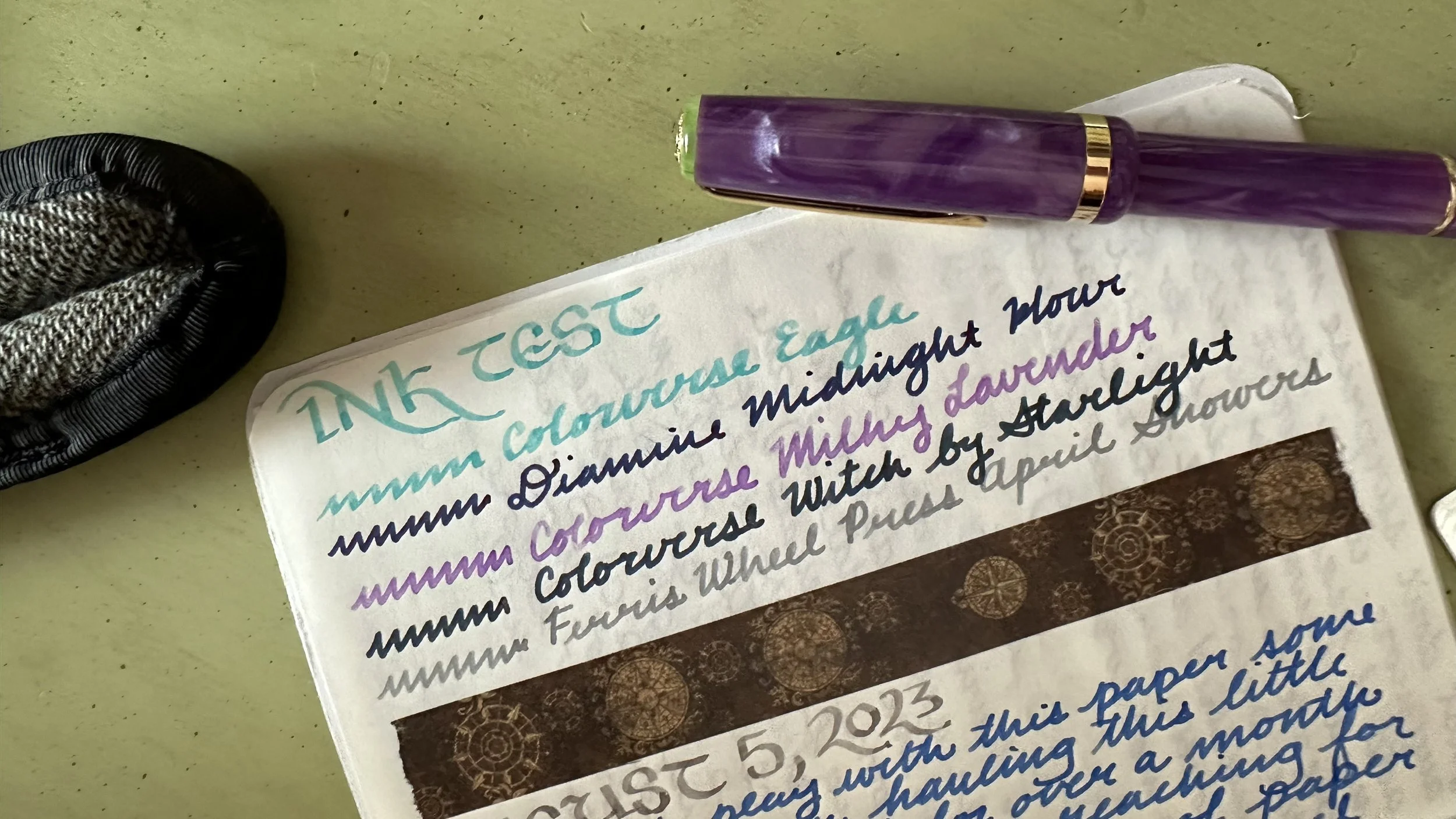
All M to BB nibs - you can see a little bit of a shadow behind, but everything is still very clear.
If you are the sort of person who hates ghosting of any kind, this is not the paper for you. However, if you don’t mind it or are used to it (I see you Tomoe River paper ghosts), then this paper is a great option. It is extremely easy to read what you are writing on either side of the page even when using dark inks and broad nibs. It also doesn’t get wrinkly like Tomoe River paper or Onion Skin paper. A feature I think is really interesting though is that as you write your letters “sink” into the page a little bit and create texture on it. This is noticeable with the wider nibs, when you run your finger across a finished page you can feel the pen marks. When the pen is moving across the paper though, there is a little bit of tooth, but it’s pleasant in a my-nib-isn’t-running-away-from-me kind of way.

This notebook is completely filled with some story scenes and some travel plans… the paper hasn’t buckled in the slightest.
Shading inks look great on this paper. It can actually be somewhat dramatic where the ink pools or where you lifted your pen. Just a little colorful punctuation here and there. As far as sheen goes, it’s not very dramatic and most inks don’t show it on this paper like they would on Cosmo Air Light or Tomoe River. It does show off shimmer pretty well, I think due to that texture the pen stroke leaves behind lets the shimmer particles pool and spread out. It has a similar dry time to Tomoe River paper (less than 10 seconds) with most inks.
Overall, I hope Kokuyo makes this paper available again. It’s a great option for lots of pages in a still thin notebook where both sides of the page are useable even with BB lines and dark ink colors. I think it is used in their Jibun Techo lineup (although last year’s model description cites a MIO paper…) so maybe it’s still produced? Have you tried Kokuyo Thin Paper? What did you think?
Currently Inked

You can see a little bit of the texture of the paper around the letters. Really fun feature of this paper.
Sailor Shikiori Shito Shito - Esterbrook JR Paradise Purple B - This bottle of ink was an impulse purchase during the Sailor Online Ink Event last month. I wanted to give one of them a try and was in a turquoise/teal mood. This is from the Sound of Rain series and is meant to evoke “quiet rain,” which is the sound effect the name implies. It’s a moody teal and I’m not sure if I like it yet, this one might be more of a fall color for me.
Sailor Pen Show Ink 2023 - Kaweco Sport Mellow Blue 14K BB CSI - This was an ink I did not think I was going to like. It came as part of the admission for the online ink event and when I first looked at the swatch I was sure this orange wasn’t for me… and then I put it in a pen. This is a really fun, straightforward, shading, bright orange. It was a joy to write with this week.
Ferris Wheel Press Blue Yosemite Falls - Kaweco Art Sport Tiger’s Eye 14K BB ‘journaller’ - I was looking for a soft blue in my stash after so many dark colors the past few weeks and decided to give this one another go in a juicy nib… and it made all of the difference. This ink has really beautiful shading with this nib and is very readable (this ink is extremely light in smaller nib sizes).
Ferris Wheel Press Golden Gate Glow - Kaweco liliput copper 14K B - Since I am headed to the San Francisco Pen Show next week (I am so excited to go to another pen show this year) I decided to give this ink a try. I had picked up a sample from Goulet Pens after considering buying it in Chicago this spring. This is a pretty sunset, almost peachy orange and shades very much like the rest of the inks in its set (Malibu Blush and Blue Yosemite Falls).
Wearingeul Anubis - Kaweco liliput fireblue 14K M ‘journaller’ - One of those inks that I bought for the name first and the color second, but so far it’s not disappointing. I just put this in my pen right before working on this post and I like it - first impression is that it’s a brown leaning gray with the pop of copper shimmer. Very mythological.
If you’d like to support my blog considering using one of my discount codes the next time you shop for pens, paper or ink. All links are found on my About page. Also, I am running a giveaway with Ferris Wheel Press over on my Instagram to celebrate my birthday next week! If you are interested in entering you can leave a comment on this post.
Thanks for reading! And if anyone is going to the San Francisco Pen Show, I’d love to see you there!