Life Airmail Paper: A Taste of History
I am a paper adventurer. I love picking up new to me papers and learning the textures and how they play with my favorite pens and inks. Paper is one leg of the triad of an enjoyable writing experience (the other being pen/nib and ink). Paper is one of those pieces that can give me new inspiration and desire to just keep scrawling words onto the page creating tales, working through ideas, and making records of the the thoughts that dart around my mind.
While my paper collection is constantly growing (there are so many interesting options popping up), I have a soft spot for one of my early forays into speciality papers. That’s onion skin paper/airmail papers. Today, I am going to take a look at the Life Airmail paper pad, a product I’ve repurchased and used up many times.
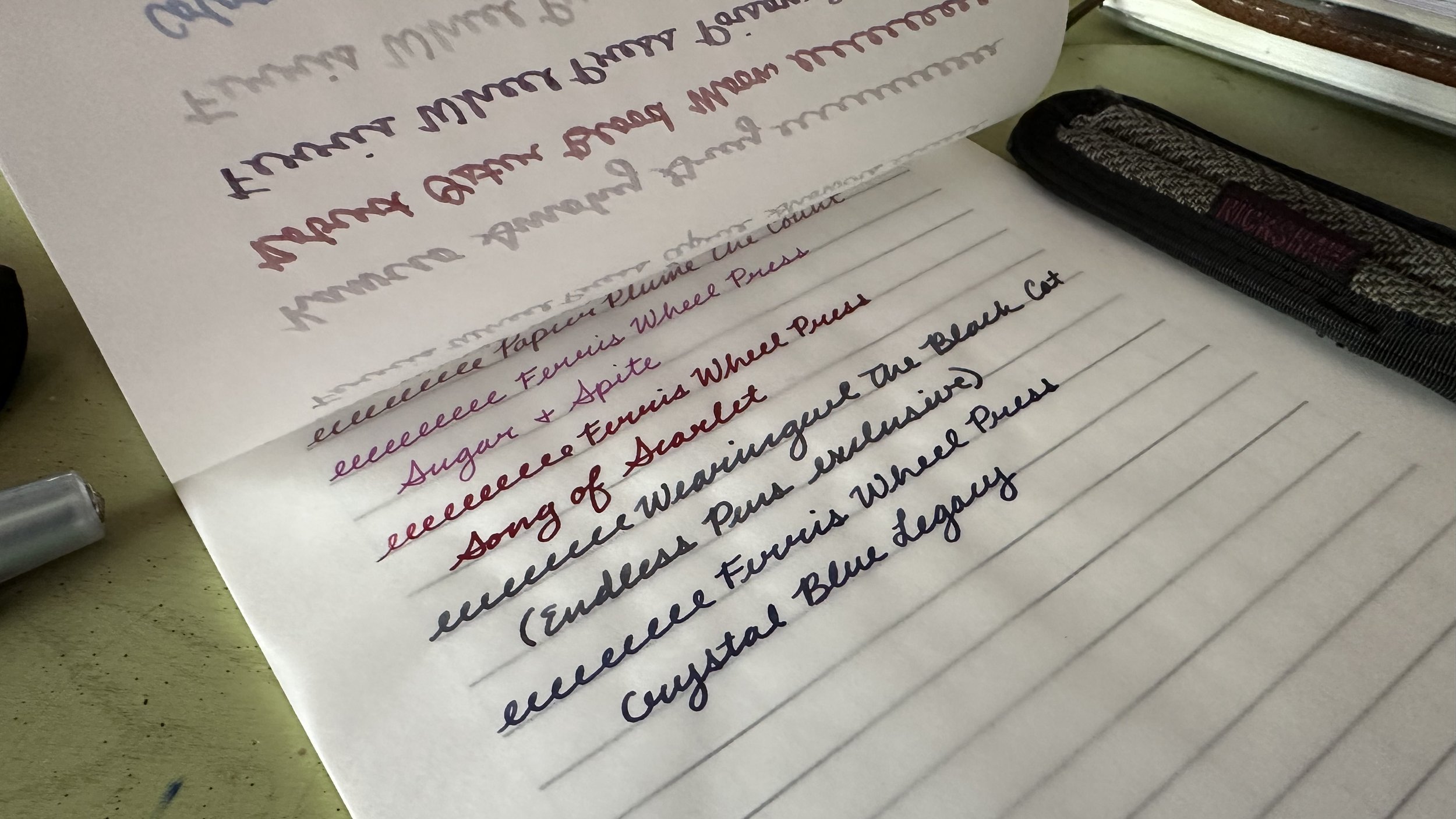
Each Life Airmail pad comes with 50 sheets of thin translucent paper. The paper is smooth to write on, although texture of the paper fibers can be seen when looking closely at the page. The bright white tone makes inks pop, although sheen can be muted. It doesn’t disappear entirely, but it becomes much more subtle. I’ve never had trouble with bleedthrough or spreading despite my love of laying down thick BB lines. Due to the translucency, however, it makes only one side of the paper useable, and it also makes it easy to use the included guide sheet. The guide sheet has a vertical and horizontal guidelines.
One of my favorite features of this family of papers is the auditory quality. There is a soft crinkling when these pages are handled, and a blank page sounds a little different than one filled with words. The paper itself has a little comment every time a page is filled and turned to the next one.
The design on the cover of the notebook pays homage to the origins of this paper. When airplanes first became commercially viable, it was a major change for the world of communication, especially for overseas communication. Instead of having to bundle mail onto ships, then loaded onto trains, and then delivered by local post, airplanes could cut out a lot of the travel time. “Airmail” became an alternative to waiting the weeks or months it would take to get mail across an ocean by water. Just like today, postage was determined by weight and so making sure your letter didn’t get too hefty was important. During the World Wars, letter correspondence was the only way for families and friends to stay in contact with each other. Those letters could get long and the need for a thin paper that wouldn’t cost too much to send became desirable. The original paper types were called onion skin because they resembled the skin of an onion (not because they were made from onions) and later were dubbed “airmail” because of their popular use for letters. Later, onion skin paper was popular as cover sheets for typewriters when making carbon copies because it allowed the key to strike through to the carbon paper easily.
Every time I pull out this notepad I feel little like a time traveler, penning something to be sent far away, even if it is something as mundane as a grocery list. At about $9 a pad, it’s not the cheapest paper out there, but it’s a great entry level to this family of papers. It’s a delight to write on and, to me, worth it to include a stash of these in my paper collection.
You can find this paper at multiple retailers including (but not limited to): Gentleman Stationer, Vanness Pens, and JetPens. (I’m not affiliated with any of these shops, they are just some of my go-to’s).
Currently Inked
Ferris Wheel Press Crystal Blue Legacy - Kaweco liliput Fireblue 14K M ‘journaler’ - releasing Nov. 3rd, this is a really beautiful new entry into FWP’s standard lineup. At first glance I thought it might be similar to Stroke of Midnight (my favorite FWP shimmer blue), but it’s much darker and with blue shimmer. It has a more of a navy blue undertone with hints of purple. I had to ink it up again this week because I couldn’t stop writing with it. It’s one of those stealth fun inks, looks really plain until you look closely.
Wearingeul x Endless Pens The Black Cat - Kaweco liliput copper 14K BB CSI - this ink gets more interesting the longer I use it and the more papers that I use it on. When swatched and written on Tomoe River paper the base colors looks like a black-purple, but on others it becomes more matte and navy blurple. Really cool ink. There needs to be more Wearingeul inks in my collection.
Ferris Wheel Press Song of Scarlet - Kaweco Art Sport Tiger’s Eye 14K M ‘selvedge’ - This pen and ink combo was refilled this week. Red is an ink color that I adore (I credit being a rebel and writing my notes in red pen in high school and college). It makes up a pretty good chunk of my ink collection, but I haven’t reached for reds much this year. It’s tricky to find a good red, often they are too burgundy or too pink, but this one hits the spot as a dark red and I’ve been enjoying scribbling with abandon.
Ferris Wheel Press Hearty Harvest - Kaweco Sport Macchiato 1.5 - This ink actually needed a partial refill to finish out the month. This is such a good shimmering orange.
Back to battling the northern Minnesota fall/winter light…


