
Memory & Muse: Maruman Mnemosyne A5 Notepad

It’s been a workhorse kind of week where I needed to get a lot of writing done fast. I went through my large pile of notebooks and notepads to find something that I hadn’t used extensively so I could keep myself on the page by experiencing the paper along with the ink I needed to sling. I picked up a Maruman Mnemosyne A5 notepad No. 188. I picked it up on one of my trips to Wet Paint in St. Paul, MN earlier this year.
Maruman is a Japanese stationery company that styles themselves as a “creative support company”. Mnemosyne is one of their product lines named for the Greek goddess of memory and the mother of the nine muses. This paper line has a variety of notepad/book styles ranging from pocket size reporter notebooks to a gargantuan A3 notebook.
The No. 188 is an A5 notepad with 5 mm grid. At the top of each page is a header section for the date and subject of the following drawing or notes. The grid is printed in light gray ink and only on the front side. The back of each sheet is blank. The pages are perforated and tear off easily. The notepad cover is black cardstock with minimal branding with an inner yellow cover that describes the notepads features in Japanese.

The paper itself is developed by Maruman to be used with a variety of writing instruments including fountain pens. The texture is smooth. The paper is on the cream side of white and easy on the eyes. Ghosting was minimal even with very bright and dark inks (it took a lot of ink to get anything to show through, normal writing left no ghosted lines). Ink shades well on this paper and has a pretty decent dry time, not very different from other coated papers. I have noticed that there is some sensitivity to hand oil and possible inconsistencies on some sheets because the ink would skip in some areas near the bottom of the page.
I find the choice to only print the ruling on only one side of the paper to make it for a very specific use case (not that I don’t just flip it over and write on the blank side). When using Google Translate to read the description of the notepad it’s clear that it is meant to be used in conjunction with a Mnemosyne planner for holding notes and/or to be filed into folders for quick reference. It’s designed to be a memo pad more than paper to be torn off and using multiple sheets at once. This particular design of the No. 188 limits its use case for me, since I am usually using notepad for multiple sheets of paper when working on articles or stories and generally like using both sides. However, I do like the paper and will definitely give it more thought in a different design (the A3 notebook looks super impractical but I kind of want one, haha).
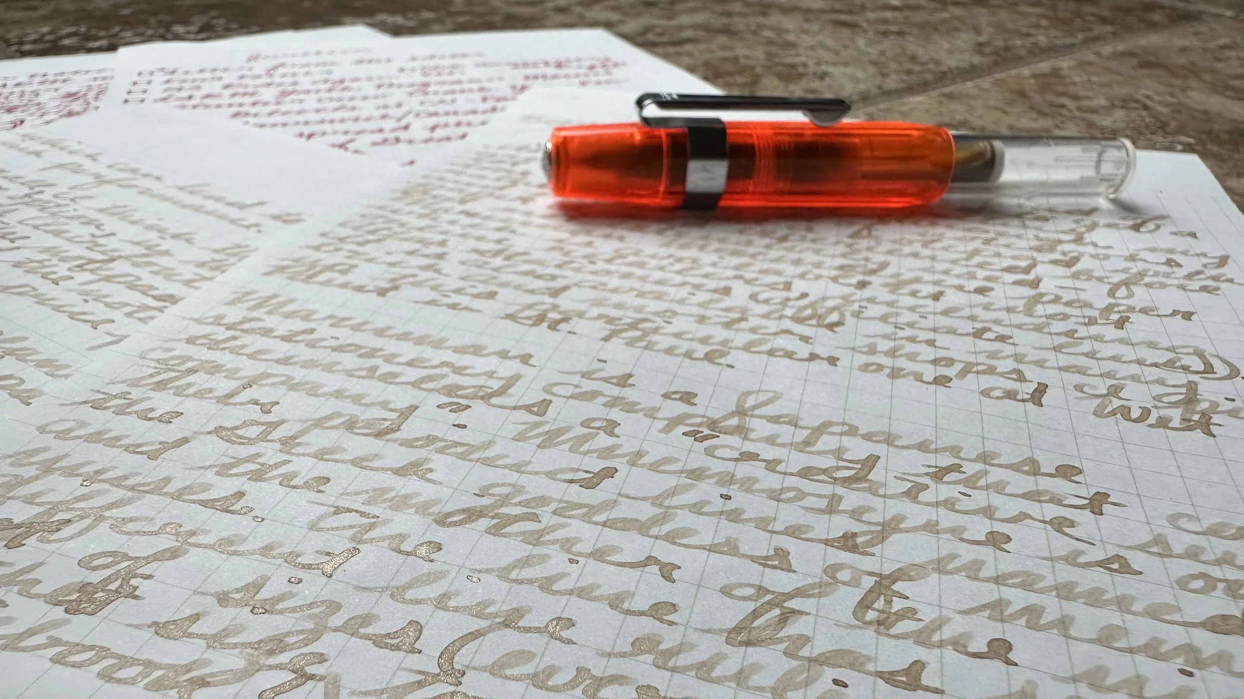
Ferris Wheel Press Majestic Maple Syrup on Mnemosyne paper. The shading and shimmer of the ink showed up very well.
For less than $10 in most places (and even cheaper for some of the other notebook designs), I would recommend giving Mnemosyne paper a shot. It’s a solid paper option, occupying a similar place to Clairefontaine and Rhodia for me.
If you’d like to try it out and save 10% you can use my affiliate code DIME10 at Atlas Stationers (affiliate link) and help support my blog while getting a discount.
Currently Inked

Monteverde Pumpkin Cake - Kaweco Sport Macchiato 1.5 - I was ready for a fall color for my header ink this month and I decided to go with an ink that I haven’t touched in a while. Pumpkin Cake is the only Monteverde ink I’ve kept around and it’s a really good deep orange-brown color.
Bungukan Kobayashi Hirai Bridge - Kaweco Art Sport Tiger’s Eye 14K M “selvedge” - This pen and ink combo survived another week. I like Hirai Bridge and want to give it a go in a wetter nib, it’s got some really interesting undertone colors that pop up where ink pools.
Utsunomiya Gyoza Brown - Kaweco Ice Sport Orange Inkball - This ink is such a nice pop of golden brown against the other colors that I was using this week. It behaves really well in the roller ball and has been a work companion this week.
Kobe Do You Believe in Fairies? - Kaweco Sport Iridescent Pearl M CSI - I decided I needed a blue to round out the currently inked this week and decided to go with one of my newest. This “viral” ink from Japan (as described by the Nagasawa representatives at the SF Pen Show) is a really pretty color. I can see why it’s popular. This tone of blue seems to be very popular lately.
Ferris Wheel Press Majestic Maple Syrup - Kaweco liliput copper 14K BB “journaller” - This nib, ink, and pen are just perfection this week. I’m also down to the feed and trying to decide if I want to refill or ink it up with something else.
Colorverse Golden Gate Bridge - Kaweco liliput fireblue 14K M “journaller” - This red ink got a refill this week. It’s such a good red and I’m really enjoying it. I need to work red inks into my rotation more often again, I forget how much I like them sometimes, especially when they fit in the color range of the rest of my currently inked. The gold sheen this one gets on certain papers is also a bonus.