
Moody Colors in My Pens
Alternative title: Gray ink rules.

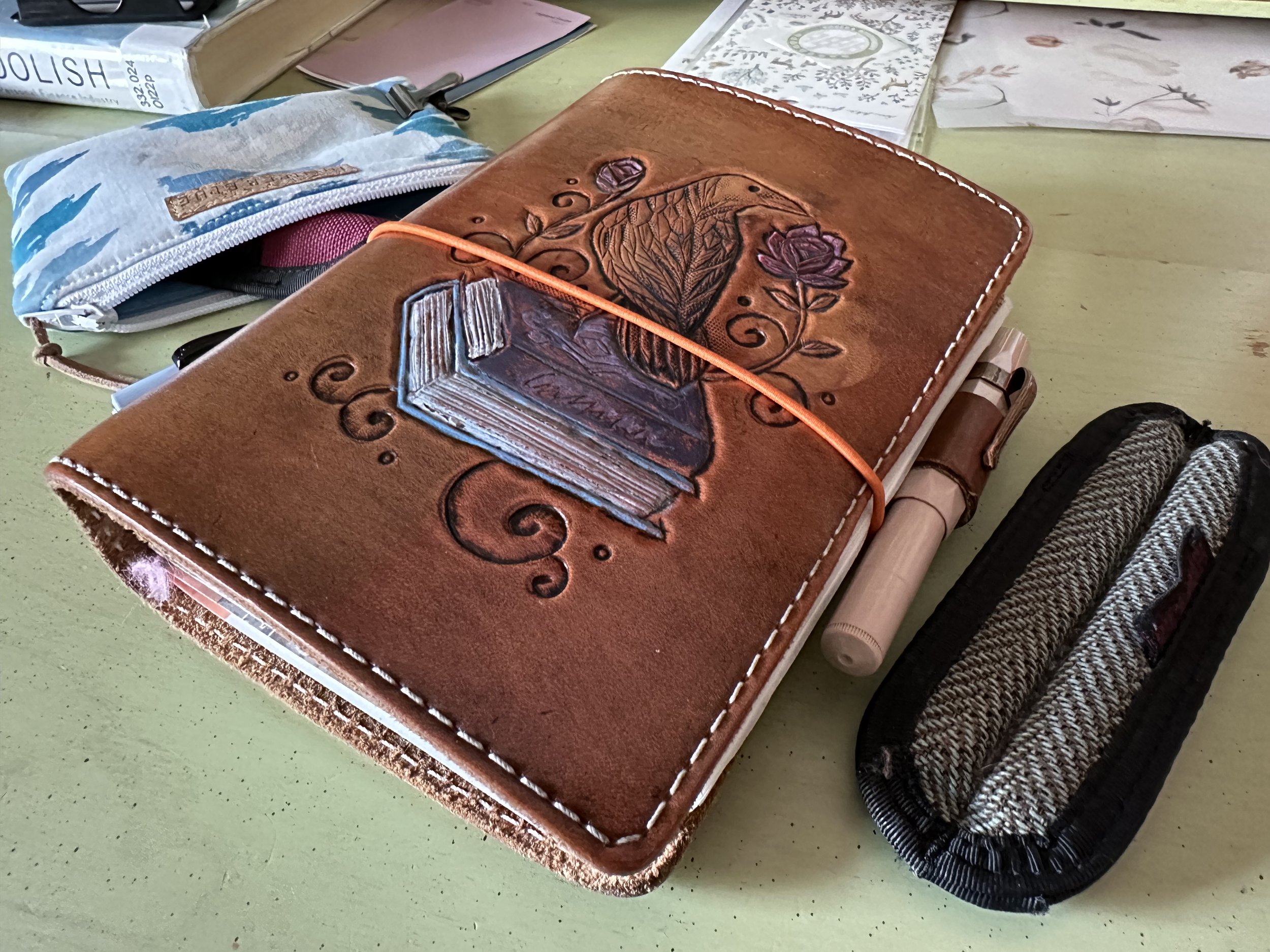
Ferris Wheel Press Atlas Iron Ore in my Kaweco Liliput Fireblue making some notes about reaching out to construction companies about a possible garage building project.
I’ve been starting work on my quarterly ink usage review (coming at the end of the month) and have noticed my tastes in ink change over the course of the year, but also year to year. I have three years of ink tracking under my belt, and it’s been an interesting journey so far. When I first started in the hobby I had some Lamy blue cartridges and bottle of Lamy Turquoise for my lone white Lamy Safari with a fine nib. As I started to branch out into a blackTWSBI Eco (M nib) and Kaweco Ice Sport Green (M nib), I started to expand my ink range. About a year in I discovered ink samples and all hope was lost.
For a good amount of time each paycheck saw an order from some ink samples. At first, I picked up any color that vaguely suited my fancy at the time or was popular in the community. Since those early 2015-2017 ink days for me, the fountain pen ink world has absolutely exploded. I’ve always tried to sample at least one ink from each brand, but I’ve definitely fallen behind. However, it’s also because I’ve started to refine my tastes and I have a lot of inks in my collection that I adore and I love re-inking.
That being said, as of this writing I have 338 inks between samples and bottles (not counting the ones that are currently in the mail). I used to have way more, but as part of my Project Enjoy Collection I have been more selective and also a lot less afraid of culling inks I never use. It’s been very helpful in refining my tastes, which is definitely skewing towards blue, brown, black/gray, and red. This year red is getting a lot of curation and my purple collection is still small but growing.
One of the best things about fountain pen inks is the variety within a color in tone, properties, sheen, shimmer, and shading. It’s one of the things that keeps drawing me back to the black/gray color range, because there are a lot of inks just called “black” or “gray” and they look nothing alike in practice. I like that you can have something wild and bright in a color range and at the same time have something sober and more “traditional” to really buckle down and get work done. When I’m struggling to get to the page, calmer colors with a little bit of flair are more likely to get me there, because I won’t get distracted by how cool the ink looks.
And ultimately that is where the last two week’s color palette has come in. I needed to put my nib to the page and work on some stuff (both day job and personal) so I went with a quieter color scheme that went together, but kept me on task and focused.
Currently Inked

Onion Skin Paper
Papier Plume Rougarou - Kaweco Liliput copper 14K B - This was the Halloween special edition from last year from Papier Plume inspired by the werewolf legends of Louisiana. It is a warm gray with a ton of shading. A total workhorse from this week for work writing and personal journalling.
Ferris Wheel Press Atlas Iron Ore - Kaweco Liliput fireblue 14K M “journaller” - I was feeling the need for a dark ink, but I wanted some flair at the same time. Enter Atlas Iron Ore, a store exclusive for Atlas Stationers. It is a dark gray with subtle silver shimmer. I think they nailed it with this color. It reminds me of the steel girders in Chicago for the trains and just the general industrial feel of the Great Lakes cities.
Diamine Celadon Cat - Kaweco Art Sport 14K BB “journaller” - I ran out of Colorverse NGC 6302 about halfway through the week and wanted to try out the new Celadon Cat compared. I thought at first they were almost the same color, but Celadon Cat leans blue where NGC 6302 runs more green. It’s a great alternate since NGC 6302 is only available in a set.
Ferris Wheel Press Storied Blue - Kaweco Sport Mellow Blue 14K BB CSI - A nib swap gave another dimension to this ink (it was a gold nib kind of week). A useful pen and ink combo for work thanks to the reverse writing capabilities on this nib. Mark Bacas rescued it from a zoom grind, and I can still flip it over for a M stub-like writing experience. Lots of notetaking with this combo this week.
Colorverse Milky Lavender - Kaweco Sport Macchiato 1.5 - I love this color as a header (and I am planning on popping it into a writing pen in July. It’s just so cheerful and such a fun shader!

Even when it’s boring, it’s worth some stickers and decoration.
In the TN
A lot of shuffling. The TN is where I come where my life feels out of control, so I do some notebook swapping. This week I finished off the Kokuyo Business Paper insert and the JetPens View Corona insert (which I promptly replaced - that’s a fun paper). I pulled the Itoya Oasis notebook because I needed some thinner inserts so I could carry a bunch of different papers at once.
Not changed: Lamy A6 is still going strong for lists and planning. Hobonichi weekly insert is still there for task tracking and small notes about the day.
Fresh in the TN:
Cosmo Air Light 3mm grid* - a favorite paper to get me writing.
Sanzen Tomoe River paper* - a paper that I’ve been meaning to try. I have a pack and I just haven’t given it a chance. First impressions is that it feels very different, not bad, but it’s just a different paper than original Tomoe River.
Midori MD insert* - I was really excited when I saw JetPens selling looseleaf MD paper and I picked up a pack. I like Midori MD and it’s fun that I now have some that I can run through my printer and put whatever design I want on the page.
Onion Skin Paper insert* - Another paper that I love which gives me another space for some freeranging creativity.
*I made these notebooks myself from looseleaf or by tearing pages out of other notebooks.
Where would I be without you?