
April 30 Inks 30 Days: First Seven
It’s a month with 30 days which means it’s time for a rendition of the #30inks30days challenge which was started by Tom Otto of @inkjournal. Ink Journal is a sample box subscription (I used to get them years ago when I was wanting to try everything) and #30inks30days was a way for people to share the ink samples/bottles they had accumulated. It was a chance to play with the collection, so I was in from the very beginning. I love seeing all of the posts on Instagram and rediscovering inks in my own collection that I’d forgotten about or adding to my lengthy “to try” list. So far, I’m really tempted with all of the neat new colors from the Teranishi ink brand.
The challenge that I set for myself is to try out some blues (and a few purples for variety) that I haven’t added to my ink passport as well as write four new short stories over the course of the month.
The Tools
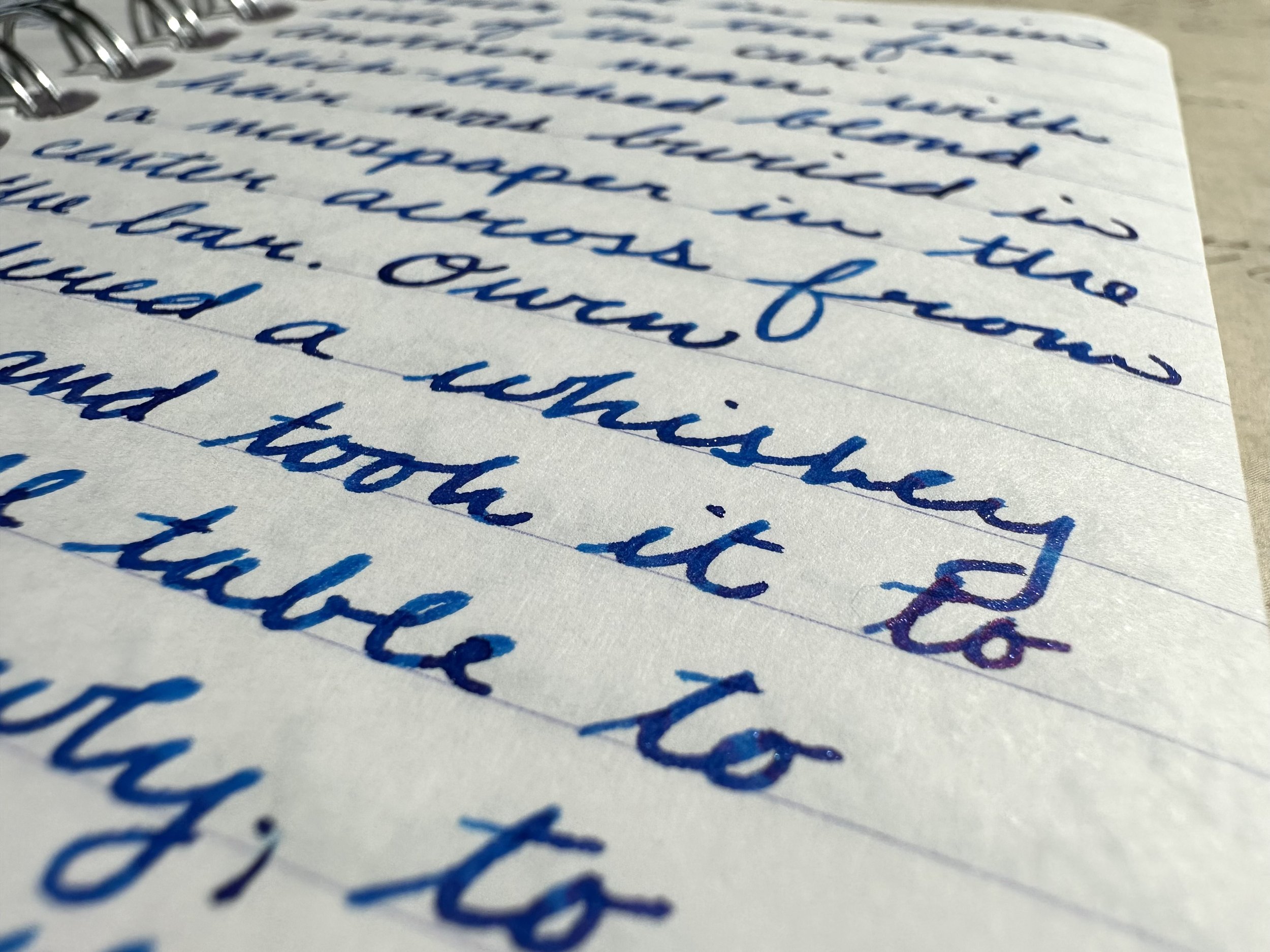
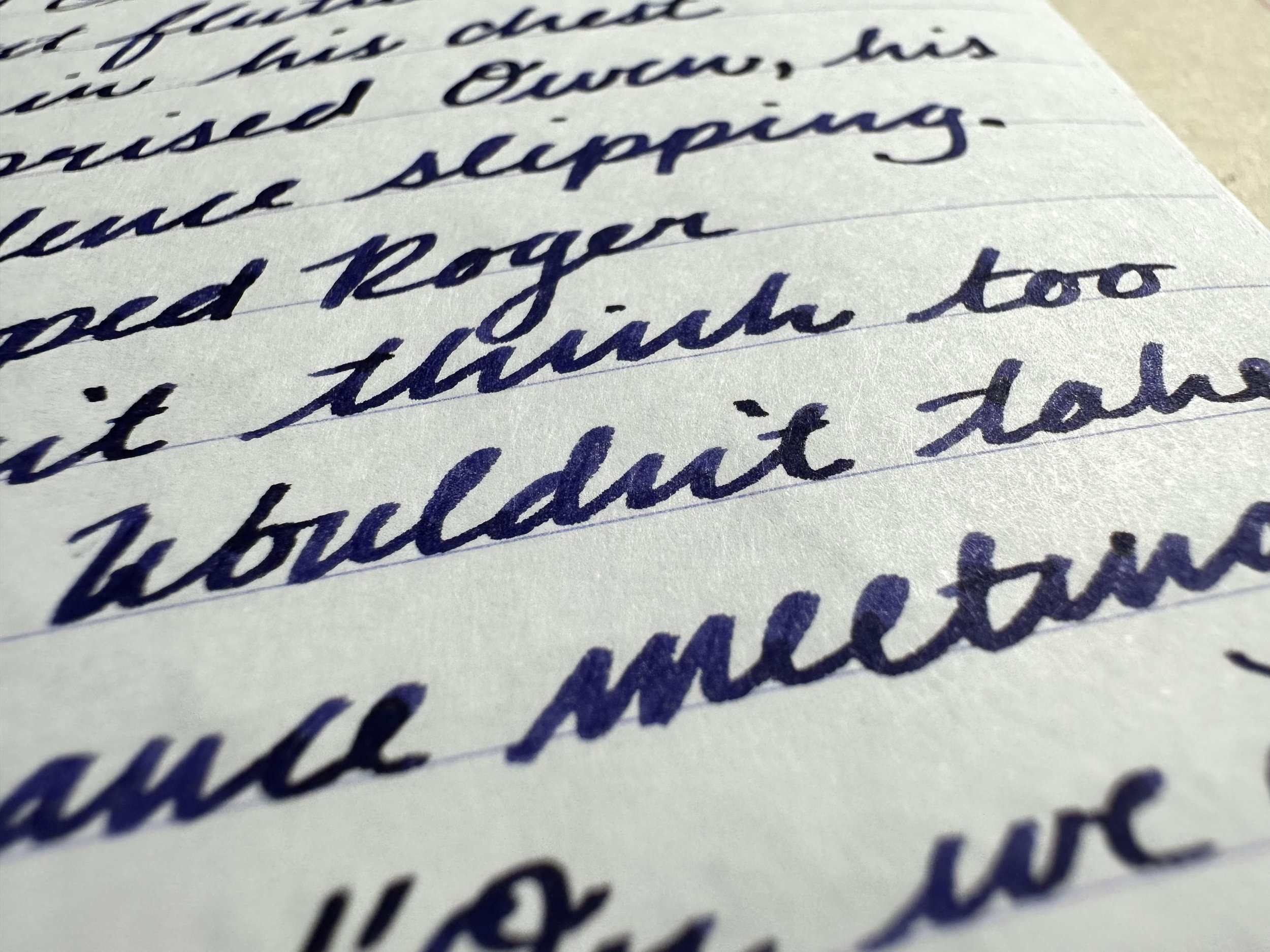
A pocket-sized Clairefontaine wirebound notebook with lined paper - I chose this notebook because of the portable size (it slides in amongst the other notebooks in my TN very well with the rings out) and because the white color shows off colors well. It is also very easy to tear pages out if needed.
Multiple Pens - The original version of the challenge was to use the same pen for the 30 days of inks and eventually became a way to explore pen collections as well. I ink up partial fills in 3-5 pens at a time and change the ink out once it has run dry. Sometimes that is just in the story writing for the challenge, or I use the ink at work and for other writing over a day or two.

The team.
Used this week:
Kaweco Liliput Fireblue 14K M ‘journaler’ - my favorite pen is involved, of course (I have had this pen for 5 years and it has never not been inked up).
Kaweco Liliput Copper 14K B - I love the warmth the copper gets when it has been in my hand a while. I think I also may have finally “trained” this nib to my writing angle.
Kaweco Sport Mellow Blue B - my second newest pen that is still getting put through its paces. I adore the soft blue color.
Kaweco Sport Iridescent Pearl M CSI - my “fancy” combo that I don’t mind using on busy office days. My handwriting always looks very crisp with this nib.
Kaweco Art Sport Tiger’s Eye 14K BB CSI - my newest pen that I am still babying (I’ll get over it eventually, haha). The acrylic is super pretty.
And now for the inks:

Day 1: Ferris Wheel Press Blue Yosemite Falls
It was really light when I first inked it up, but has mellowed to a warm pastel blue with some shading. This is a very characteristic ink for FWP, light colors and lots of shading dominate the standard lineup.

Day 2: Diamine Night Shade (2021 Red Inkvent Calendar)
A great shader that straddles the line between blue and purple, I actually had this ink in the purple section of my ink catalogue. Probably my least favorite of the week as it is a dry one. A good candidate for rehoming.
Day 3: Diamine Jack Frost (2019 Blue Inkvent Calendar)
I remember this ink being the bee’s knees (people still say that, right?) when it was first revealed. A bright blue with pink sheen and blue shimmer. While it’s not as unique as it once was, this is still a super fun ink and really well-behaved. It offered a boost of color to some boring work stuff this week after some story scribbling.

Day 4: Diamine Midnight Hour (2019 Blue Inkvent Calendar)
A blue-black with a twist, a coppery sheen that makes the ink look black at some angles. I love this sort of color when I am craving something dark and bold for my writing. On the surface it seems plain, but it has enough character to keep it interesting and be surprising when I flip back to it in the future.

Day 5: Colorverse Office Blue-Black
I had been inspired to grab a sample of this ages ago by Mountain of Ink when I was in a blue-black and black ink mode. It’s a no frills (maybe a little sheen on some papers) blue-black. A brighter base when compared to Diamine Midnight Hour.

Day 6: Diamine One More Sleep (2022 Green Inkvent Calendar)
I’d been wanting to try this ink for a while because I love pastel shaders. This ink delivers a soft periwinkle that becomes a little bit cornflower where the ink pools. A soft, but still very readable color.
Day 7: Ferris Wheel Press Tanzanite Sky
One of the OG FWP inks that I’ve never tried, this dark blurple lives on the dry side. I ended up adding some white lightning to it to up the flow and it got really fun. It’s a moody color that I’ll definitely need to play with more.
And onto next week!
If you were thinking of picking up some ink and you’d like to get a discount and support my writing at the same time, you can use the code ‘DIME10’ at AtlasStationers.com to get 10% off your order! You can also pick up inks from Ferris Wheel Press and get a free ink charger by using the code ‘DIME’.