Sturdy & Solid: Midori MD A6 Diary
A recently filled Midori MD notebook and two waiting in the wings.
I became a fan of A6 notebooks on accident. The journey actually started with a traveler’s notebook cover, my hand-tooled Chic Sparrow with the raven, books, and roses. It popped up on a busy-sell-trade group on Facebook around the time of my birthday. At the time I was pretty dedicated to pocket-size notebooks. However, I took the plunge, knowing the opportunity to own that design would probably never come again. It was meant to be.
A new cover in a new size meant I got to explore new notebooks, a journey that I’m still on over 5 years later. One notebook, however, that I found early on in my stationery explorations is one that I come back to again and again - the Midori MD Diary/Notebook. I just recently archived one that I’d been playing with since the end of January.
The Midori MD Diary is very easy to get a hold of, as opposed to some other Japanese brands. Most online retailers carry them and I’ve bought them from Vanness Pens, Anderson Pens, JetPens, and Atlas Stationers (affiliate link). Beyond the A6 size, they also come in A5 and B6 Slim.
The interior grid and ribbon bookmark. The still sealed book is one of the 15th Anniversary special editions that had typography designs embossed on the covers.
I love how simple these notebooks are. They have a cream cardstock cover, their logo embossed on the right hand side, and a cloth-covered binding. The notebook signatures are stitched. Glued to the spine is a ribbon bookmark. They come with a set of simple black and white stickers that can be used for labeling the spine when the notebook is complete. Personalizing my notebooks is usually my first step when I start a new one and the Midori MD notebook covers are perfect blank canvases. Even if you aren’t the decorating type, the simple cover builds character as it is used, but keeps its minimalist aesthetic. I keep mine in a cover, but I enjoy it gaining some dings and crinkled edges. It lays flat pretty easily when opened, although the first few and last few pages might need a little bit of spine training. These little notebooks are extremely durable, I’ve never had the spine break on me, the cover fall off, or pages fall out despite some rough handling at times.
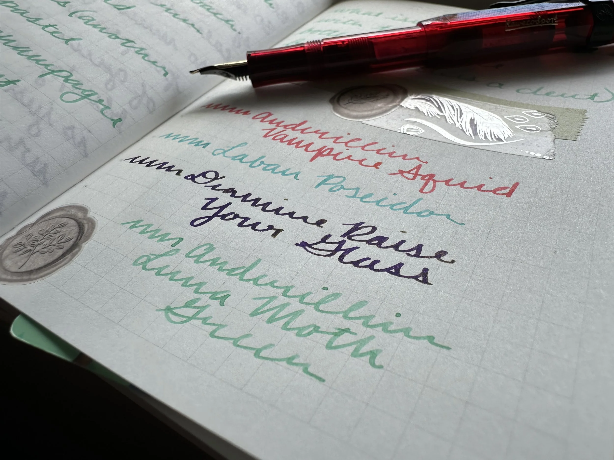
The paper inside is cream and smooth. It takes fountain pen ink like a champ and shows off both shading and sheen. The A6 notebooks come in three rulings - grid, lined, and plain. I am personally fondest of the light blue grid lines. I flip my A6 notebooks on their sides quite often to give myself A5 canvases to write on, so grid or plain just works better for my purposes. The paper has a “dry” texture to me, as in its not super absorbent. It tends to make pen strokes look thin, which is probably an intention for those skinny Japanese nibs. Despite the dryness you can really pull some character out of wide nibs, the lines stay disciplined and it really shows off ink shading.
Always good for swatching.
Midori MD notebooks also have a great price point around $10 for the A6. Even the A5 notebooks aren’t usually more than $15 depending on where you buy them. I write A LOT and it usually takes me 3-6 months to use one up. If I was using it exclusively that time would probably be cut in half, but I rarely am only using one notebook at a time.
Overall, they are a great notebook and I recommend giving them a try if you haven’t gotten the chance.
Currently Inked
Currently inked on Stalogy paper… you can really see how cream the Midori MD paper is in comparison.
Laban Poseidon - Kaweco liliput copper 14K M ‘selvedge’ - Over the summer I really want to get reacquainted with my turquoise inks. While this is the newest addition to that collection thanks to Federalist Pens at the Chicago Pen Show, it’s really inspiring me to keep playing with this color range. Poseidon is really well-behaved and has some lovely shading even in this dry, narrow nib.
Anderillium Vampire Squid - Kaweco liliput fireblue 14K ‘journaler’ - Speaking of color exploring, I’ve been inspired recently to work my way through my red ink collection. Red is such a varied color category when it comes to fountain pen inks. I won this ink a while back in a giveaway and this is the first time I’ve inked it up. It’s a pretty standard red with a little bit of shading and a tiny bit of gold sheen on the right paper. I’ve been enjoying Anderillium inks lately, everything I have from them is so very useable.
Diamine Raise Your Glass - Kaweco Art Sport Tiger’s Eye 14K BB CSI - This was the 30 mL bottle in the 2023 Inkvent Calendar, another ink that I hadn’t tried yet. I like this one. It’s a dark purple with a hint of green sheen and blue/green shimmer. It feels like a party when I write with it.
Anderillium Luna Moth Green - Kaweco Art Sport Terrazzo B ‘imperial’ - It’s back. I took a brief run with Ferris Wheel Press Grand Central Skies for a few days (which is another beautiful pastel green, but with shimmer), but I wanted to come back to this one. Not going to fix what isn’t broken.


