
When in Doubt, Write in Red

Very relevant sticker from Sugar Turtle Studio adorning my ink logbook.
The quote really is “When in doubt, wear red,” said by Bill Blass, an early 20th century fashion designer and World War II hero. However, I think that the principle that applies to clothes applies to red ink as well. It’s bold, makes a statement, and is sure to get noticed.
I think I started hoarding red ballpoints when I was in middle school. There was just something so rebellious about filling 50 cent composition notebooks or 10 cent spiral bound notebooks with pen that was usually reserved for corrections and grades. It was a forbidden color for writing long prose, that was only the territory of black and blue ink. In undergrad, I was all about the Bic multi-pen (if I had known about some of the Japanese multi-pens back then… I would have been all over them!), the standard ones that came with black, blue, red, and green. The first ink to usually go was blue, then red, black, and finally green (still not my favorite ink color).
Just like the variety of blue inks for fountain pens, the variety of red inks is wide. For me, red was a category that ballooned in size once I discovered ink samples. I just wanted to try everything, trying to find that elusive, perfect, absolutely inspiring red.
I must report that I still haven’t found “the one”, but here are five of my favorites in no particular order:
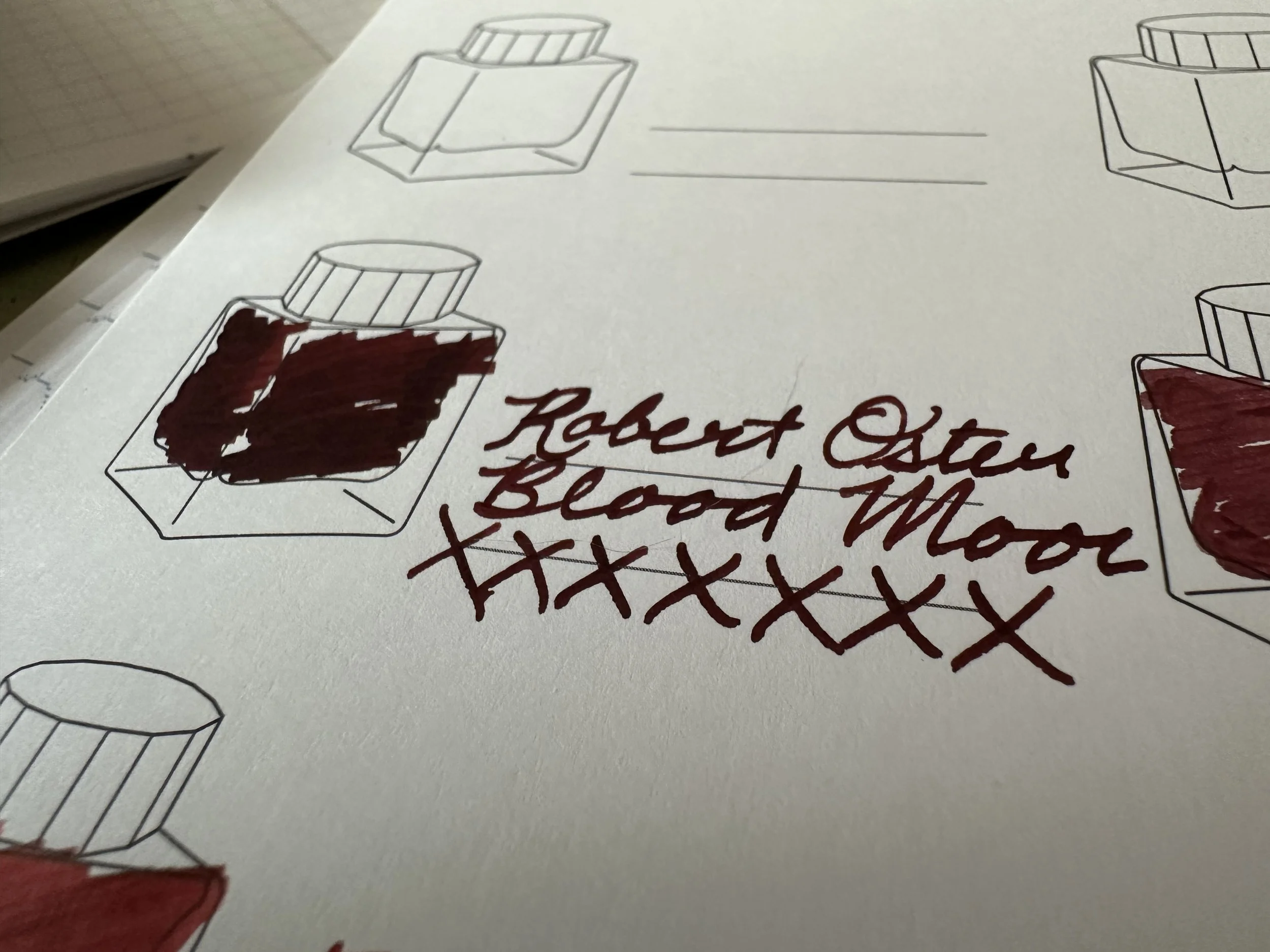
Robert Oster Blood Moon
This ink just feels like scary stories told around campfires. It’s the moon the werewolf howls at. It’s the blood moon that signals the vampire in the creepy castle has reawoken. It’s the color of the drapes in the spooky haunted mansion. I mean, how cool of a name is Blood Moon for an ink? This ink is a dark red, a blood red, that gets a dark coppery sheen in wet nibs and in ink splotches. It’s a subtle red, not as in your face as other ones can be. It falls into the lighter end of the black-red category, which makes it easy to read. Being made by Robert Oster means that it behaves well in pretty much any pen/nib combination I’ve ever tried it in.

Colorverse Coast Redwood
The tree series is a bit of an underrated Colorverse series. I have two of the sets - Coast Redwood & Redwood Forest and Gingko Tree & Gingko Leaves. Coast Redwood is a chalky mineral red, muted, but very natural looking. It doesn’t really bring redwood trees to mind, but more the red rocks of the American Southwest. It’s an ink that I’ll forget about for a while, but when I come back to it I remember how much I love it. The ink can be a little dry, but a wetter feed or a dash of ink additive makes all the difference. The shading is great!

Franklin-Christoph Urushi Red
This ink is probably the closest I will come to anything urushi. The color was inspired by the dark red lacquer layers that exist on some styles of kintsugi pottery. It also exists on some very pretty fountain pens that are way out of my price range (I’m looking at you Namiki pens)! This one is also in the darker, more muted red category (sensing a theme here) with some brown sheen in ink splotches. I don’t have a ton of FC inks (I have this one and the newer Bronze Age that released last year), but they’ve all been really nice to write with.

Colorverse Golden Gate Bridge
I almost didn’t include this one since it was a limited edition only available at the San Francisco Pen Show in 2023. However, this one ticks a lot of boxes for what I love in bright red inks. I’m not very fond of red inks that are so washed out they lean pink. That is not a problem here at all. If anything it flirts with orange-red, but really captures the color of the iconic bridge across the Bay. It even has a little bit of gold sheen in really wet nibs. Colorverse usually knocks it out of the park with their limited editions and this one was no exception.

Ferris Wheel Press Song of Scarlet
This one is a shimmer ink inspired by the pied piper story from European folklore. This ink can look festive when paired with bright cheerful colors and spooky vibes with darker ones. It’s a very saturated red with blue shimmer. I love pulling this one out around Halloween. Like all shimmer inks it can be a bit finicky, but it’s worth the extra effort for me.
Red inks that didn’t quite make the list, but deserve a shoutout:

Diamine Cardinal
The inkvent ink really captures the color of male cardinals. These birds didn’t live where I grew up, but I was very fond of them when I lived in Florida briefly and occasionally they pop through Minnesota while migrating. It was an ink I wasn’t expecting to like since it definitely sits in the bright, true red category. However, it is just the right kind of bold for me when I want something of that nature.

Ferris Wheel Press Velvet Ballet
This ink kind of sits on the border of red and burgundy. It’s a sort of muted red with silver shimmer. It was one of my first FWP special editions and I adore the imagery it invokes (velvet curtains in a traditional theater). It’s a cozy and elegant color.

Colorverse Office Red inspired this post. Just like Colorverse Office Blue, when I want to reminisce about my school days with cheap ballpoints… this really invokes the color. I wrote out the fill drafting this post.
Currently Inked

Ferris Wheel Press Bayou Berry Mist - Kaweco liliput fireblue F - This was an ink that got caught in my mind again after playing with Terracotta Canyon last week. I actually am really liking it after remembering a kind of ‘meh’ reaction when I first got it. It falls into that gray-purple category, definitely leaning more on the purple end. It’s pretty fun as a stealth “business appropriate” color since it looks like a gray ink at first glance. It definitely runs a little dry, so I added some ink additive to smooth it out.
Teranishi Opera Rose - Kaweco liliput copper M - I am so very grateful to the Pen Addict Slack member who sent me both this ink and Gentle Green. As a fan of earthy pinks I knew I always wanted to try this one, and it did not disappoint! This ink is soooo good! It’s a warm pink and it’s just amazing to write with. I was excited to see that Vanness had Teranishi samples back in stock earlier this week and picked up a few more to try out.