
Brown: Anything But Nondescript
“The color brown, I realized, is anything but nondescript. It comes in as many hues as there are colors of earth, which is commonly presumed infinite.”
- Barbara Kingsolver
And it’s one of my favorite ink colors.
When I first started getting into fountain pens, my white Lamy Safari with a F nib was almost exclusively bright inks. It was a new world for me, essentially infinite options for the color coming out of my pen. Much different than the legion of ballpoints I used to utilize. In this vein, my first ever ink bottles were Lamy Turquoise and Lamy Green. Despite that very “bright” beginning, the further I’ve come down the fountain pen path, the more respect I have for “somber” and “serious” colors.
Brown definitely falls into that latter category.

My ink explorations generally follow a pattern. I decide I want a color, try the inks that I already have in that color, then if I can’t find it I seek out samples. I would browse the sample listings and read review blogs making a list. I usually purchased this list from Vanness Pens since they always seem to have everything I’m looking for. Over the past two years I have slowed down on sample buying significantly, partly because I am trying to limit my ink purchases to more exclusive or limited edition inks (which generally don’t have samples available) and partly to keep up with my goal of doing at least one fill of every ink that hasn’t been in a pen since 2021 (the year I began tracking use).
While ink exploring, I ended up with a lot of browns over the past few years. It’s a category that I have utilized a lot and there are currently only 9 brown inks left on my “dusty ink list”.
What makes brown a great color to write with?
Brown is a nice neutral to have as an option. It goes well with nearly every color, not dissimilar from gray and black inks.
Just like the quote at the start of this post, brown inks can be wildly diverse. They can be deep and dark or light and airy. Black brown to taupe and all of the shades in between. The undertones in them also change if it is a cool or warm brown.
Another thing that makes them useful is they are “serious” enough to use in a professional setting, but still offer just enough rebellion against the standard office pen.
My Top Five
I gave myself some ground rules when picking my top five. One was that the ink had to still be in the collection (which sadly disqualified Ferris Wheel Press Writing Desk, which had an incident). The second consideration was my frequency of use. I have some browns that I certainly like, but haven’t used them enough to call them a favorite yet.
With these guidelines in place, I chose the following:

One. Diamine Pick Me Up - Green Edition Inkvent
There were so many great inks in the green edition, but this one was one of the top for me. I remember this ink being a little controversial when it popped out of its numbered window. Some people thought it was too wet, the smell was weird (it’s a scented sheener), or it was too boring. I actually like the smell, it doesn’t quite smell like coffee so much as coffee with a considerable shot of something alcoholic in it. Appropriate for holiday theme, there’s always someone drinking a boozie coffee at those (it’s me if it’s not someone else, haha).
The ink itself is just so pretty on the page. It is a dark brown that has some variation in the tone across the word and shows off green sheen on some papers. It’s classic and playful all at once. Word of advice: this ink is very wet, use in a dry writer or you’ll end up with a firehose situation.

Two. Ferris Wheel Press Oyster Hour - Finer Things Collection
My poor little ink charger is almost out, which means I need to snag a bottle. I have a soft spot for taupe inks (which the rest of this list will surely reveal). Oyster Hour is on the warm, yellower end of that color variety. It has a light academia vibe that I really enjoy. It has some great shading. Word of advice: It has the opposite problem of Diamine Pick Me Up, this ink is pretty dry. I recommend a wet writer for this one or adding a teeny tiny amount of ink additive like White Lightning to help with flow.

Three. Montblanc Swan Illusion Plume - Limited Edition
Taupe no. 2. This ink was the first bottle of Montblanc ink I ever bought. It’s part of Montblanc’s Patron of the Arts collection, this one inspired by Ludwig II of Bavaria, whose nickname was the Swan King. It has a slightly muddy quality to it, just like the belly feathers on a swan after it’s gotten off the pond and walked around in the dirt. While that description may not appeal to some, I love it. I feel decadent when I use this ink, partially because it’s a Montblanc ink, but the color is very elegant. Word of advice: Similar to Oyster Hour, this ink runs on the dry side. Use a pen with good flow or add a little bit of ink additive.

Four. Sailor Ink Studio 273
I bought this ink quickly after I fell head over heels for the sample. It was among my first chromashading inks (I can’t remember if I bought it and 123 at the same time or not). Where the ink pools it offers up a pink tone, while serving as a nice beige brown the rest of the time. Every time I see someone else using it on Instagram I pause and go “what’s that gorgeous ink???” and then rediscover that I can use that ink as much as I want, at least until I run through the 20 mL bottle (and then I’d probably just get a replacement bottle if they are still available).
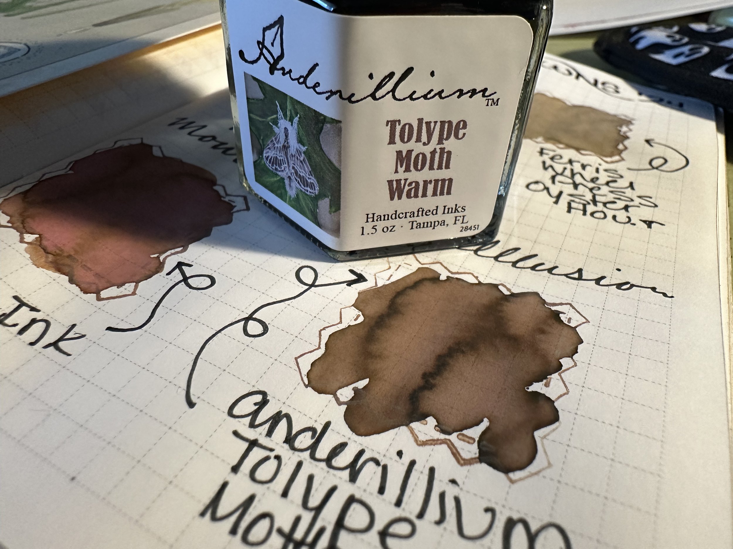
Five. Anderillium Tolype Moth Warm
The only reason this ink is in position five is because it’s the newest ink in my collection on this list. However, it was love at first sight. The shading is downright amazing and it’s a smooth, lubricated writer. The warm light brown just brings a smile to my face when I see it on the page. Anderillium is doing awesome things with their ink. Their Cuttlefish Brown is an honorable mention here, because of its really antique brown tone. It does look like something that would be in an old logbook from wooden boat days.
Do you have a favorite brown ink? Why do you like it?
Currently Inked

Pelikan Edelstein Golden Beryl - Kaweco liliput fireblue 14K M ‘journaler’ - After picking this up at the Pelikan Hub, I was waiting for an opportunity to give it a try. It looks amazing in the swatch and the gold with the standard blue base looks interesting. First fill impressions? It’s okay. The shimmer gave me a lot of trouble when I first inked it up which took some tinkering and a lot of clearing shimmer clogs with a brass shim. Additionally, if I left the pen for more than a few hours without writing with it, the brass shim had to come out again and would pull out a ton of shimmer. I don’t know if Pelikan has ever done a shimmer before? Some small maker shimmers and when companies first come out with shimmers there seem to be a lot more maintenance to write with them.
Franklin-Christoph Terra Firma - Kaweco liliput copper M stub - This ink sample has been in my drawer so long that Franklin-Christoph doesn’t even have this ink anymore, or it was a special edition from a while back. It’s a muted red with shading which works very well. It’s not really digging it though, which is probably a good thing since it’s no longer available.
Diamine Cardinal - Green Edition Inkvent - Kaweco Art Sport Tiger’s Eye 14K M ‘selvedge’ - In contrast to Terra Firma, Cardinal is a red that got me excited to write with it. So excited in fact that I wrote the pen dry midweek and just haven’t had time to re-ink. This true red is just a delight and I’m appalled I’ve had it for nearly 2 years and never used it. I will definitely be coming back to this ink in the future.
Sailor Ink Studio 123 - Kaweco Art Sport Terrazzo B ‘imperial’ - This ink carried me through a lot of office work this week. It’s just tame enough to not look out of place from far away, but with the pink shading it’s so much fun up close. This is such a cool ink.