Choosing my 2026 Planner
It’s almost impossible to be a member of the stationery community and not be keenly aware of planner launch season. Hype about new planner designs, new accessories, layouts, different kinds of papers… I could go on. This year, I decided to wait and see what was coming out, so I didn’t get my planner until early November. I wanted to better understand what I wanted and needed from the book that helps keep me on track.
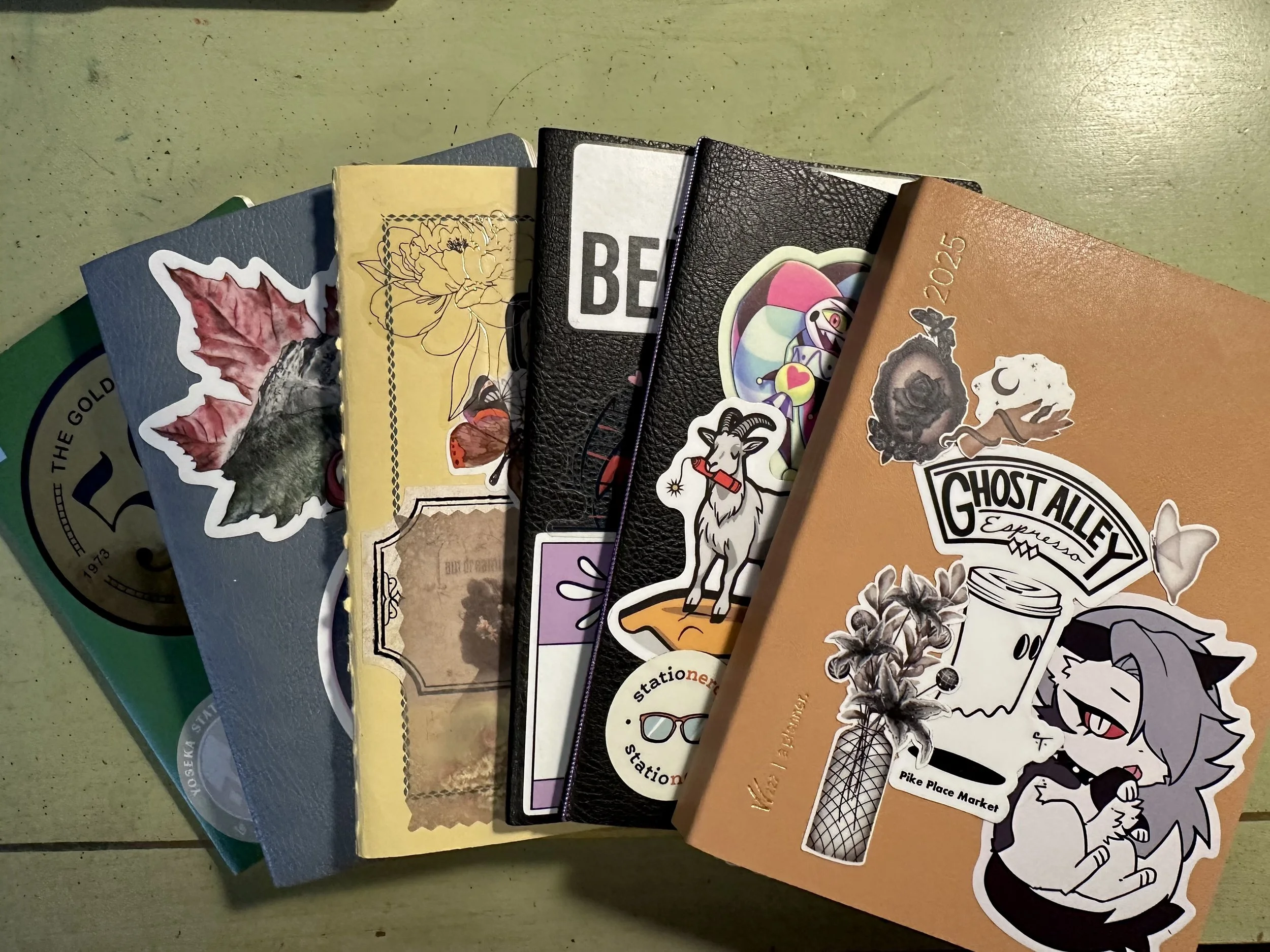
2023 to 2025 L to R: Hobonichi Weekly Insert, Sterling Ink Common Planner, Life Vermillion grid, Sterling Ink Insert Grid, Sterling Ink Monthly Insert, Wonderland222 Core.
Last year I decided on a combination of a monthly insert from Sterling Ink and a second notebook to track tasks and other weekly overview things. While this combination worked, it felt really incomplete for me and I found myself setting up the weekly pages less often further along in the year. I knew I wanted something else for 2026. But what?
I sat down and decided what I wanted from a planner and decided on these two criteria.
Is the paper fountain pen friendly? If the answer to this question is ‘no’ it’s immediately eliminated from consideration.
Is it an A6? While my planner doesn’t necessarily have to fit in my TN, I would prefer that it does.
Those two questions alone eliminate a lot of options. Books like From there I started to narrow it down further. The biggest contenders in the A6 planner space are Hobonichi, Midori, Sterling Ink, Wonderland222, and a variety of small creators offering physical or printable inserts.
Now, these planners do have similarities with each other, but I wanted some particular features:
A monthly layout so I can get an overview of the month/year.
Structured weeks. I got bored creating my own layouts each week, I didn’t really need the flexibility the bullet journal offered.
Notes pages in the back to keep track of important info and notes about finished books so I can find information quickly. I also use this space as a sort of hybrid commonplace notebook.
The weekly layout need takes the A6 Hobonichi out of the running since it only has the monthly and daily pages. I considered potentially buying it with the weeks insert add-on, but I decided one book was better than two. I do like the Hobonichi A6 weekly books and used them for a few years. I also don’t have much need for daily pages as I tend to write longform in a separate journal.
Many printables are also out of the running because of the amount of cobbling together it can take. Also, most printables do not contain the full year in one book. If they have the monthly, weekly layout they tend to be for a half year or quarter.
That left me with Midori MD, Wonderland222, and Sterling Ink.
My experience in the past with Midori MD Diaries is from an A4 slim one that I purchased for work two years ago. I really like the way their monthly calendars look. They have a very clean aesthetic and it’s very easy to customize. Also Midori MD paper leans cream and is easier on the eyes than some other papers.
Pros: Price (~$15), MD paper, minimalist design
Cons: I would need to date the weekly layouts. The A6 also doesn’t have a dedicated notes section.
I have been intrigued by this planner for a few years and had purchased some of their notebooks in the past (and really liked them). I decided to jump on their 50% off 2025 planners and grabbed an A6 core and have been using it for the final quarter of 2025. I went with the core planner because I don’t want a super thick book, but they do also have an “all-in-one” that looks like it has a spine size similar to a Hobonichi A6 for reference.
Pros: Monthly layout, weekly layouts, notes pages with numbers. It has fountain pen friendly paper and lots of room for notes and monthly planning with dedicated quarterly overview and tracking pages. There a lot of options for covers.
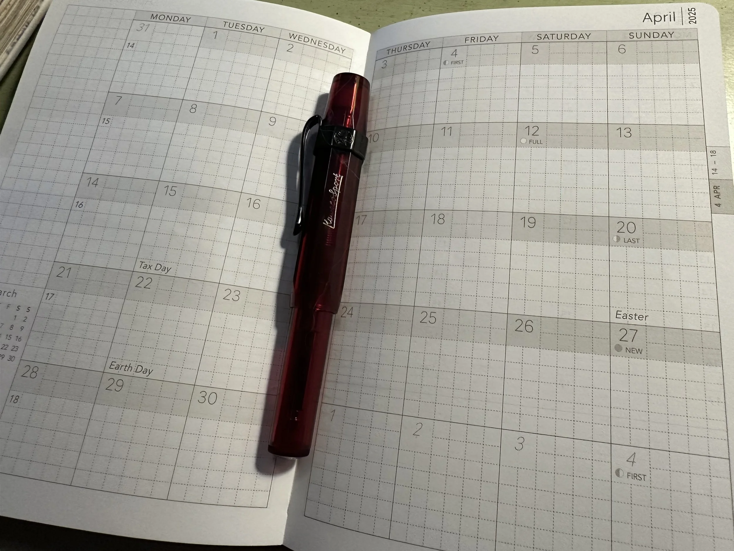
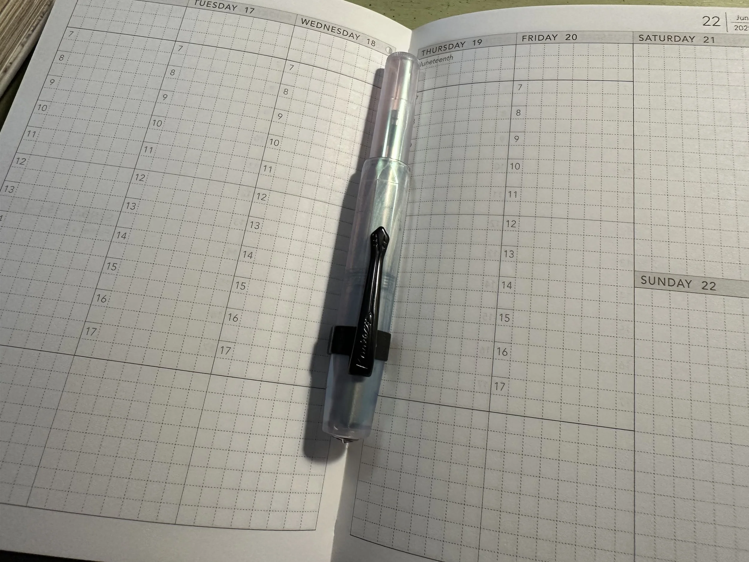
Cons: It’s not easy to flip through the monthly spreads because they are throughout the book and separated by the weekly calendars for that month. The weekends are also stacked. I don’t have a traditional work schedule so having weekend blocks the same size as the rest of the week are useful for me.
Neutral: The first 30 pages of the book are dedicated to big picture planning and habit tracking. I’m not that consistent when it comes to things like habit trackers. However, I do like the look of the quarterly layout pages with the little calendars. I am making an effort to understand the psychology of setting goals so that I am better at planning long term. Health struggles had me just surviving day to day, week to week for a while, but since I’m doing better now I want to make those bigger plans.
Sterling Ink A6 Compact Planner
I used this planner in 2024 and I stuck with it. I liked the minimalist design and it held up to being used for an entire year. I actually really wanted to get a year in two books version for 2025, but it wasn’t available. I was also a little sad that there weren’t as many color options in A6 as there were for A5, B6, and traveler’s notebook standard sizes. I understand the choice the creator made though since A6 hasn’t been as popular recently.
Pros: Monthly spreads all together at the front making it easy to flip back and forth. Tomoe River paper on the inside and a faux leather cover on the outside. The book looks really classy.
Cons: The lack of cover options and layouts that are available in other sizes. Essentially the A6 has a compact in horizontal weekly layout or vertical, and a full year which has enough notes pages to be used as dailies for the whole year.
Neutral: I wish they offered more size options in the booklet designs. They do offer an A6 monthly, but only offer a weekly insert in the passport size, and then some larger sizes. I think a monthly booklet combined with a 1/2 year weekly booklet would be a great set up.
Essentially, the decision came down to a Wonderland222 Core Planner and a Sterling Ink Common Planner. I’m really glad that I decided to pick up a 2025 Wonderland222 planner at a reduced cost to get it in hand. While I like the idea of the different planning layouts at the front of the book, the thing that helped me make my decision was the inability to flip easily back and forth between the months. Even with tabs I would flip to a weeks page when I wanted a monthly or would grab the wrong tab. There are probably ways I could mitigate this if I wanted to, but I ultimately decided to go with something familiar.
My 2026 Planner is going to be a Sterling Ink. I decided to go with the vertical layout option as it was the one that I had previously and I also liked the cover color option better.
And of course I had to add stickers! Some of these I’ve had for a while and some I picked up this past year. The cute baby designs of Eagle and Raven in Tlingit art style are too cute. I got those while I was in Alaska from a native artist.
And the back! The coffee up sticker is from a fellow Duluthian - Everyday Antonia Mae. Her stuff is so cute! The adorable nib dragon was picked up at the Chicago Pen Show from Pen Realm and Stationery Universe.
Currently Inked
Still working on writing out FWP Skies of Uproar, FWP x LOTR Verdant Voyage, FWP x LOTR Dawning Silver, and FWP Astral Blue Odyssey.
Ferris Wheel Press Furry Frostbite (releases 12/5) - FWP Carousel Blushing Blossom M - When I first inked this up, all I could think of was a past FWP release, Crystal Blue Legacy, an ink I really like because it’s a dark navy with dark blue shimmer and some black sheen. It’s one of those stealth inks that can be used at work, but is still fun when it catches the light. I decided to compare them side by side and I couldn’t tell the difference. I decided to ink up a pen with each ink, same deal. I honestly couldn’t even remember which was which. The only difference I can sort of see is that the blue shimmer on Crystal Blue Legacy is a little darker, but it’s not different enough to make much difference. This is the first time I’ve seen this with FWP inks where two of them are so close it’s nearly impossible to tell the difference. That being said, this ink is pretty and it’s worth a look if you don’t have Crystal Blue Legacy.
Ferris Wheel Press Crystal Blue Legacy - FWP Blushing Blossoms M - Love this ink and the rest of its set (Hearty Harvest and Frontenac Blue).
Ferris Wheel Press Starlit Stories - FWP Carousel Granite Guardians M - This was an ink I wasn’t all that intrigued by when I first received it. I decided to give it another go at a workshop where I was teaching folks about fountain pens and demonstrating filling a converter. The base color of this ink is more dark blue as opposed to dark navy like Furry Frostbite and Crystal Blue Legacy. The shimmer also sets this one apart as a purple/gold duochrome. It’s an interesting one, but I think I might have to give this one a go in a BB or stub nib to really see it shine.
Ferris Wheel Press Leadcast Letters - FWP x LOTR Gandalf Bijou ‘tengwar’ (aka fude) - I’m testing this pen out for review and my first impression is that it’s love. I was a huge LOTR fan when I was young and this pen is hitting those nostalgia buttons. I decided to ink it up with a different gray ink since I already had its companion ink (Dawning Silver) in a different pen. This ink is such a nice warm gray with a little bit of brown shading and I think it pairs well.
Diamine Best Wishes - Kaweco Collection Sport Iridescent Pearl M CSI - This still might be one of my favorite final inks from a Diamine calendar. This ink is a green-black with black sheen and green shimmer. It’s just so moody and yet cheerful at the same time. It flows great and while I was originally using it in a 2.3 nib for some uncial writing, I enjoy it here in this smaller nib as well.


