
Connect the Dots, Sticker Beads, and Kawecos with Custom Nibs
Long-winded subtitle: These are the things that are keeping me sane at the moment.
As Natalie Goldberg said in Writing Down the Bones, “In the middle of the world, make one positive step. In the center of chaos, make one definitive act. Just write.” It’s a quote that has stuck with me for years (and making me feel like I should read that book again). She also said, “Choose your tools carefully, but not so carefully that you get uptight or spend more time at the stationery store than at your writing table.” I really need to work on that… maybe after a day at my stationery store, haha. Yet, I know the feeling of staring at two different notebooks and wondering which to start writing in. Do I want to use this pen or that pen? Shoot, the pen is out of ink, do I switch it up or just refill with the one that I was using? Do I have too many pens inked up? It’s a delightfully distracting conundrum that let’s us be present with what’s in front of us before journaling, drawing, coloring, or even doing puzzles.
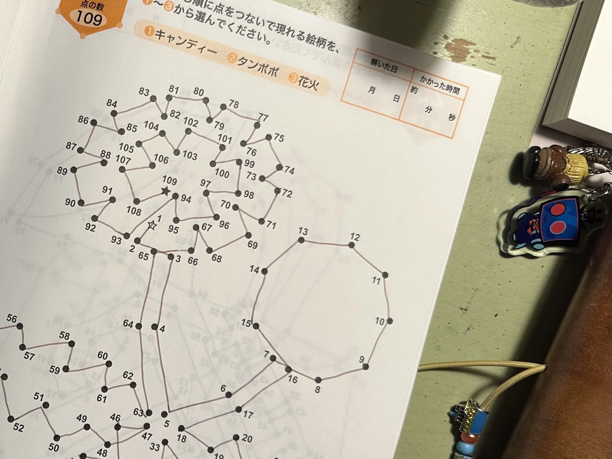
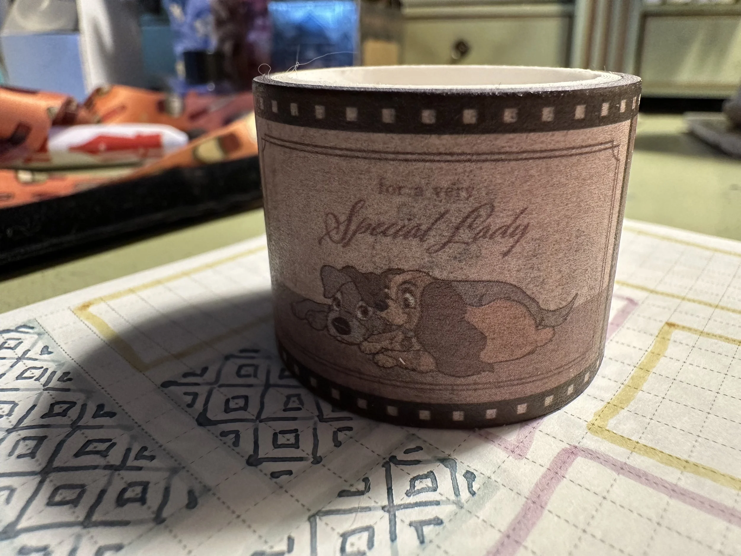
I was recently in Minneapolis to take my cat to a veterinary surgeon. While my friend and I were waiting to get him back after dropping him off, we did our usual run to the larger grocery stores to buy things we can’t get at home and then decided to take a detour to a Daiso. We just got these in Minnesota and I find them pretty fun. While there is a lot of landfill fodder (like any other ‘dollar’ store), most Daiso shops have a wide variety of stationery options. It was a nice diversion to spend an hour going through the notebooks, washi, pens, and craft papers. I picked up a few Zebra Clickart pens, a Zebra Sarasa metallic gold, some stickers, some cute ephemera papers, and a Lady and the Tramp washi tape that is presented like a film reel. My favorite purchase though, was an adult connect the dots book. I don’t think I’ve done connect the dots since I was a kid. There is something very focused about looking from one number to the next and drawing lines. Wild thing was I was sure my fountain pen ink would bleed through and it didn’t! I’ve probably done ¾ of the puzzles in less than a week. I am on the search for more adult connect the dot books if anyone has any recommendations.
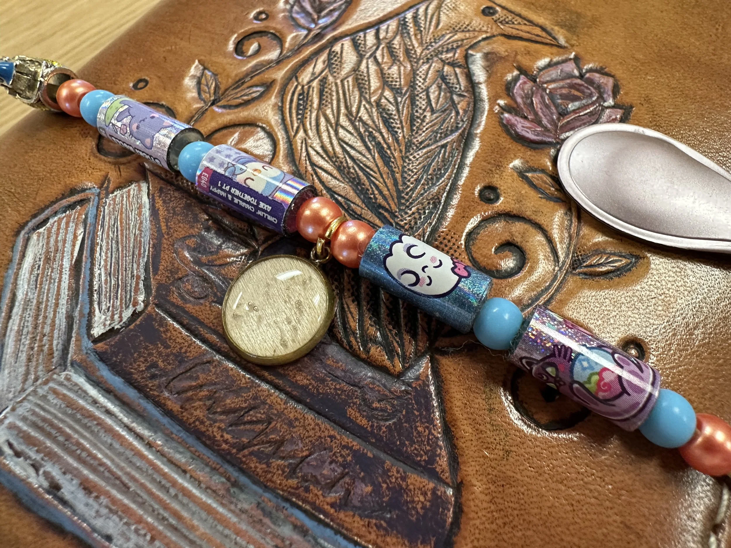
Beyond puzzle books (wordfind puzzles made a comeback last fall), my inner child has been utterly delighted by the discovery of Sticki Rolls, bracelet blind boxes where five of the beads are rolls of 10 little stickers with cute characters. I have gotten two for myself from different lines and had too much fun trying to decide how I wanted to integrate them onto my traveler’s notebook. I ended up taking apart the two bracelets and combining the beads and a few of the sticker beads. It’s giving 90’s kid binder decorations and I’ve been sticking the stickers in my planner and journals.
It’s a surprise to no one that Kaweco makes it onto my “keeping me sane” list. I have once again switched up my nibs and it is to two customs, one I use quite a lot and one that I use rarely and haven’t really found a stride with. The first combo is my Kaweco liliput fireblue with my B ‘imperial’ by Pen Realm Kirk Speer. I really like this nib because it gives the italic look to my writing when writing right side up, but I can also flip it over and get a more marker-like line. It’s currently inked up with Colorverse Pillars of Creation which I haven’t used in ages.
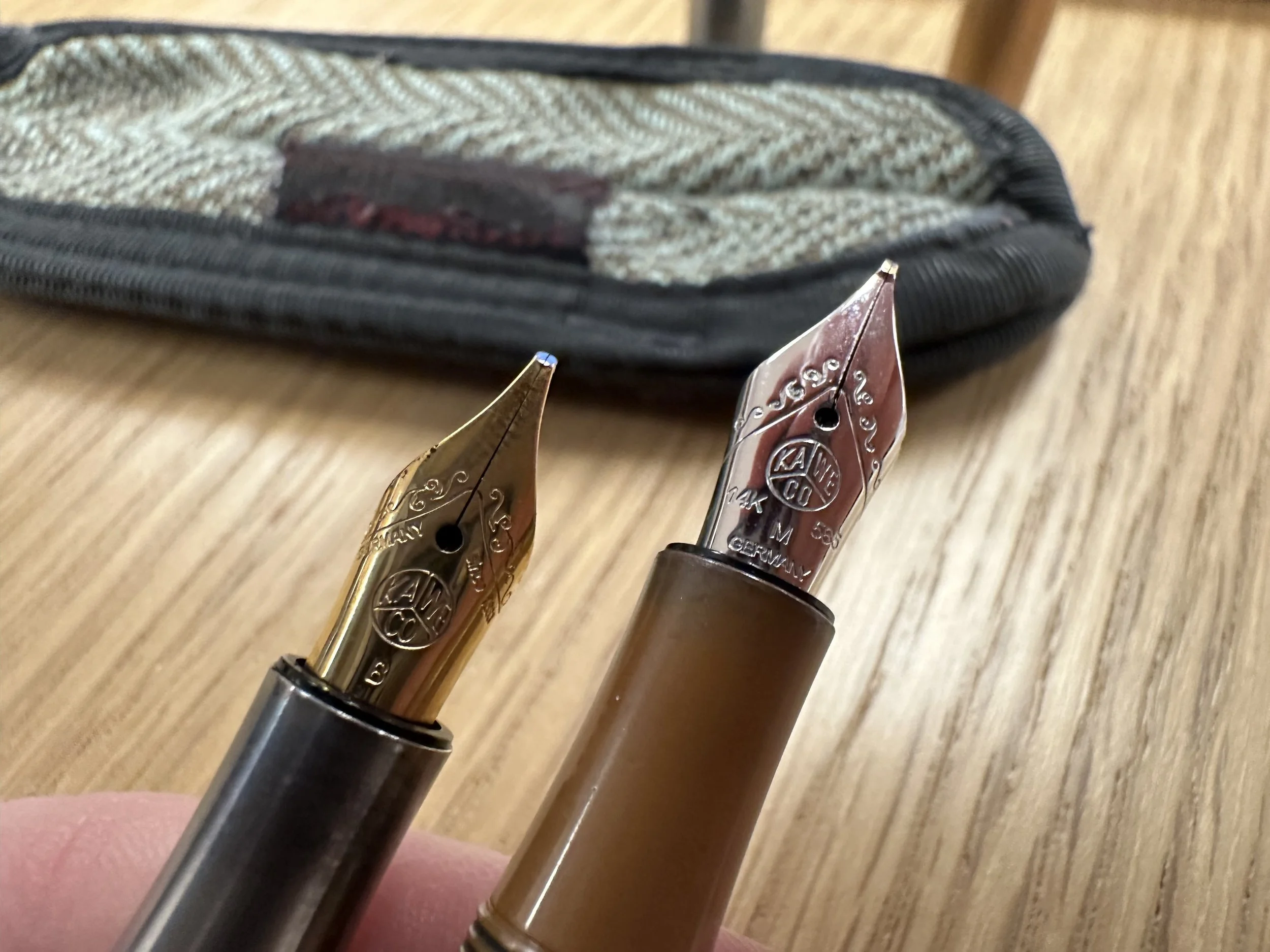
The other set is the Kaweco liliput copper with a 14K M ‘selvedge’ by Nib Tailor JC. This is another italic nib, but is designed to be less dependent on angle to the paper. This nib and I have a weird relationship since I bought it used on eBay and it is the stiffest gold nib I have ever had. JC tinkered with it extensively and it still feels harder than my steel nibs at times. It is also a pretty narrow medium (definitely closer to a fine in a lot of ways), so I don’t use it very often. It’s currently inked up with Robert Oster Muddy Wine, an old favorite that I’d completely forgotten about.
I have a few more pens inked up, all of which have contributed to a lot of zen doodles in my journal for times when I needed to quiet my mind and really needed to step away from playing Stardew Valley. I’m super behind on podcasts and doodling is a great way to listen but also have something to do with my hands.
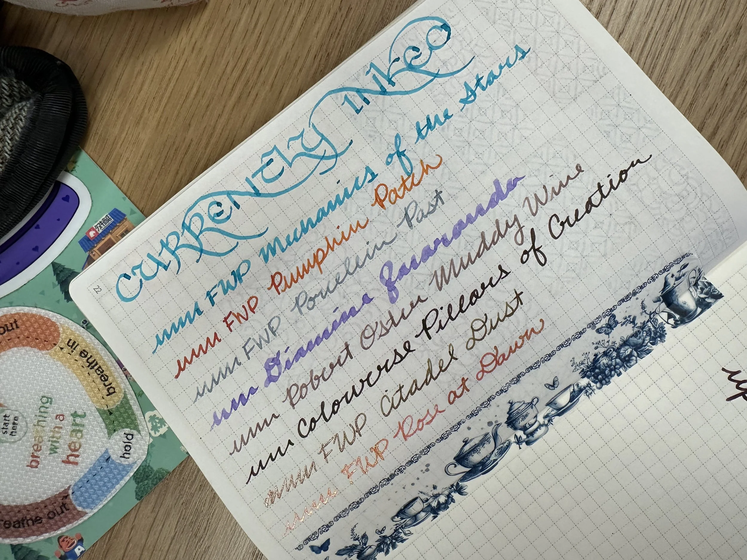
Currently Inked
Ferris Wheel Press Mechanics of the Stars - Kaweco x Galen Leather Sport Carmine 14K BB ‘journaler’ - This month called for a bright ink to ward off second winter and I decided on this bright blue with rose gold shimmer. This ink is so much fun. It flows well and when the shimmer catches the light it really pops. It’s definitely in a fight for top spot with Astral Blue Odyssey for a rose gold shimmer blue.
Ferris Wheel Press Pumpkin Patch - FWP Roundabout Rollerball Little Miss Jubilee - This combination has made its appearance again (and technically never left the lineup because I never cleaned it, just set it aside). Orange ink in pens is a comfort go-to. Not sure when that became the case, but anytime I need something to just tackle writing with an orange rollerball usually fits the bill. For some reason this particular pen has usurped my old J. Herbin rollerball for the pen I reach for when I want some orange ink in a pen like this. Pumpkin Patch is a bright orange that isn’t as in your face as some other orange inks out there.
Ferris Wheel Press Porcelain Past - FWP x LOTR Bijou Gandalf - This is one of the newest releases from FWP and when I first saw the swatches I worried it would be too light to be practical. A soft china (as in the dishware) blue is the perfect way to describe this color. It’s dark enough to be legible and reminds me of a bluer version of Diamine Celadon Cat (more teal) or FWP Harlequin Dream (way more purple). I may have to do a head to head comparison at some point.
Diamine Jacaranda - Kaweco Ice Sport Green 1.9 - I was teaching a art/junk journaling workshop earlier this week and decided to take my well-loved original Sport with a calligraphy nib in it for people to try. I decided to go with this absolutely epic purple from a past Diamine Inkvent. It flows really well and really shows off how the ink shades in the wide nib.
Robert Oster Muddy Wine - Kaweco liliput copper 14K M ‘selvedge’ - I had a craving for this ink set when it first came out years ago and was a direct order only ink. I could never get myself to commit to buying them all and then paying for shipping out of Australia so I was thrilled when they became available through more retailers. I feel like this ink is best described as a purple-brown. It depends on the light and the paper whether it leans more brown or more purple. It’s a nice wet ink which works really well with this drier nib.
Colorverse Pillars of Creation - Kaweco liliput fireblue B ‘imperial’ - I’m happy that I am revisiting a lot of my old Colorverse favorites recently. There are just so many good ones out there. The Eyes on the Universe season produced a lot of really great ones, including Pillars of Creation. It is a deep purple with a green sheen. It’s moody and interesting. It’s a great pairing with this nib which can lay ink down in a lot of different ways.
Ferris Wheel Press Citadel Dust - FWP Carousel Hearty Harvest M - Another recent release from FWP (I think it actually came out in the last few days). This ink is quirky and I think I need to put it in a larger nib to fully appreciate it. Its base color is olive green, but it has copper shimmer which makes it look khaki on first impression. I haven’t played around with it much, but it does give medieval art vibes.
Ferris Wheel Press Rose at Dawn - FWP Carousel Oinking Embers M - This is an ink that I did not like the look of when I first swatched it. I am picky about pink inks. It actually took a few pages of writing with it before I started to say, “wait, I do like this”. It’s a warm pink with gold shimmer and is a partner ink with Porcelain Past.