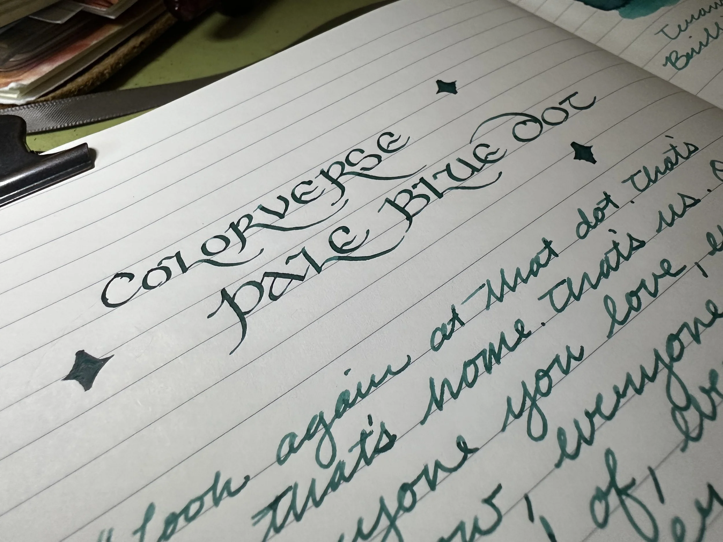
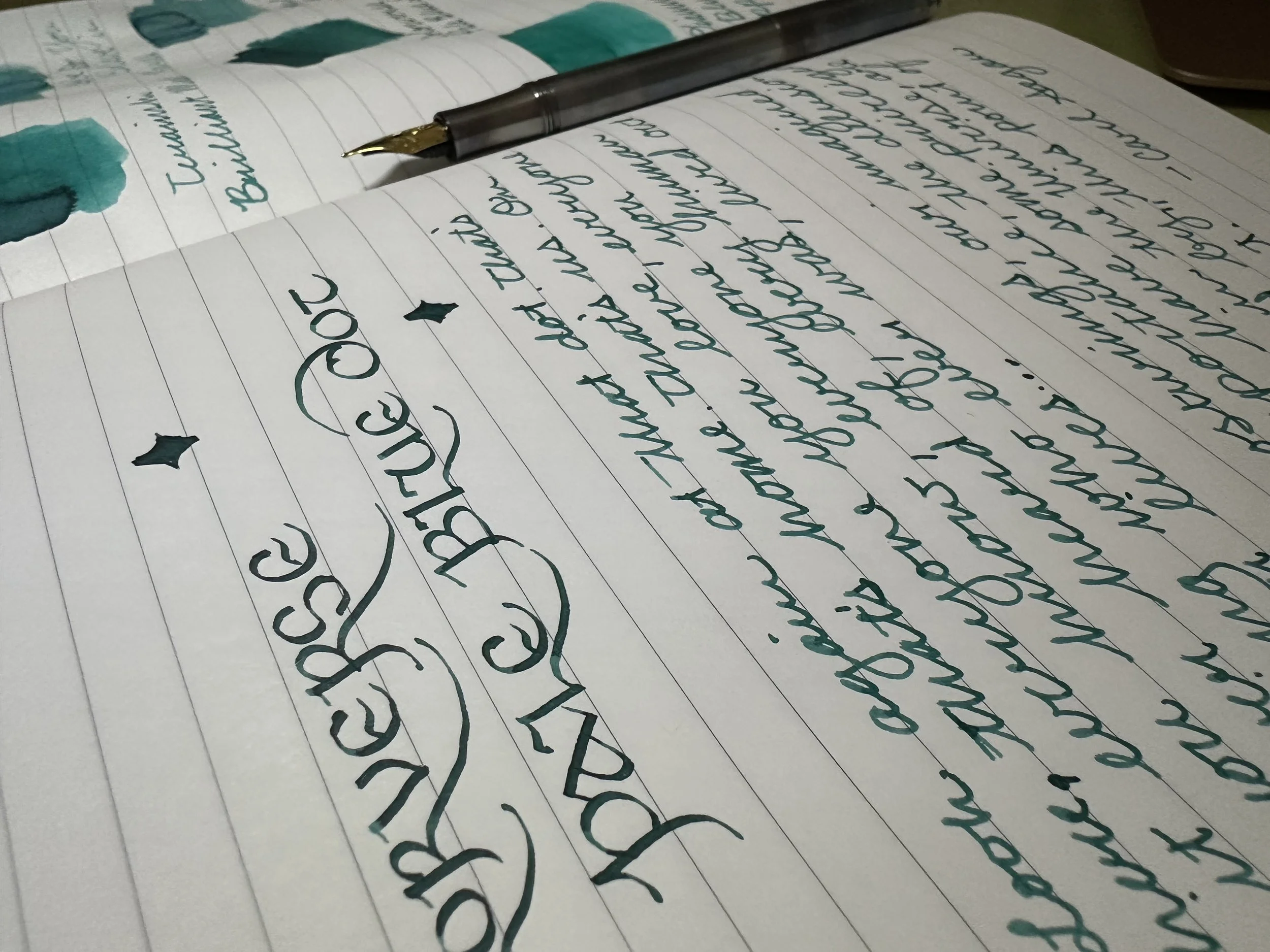
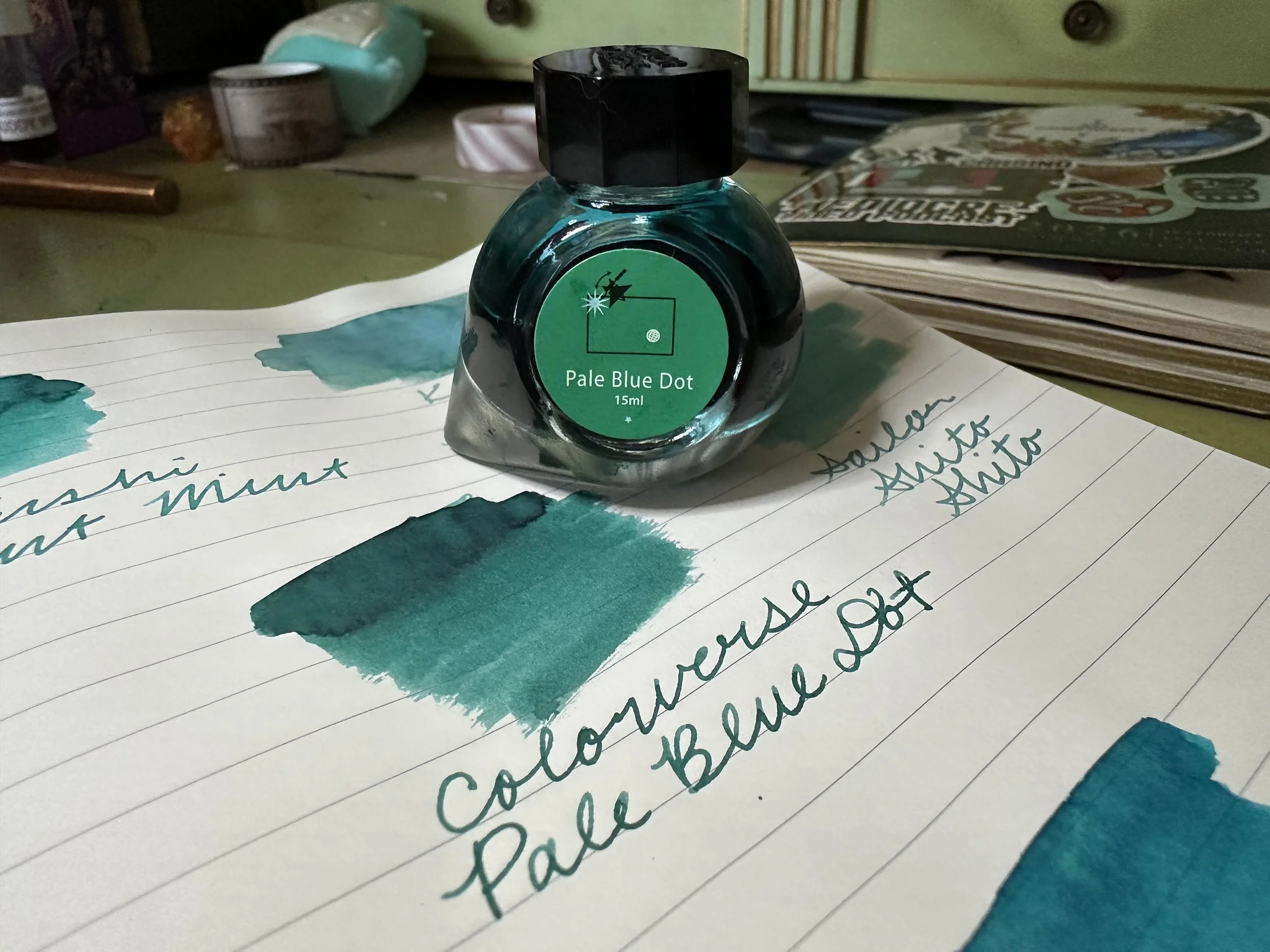
Ink of the Week: Colorverse Pale Blue Dot
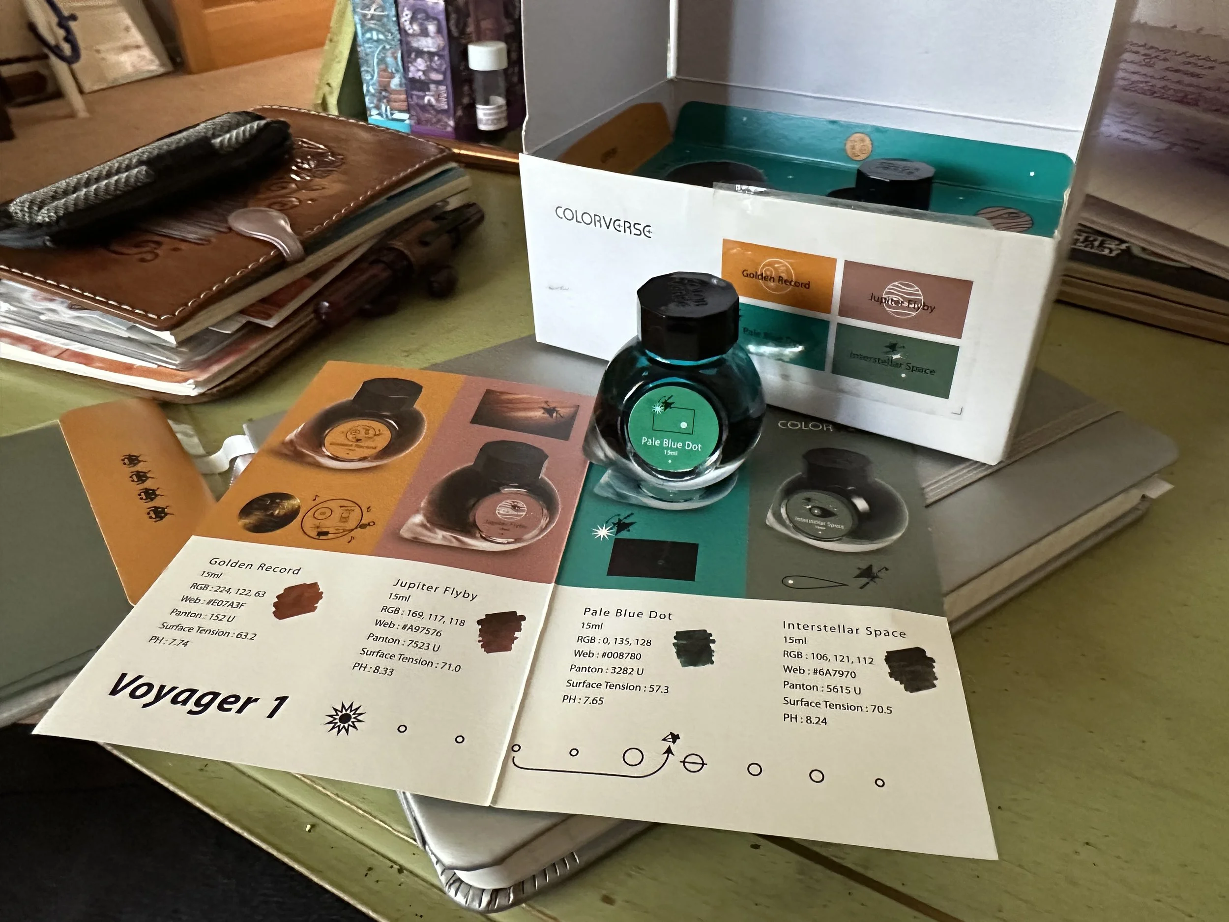
Colorverse is seriously one of my favorite ink brands (I may have mentioned that once or twice, haha). And I love the thought they put into their special editions. The Voyager I Limited Edition set, which Colorverse Pale Blue Dot is part, was both my first limited edition from them and my most expensive ink purchase at the time. This one has seen been eclipsed in price by other Colorverse Special Editions.
The Voyager I set was made up of four 15 mL bottles in a commemorative box. It retailed for about $50 when it was available. Each ink has a name inspired by elements of the Voyager I space probe that was launched in 1977 and is now currently pinging data back to us from beyond the Solar System. The other inks are Golden Record (an orange), Jupiter Flyby (a matte brown), and Interstellar Space (a green).
Pale Blue Dot wars with Golden Record for being my favorite in the set. At the moment it is winning since I am definitely down to only half a bottle of it as of this writing. The phrase “Pale Blue Dot” was coined by astronomer Carl Sagan in a 1994 book of the same name. It refers to a photograph taken by Voyager I in 1990 at a distance of nearly 4 billion miles away. The photo was part of a series of pictures titled “Family Portrait” which included images of all the planets in our Solar System. Earth appears in this photo on the far right as a blue pixel in a sunbeam. It’s small and very far away.
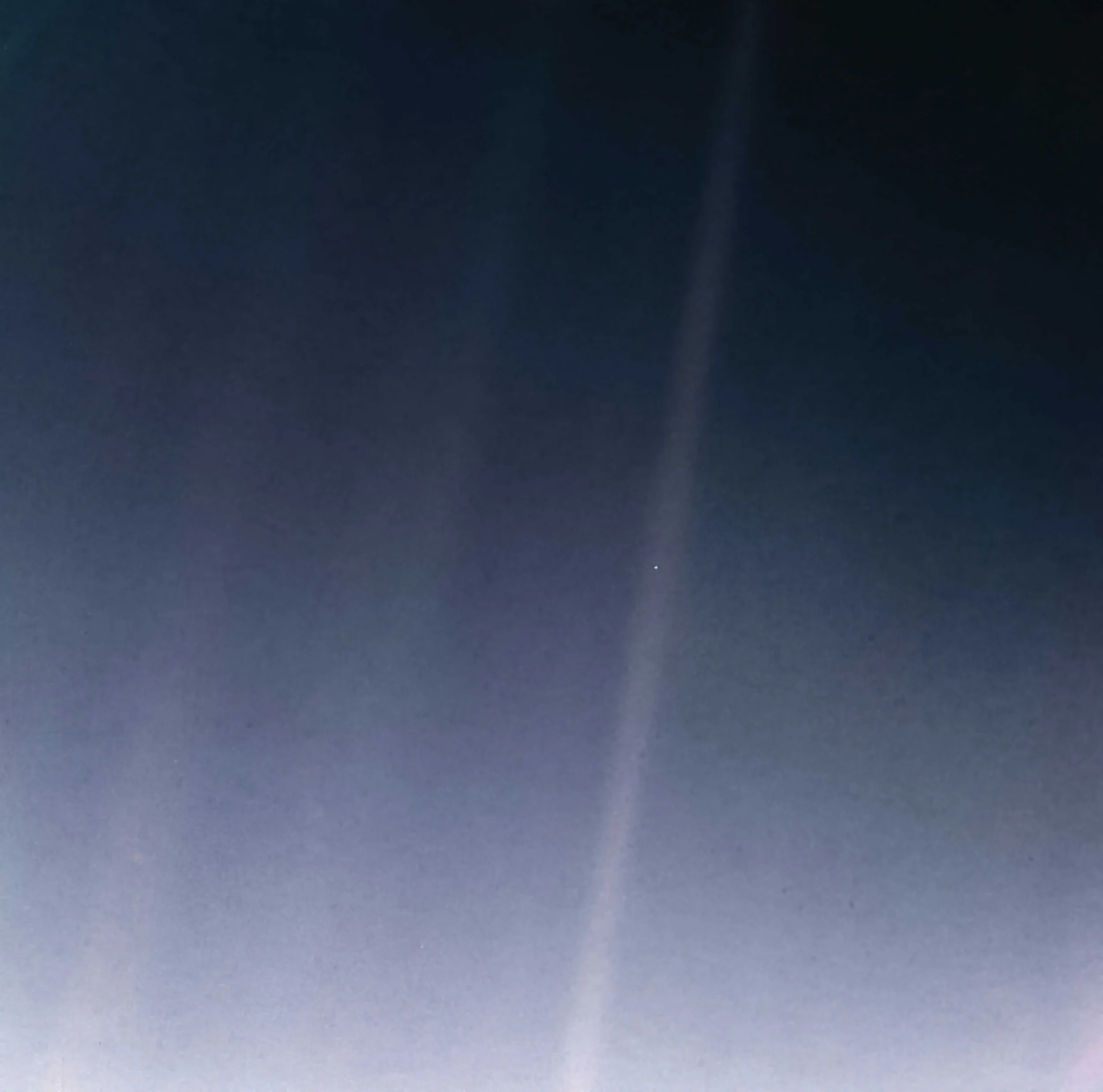
Image from NASA. Earth is the little bright dot in the right most sunbeam.
Look again at that dot. That’s here. That’s home. That’s us. On it everyone you love, everyone you know, everyone you ever heard of, every human being who ever was, lived out their lives… Our posturings, our imagined self-importance, the delusion that we have some privileged position in the Universe, are challenged by this point of pale light.” - Carl Sagan
The Ink
On Tomoe River Paper
Pale Blue Dot is a teal-leaning blue reminiscent of the color of Earth in the photograph. It has a little bit of shading and a little bit of red sheen depending on the paper and nib size. I wrote with it in a medium nib on my Kaweco liliput fireblue. This ink performed well with issues only arising when I was thinking too much and it got dry on the nib. This ink and pen was a reunion of sorts as they were both the most expensive fountain pen items that I had in 2018. I’m not sure if this is the first pen this was inked in, as that might have been my Kaweco Brass Sport, but it was certainly an early pen for this one to shine (probably in an EF nib if I remember my 2018 self).
Ink Siblings
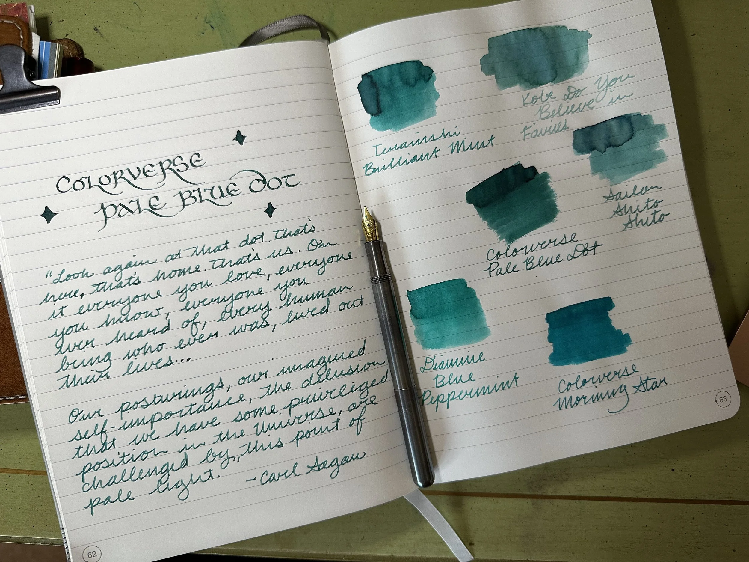
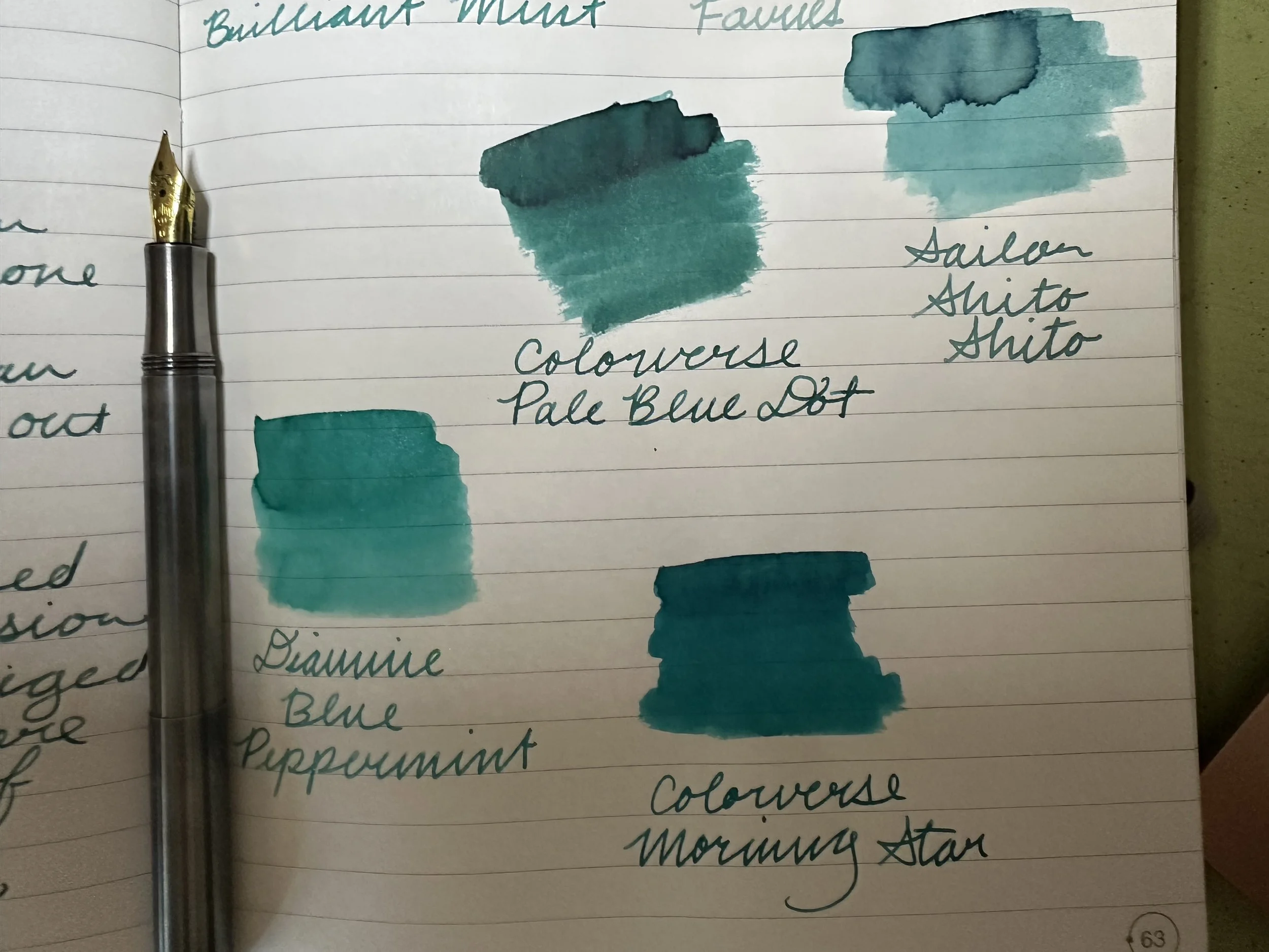
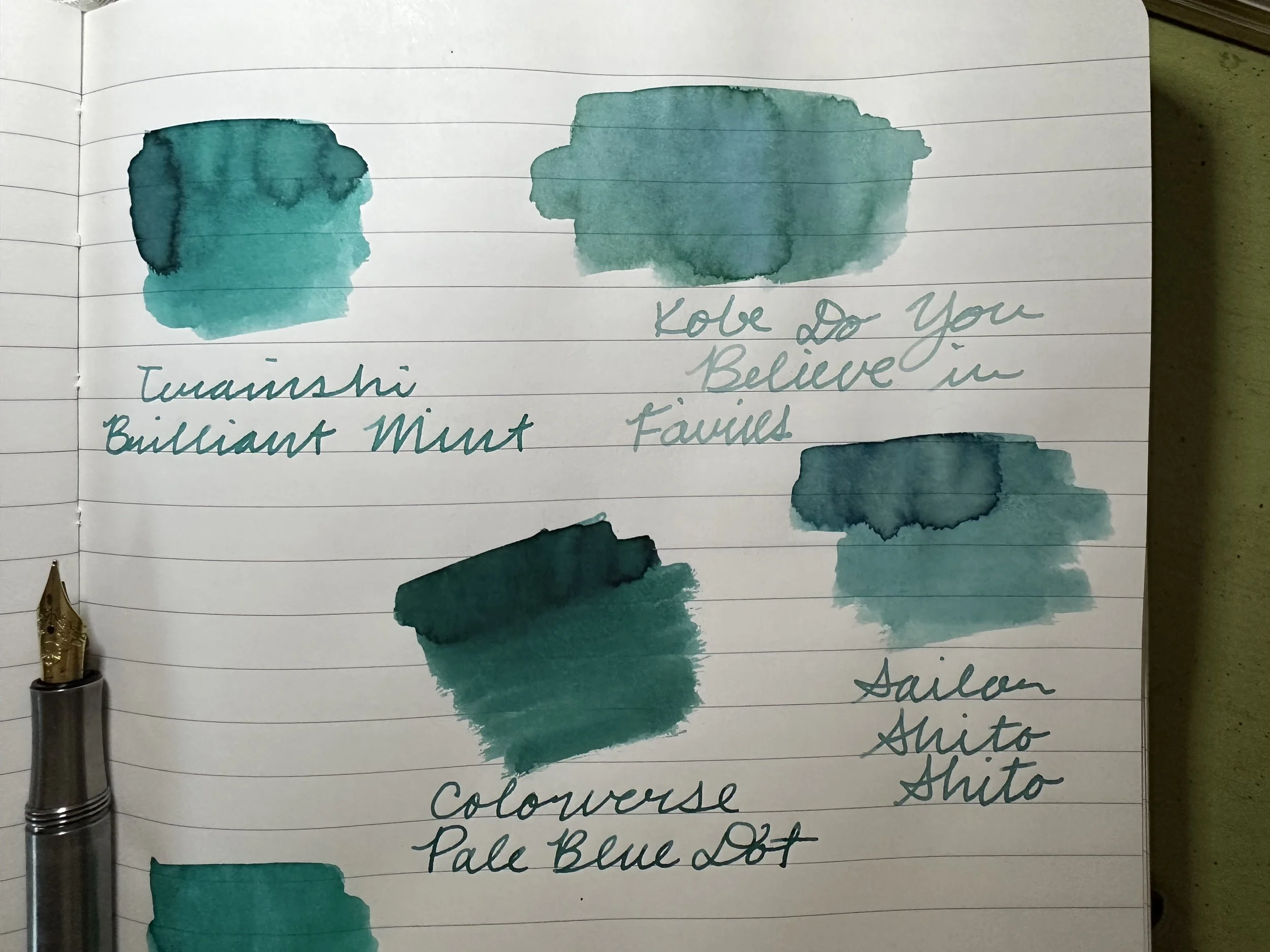
Overall, I didn’t have any teals quite the same shade as Pale Blue Dot.
Teranishi Brilliant Mint was probably the closest. It’s a similar tone although a few shades lighter. However, the sheen effect appears to be the same.
Diamine Blue Peppermint is more aqua than Pale Blue Dot and has added blue shimmer.
Colorverse Morning Star leans more blue in the swatch, but they appear to be very close in shade in the writing samples I did with a Sailor Hocoro medium nib.
Sailor Shito Shito was much lighter and contains more blue.
Kobe Do You Believe in Fairies is a much lighter version of a similar teal to Pale Blue Dot, but there isn’t much else similar about them.
Overall
According to my ink tracking, I haven’t inked this up in at least two years. Now that I remember this one, it is likely going to be in use more often in different capacities. Love this ink, love this set. Although it was definitely pricey per mL, it’s been a favorite in my collection, even when I’m just enjoying the look of the box on my ink shelf.