
Doodle in the Margins
I was stuck on what I wanted to write about for the last two weeks. I have a slew of drafts in my folder of thoughts started and stopped. Things that felt too small or too big. And, as many other stationery bloggers have mentioned, feeling a little bit superfluous to the scheme of things.
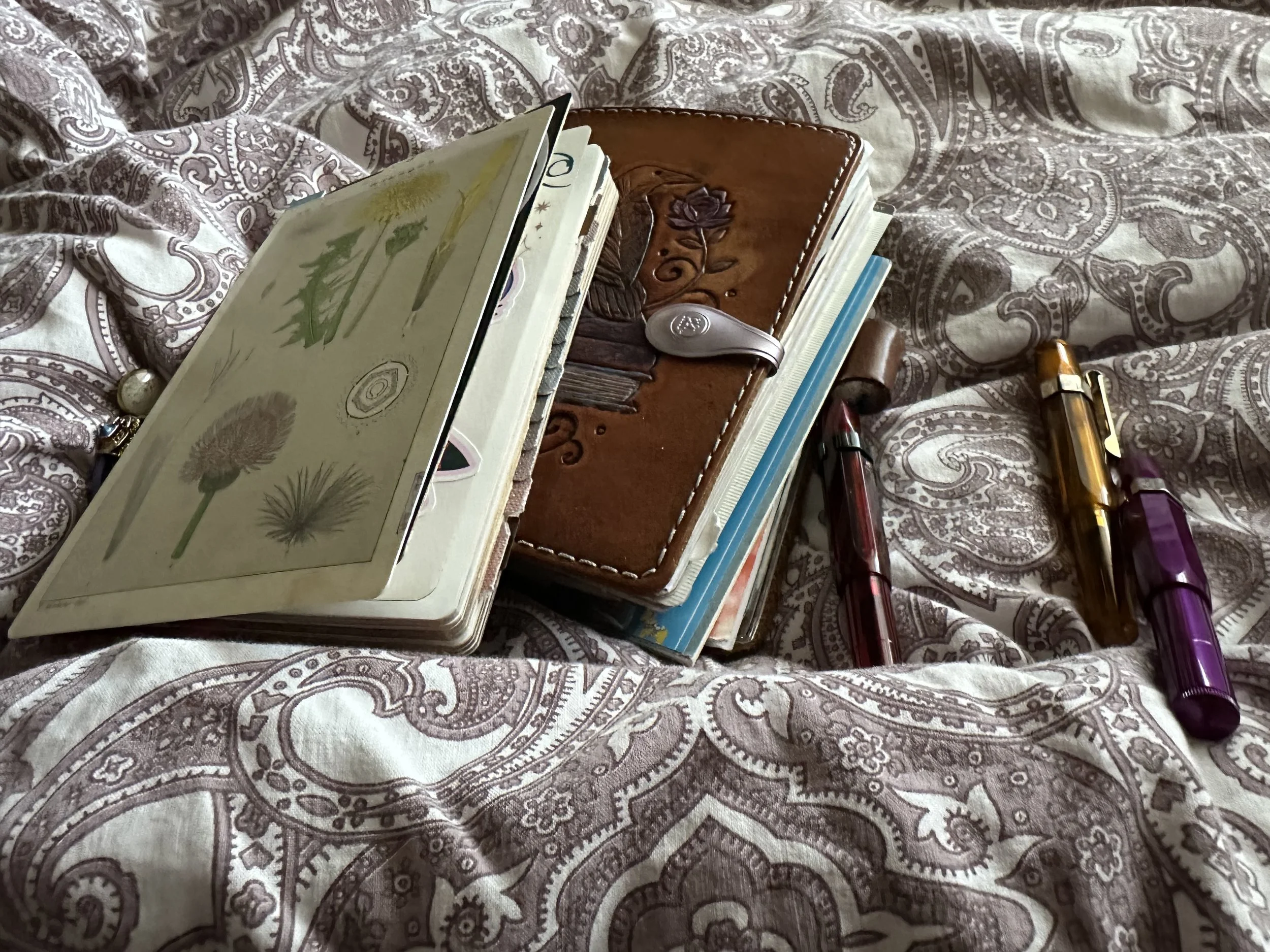
Journal pile on a weekend morning.
Enter some inspiration from Amie McNee @inspiredtowrite on Instagram. In her post she paints the phrase, “The world is facing a crisis of meaning. Art is the remedy. When we create we gain agency, power, and purpose.”
I think journaling can fit into that as well. While I invite folks to take glimpses into my journals at times, I still write them for me. I don’t hold back and I’ve certainly had to toss an image here and there due to not realizing I photographed some rather colorful profanity on my pages, haha! Ever since coming back to journaling regularly I don’t judge what I put down. If I feel like it’s too vulnerable to even look at again, I can collage over it.
Except, there are times when everything seems like too much all at once. It’s in these times that I get an itchy feeling like something is missing. Maybe I need a new notebook, a new pen, a new pile of ink samples to swatch. That will get me to what I really want to be doing, right?
Unfortunately, no. Because what I am wanting is to write. Having the tools to write doesn’t mean much if I don’t even set the pen to the page. And sometimes there are no words, but just seeing ink on the page can often create a sense of calm and the words will come. Even if they don’t, the notebook and pen served their purpose - it got me out of my head and onto the page.
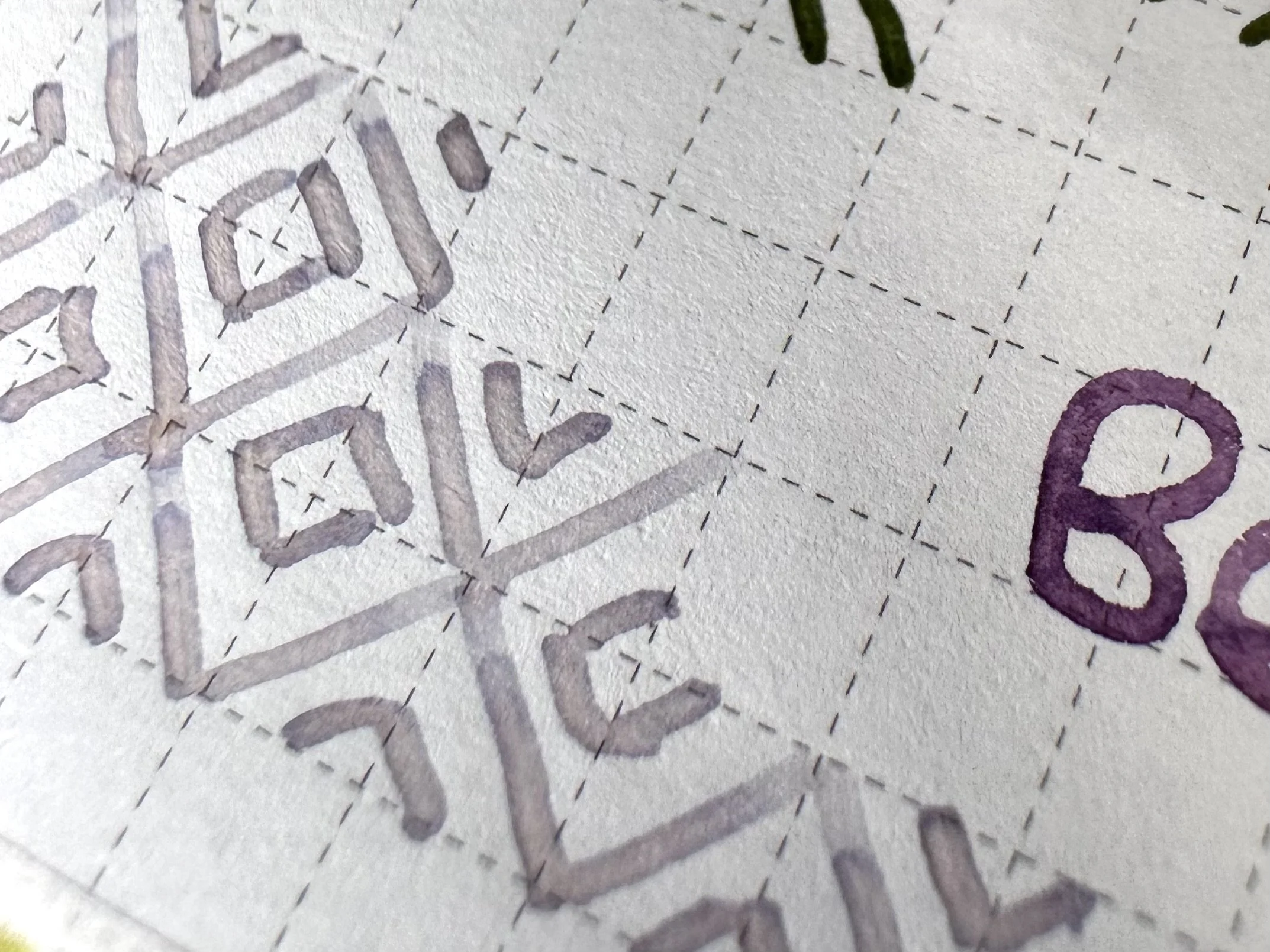
My current journal is a total mishmash. Normally, I start a new notebook at the beginning of the year, but this time I continued the same one that I started towards the end of October. It is a 272 page Sterling Ink notebook with tomoe river paper. I’ve probably got a third left. The pages are chaotic, filled with journal entries that trail off mid-sentence. Scribbles with markers, fountain pens, and even a dip pen at times. Many stickers, some placed with intention and others because I just really wanted to use it. Notes from friends and colleagues.
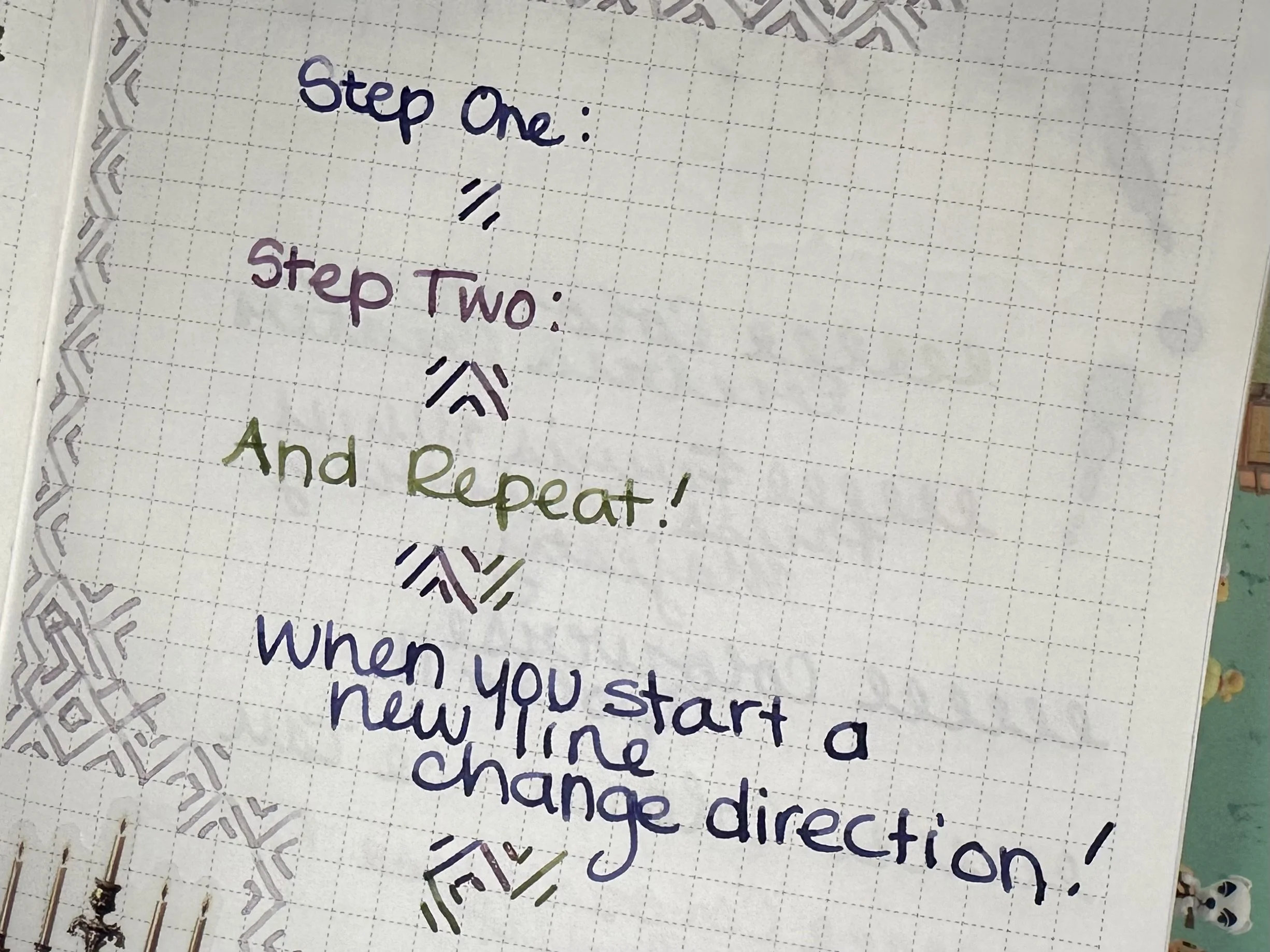
And recently? A lot more zen doodles, usually in the form of some sort of pattern. My current favorite is one a simple one that just consists of alternating three lines across the grid to form little diamonds. I learned this from Helen of Journal with Purpose ages ago. She uses the design in her habit trackers. Her YouTube is great for creative journaling ideas.
It helps me get going at what I want to write about, or at least away from my phone for a little while. I’ve grown way too addicted to my phone and have lost countless hours scrolling. I mean, it’s designed to hook our brains after all. It’s been hard to unplug, but even just setting the Screen Time feature on my phone has made me more conscientious about how long I am using different apps. Hearing about April of Penguin Post’s recent adventure thanks to the Brick device, I may have to actually check them out.
I am adamant that slinging ink on a page in any form is an act of self expression. We are not always huge gestures and deep thoughts. It’s okay to sometimes just be a little doodle in the corner of the page.
After all, there’s no such thing as “bad” journaling.
Do you have any journaling techniques to share for the times where you find it difficult to start writing? Please share!
Currently Inked
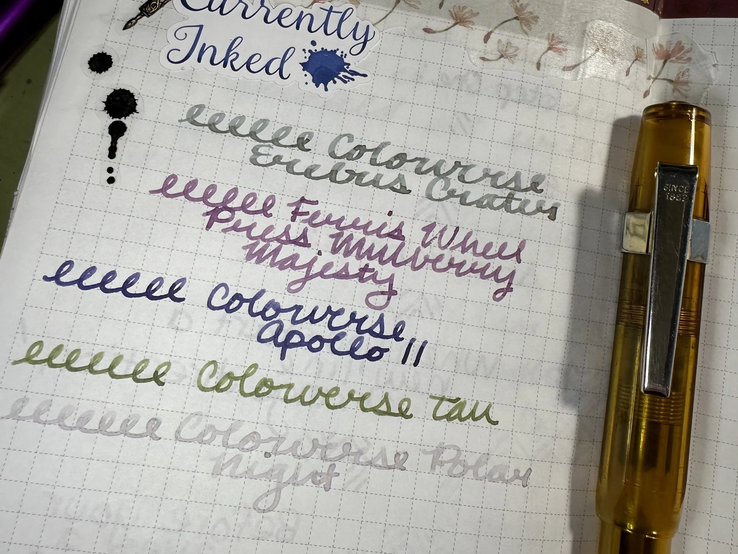
Colorverse Erebus Crater - Kaweco x Galen Leather Sport Carmine 14K BB ‘journaler’ - For my header ink this month I decided to try something pretty new. This ink came from the 2025 Colorverse Colorvent and it is in the top three inks, meaning it will get a larger bottle and special release later this year. This ink made me go “oh wow” when I first swatched it. It’s a blue gray at first glance, but as the ink dries it takes on a more purple hue. Epic chroma-shading. It can be a little dry on some papers and too wet on others in my limited testing, but it is so amazing with the right paper. Might be a contender for an ink of the week… except I’m not sure I have any inks even remotely similar that are also chroma-shaders… will have to take a deeper look.
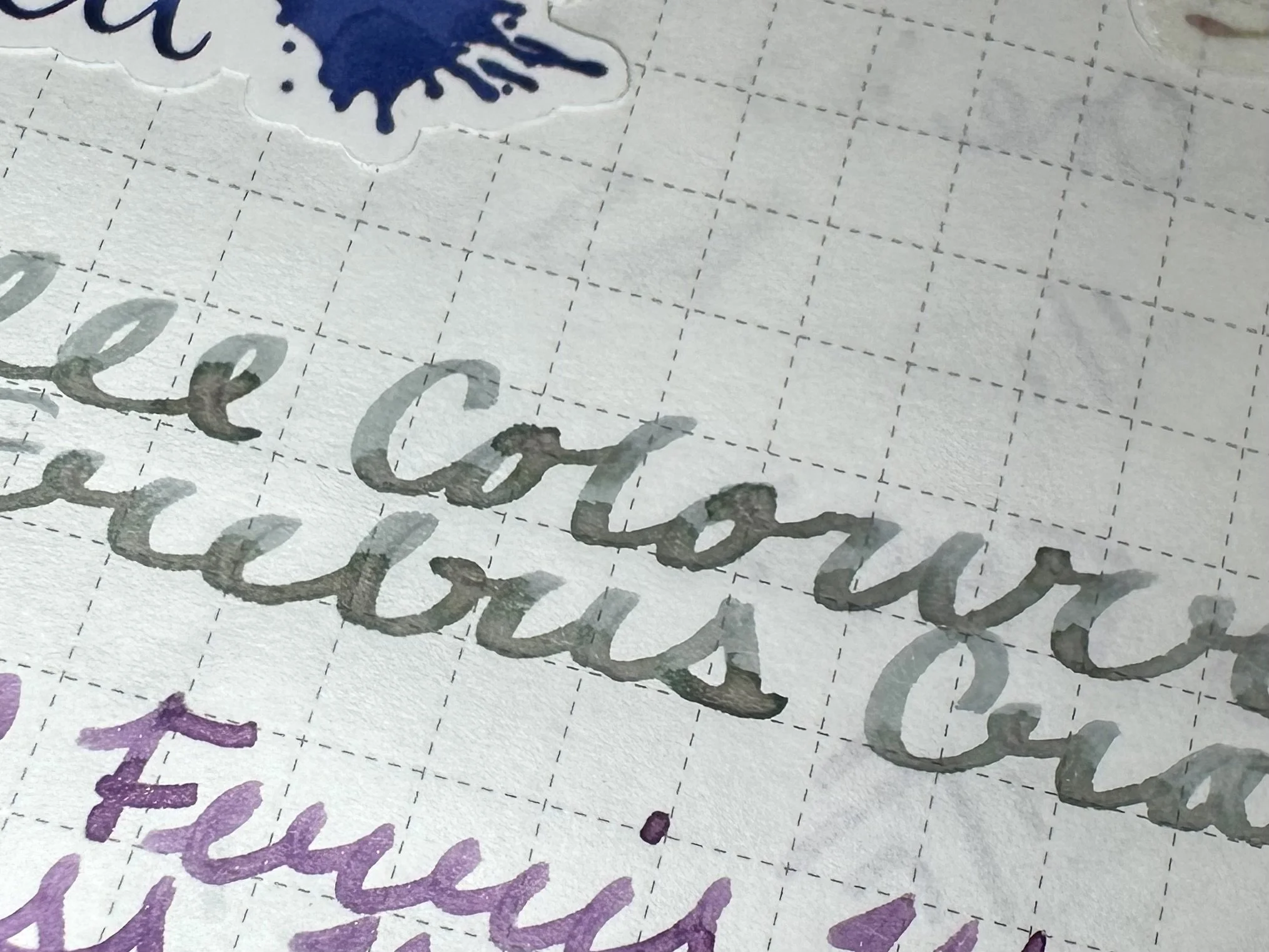
Extremely tricky to try and get the camera to catch what I can see with my eyeballs, but at least you can check out that shading!
Ferris Wheel Press Mulberry Majesty - Kaweco Sport Cognac M ‘monoline’ - The macchiato is taking a break in exchange for my OG cognac from super early on in my collection. Mine has been through it and I still hold firm to my opinion that Kaweco needs to do more standard lineup see through pens. They often end up as shop exclusives which can make them much more difficult to find. On to the ink! This ink has been stuck in my mind lately. I believe it was a release from 2024’s holiday season. It’s a warm purple with purple shimmer. The monoline is laying the ink down in a way that really shows off its shimmer on the page.
Colorverse Apollo 11 - Kaweco Sport x Cult Pens Metallic Violet B - This ink is a favorite. I wrote about it ages ago with my thoughts on limited edition inks back in 2023. It’s a topic that I’m now curious about revisiting (since I have gotten quite a few limited edition inks since then). Colorverse Apollo 11 is a dark blurple. It shades really well in most pens. I bought it when I was teaching a lot of science programs about space and became very interested in the space program. Eagle is probably my second favorite in that set and I may have to ink it up soon.
Colorverse Tau - Kaweco liliput fireblue M - I don’t think I have ever used this ink in the entire time I have owned it. The Colorverse Standard Model is probably still one of the wildest limited editions that I have ever purchased, and I need to remind myself to use the inks. When I was making my new swatchbook, I learned that some of the bottles had gone funky either by discoloration or getting a funky smell. And the inks are rather fun with some deep science nerdiness in their design. Ana from Well Appointed Desk wrote a very in depth review back in 2021. I’m really enjoying this green at the moment.
Colorverse Polar Night - Kaweco liliput copper M stub - I decided I wanted to try another of the top three 2025 Colorvent inks. This one confused me in the lineup at first. It just seemed like a light purple in swatches, but oh it is definitely much more interesting coming out of a pen. It has a subtle chroma-shading property from the purple to light pink. It also has the halo effect on some papers (where the outside of the written line is darker than the inside). It’s also surprisingly readable for an ink I was sure would just disappear into the page. Still early on in the playing phase of this ink, but I am quite intrigued.
A much more interesting ink upon further study.