
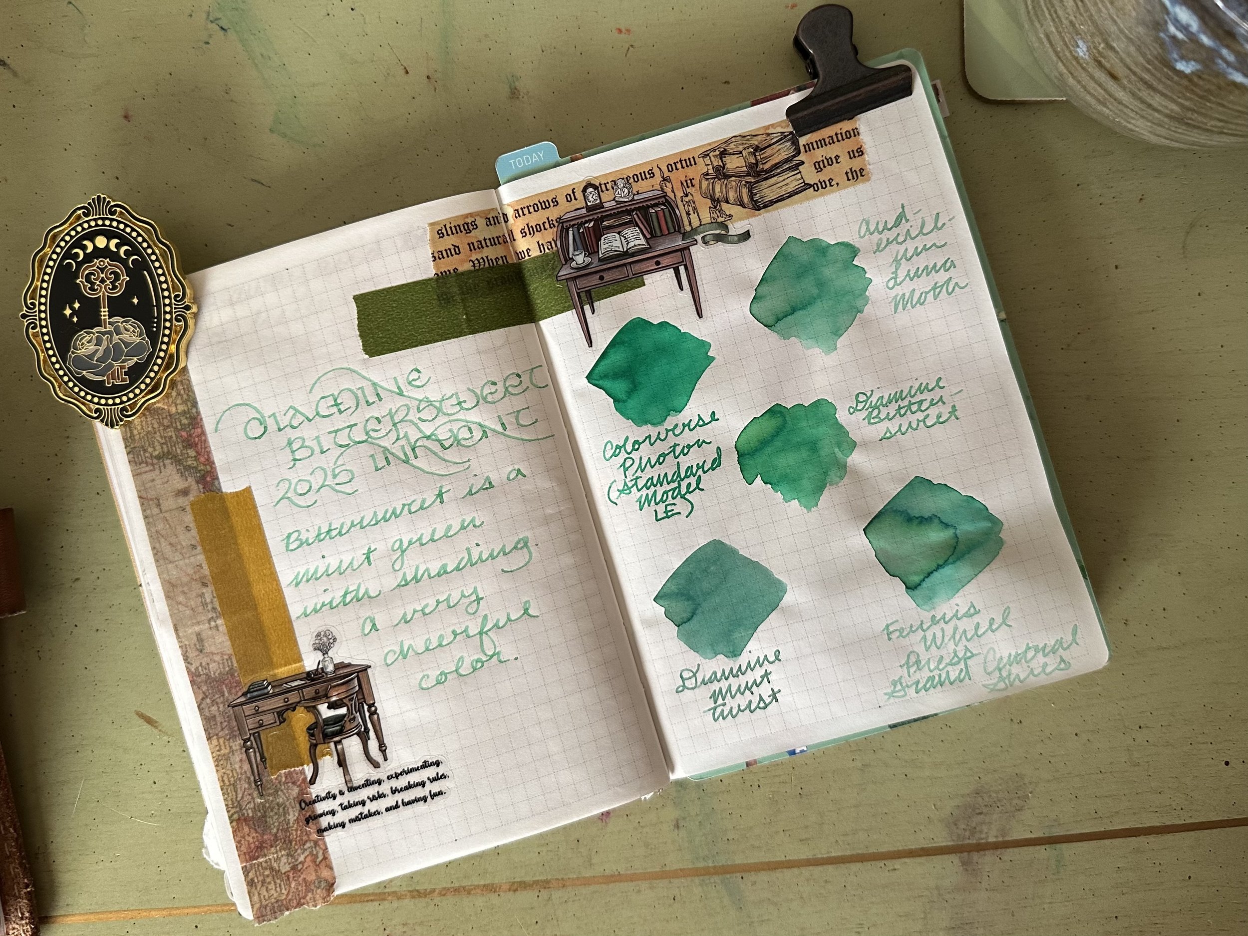
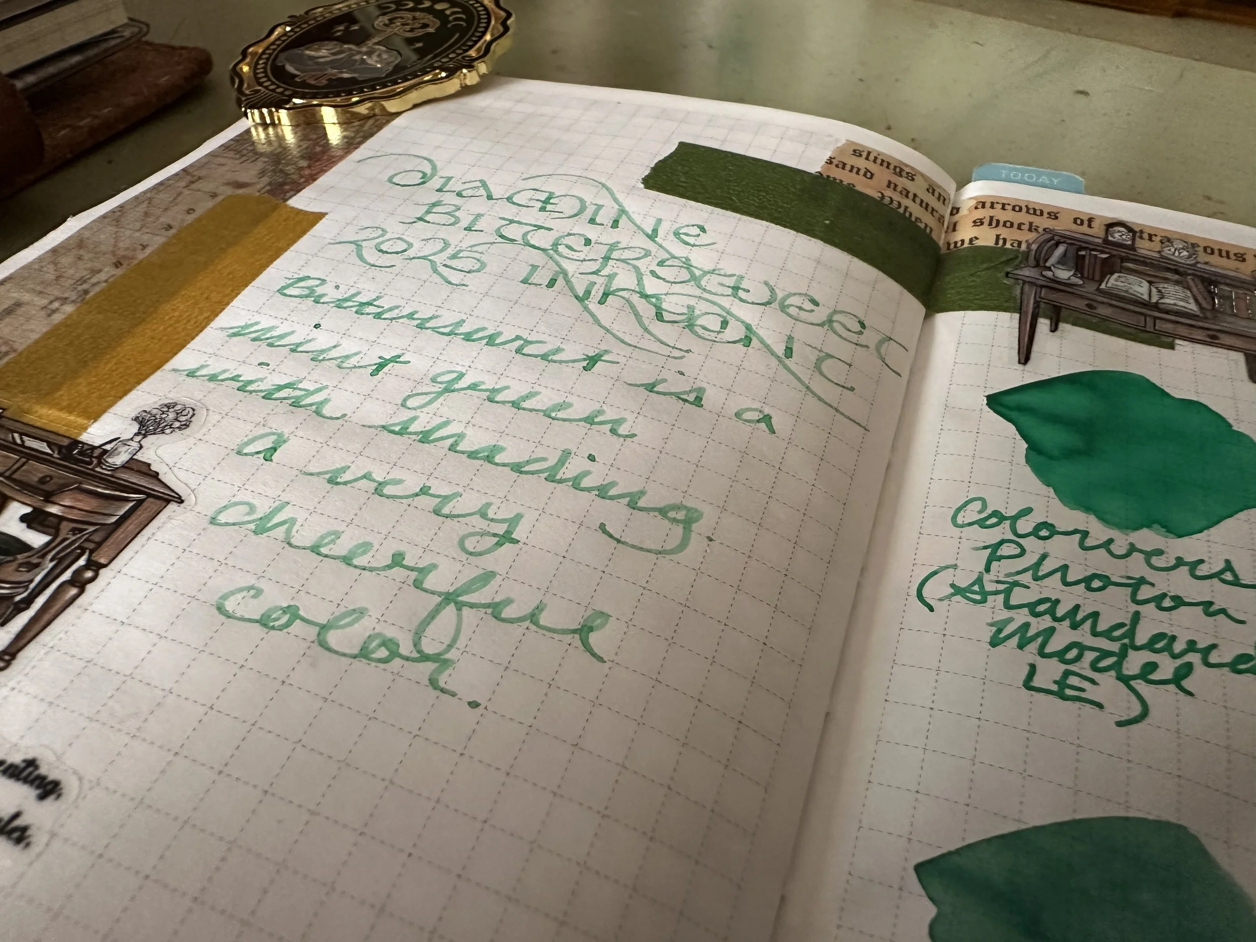
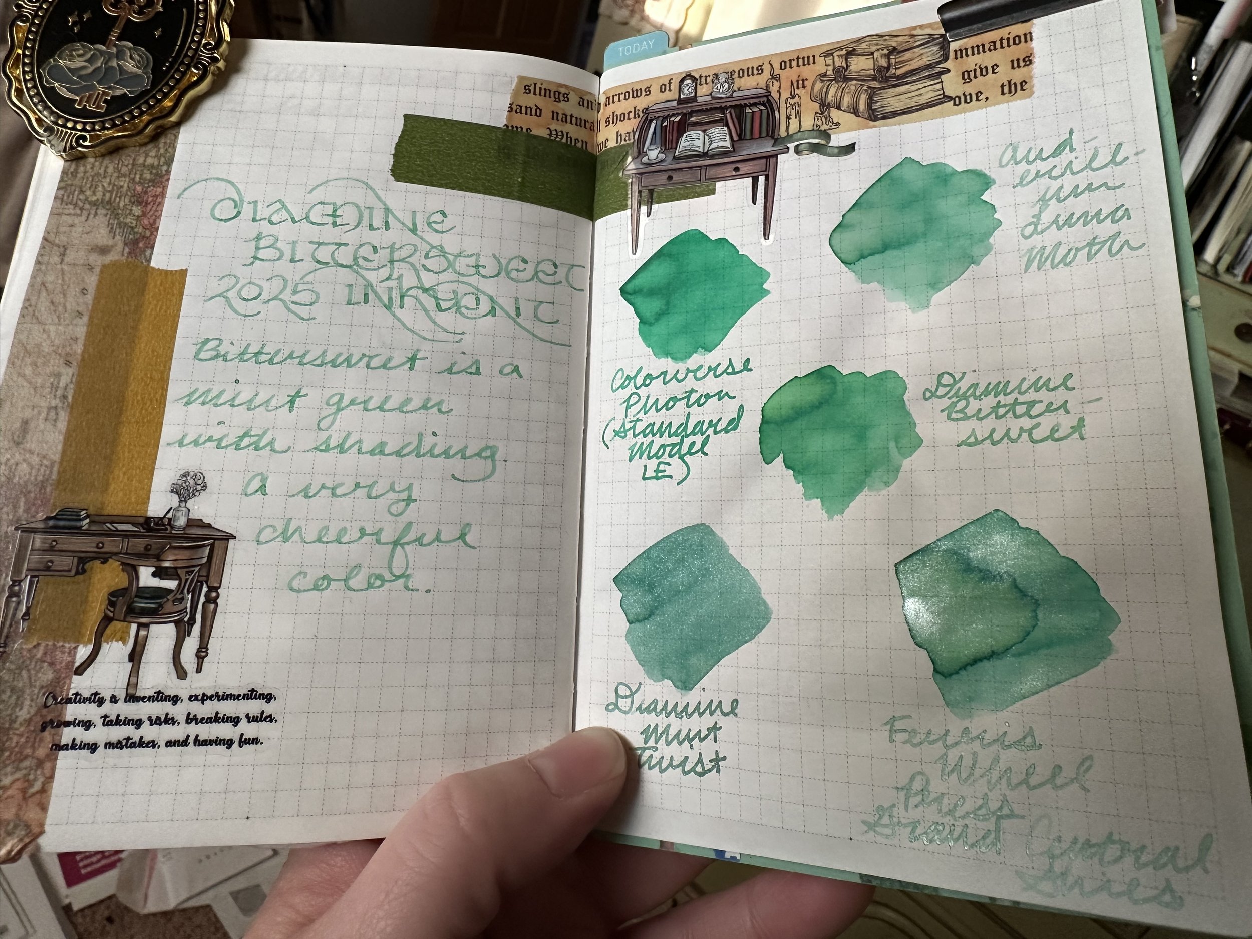
Ink of the Week: Diamine Bittersweet
This ink is from the 2025 Diamine Inkvent calendar. I didn’t buy the calendar, but sometimes you can find single bottles for sale by either retailers trying to clear out the rest of their stock or other enthusiasts who didn’t like certain colors and want to pass them on to someone who might. I was intrigued by a few of the colors that I’d seen over the course of December, Bittersweet being one of them.
The Ink
Sterling Ink Tomoe River Paper, Kaweco liliput copper M stub
Diamine Bittersweet is essentially a mint green. It is a little dry but still does manage a bit of shading with the M stub I tested it with. It behaved on tomoe river paper, canopus paper, and kokuyo campus paper that I was using it on. I wrote through a fill in about a week and a half. Ultimately, I wasn’t wowed by the color because I have some other inks in this color category that I like much more (see ink comparison below).
The Presentation
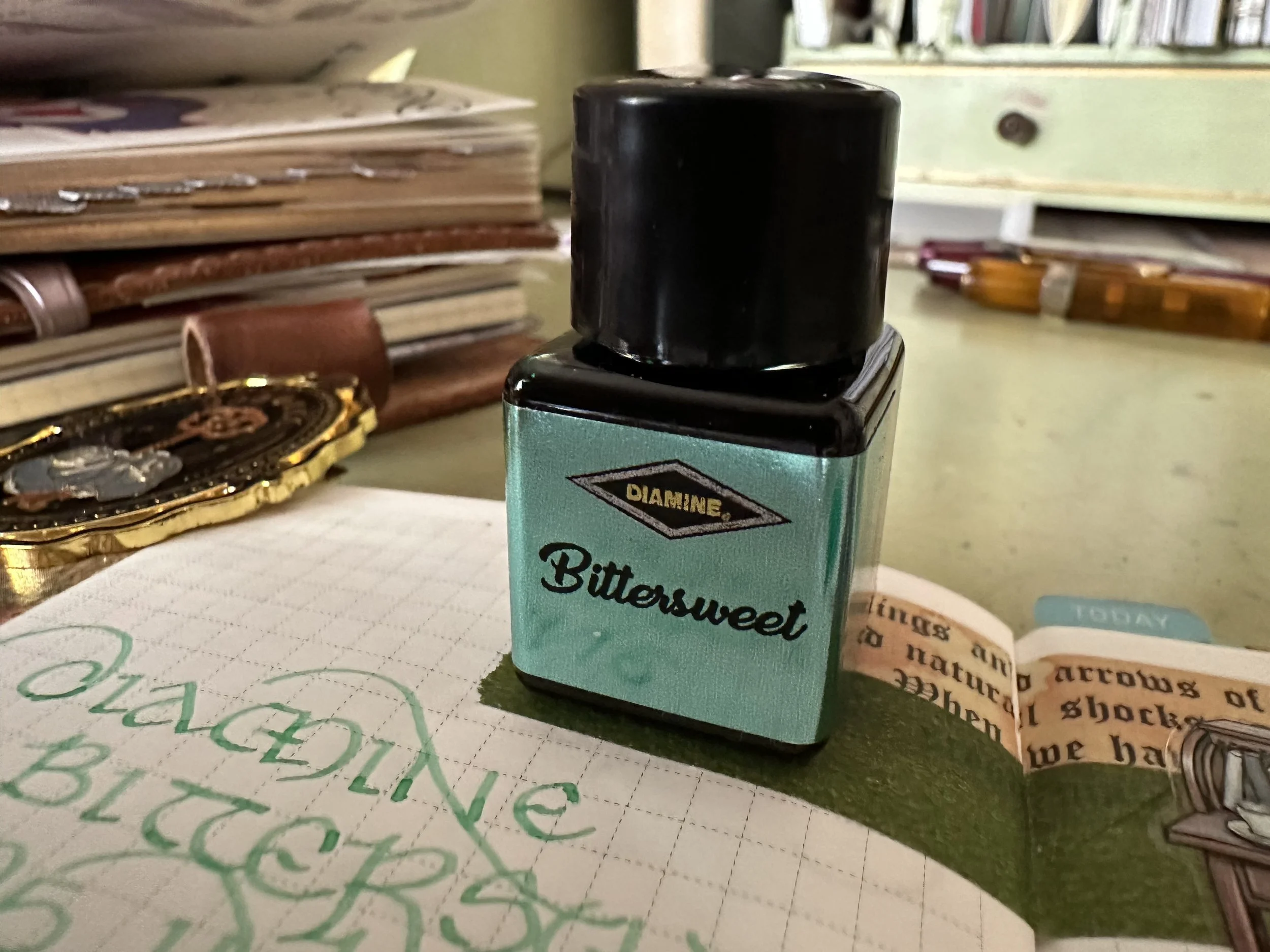
As this is an Inkvent ink, it is currently only available as part of the Teal Edition set in the 12 mL bottles. I do appreciate that Diamine switched to these after the Blue Edition (which were 7 mL glass bottles). I think it follows the Diamine aesthetic much better and are also much easier to keep in a box or on a shelf in the square shape. By summer, Diamine has released the previous seasons in the 50 mL bottles that have the little glass feet, so I imagine that the same will happen with this one. One thing I would like Diamine to do with the inkvents is to a. make the shrinkwrap less intense (I always have to get scissors) and b. share how the name/ink color were inspired. This one is called Bittersweet and I’m not really sure why unless they are maybe referring to clove candy, but that candy can really be any color. There has been some wild name and color combinations as the years have gone on and I would like to know that they are putting thought into the naming and the color.
Ink Siblings
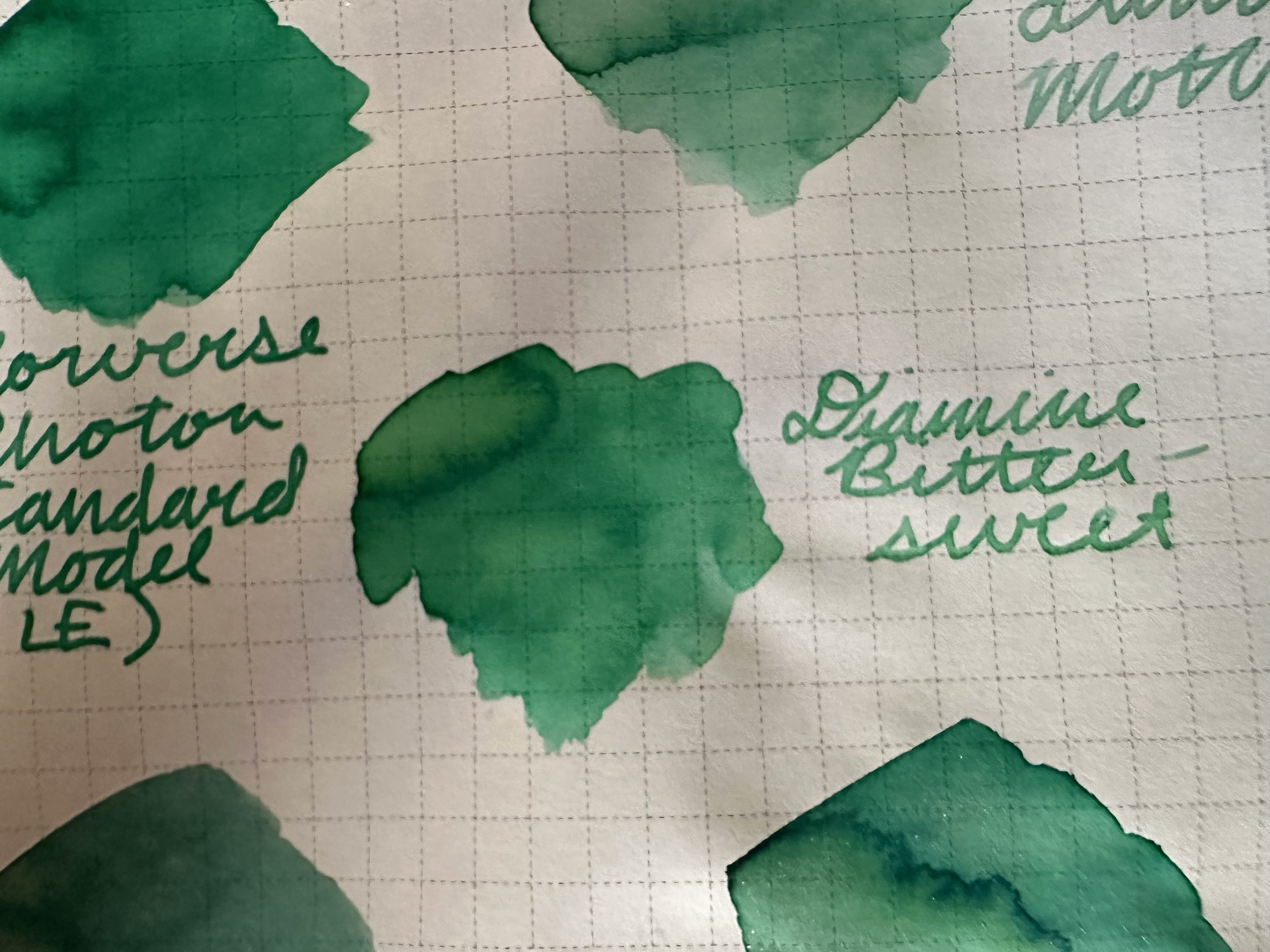
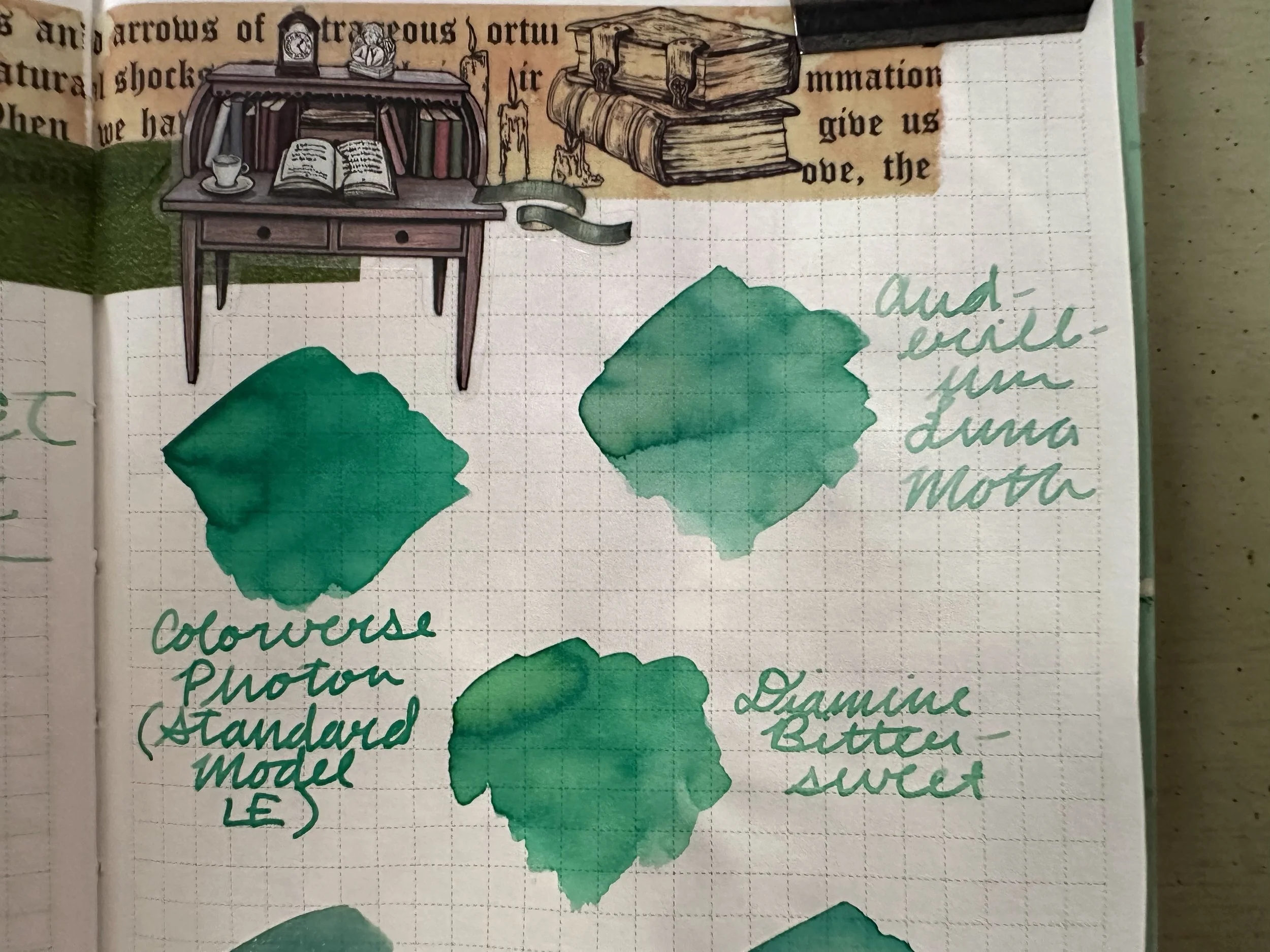
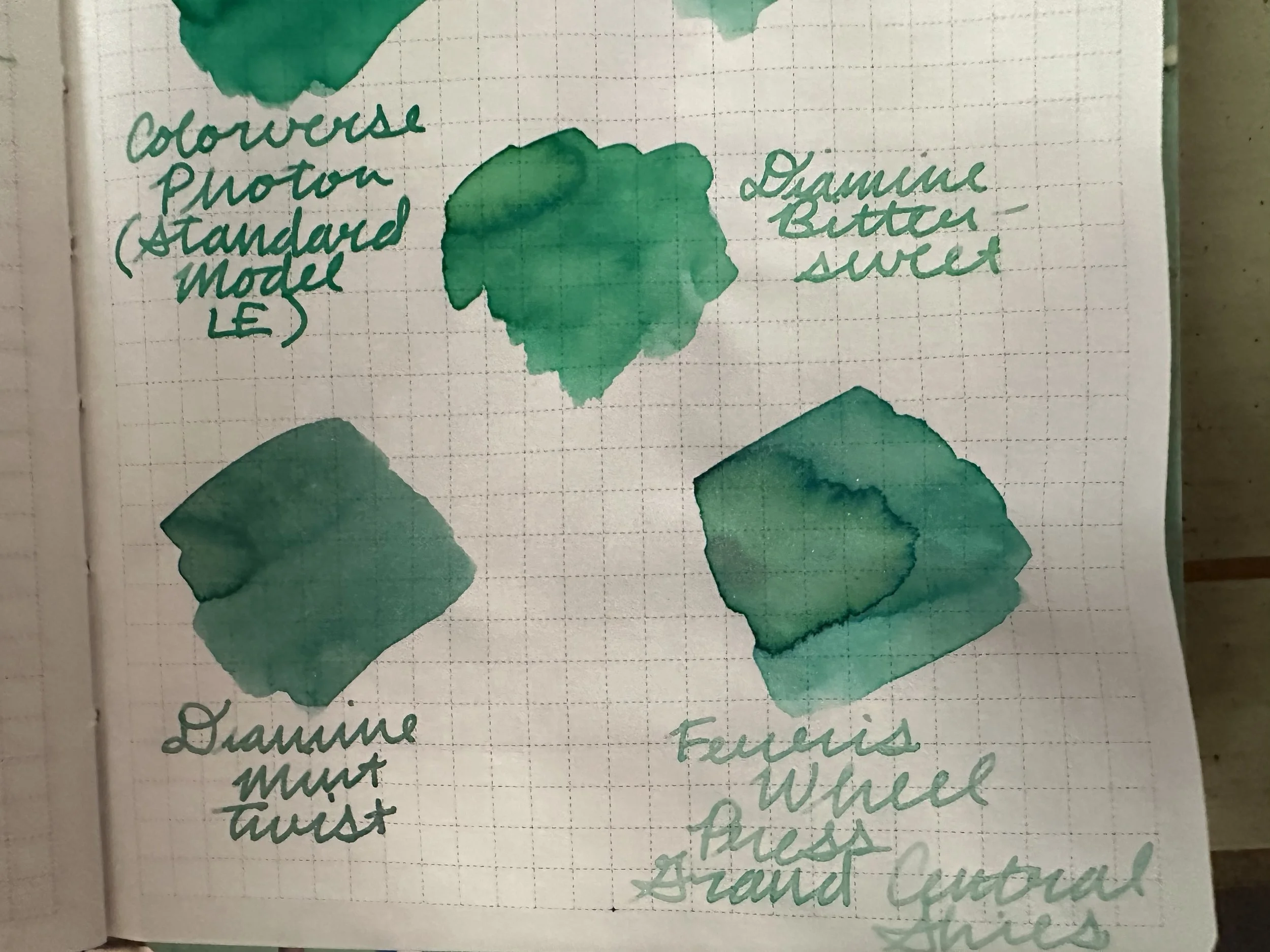
Colorverse Photon (Standard Model LE version) is several shades darker and much bolder.
Diamine Mint Twist has a cooler undertone along with green shimmer.
Ferris Wheel Press Grand Central Skies is a little lighter and has silver shimmer.
Anderillium Luna Moth is the ink I will always judge other light greens against. Luna Moth is much softer than Bittersweet, but still in the same family.
Overall
I don’t think this is an ink I’m going to keep in my collection. Looking at it against these other mint greens makes me want to write with the other ones much more (especially Anderillium Luna Moth and Diamine Mint Twist).