
Enjoy Collection 2025 Q4/Wrap-Up
You can find the other posts here: Q1, Q2, Q3.
Buckle up, this one is a long one!
At the end of 2024, I had set out the following goals for 2025:
Continue using inks off the “dusty ink” list so that I have made active use of at least 80% of the collection since 2021.
Make an inventory of the types of paper and notebooks I have in the collection.
Focus on using what I have and sharing my experiences with them.
How did I do?
Ultimately, the only goal I kept up with was making use of my collection. I have tried to put into words my feelings about the year so many times that I was beginning to wonder if I was ever going to get around to this wrap-up. It’s not news to anyone that the world is scary right now, and similar to what RB said in their end of year post, I wanted to focus on what brought me joy. That was getting my fingers inky and revisiting a lot of old favorites and finding some new ones. Somewhere in the middle of the year my tracking got a little wonky and I’m reconsidering how I want to keep tracking in 2026. I really like being able to look back at inks and stats, but I might change the form a little bit.
I also spent a lot of focus on being present and building a fountain pen community more locally to me, which has been really exciting. I also pen-abled two former colleagues, so I’m calling that an unexpected win of the year. Despite not being as dedicated to my original plan, I still came out of the year with some interesting observations.
Q4 Inks (Key: ^dusty ink, +added in 2025, -sample)
Red (3) - Anderillium Piranha Red, Colorverse Martian Dust+, FWP x LOTR Shadows of Mordor+
Pink (1) - Diamine Wilted Rose
Orange (1) - FWP Pumpkin Patch x2,
Yellow (2) - Colorverse Apollon+, Diamine Candlelight
Green (5) - Diamine Alpine^, FWP Catnip Cafe+, FWP x LOTR Verdant Voyage+, Sailor Ink Studio 280, Teranishi Gentle Green+
Blue (11) - Colorverse Windy City Blue+, Colorverse Brinicles^, Colorverse NGC 1850, Colorverse Erebus Crater+, Colorverse Sky-tinted Water, Coloverse Strelka x2, FWP The Sad Charade, FWP Starlit Stories+, FWP Skies of Uproar+, FWP Astral Blue Odyssey+ x3, FWP Mechanics of the Stars+
Purple (4) - Colorverse Milky Lavender, FWP Phantom Mist+, FWP Madame Mulberry x2, FWP Purple Jade Rabbit
Brown (3) - Colorverse Office Brown-, Diamine Dusted Truffle, Robert Oster x Vanness Charred Hickory-
Black/Gray (4) - FWP Highland Smoke+, FWP Embers of Time+, FWP x LOTR Dawning Silver+, FWP Leadcast Letters
Total inks: 34
Overall Inky Collection Stats for 2025
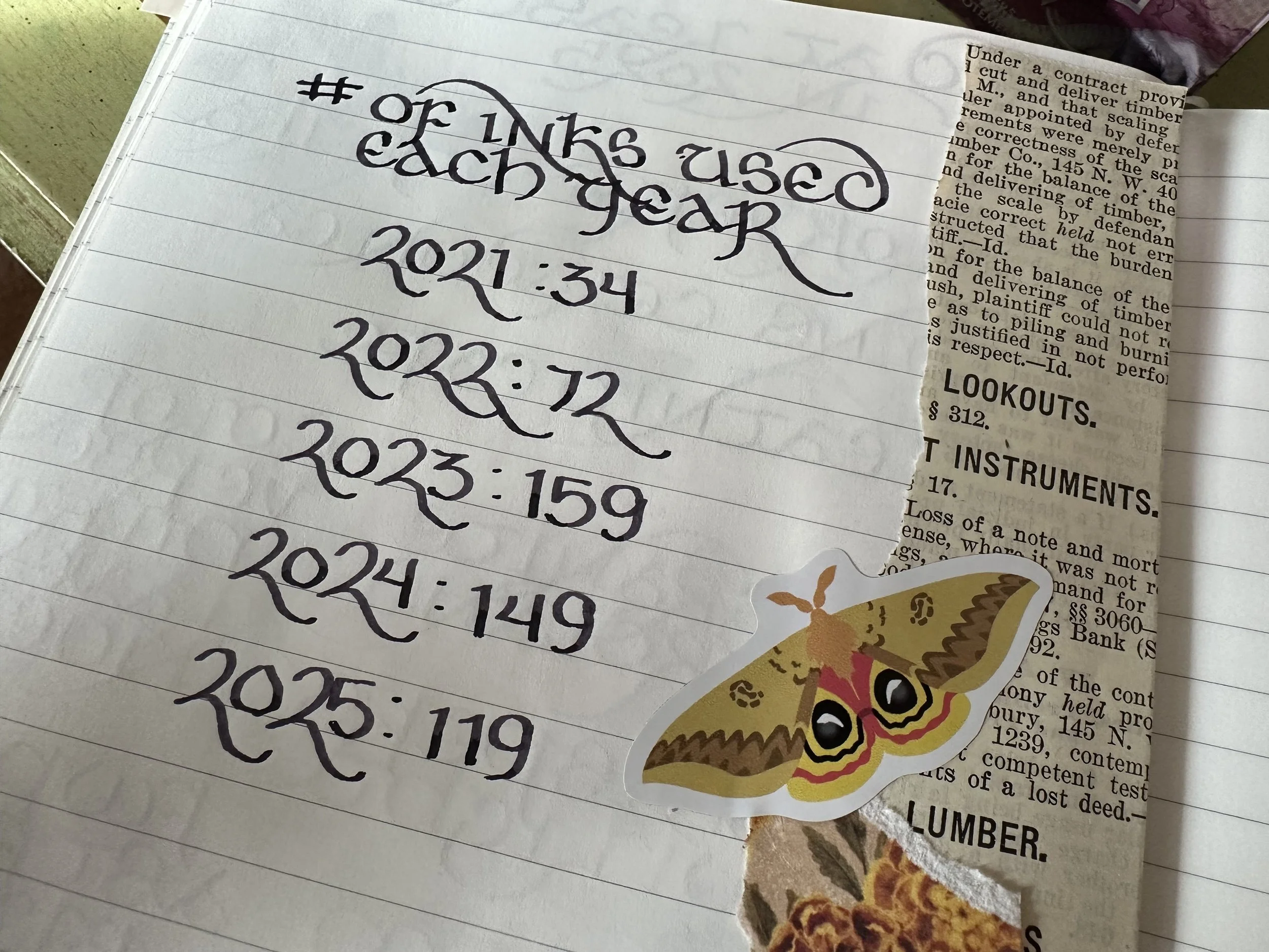
119 different inks were utilized, which is 30 less than 2024. I think a big driver of this change was the ease of refilling my liliput pens thanks to the Kaweco foldable mini converter. I often refilled 2 or more times on inks that I really liked. When I first bought them I wasn’t sure how well the little hinge mechanism would hold up to a lot of use. I want to say I got them in April, so about 10 months later and they are still just as good as the day I got them. I probably used the same overall volume of ink, just more of the same colors as opposed to different ones. It’s easy to see how my collection has grown over the years with how many different colors of inks I’ve used - 34 in 2021, 72 in 2022, 159 in 2023, and 149 in 2024.
2025 Top 3 Ink Color Categories
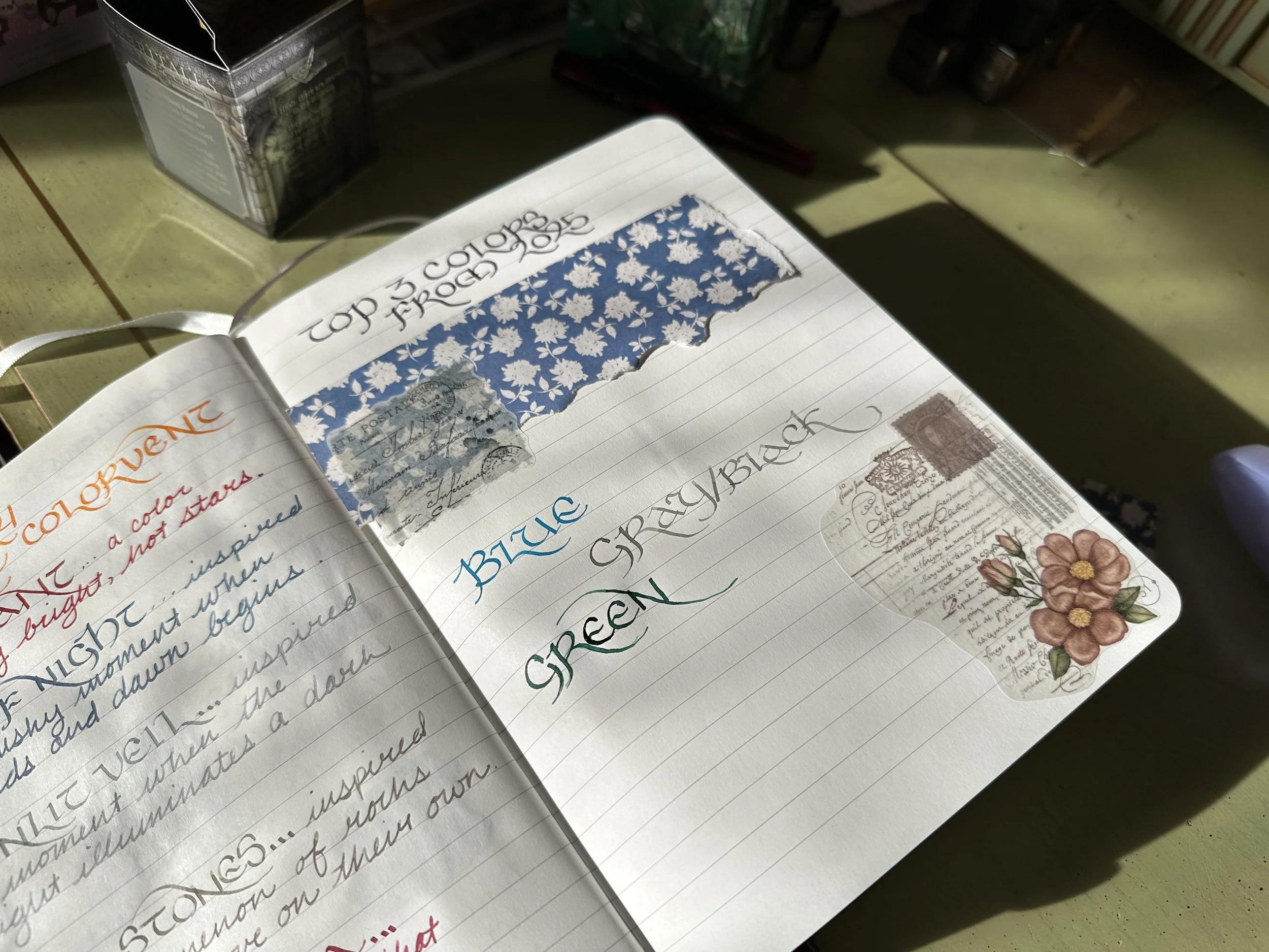
I used Colorverse Strelka, Diamine Tundra, and FWP Catnip Cafe to represent the categories.
Blue - No surprises here. Blue makes up the majority of my collection and it is easily my favorite color to write with. When I’m not feeling something wild, a blue is often in all of my pens. I love the diversity of blue inks for fountain pens and that there are still new ones to discover every year.
Black/Gray - Apparently standard ink colors were my jam this year. I put black and gray in the same category since there is sometimes a very fine line between the two colors. That being said, I was leaning more toward gray than black. I love how well the different tones available can compliment my more wild choices of ink colors.
Green - I should have seen this one coming, but I was expecting purple or brown to hold the third spot. Green has been creeping up on me slowly the last two years and apparently has now won a place in regular use. Early on in the hobby I just didn’t like green inks, I thought they were too loud or simply clashed with other inks I wanted to use. The expansion of the green spectrum in the ink world has definitely made it more appealing. I am very fond of olive greens and greens with yellow or brown undertones. Still not quite in love with the cooler tones of green.
Inks Used 3x or More in 2025
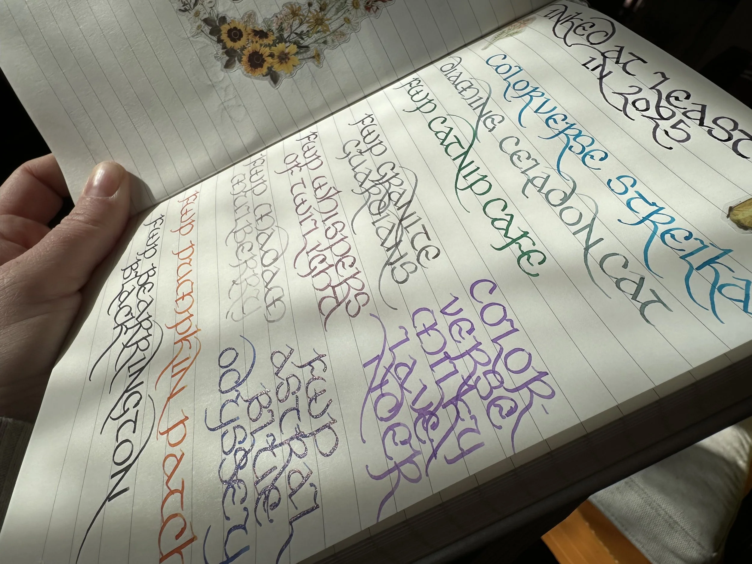
I got myself a few new Sailor Hocoro nibs for Christmas and wrote these with the 1.0 italic nib. I could not find my bottle of CV Black Hole, so unfortunately it’s not in the pic, but it was in this category.
Colorverse Black Hole - This is such an underrated ink. It’s essentially a very dark purple with a black sheen. Like a lot of other Colorverse blacks it has a depth which can’t be said of all black inks.
Colorverse Strelka - An ink I revisit at least once a year and usually multiple times. It’s a sky blue and was one of my first big bottles of Colorverse ink in its set with CV JFK’s Dog Pushinka (a soft brown). It’s just such a solid and unfussy light blue. It’s insanely easy to say yes to multiple fills of this one.
Colorverse Milky Lavender - Similar to Strelka, this ink gets some love at least once a year and usually multiple times. This ink just makes me happy when I’m using it and makes me go “what ink is that?” when I see it in a journal. It’s super unique so I should probably know it on sight, but sometimes I forget how good of a purple this one is. Definitely a top purple ink for me.
Diamine Celadon Cat - This is such an interesting blue shader. I have a soft spot for blues in this color range, especially ones that have a little hint of chromashading.
FWP Astral Blue Odyssey - The most recent acquisition in this list, and I can guarantee there was some recency bias with choosing this one for so many fills. I wrote a review on it a few weeks ago, and it really was just hitting the spot. I wonder how I’ll feel about it once it’s aged in the collection a bit. A royal blue with a hint of sheen and pink shimmer. I actually bought this one myself, it wasn’t part of an affiliate package.
FWP Catnip Cafe - On its face, this is an ink that should have been a miss for me as a cooler toned green, but it ended up being love at first sight. It was a delightful ink to use with just a little bit of sheen on some papers. It ended up being a workhorse in my FWP Roundabout rollerball in Little Miss Jubilee in the fall.
FWP Granite Guardians - This ink had the almost opposite start to Catnip Cafe and Astral Blue Odyssey. On paper I thought I was going to like it, as a gray with pink shimmer. When I inked it up in the pen it was sent with, meh. Honestly, the Carousel Granite Guardian was the worst Carousel I’ve ever written with. Usually, they write just fine out of the box, but this nib was just dry and scratchy. I ended up having to do some tine realignment and smoothing to get it anywhere. I later decided to give this ink another go in a wider nib and that was what it needed to shine. It ended up being a very interesting ink to work with on the page.
FWP Whispers of Twilight - This ink might be at the top of my favorite new inks of the year. A dreamy pink-purple with silver shimmer just has a magic feel to it. In a broad or double-broad nib it’s so lovely.
FWP Bearington Black - This was the black I reached for the most this year and I think it had a lot to do with the fact that I just really like the way the box looks sitting on my desk. The artwork of the bears working in the old fashioned letterpress shop is just so cute. As an ink it’s a solid simple black with a little bit of gray shading with larger nibs. It’s part of the Printing Press Collection that I reviewed at the end of 2024.
FWP Pumpkin Patch - This ink had the top spot for most refills this year. It may have supplanted Diamine Pumpkin for my favorite orange. This one is less bright than the other and has some great shading properties. I actually have it in my currently inked for the start of 2026 in one of my FWP Roundabout rollerballs. This was one of my early FWP inks back when they did the “ink chargers” that were cute but super impractical and I snagged a full bottle this year when they were doing a clearance sale.
FWP Madame Mulberry - The first full bottle of FWP ink that I ever bought (thanks Wet Paint in St. Paul during my first ever Pelikan Hub in 2022, I think). I would describe it best as a purple-gray, it’s soft and elegant.
Fun little observation I just made as I typed these out… I love shimmer inks, but there are only two in the most inked list.
Most Used Ink Brand for 2025
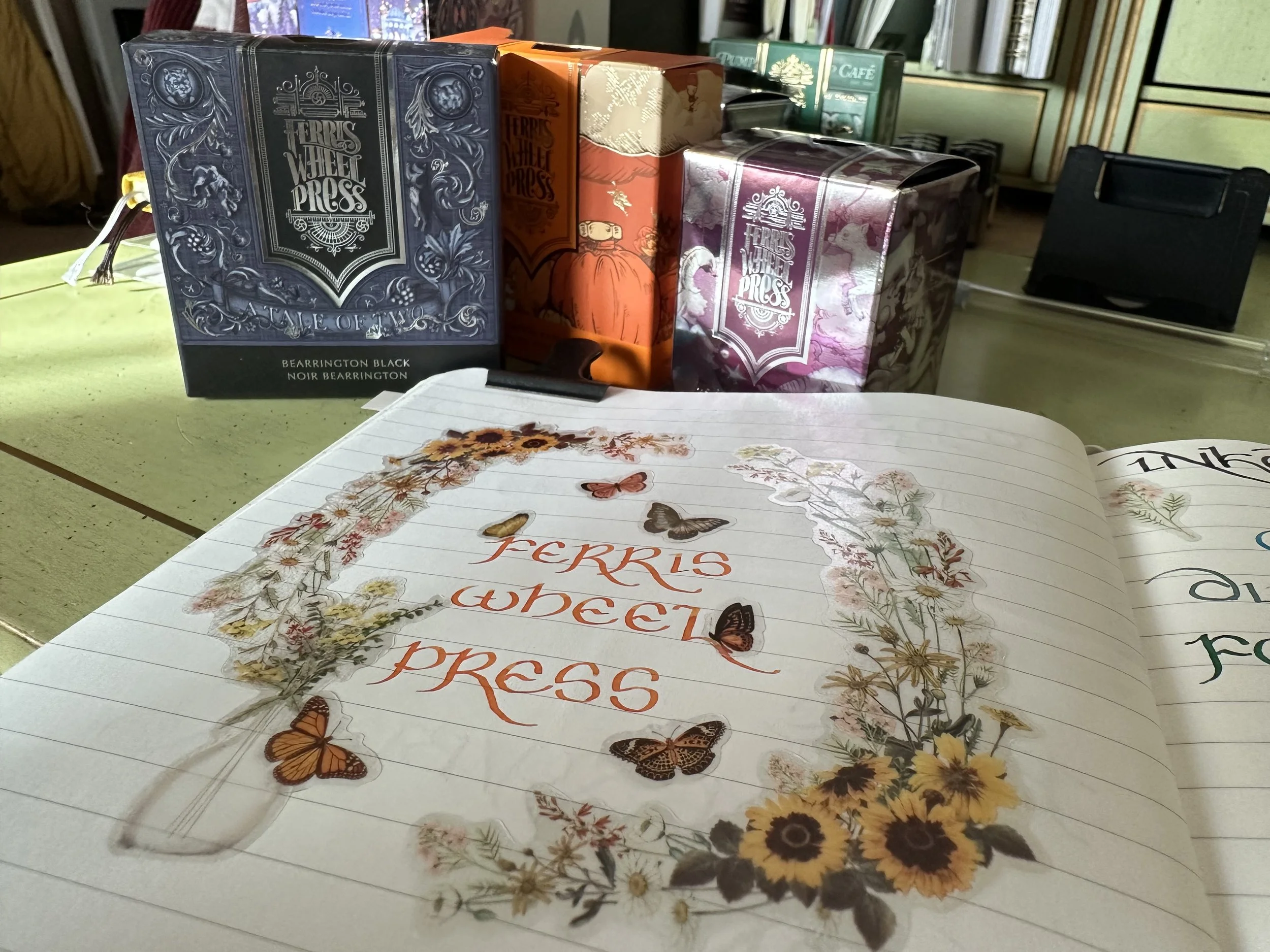
The notebook I have used for these pages is a lined Odyssey Notebooks with 68 GSM original Tomoe River paper. The ink on this page is FWP Pumpkin Patch, definitely one of my top inks from them.
Ferris Wheel Press dominated my use this year. I think there are a few reasons for this, one being that I am in their affiliate program and another is that some of their inks I absolutely adore. While they have definitely made some missteps as a company, I do really appreciate their vibe of whimsy and the magical world that they bring to the storytelling of their company. When I think about my favorite inks they often have a story going along with the color. Colorverse is a close second this year, another brand with really strong storytelling and great ink. If I put them in a bottle comparison contest, Colorverse is easier to fill from, but Ferris Wheel Press is certainly more eye-catching.
Concluding Thoughts
I’ve been working on processing what I think this year represents in my collecting and my participation in the hobby. I do like trying new inks, but I haven’t really expanded on the pen front. I’m currently in a spot where I can admire a lot of pens, but whether I want to add them to my collection is often the question. Paper is definitely where a lot of my exploration is at right now and I hope to find some more interesting papers in 2026. It’s the core trio of the stationery hobby - pen, ink, and paper. And I am definitely in a place where I feel pretty good. With all of the costs going up I have a feeling I will continue to be focused on stationery items that are under $100, which does exclude quite a lot of pens at this point. Overall, 2025 was a fun year for inky explorations and I look forward to more in 2026.
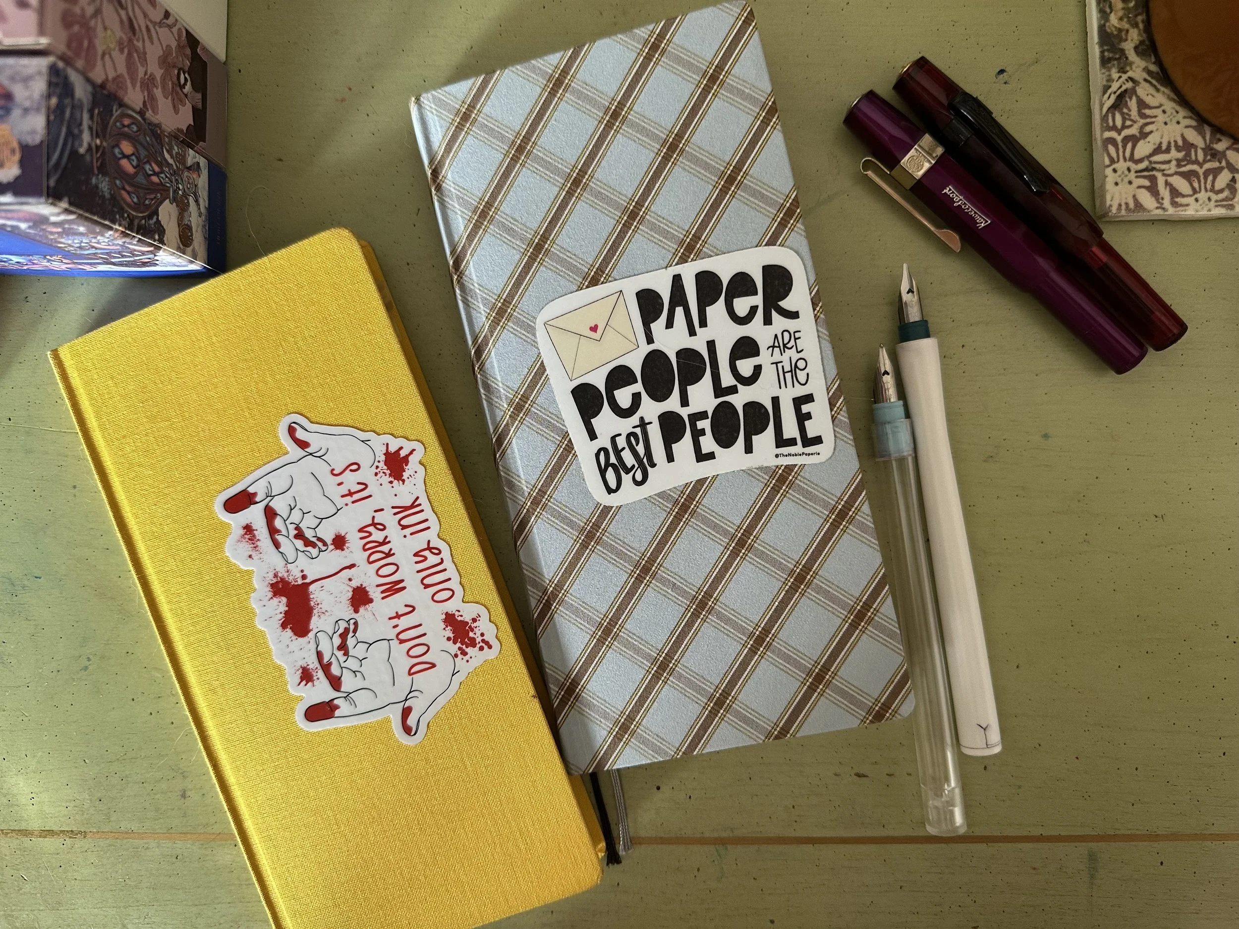
The yellow Hobonichi weeks is being retired after two-ish years of use as an ink passport. I am moving over to this plaid one. I have made sections by color in the new one which will hopefully make it easier for me to track which colors I use the most and also figure out what inks I’ve actually used (because I will admit I forgot to swatch quite often this year).
Currently Inked
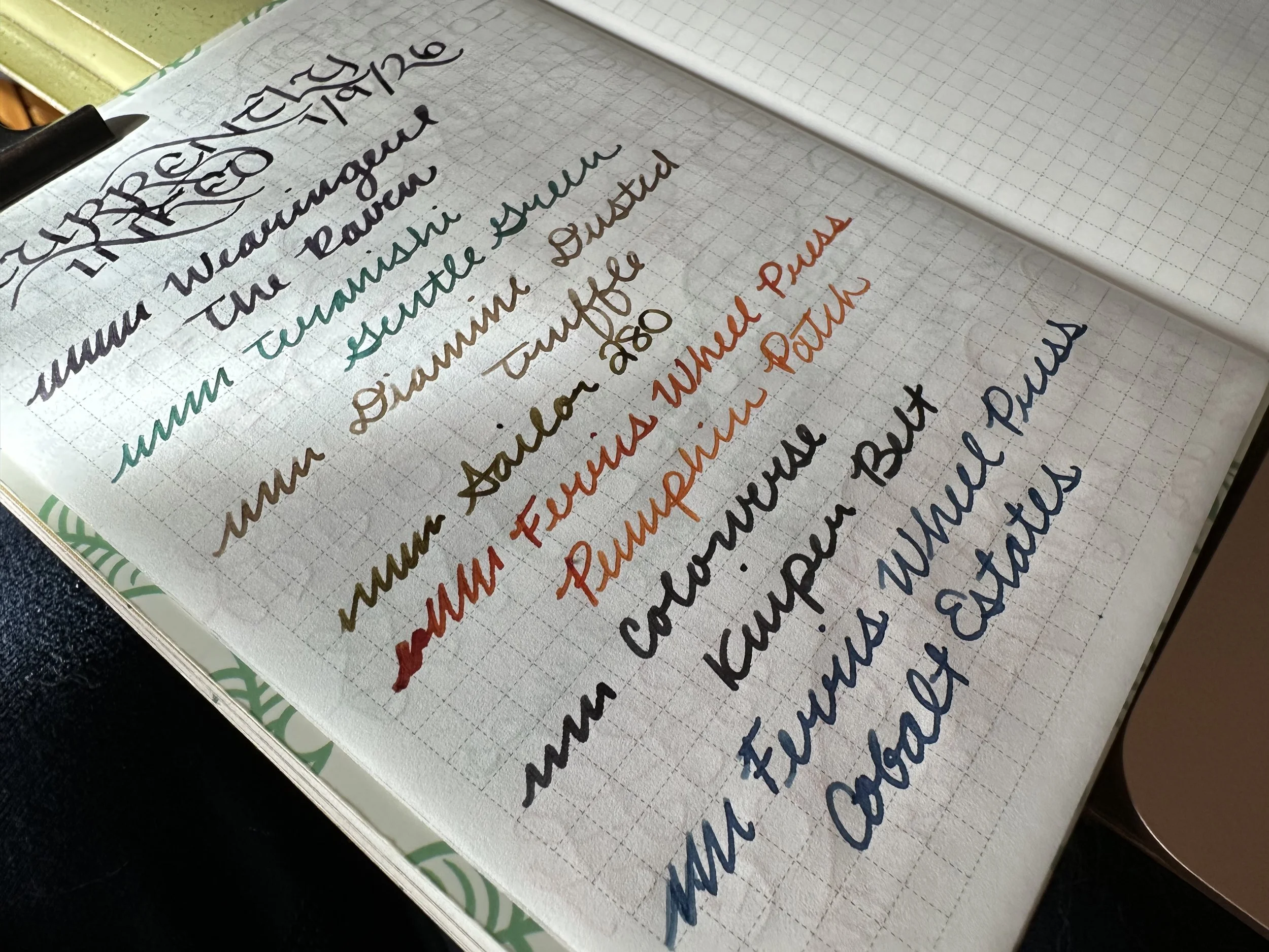
Wearingeul The Raven - Kaweco x Galen Leather Sport Carmine 14K BB ‘journaler’ - It was no question whether I was going to get an ink named this, although I did hesitate because it is very similar to Wearingeul x Endless Pens The Black Cat. Conveniently, Wearingeul includes the RGB code for their ink colors, so while they aren’t the same they do appear very close. If you missed the LE ink from Endless Pens, The Raven is a great alternative. I’m really enjoying this dark purple shimmer ink.
Teranishi Gentle Green - Kaweco Sport Burgundy M - I inked this one up for one of my workshops back in December and decided to ink it again. This ink is such an interesting color, it almost looks blue going onto the page but dries to a red sheening green. Very cool ink. I think I will have to play more with the Teranishi inks that I have samples of this year.
Diamine Dusted Truffle - Kaweco Sport LE Metallic Purple B - I had a bit of this ink left over in my header pen from December and decided to finish it off. Dusted Truffle is such a nice soft brown with the silver shimmer. It feels very lovely on cold snowy days.
Sailor 280 - Esterbrook JR Purple Paradise B - Another pen I had inked up for a workshop and I’m still working through the fill. This ink is such a cool chromashader with the green and brown accents on coated papers. It’s a nice warm compliment to the other inks I’m using at the moment.
Ferris Wheel Press Pumpkin Patch - FWP Roundabout Rollerball Little Miss Jubilee - I have been having an itch to buy gel pens and I know that I won’t use them. When I get into that sort of mood it’s always helpful for me to ink up one of my rollerballs that can take fountain pen ink. I’ve also been in a felt tip pen kind of mood and have picked up some of those Kuretake refillable ones, but a Tom’s Studio might have to be an acquisition in 2026.
Colorverse Kuiper Belt - Kaweco liliput copper B - I ended up doing a refill on this pen after my review last week. This dark, dark blue has offered a counterpoint to some of the lighter ink colors I am starting the year with.
Ferris Wheel Press Cobalt Estates - Kaweco liliput fireblue M - I bought this along with a few other inks this fall and this was the first time I’ve inked it up (and then inked it up again). I really like the tone of this blue. I wasn’t sure it wasn’t going to be the same as many other blues I have or that it would be too close to FWP Bluebell Brushstrokes. It does seem to have a different vibe and I’m really enjoying using this subtle navy blue. I love it when FWP releases non-shimmer inks (even though I love shimmer), they offer a much easier entry point for folks who may not know enough about pen cleaning and maintenance to play with shimmers.