
Halfway Through the Year with a Sterling Ink Common Planner
I think there are two big moments where people change planners. One is in March, you’ve used the planning system enough to know if it works for you, and the planner companies usually have an April start so you can seamlessly pick up the new one. I think the second time is halfway through the year. The book has gained some bulk, it’s been written in, and the novelty of the shiny new book has thoroughly worn off. For me, I am sticking with the planner that I have, and will probably get another one for 2027 (although I’m considering giving Midori MD Diary another go). However, the flexibility of the design of the Sterling Ink Common Planner has had me come back to it for two years, 2024 and 2026.
What is the Sterling Ink Common Planner?
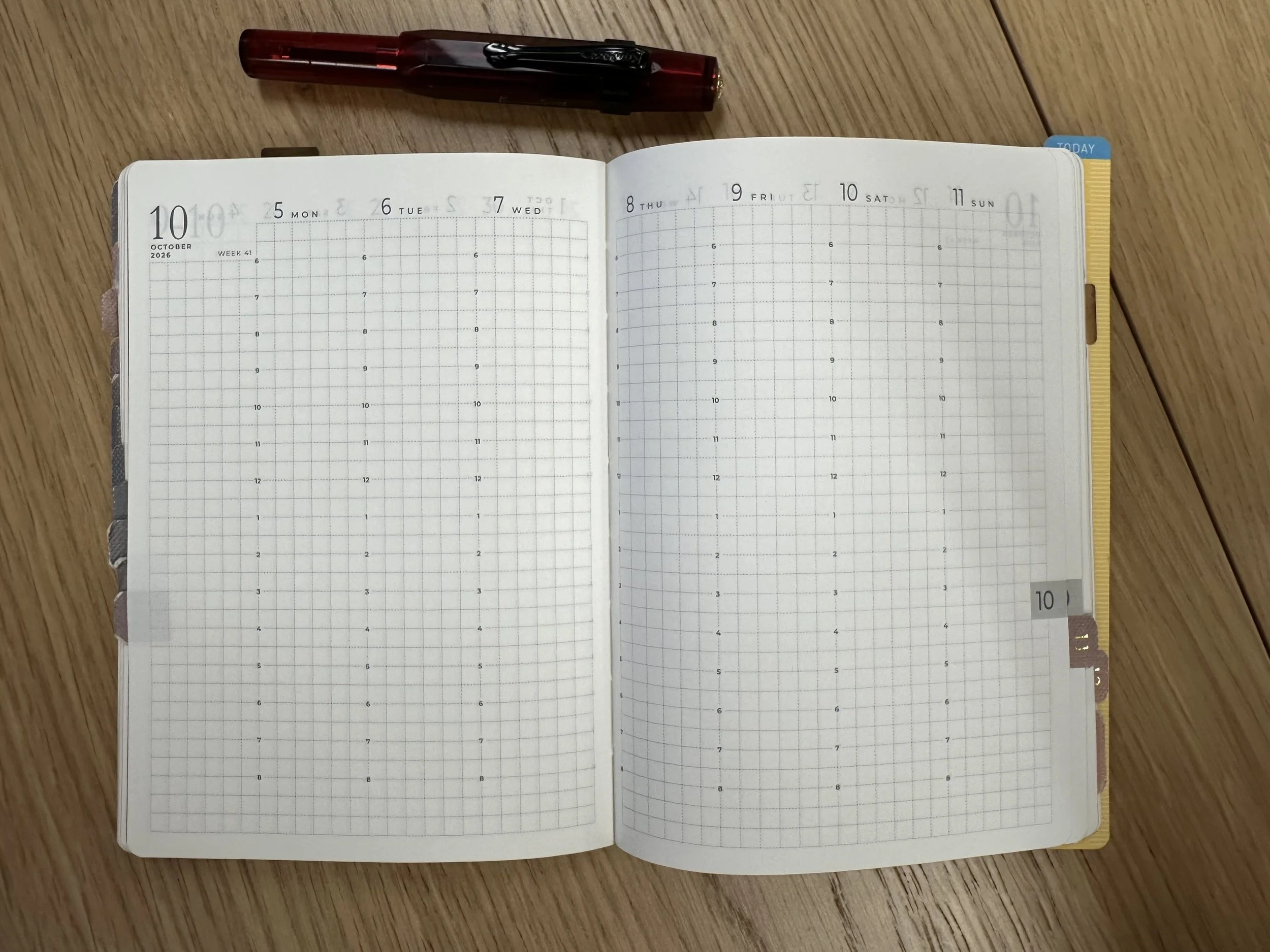
It is a minimalist planner with a few goal pages at the front, monthly spreads all together, and then weekly spreads. The compact version, which is what I have, has a 120 notes pages in the back. The full size one has enough extra pages to use a page a day, similar to a Hobonichi cousin. There are two options for the layout of the weekly pages as well, vertical or horizontal. The horizontal layout reminds me of the Hobonichi Weeks layout (day pages on the left and notes page on the right). They were sold out of that layout when I bought mine, but if I decide to go with another one in 2027 I might try that route.
What I’ve really liked about Sterling Ink and several other companies like them, is that they offer the planner in a variety of sizes. Use an A6, you have the option. Traveler’s Notebook? An old Hobonichi cover for the classic, weeks, or cousin? Those are available. They have planners as tiny as a passport to B5. As I am very attached to my journal cover, I like to use it year after year and it’s nice to be able to just slip a new notebook into it.
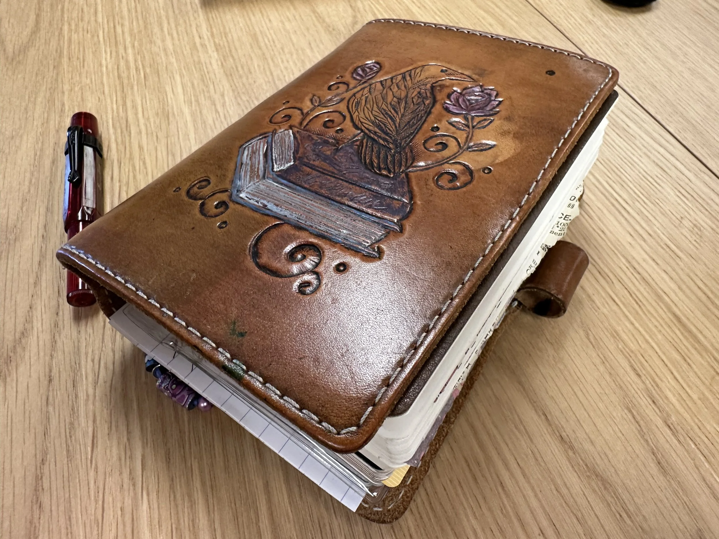
I mean, can you blame me for wanting to keep using this guy?
The printing on the pages is also done in a gray font which lets it stand out, but not be in your face if you need to utilize the page in a different way. It is a bound book with a faux leather cover and tomoe river paper so it holds up well to whatever fountain pen I want to use.
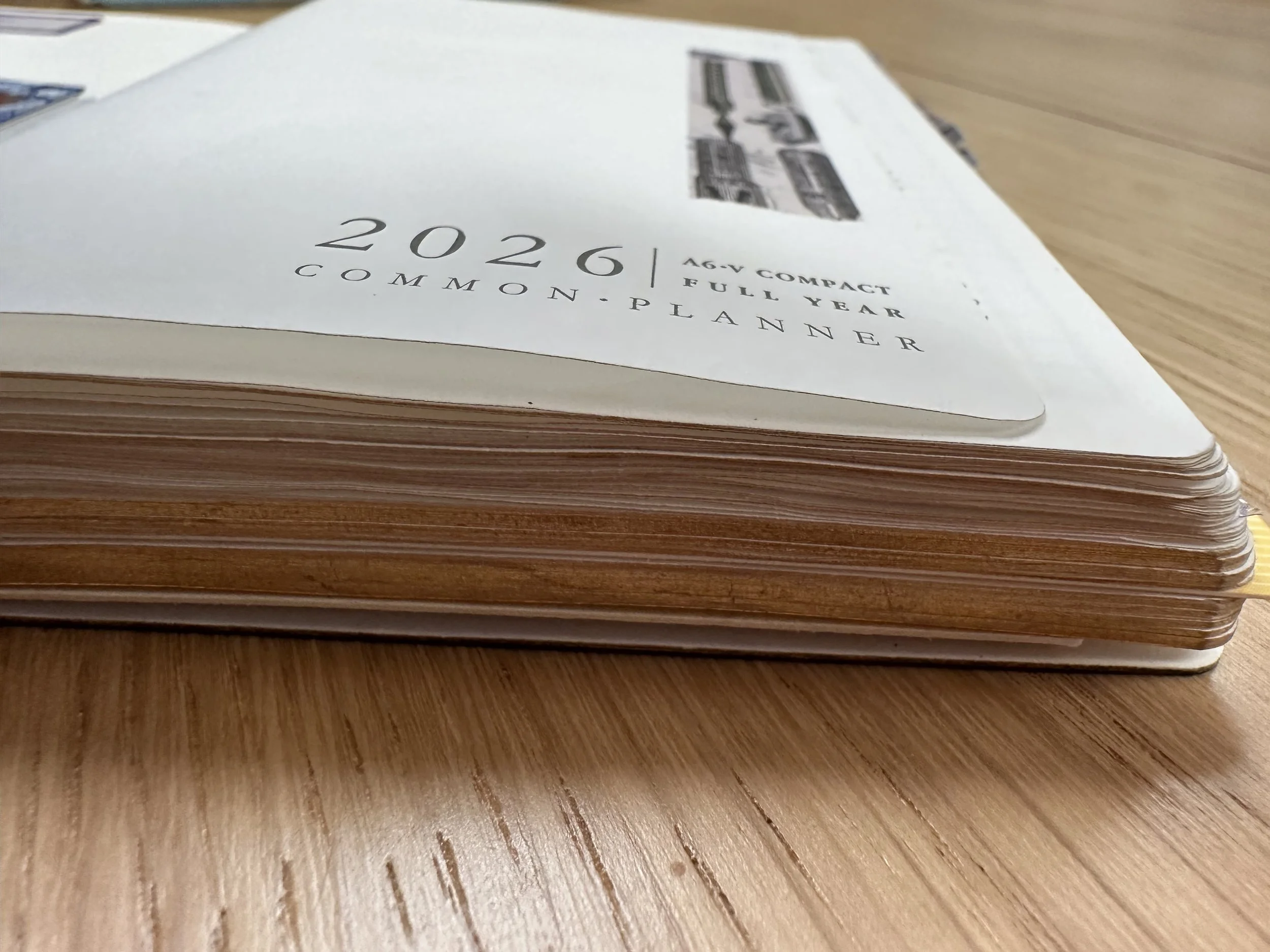
Getting a little chunky, but still a slimmer carry than many other A6 planners.
Does it hold up to a full year?
In my experience with the 2024 edition it holds up great to daily use. The more it gets used the flatter it lays as well, the flexible cover really rolls with getting knocked around. My 2026 edition is getting a workout and it’s still going - it closes easily (cover doesn’t really pop up much) and lays flat.
How do I use it?
My planners get used, especially now that I have been managing a part-time job and starting my own business. I don’t worry about aesthetics. If I bother with washi or stickers at all it is usually to cover up something I don’t actually need to remember or a mistake (writing something on the wrong week for example).
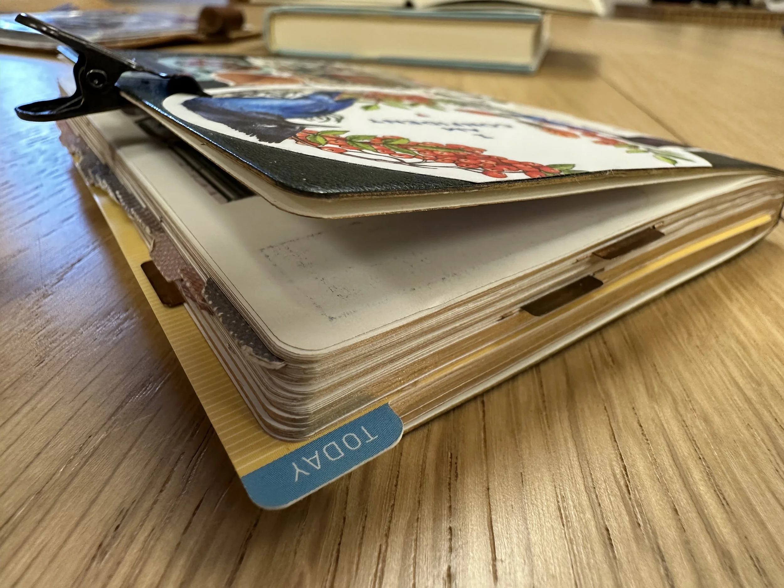
Monthly pages are for the big picture. This is where I put appointments, work hours, deadlines, and other things that I’d like to keep in mind as I’m looking forward in time. In 2025, I was using just the monthly insert from Sterling Ink, I don’t think I could do without a monthly spread at this point. The layout with them all at the front makes it easy to flip back and forth. I use two Midori index clips at the top of my journal to make it easy to flip to the current month and the current week. This year I added a set of monthly tabs from Wonderland222. I’m not utilizing those a ton, but they do help me flip to the weekly pages when I need to write down more details about something in the monthly spread.
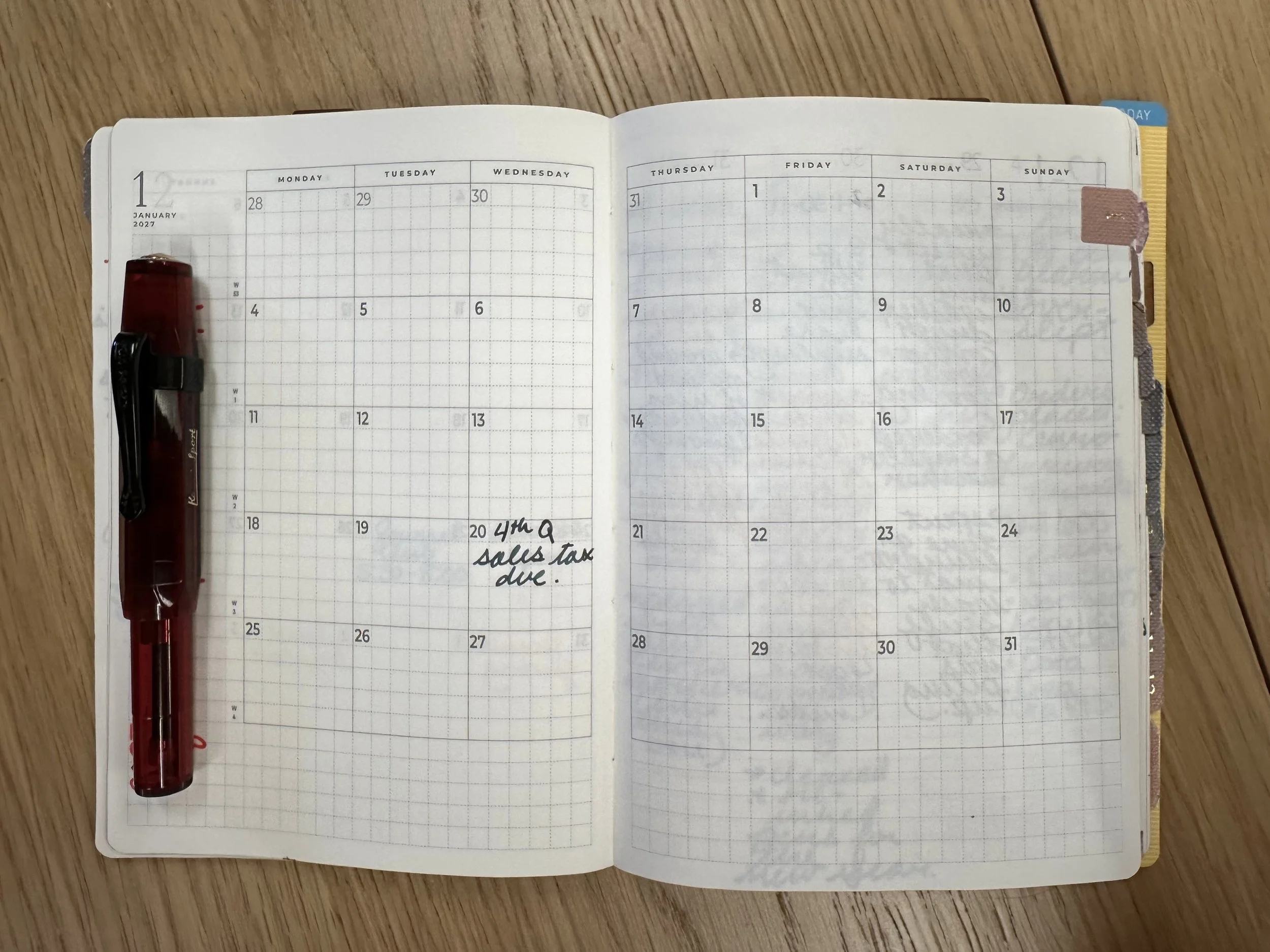
The monthly spreads are for December of the previous year through January of the next. This was te onlclean month I had left in the planner.
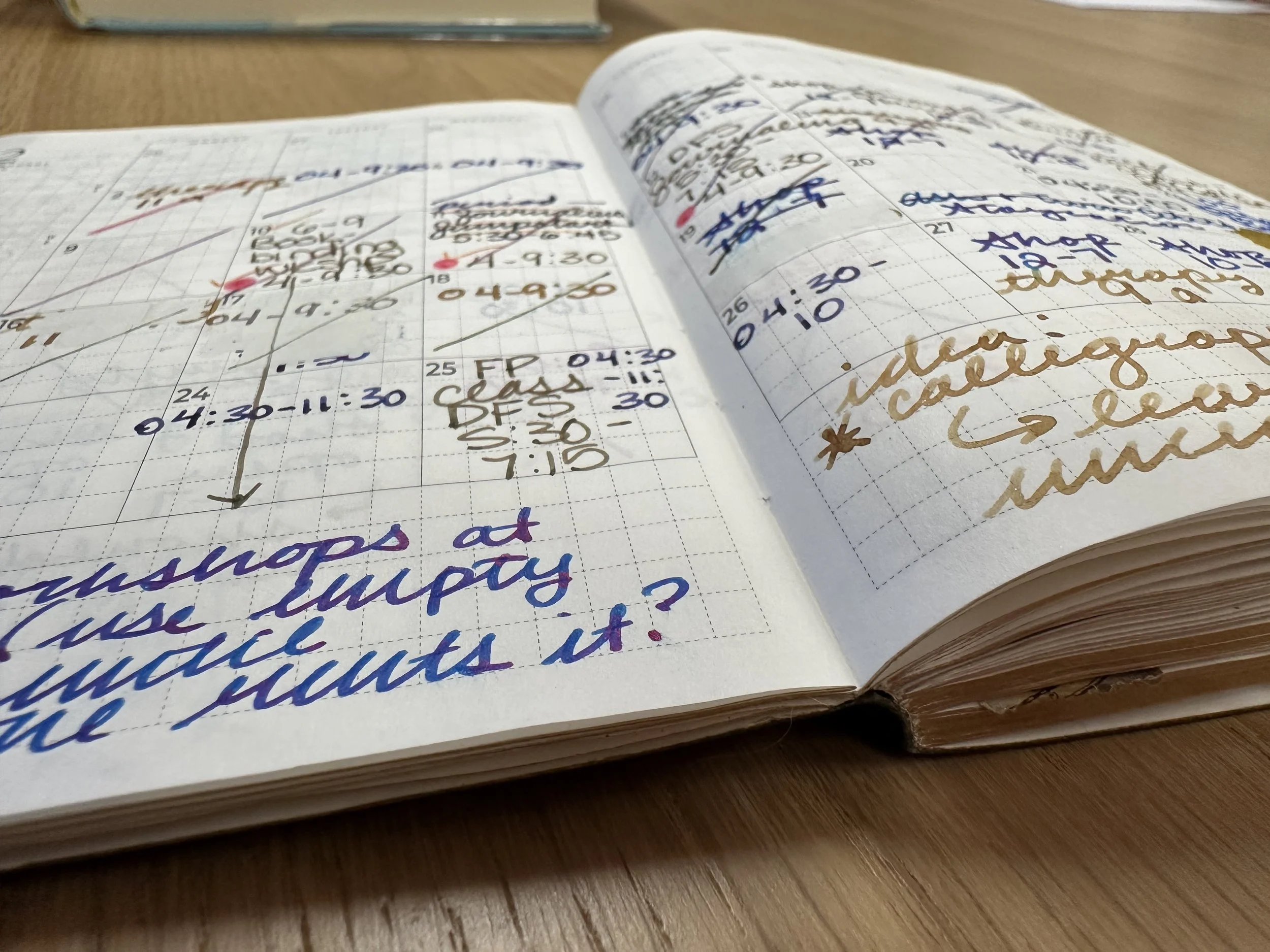
Dramatic angle of a full monthly spread complete with chaos and a few days with white-out. On the left of the calendar and bottom of the pages is space for notes.
Weekly pages are for the detailed notes and for mini thoughts/observations. For example, if I started reading an interesting book, I may make note of that on the date I started. Sometimes I write about my energy levels. It can also be a to-do list. I don’t follow any rules or design principles. One week might be neat and tidy and the next might be pure chaos and covered with sticky notes. It’s a working planner in the truest sense.
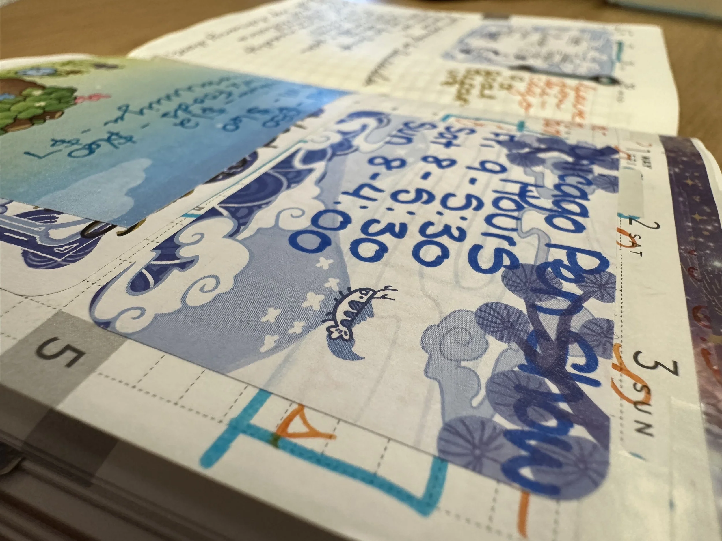
The Chicago Pen Show was a busy week. Sticky notes were required.
Notes pages are usually used for information that needs to stay with me or lists that I use throughout the year. An example of this is my books read list and my ink list. However, sometimes I use it for a quick brainstorm if it’s the only book I have at hand (rare, but it does happen). The notes pages are numbered so I can even leave a note on another page on where to find more information in the back without having to search for it.
Overall, this is a really solid planner and it’s totally worth checking out. As of this writing, many of the planners are on clearance on their site.
Currently Inked
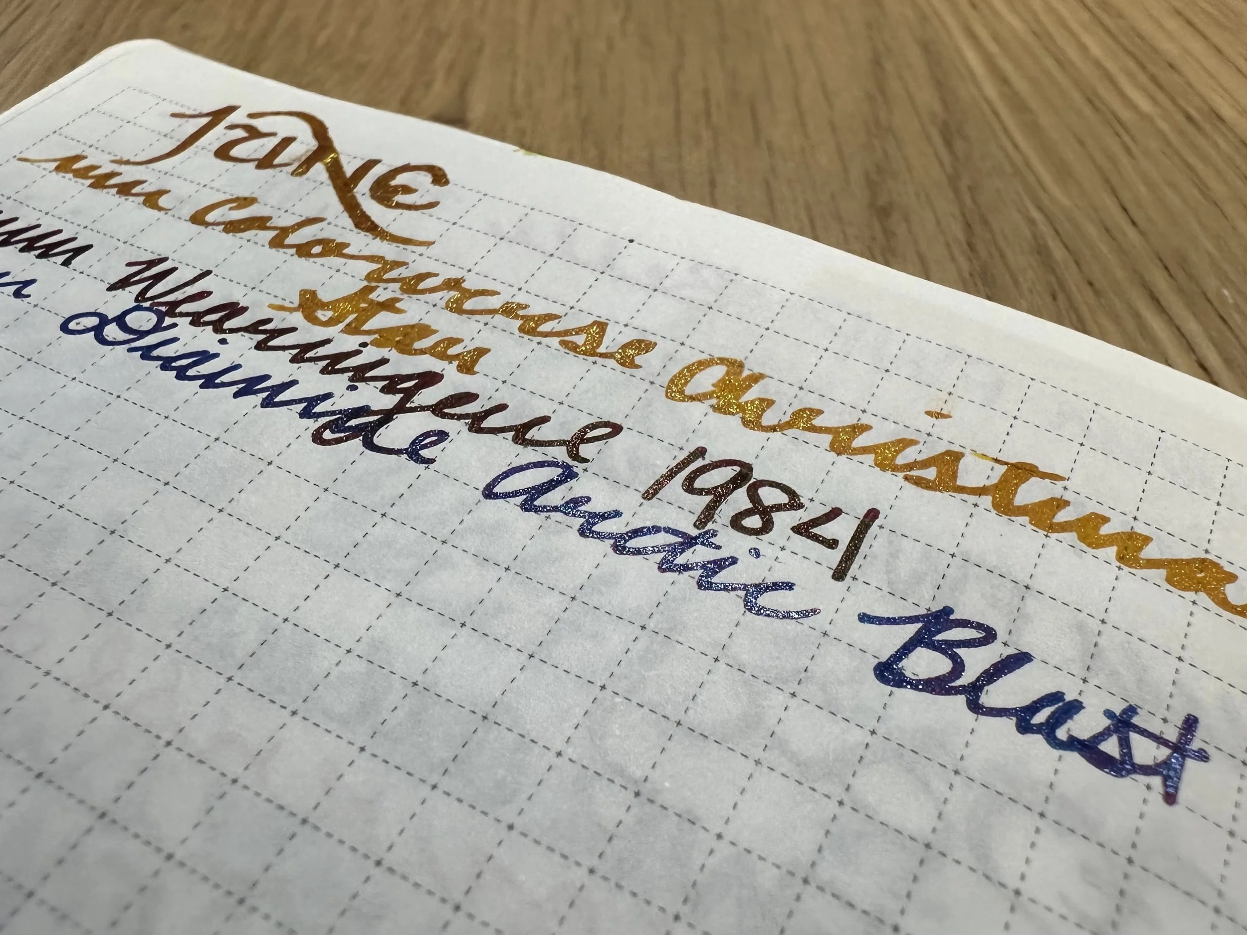
Colorverse Christmas Star - Kaweco x Galen Leather Sport Carmine 14K BB ‘journaler’ - Yes, yes, I know this is a Christmas-themed ink and it’s June… but I was feeling a sparkly yellow and this one is the boldest in my collection. The base color is a warm yellow (true yellow, not golden brown) and has gold shimmer. Definitely the vibe I was going for as things warm up for the year.
Wearingeul 1984 - Kaweco liliput copper M - Although we are living in a scary 1984-ish timeline, I decided to go with this red-black with red shimmer. It’s a vibe I was seeking. I’m actually really enjoying this ink for a doodle project that I’ve been playing around with. It can fade to looking more black on different colors but flashes that red shimmer in the light. Very fun ink.
Diamine Arctic Blast - Kaweco liliput fireblue M - Another winter ink, but it’s perfectly capturing another mood. This is an Inkvent ink that I’m going to have to grab a full bottle of at some point. It’s bright blue, red sheen, and blue shimmer. A very stunning ink.