Ink of the Week: Anderillium Diversey Harbor
The Chicago Pen Show is going to be here before we know it and I’m getting pretty excited. Not only for the return of the pen social and some re-worked workshops, but also that I will be able to have a table and share a taste of my tiny Duluth store. This growing anticipation had me turning toward previous show special edition inks. Anderillium Diversey Harbor was one of the show inks in 2024 (there’s sometimes more than one at the Chicago show as Papier Plume often does one as well).
The Story
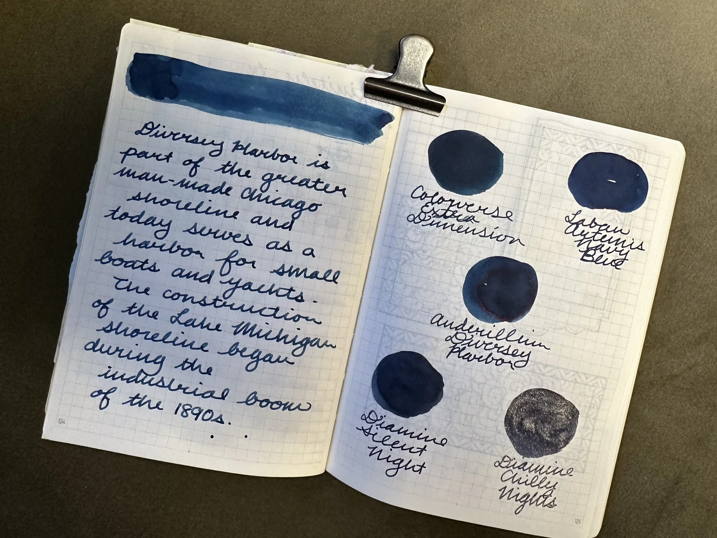
The ink is named after a popular harbor for small boats off Lake Michigan in the Lincoln Park district of Chicago. The harbor is named after Michael Diversey, who was a little difficult to research despite being a prominent 19th century citizen of the Windy City. Diversey moved to the USA from Prussia at the age of twenty in 1830. He founded the Diversey Beer Brewery which later became the Chicago Brewery. Sadly, the brewery was destroyed during the 1871 Great Chicago Fire (which was the theme of the 2023 Anderillium show ink). In addition to being a brewer, Diversey also served as a city alderman in 1844-1845 and then again in 1856 - 1868. Being the history nerd that I am I tried to delve into how the harbor was built (as it is man-made), but there is very little available online about the harbor. All I could really find was that Diversey harbor is part of the major developments in Chicago in the later 19th century as the city became a major hub of commerce on the Great Lakes.
The Ink
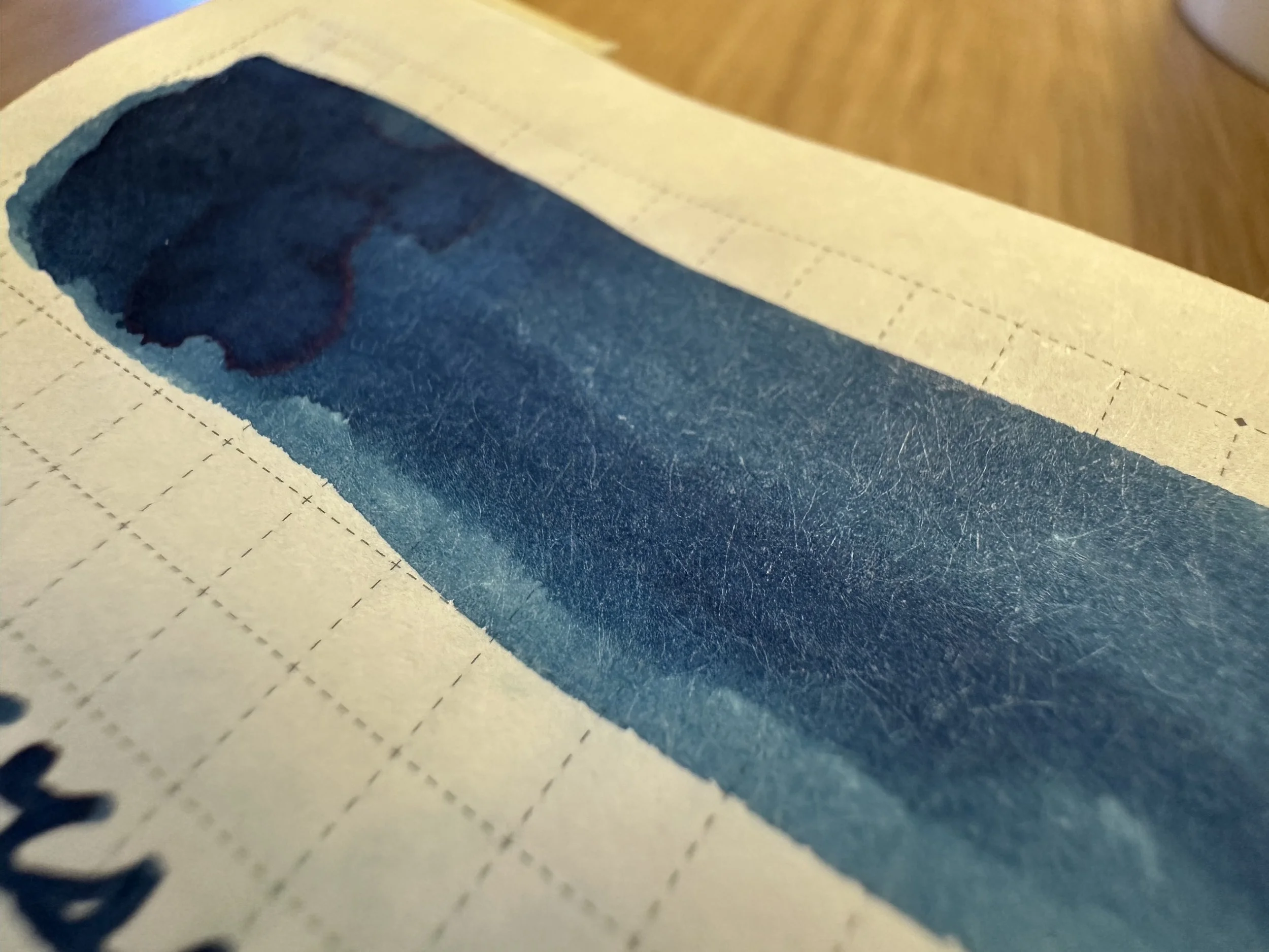
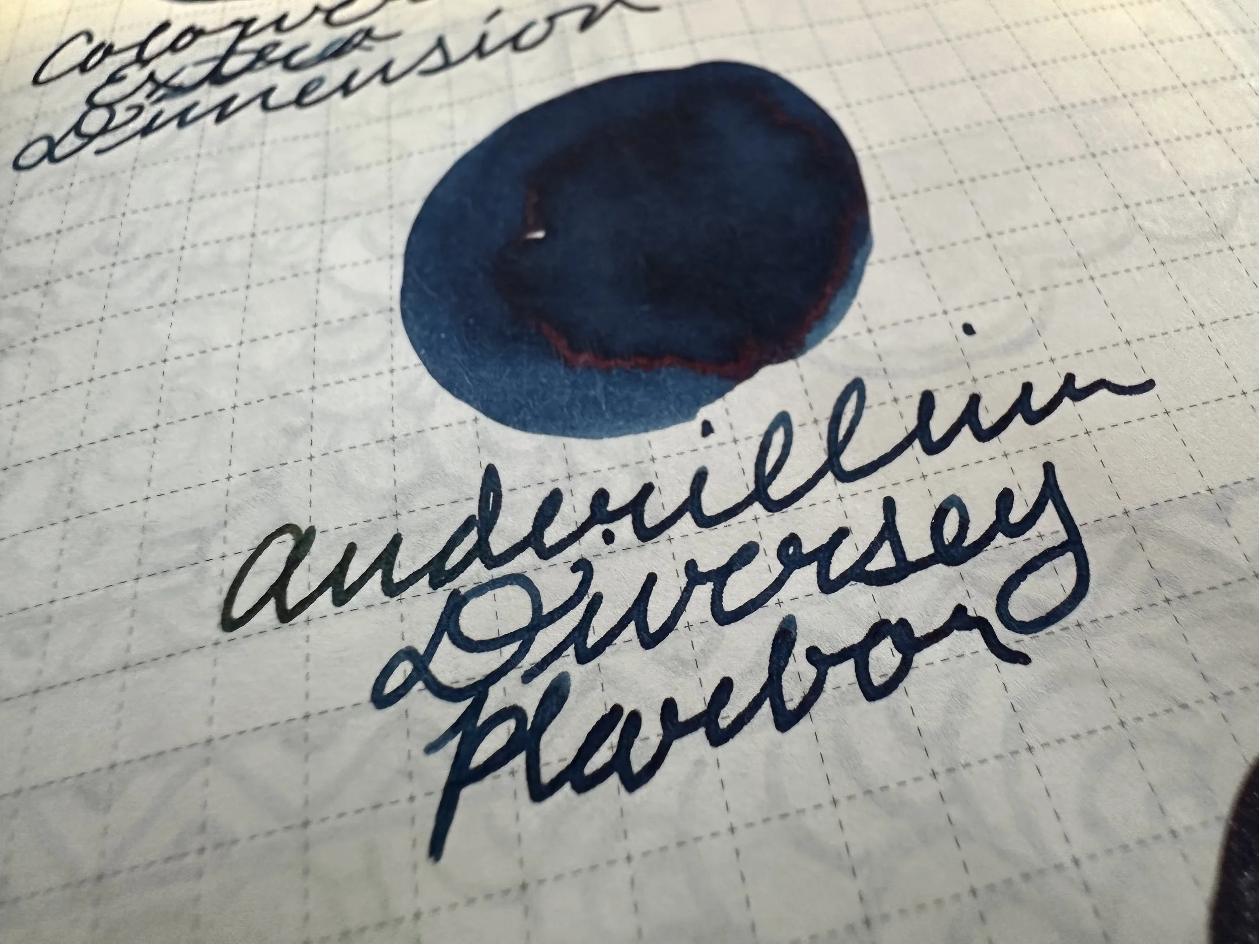
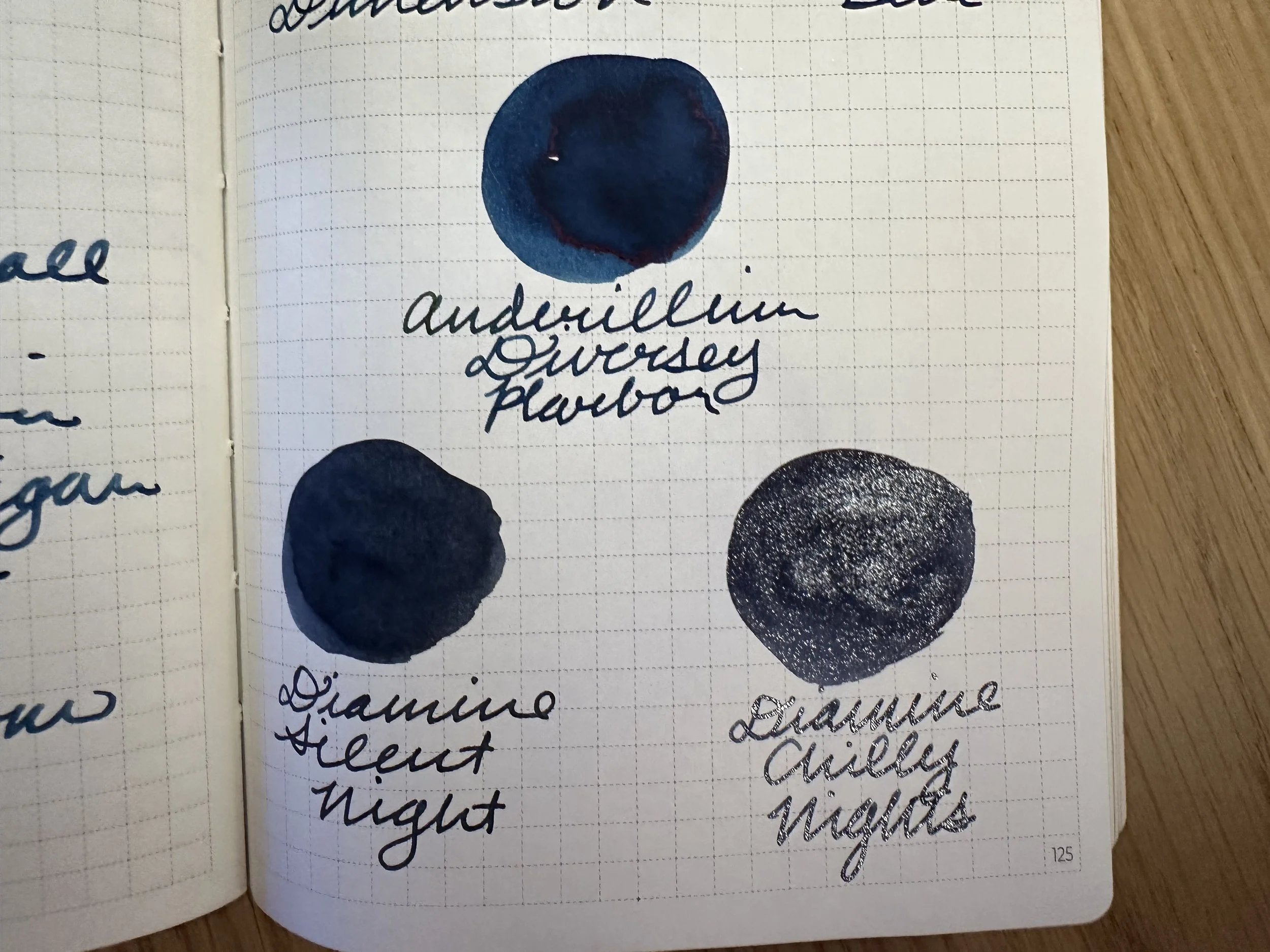
The ink is a navy blue, capturing the deeper spots of Lake Michigan. It has a wet flow and worked well in the two nibs I’d been using. I swapped the BB out of my Kaweco fireblue for a 14K M ‘journaler’ that I haven’t used in a bit. The blue comes out dark on both white and cream papers. It does have a tiny bit of shading which gives it some depth. On coated papers it also offers a little bit of red sheen. This is firmly a navy blue.
Ink Siblings
When trying to find close inks also in my collection I noticed something about the dark blue inks - they either have a brighter undertone or a grayer one. The brighter can make them lean toward purple or green, while the darker almost always creates what I would call a blue-black.
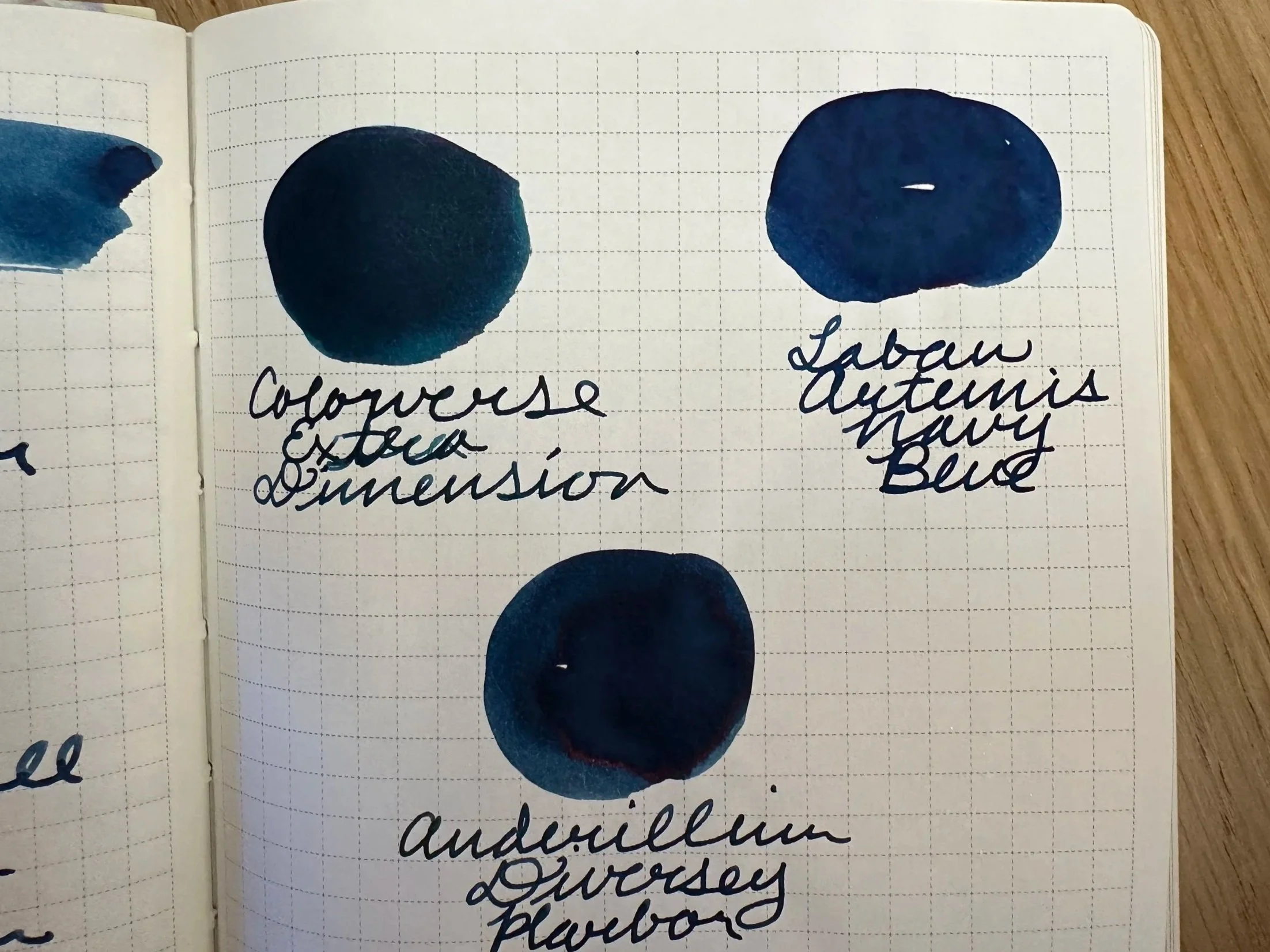
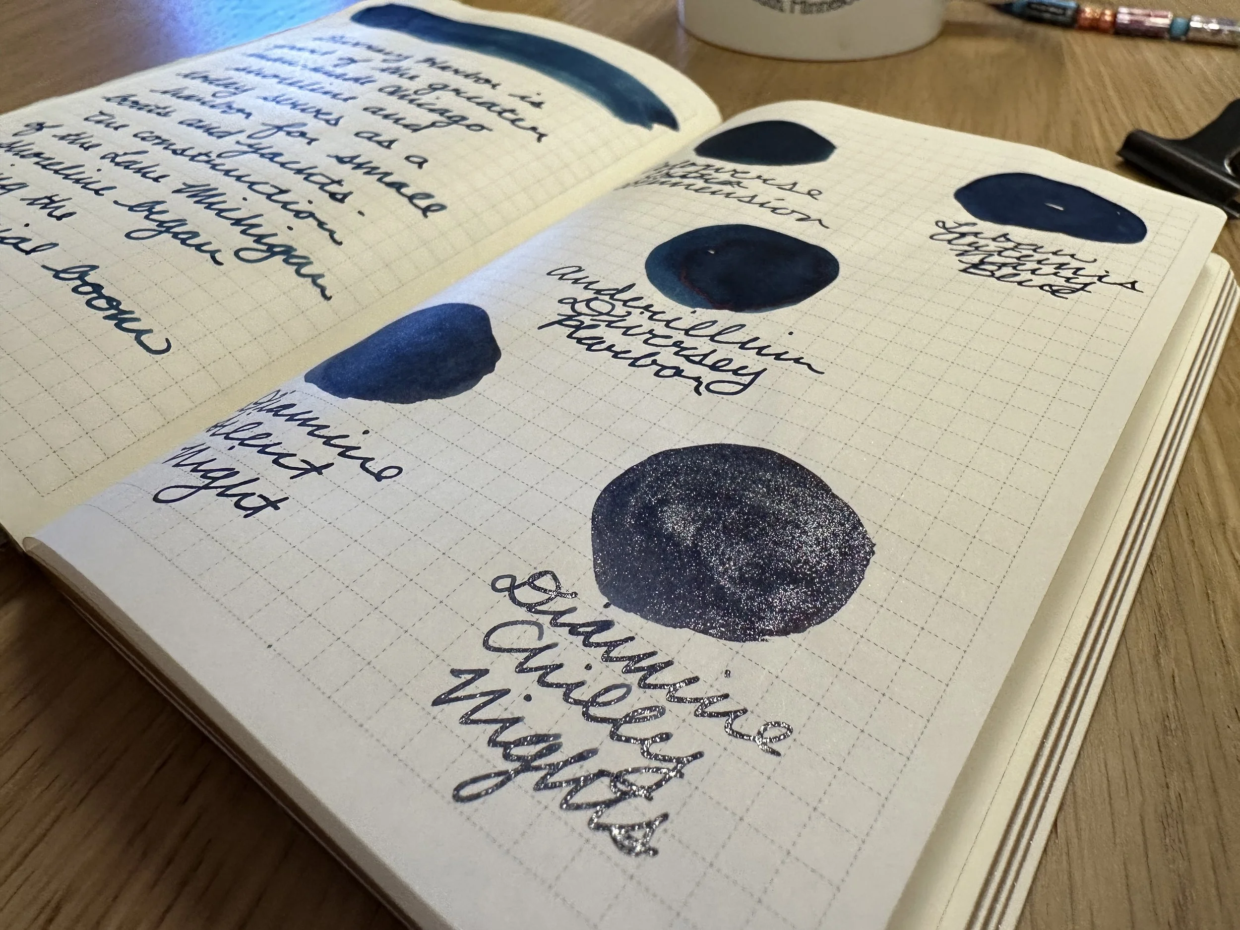
Colorverse Extra Dimension - This ink is the closest in my collection. It leans a little bit more green than Diversey Harbor.
Laban Artemis Navy Blue - Artemis has a brighter base blue and shares the red sheen.
Diamine Silent Night - This ink leans more blue-black with a cooler undertone.
Diamine Chilly Nights - Looking at them side by side, Chilly Nights is probably Silent Night with the “star bright” shimmer added. The silver shimmer definitely makes it pop and makes it look even colder than the base color.
Overall
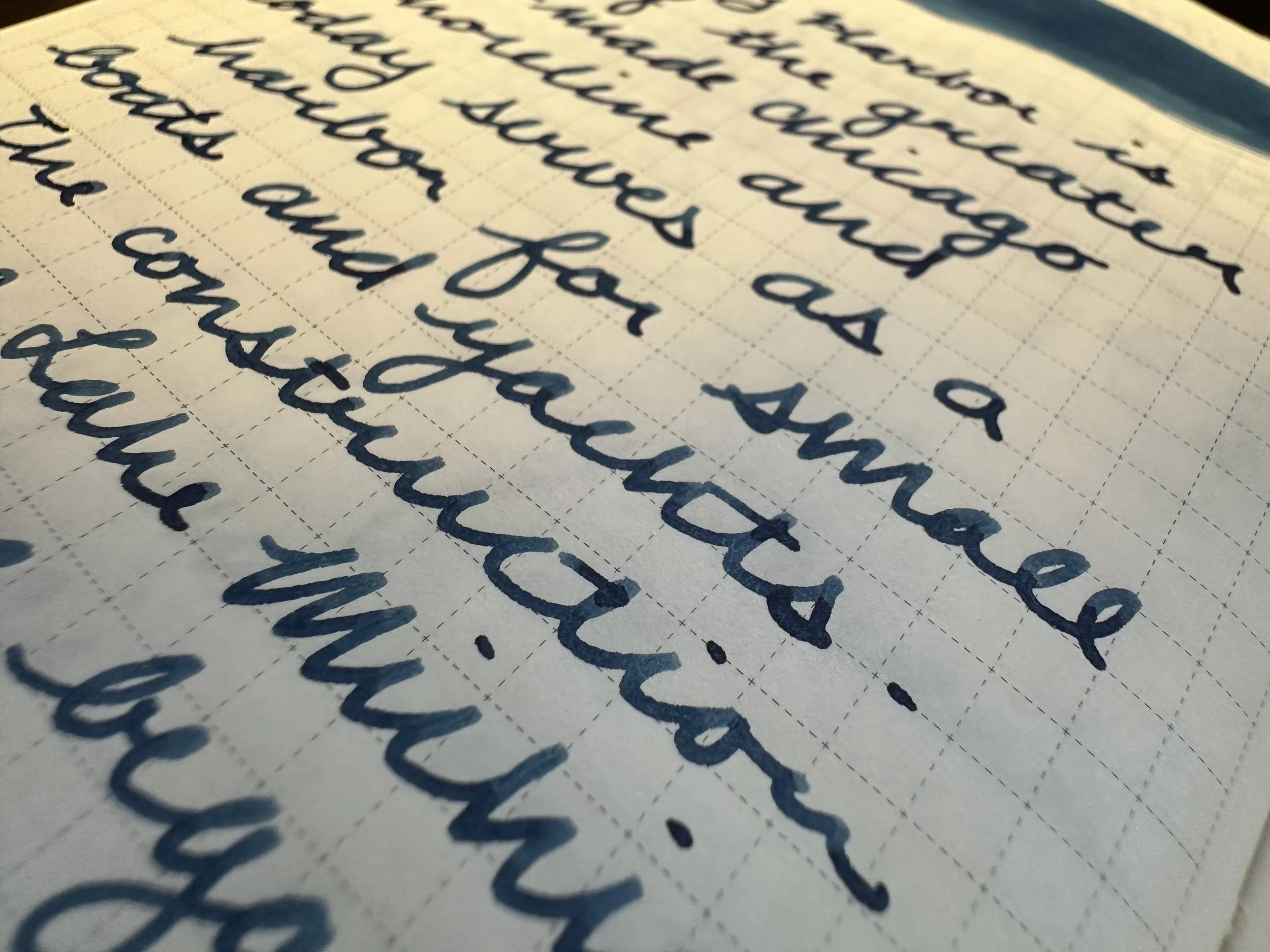
Like every Anderillium ink I’ve tried, the ink behaves well in a variety of nibs and on a variety of papers. Over the course of the week I have written on Midori, Koji, Tomoe River, and Clairefontaine paper and they all had an enjoyable experience due to the wet character of the ink. It does look a little different depending on paper, but that adds to the theming. Lake Michigan looks different depending on the angle of the light and the day. The ink inspired by it does too.