
Sometimes it Needs Simplicity
When I got back from the Chicago Pen Show earlier this week, I was feeling the joy and glow from being surrounded by stationery people for four days. It’s one of my favorite things in hobby spaces, being with other people who love the thing as much as you do. I have an update coming about the show (need to take pics of my swag still), but I was surprised by another vibe that I felt when I got home.
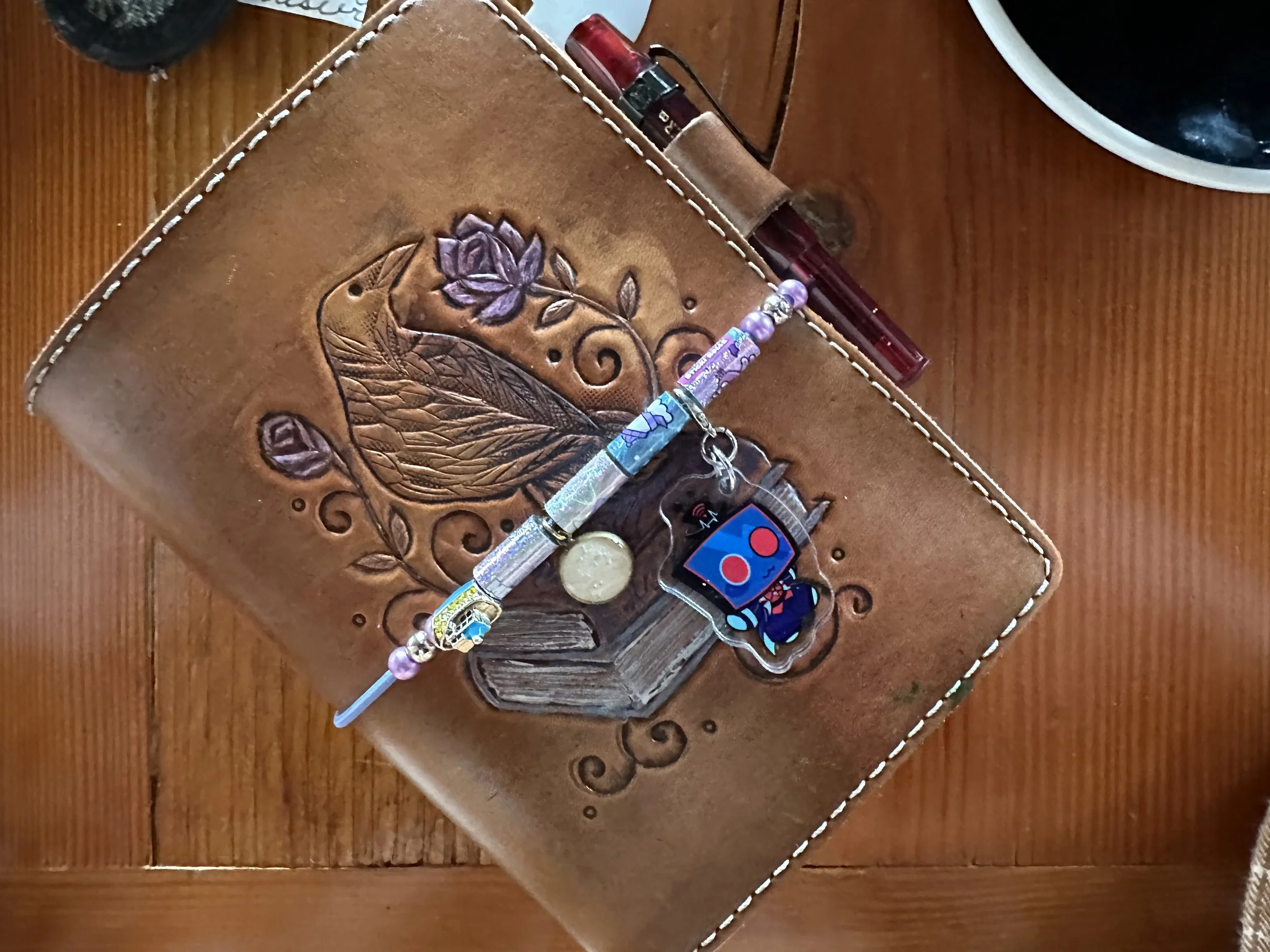
This lovely little book needed a reset.
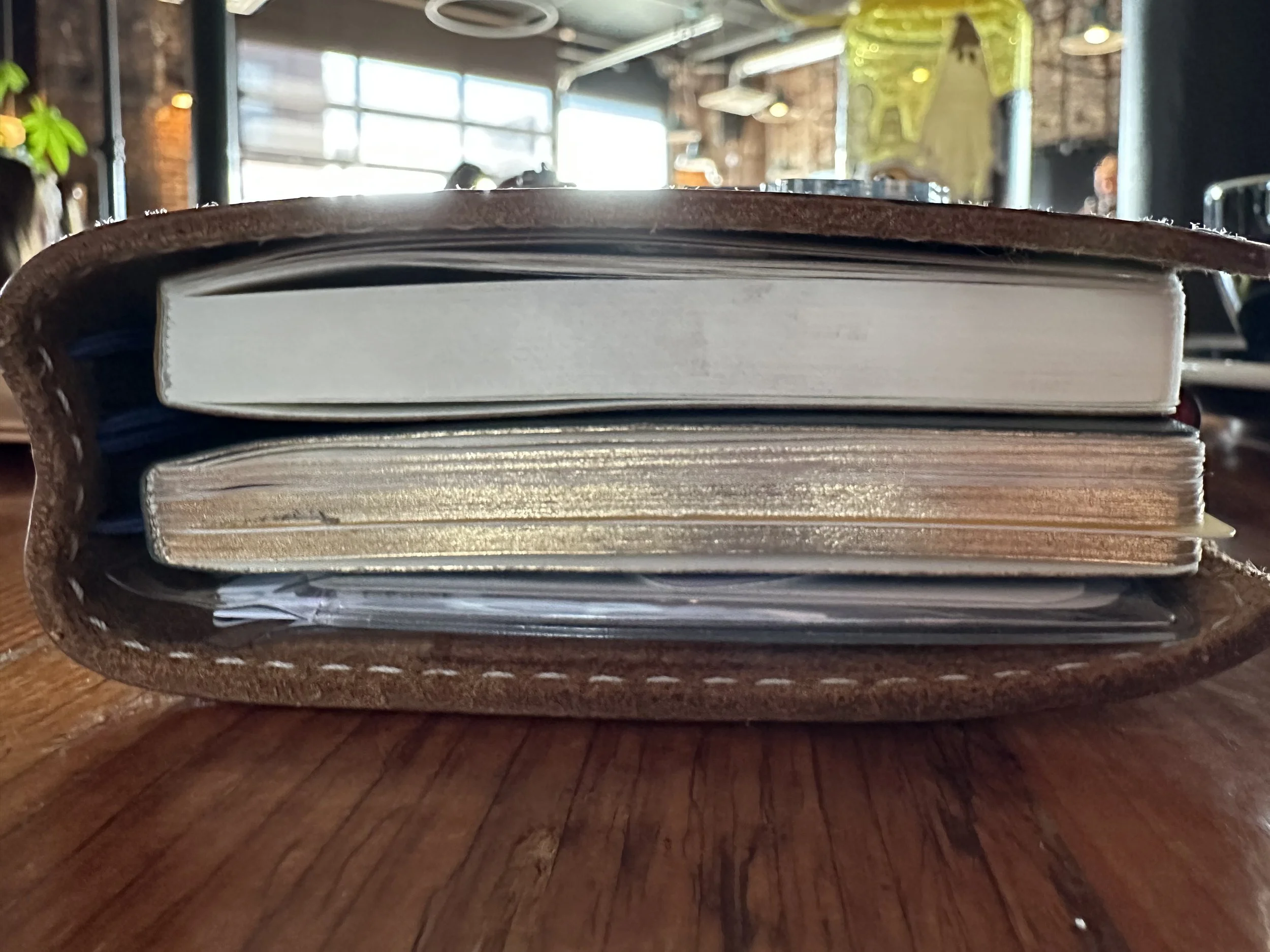
I’d been hauling around my TN thoroughly fluffed. I had a packed full folder of stickers and washi. Front and back pockets attached to the leather with a small ruler and an Oli clip. I had a ton of charms hanging off of the spine and belly band. I had a very thick 270 page notebook alongside my planner. I also had a Midori Commonplace Notebook in there too. I shared my TN with a lot of folks over the weekend and I realized the chaos within was not working for me. I did resist cutting the planner in half to de-bulk it (for now at least), but I decided some notebooks needed swapping and things in the set up needed changing.
That is the beauty of TN or binder systems for creativity and planning. You can keep the same beautiful cover gaining character and becoming a notable companion, but swap out the innards when they aren’t serving you. And man, what I had in there was not serving me. It was too many decisions when I opened the cover, too many things hanging off of it, and generally was not that pleasant to lug around. Sometimes I adore the chonk. Right now is not one of those times.
Therefore, a pivot was in order.
Step One - Decide what I needed to carry and what could stay at the desk.
Part of what was making it unwieldy was the sheer amount of extra stuff I was carrying. The Traveler’s Company pockets I’d stuck to the inside of the cover were the first to go, along with the Oli clip and the Tools to Liveby ruler. While I like having a straight edge on hand, I realized I can probably make do with an empty washi card which fits in the clear pocket folder or in the pocket at the back of my planner. The ruler will probably end up in a pencil bag. First step in making the entire system slimmer.
Much less chaotic setup… you know, until I chunk up the new notebook. lol.
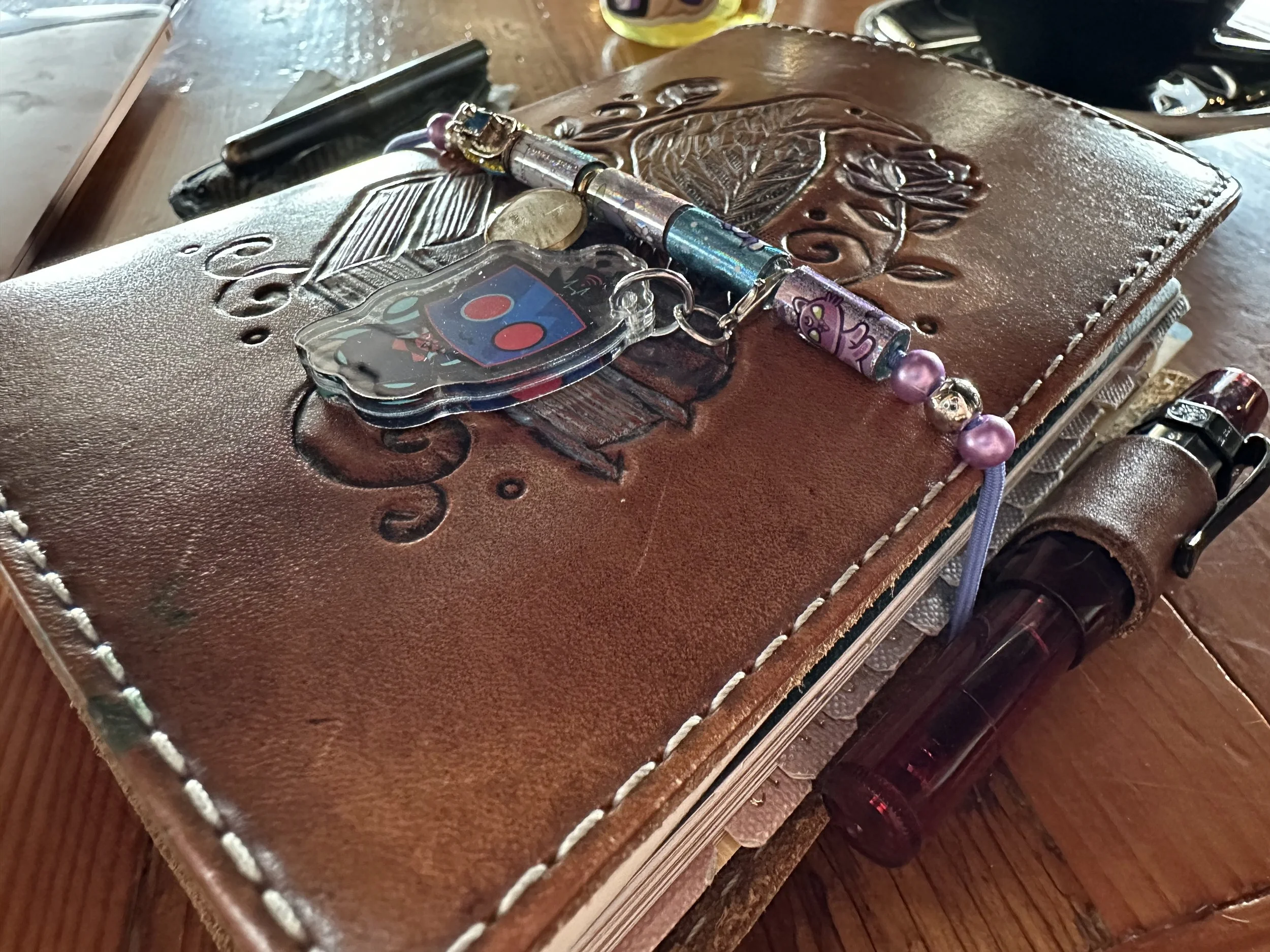
Step Two - Reduce the number of charms.
I love hanging things off my TN cover. It gives it an extra dose of personality. It’s my mini (and much less expensive) version of blinging out a Birkin bag. However, I have accumulated quite a few things and it’s became a bit much. I’m honestly surprised I didn’t lose any from them getting caught on things.
Ultimately, I decided to keep only one thing on the spine, a raven charm that I was given as a gift years ago in keychain form. It’s pretty much been on my TN since I received it. It’s witnessed a lot of my writing over the years. On the belly band I decided to move my Vox fanart charm (as I was thinking through my charm choices I realized the irony that one of my favorite villainous characters from Hazbin Hotel is literally modern technology and his main rival and narrative foil is a proponent of analog tech… and here I am trying to live an analog life in an increasingly techy world. He would hate that I use pen and paper, lol. Then again, he would have been the sort to have an extremely ostentatious Montblanc or similar on his desk while he was alive. Iykyk.)
I also have four Sticki Rolls beads with some fun cat and ghost themes. I swapped out the beads I’d salvaged from the bracelets as well from blue and orange to purple and silver. I also decided to keep the willow bark charm that I got around Christmas from a local artist. Willow symbolizes fresh starts and new journeys which feels like a good omen for all of the new things I am trying. I also kept the little Royal Caribbean charm that I got completely on a whim while taking my Alaska cruise last year.
This new charm setup is definitely less unwieldy and not getting caught on things in my bag nearly as often. While I was at it I also switched to this light blurple elastic.
Step Three - Fresh notebook situation.
I really enjoyed the Sterling Ink Koji notebook that I just retired to the storage box. The paper was really good and Sterling Ink makes great notebooks. However, I was at the end of it after the Chicago Pen Show.
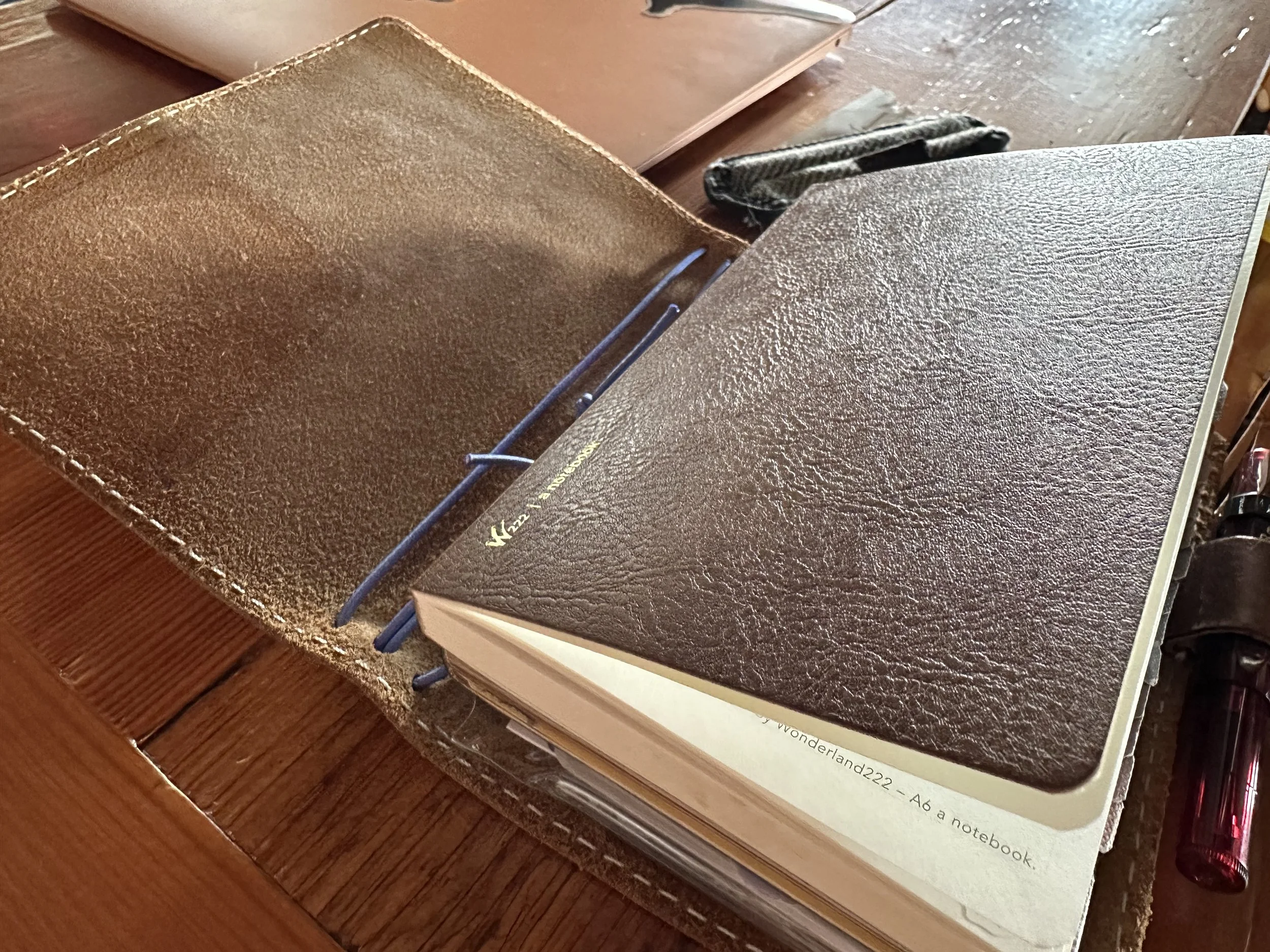
I sat down with my notebook box and picked them up one by one. I had a gut feeling which one I wanted, but I wanted to see if one of them intrigued me more than others. I had picked up some A6 2026 Wonderland222 notebooks during one of their recent sales so I could try the paper. The Sea Otter brown cover caught me when it arrived and it’s been in the back of my mind ever since. I was hesitating using it because it was only available in the 368 pages and that is thicker than I generally like to use. However, for the sake of simplicity I decided it might be fun to try an all-in-one notebook again. I also snagged a CoraCreaCrafts star bookmark for myself to use as a break from the A6 Hobonichi board I’ve been using for a few years. So far I really like the paper and I’m enjoying using it. The challenge I have with thicker A6 notebooks usually comes in the second half when it is starting to bulk up.
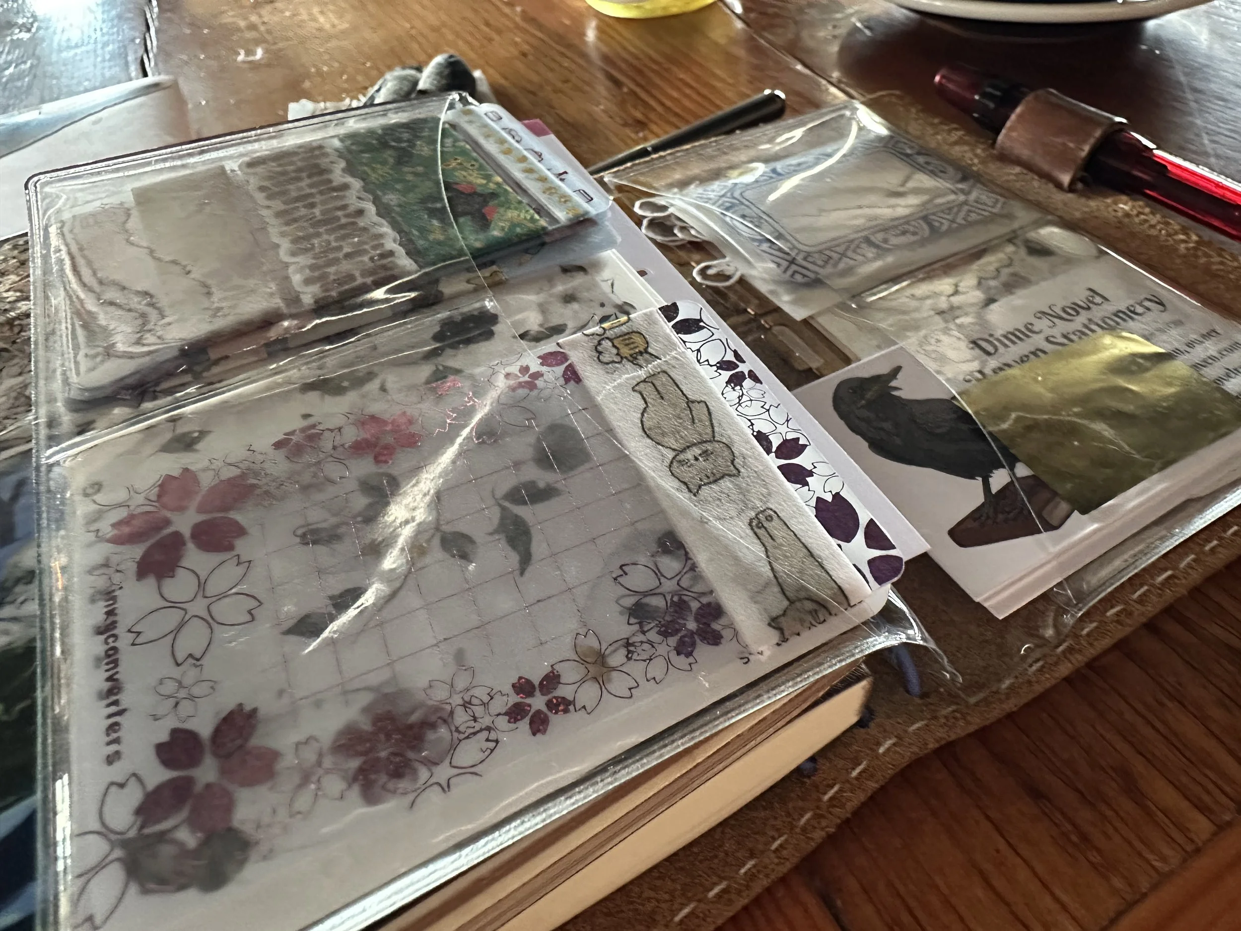
Step Four - Take everything out of the PVC folder and reassess plus clean it.
This little clear folder by Lauren Phelps designs is such a great little add on - it has a large pocket on each side and then four card pockets. I can fit a lot in here… but fitting a lot in the folder can cause decision paralysis on using the washi and stickers that I store (Inkyconverters makes the cutest washi cards!). I ended up taking about half of everything out which is allowing it to lay much more flush. Gunk had built up in some of the pockets from being used for so long, so I ran it under some water and used a q-tip to clean up and dry the crevices.
Step Five - Enjoy the Setup
As mentioned earlier, I love how easy it is to reevaluate how I am using what I have and can adapt to what I need it to be when I need it. Just like my favorite pens the TN and I have some mileage together and I plan to keep using it for even more years to come.
Will this simplification last? Maybe, maybe not, but that’s part of the fun.
Currently Inked
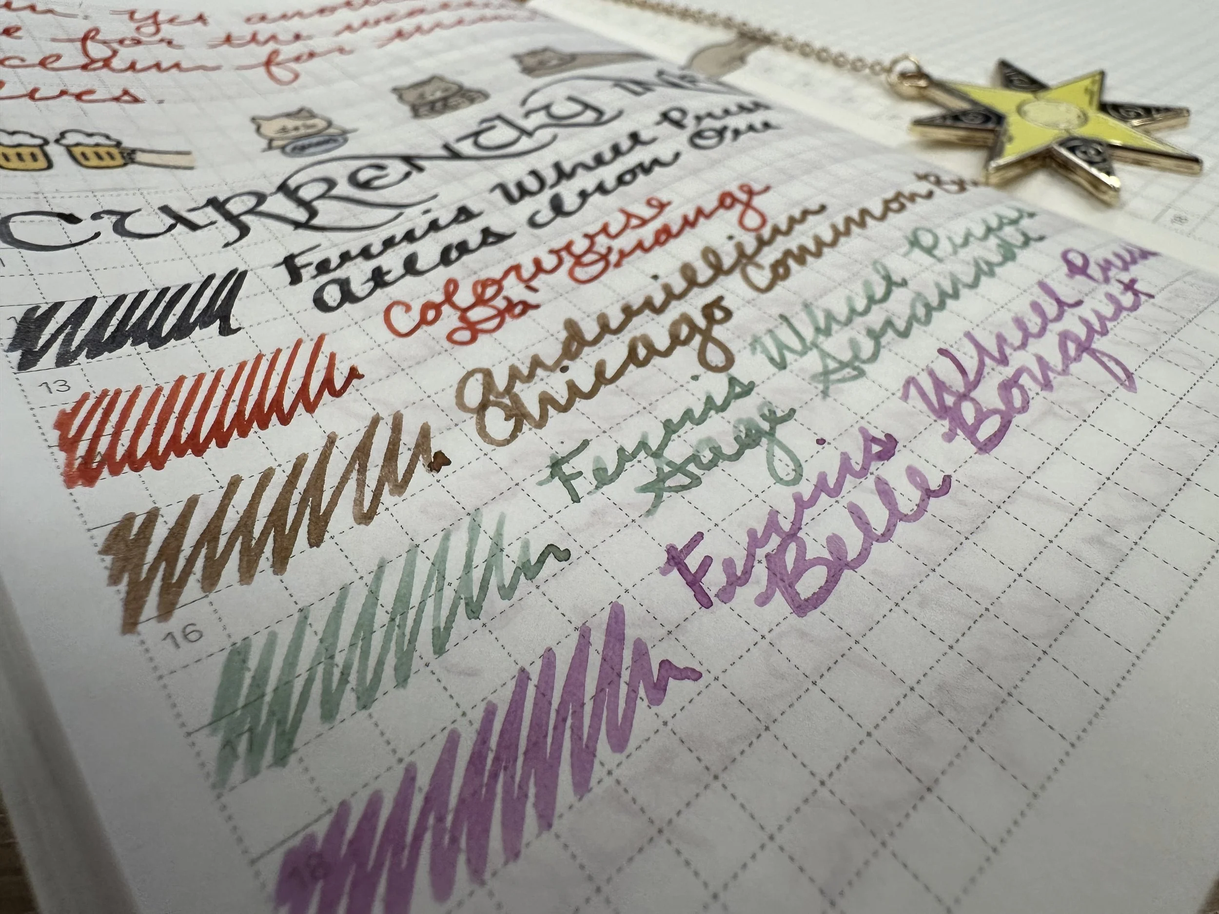
Ferris Wheel Press Atlas Iron Ore (Atlas Stationers Exclusive) - Kaweco x Galen Leather Sport Carmine 14K BB ‘journaler’ - I decided I wanted a neutral for the May header ink. I picked this ink up years ago (I think I bought it at the store on my first ever visit to Chicago). This is a dark blue-gray with silver shimmer. The blue tint gives it a little bit of red sheen on some papers.
Colorverse Da’ Orange (Chicago Pen Show 2026 Exclusive) - Kaweco liliput fireblue M - As soon as I saw the swatch of this ink on the registration table last weekend I had to snag it. It’s a red orange with orange shimmer. Very bold. I think the name is inspired by an SNL skit about the Chicago Bears (borrowing the orange from the team’s logo). I’m not a sportsball person, but I’m really enjoying this ink.
Anderillium Chicago Common Brick (Chicago Pen Show 2026 Exclusive) - Kaweco liliput copper B - The story behind this ink is right up my alley as a history geek. Chicago Common Brick is a style that was made from the iron ore rich clay around the Chicago area and can develop a variety of warm colors. It is the brick that makes up a lot of “old” Chicago, especially buildings built in the late 1800’s through the 1920’s. The ink itself is a shading warm brown that has a hint of black sheen where ink pools. The jury is out, but this might be my favorite of the show inks I picked up this year.
Ferris Wheel Press Sage Serenade - Kaweco Sport Metallic Violet B - One of the newest FWP releases and this one took a second for me to decide if it was too light for a writing ink or not. I think with finer nibs it certainly would be, but in a broad it shows off some lovely shading and gives a soft look to my writing. I’m interested in comparing this to FWP Dancing Thyme from a few years ago. I think they will be close, but this one seems like it is a warmer version of that ink.
Ferris Wheel Press Belle Bouquet - Kaweco Sport Cognac M ‘monoline’ - I was really meh about this ink in the initial swatch. As I started to write with it though, I started to like it. It appears like it might be a warmer version of Colorverse Milky Lavender (a color I absolutely love). They might need a head to head as well. The ink is wet and has some nice shading.