
Ink of the Week: Ferris Wheel Press Embers of Time
I have a soft spot for gray inks. Well, and black, but gray offers a little bit more interest at times and really shows off how interesting fountain pen ink could be. I had received this ink as part of the FWP Jubilee program a few months ago and wasn’t all that wowed by it in the first pen I tried it in. That means, time to give it a go in a pen I really like.
I also may or may not have deconstructed a Clairefontaine Seyes-ruled notebook in order to make an A6 for my TN. When you want a paper you want a paper.
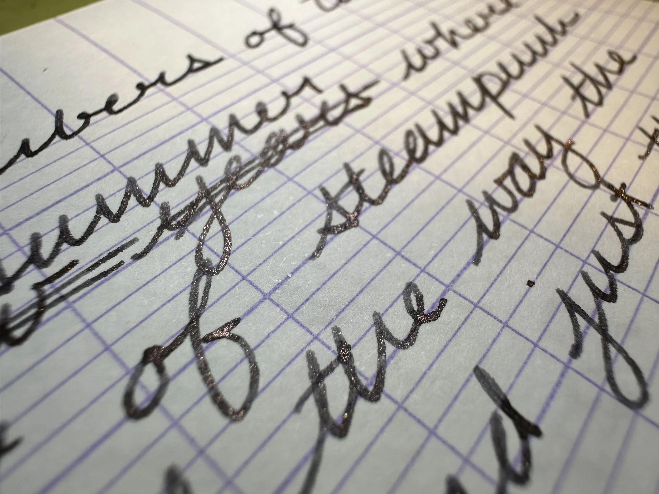
This ink, along with Astral Blue Odyssey and Mechanics of the Stars, are part of a steampunk themed set that was released towards the end of 2025. I’ve always been fond of the steampunk aesthetic. It’s such a fun mix of analog technology and an alternative historical setting. Playing with this ink makes me want to revisit Scott Westerfield’s The Leviathan, a sort of steampunk/biotech version of World War One (I find alternative histories with added elements very fun, see also: His Majesty’s Dragon by Naomi Novik - it’s Age of Sail/Napoleonic Wars with dragons).
According to the FWP description, this ink represents the firebox of an airship’s engine, coal and fire. If one wanted to not have the fantastical element, this would also be a fun take on a steam locomotive inspired ink. Same type of engine idea after all.
The Ink
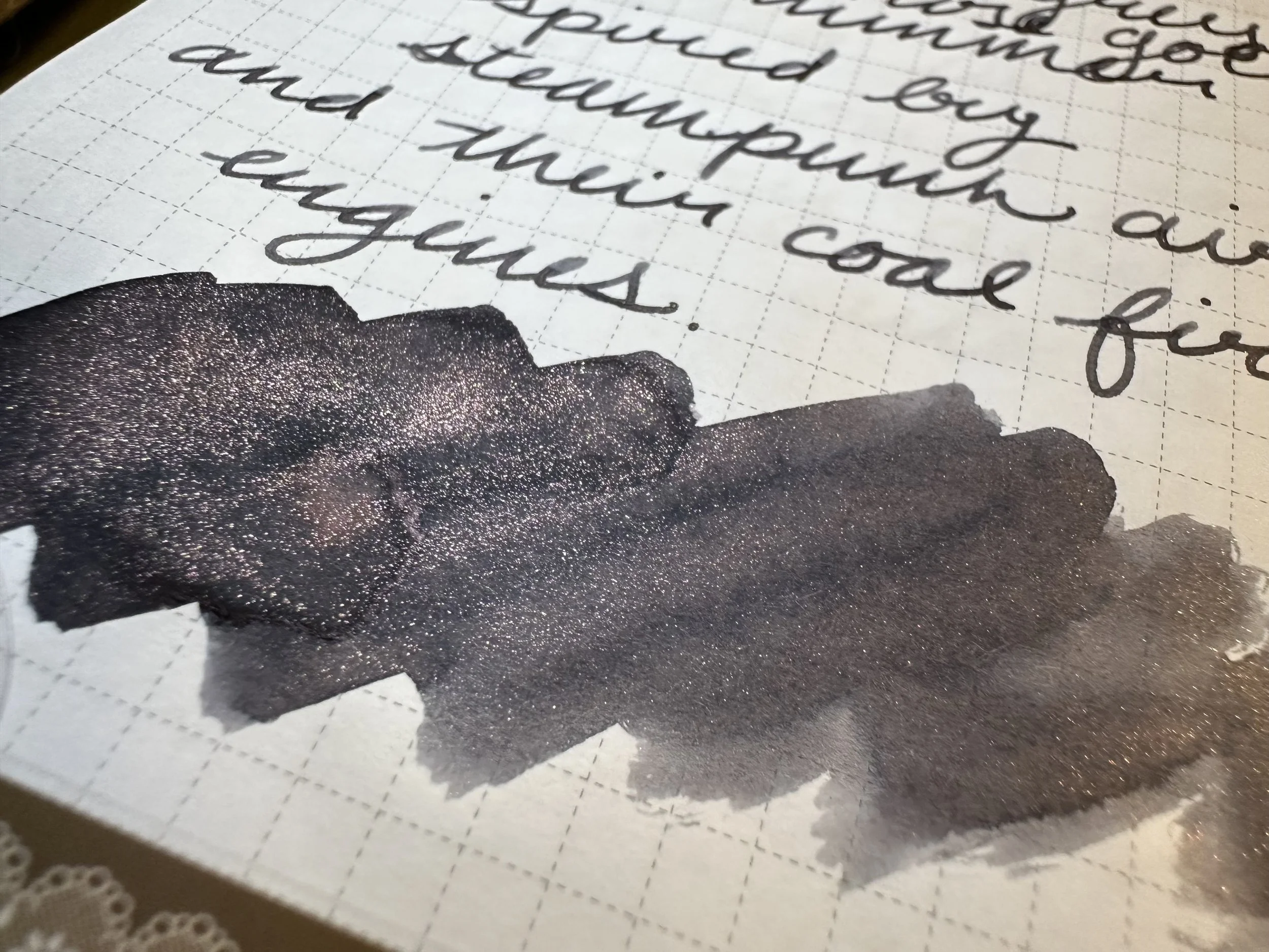
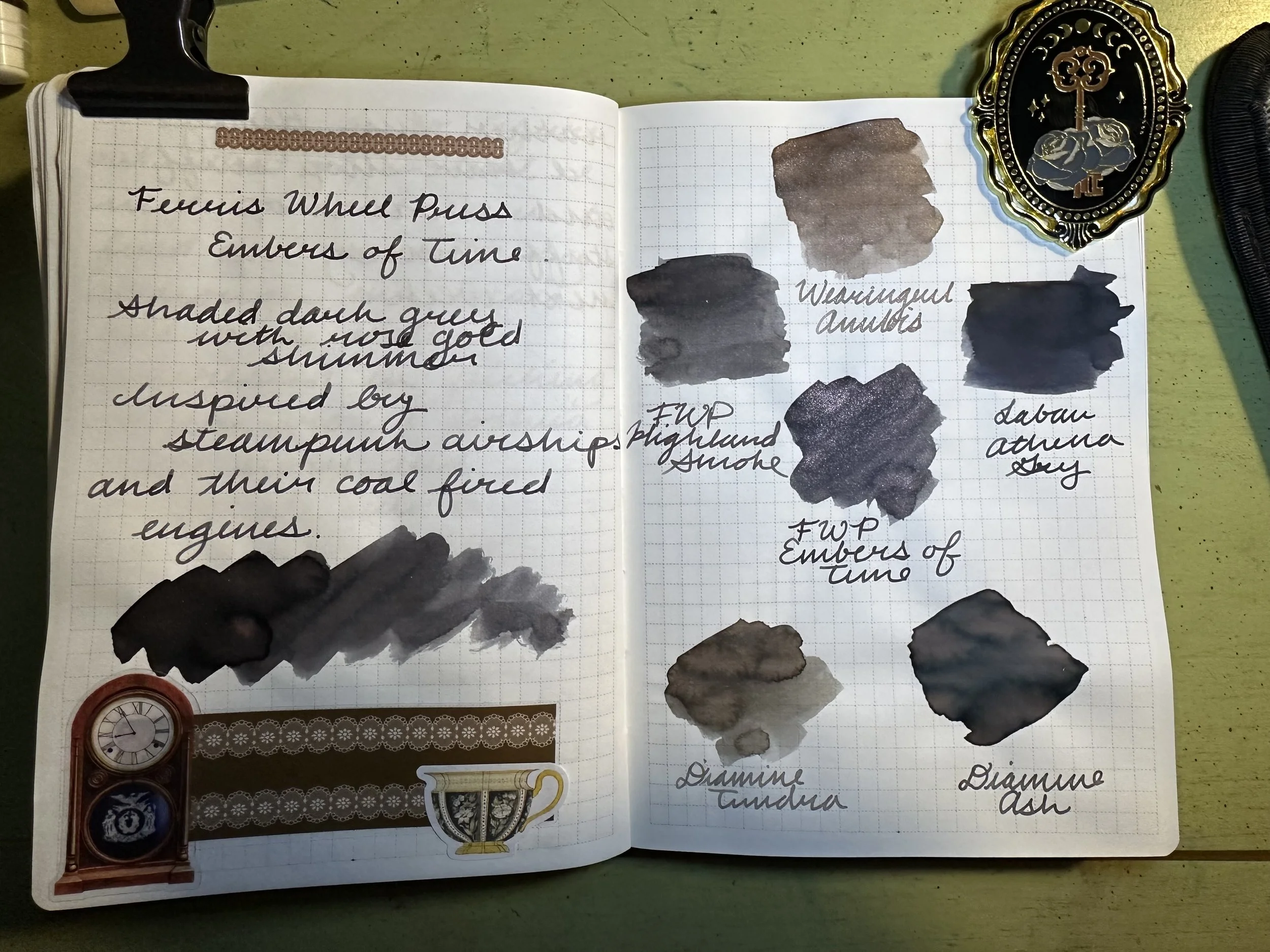
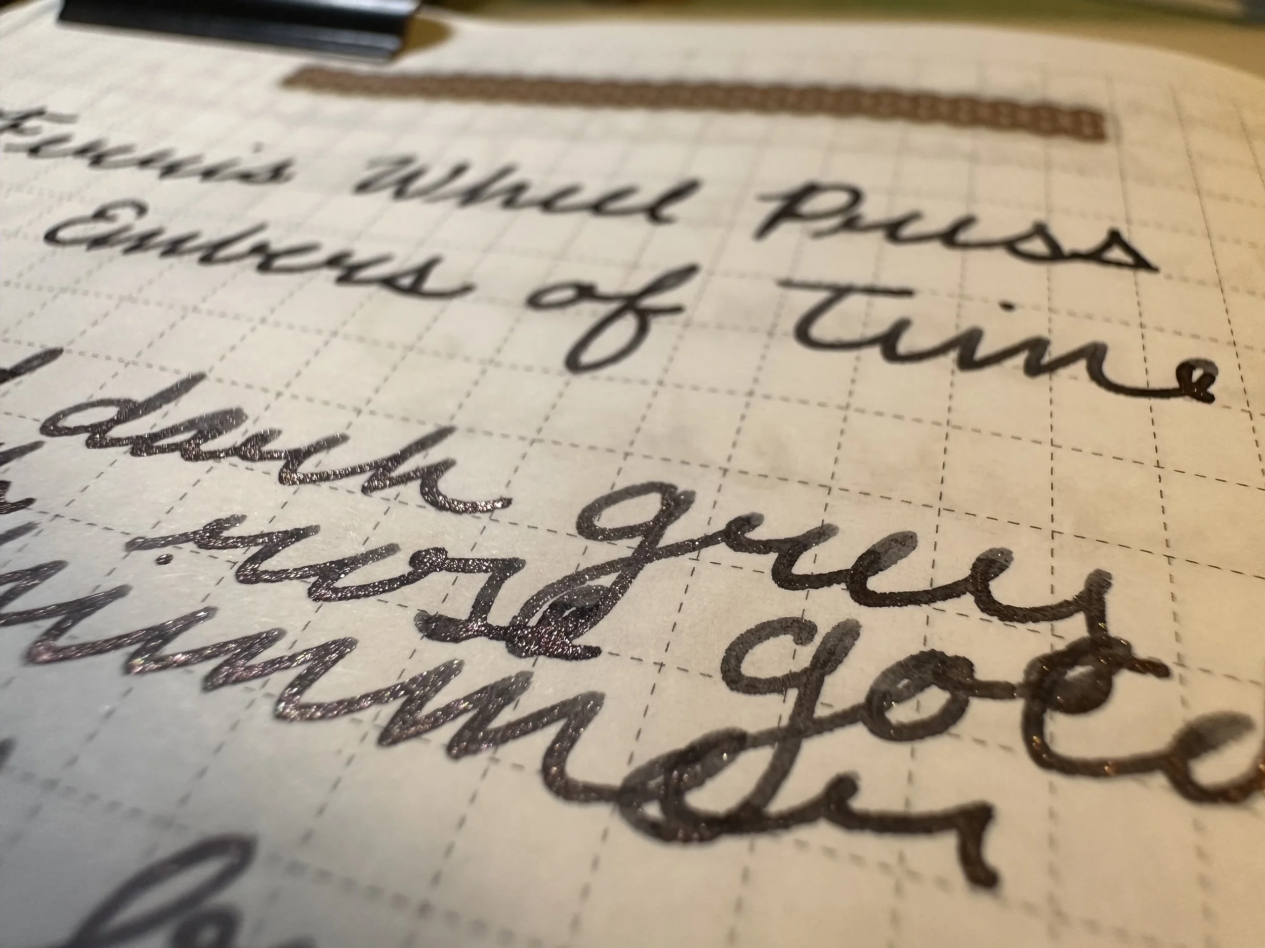
Embers of Time is a dark gray ink with rose-gold shimmer. It does shade, but it’s minimal, not very dramatic. The flow is wet enough that I haven’t had any trouble with clogging, even when it’s been getting banged around along with my Kaweco liliput fireblue in my pocket or falling on the floor. However, like all shimmer inks it does need to be agitated in order to keep showing up in the letters. I do this by tilting my pen back and forth a few times and then continuing to write. It was pleasant to write with. I’ve been enjoying the mix of shimmers being utilized by different pen brands these days. We have come really far from silver and gold being the most available options.
The Look
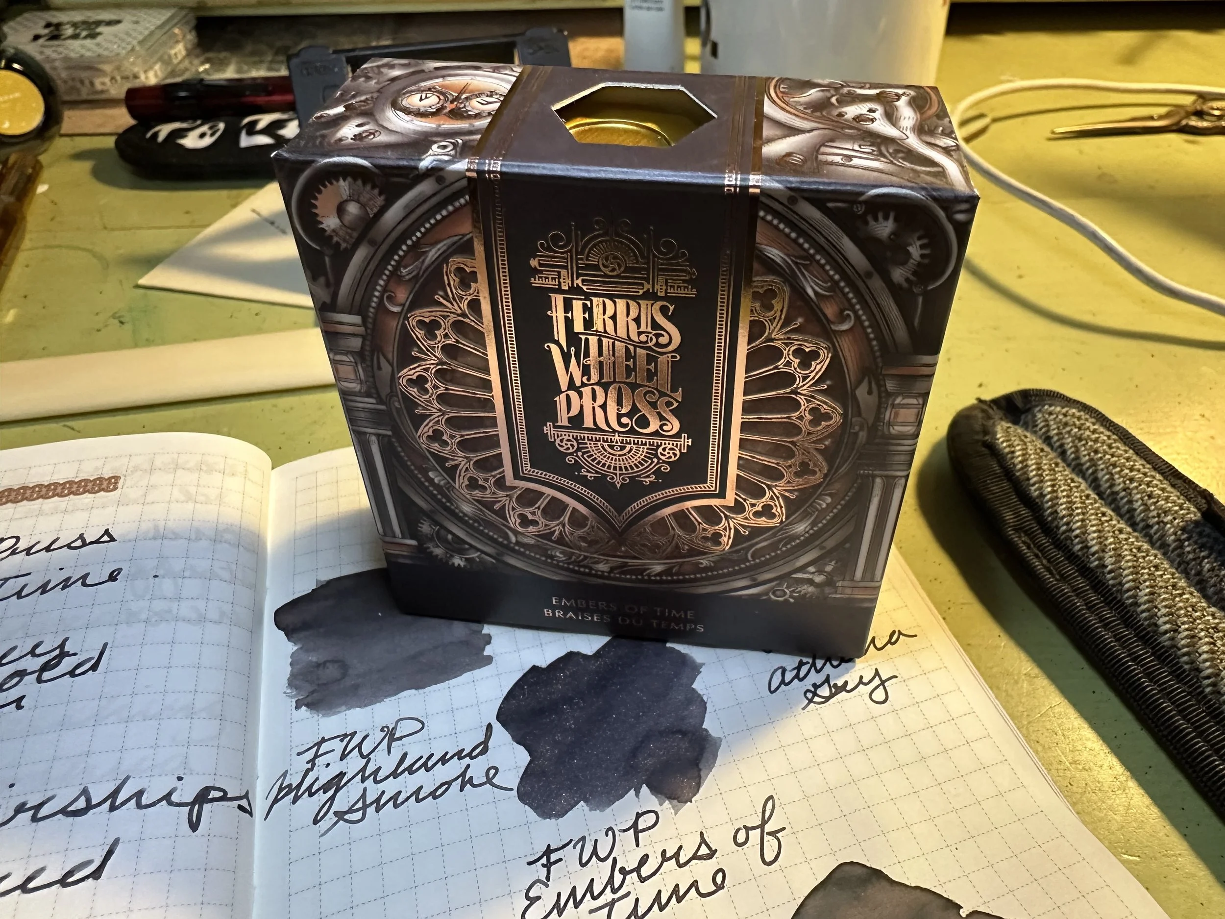
FWP has it dialed in on design (I think the founders are all graphic designers, so it makes sense). The bottle is their 38 mL “perfume” bottle, although it can be found in their 10 mL “ink pot” as well. The box design is beautiful and I’ve had it hanging out on my desk since I’ve inked it up. The box has copper accents and images of gears and a large clock. There are even a few steampunk-clad rabbit engineers hidden in the design. Box is pretty and ink is functional, a good combo.
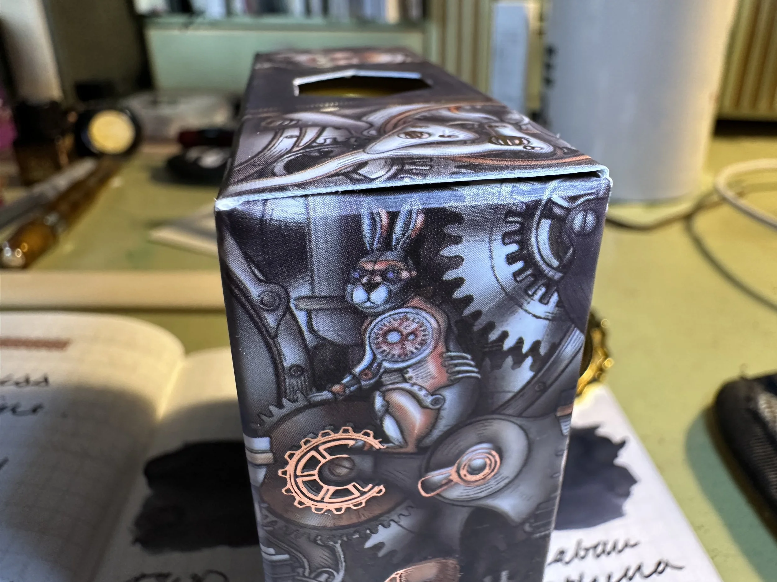
One of the aforementioned rabbit engineers.
Ink Siblings
As far as gray inks go, I definitely have a type. In general I lean towards warm grays. Embers of Time is sitting right on the cusp of being cool toned. I think the shimmer helps keep it on the warm side though. As I flipped through my gray inks I actually had a hard time finding anything close. In fact, some that I thought would be close are actually pretty different.
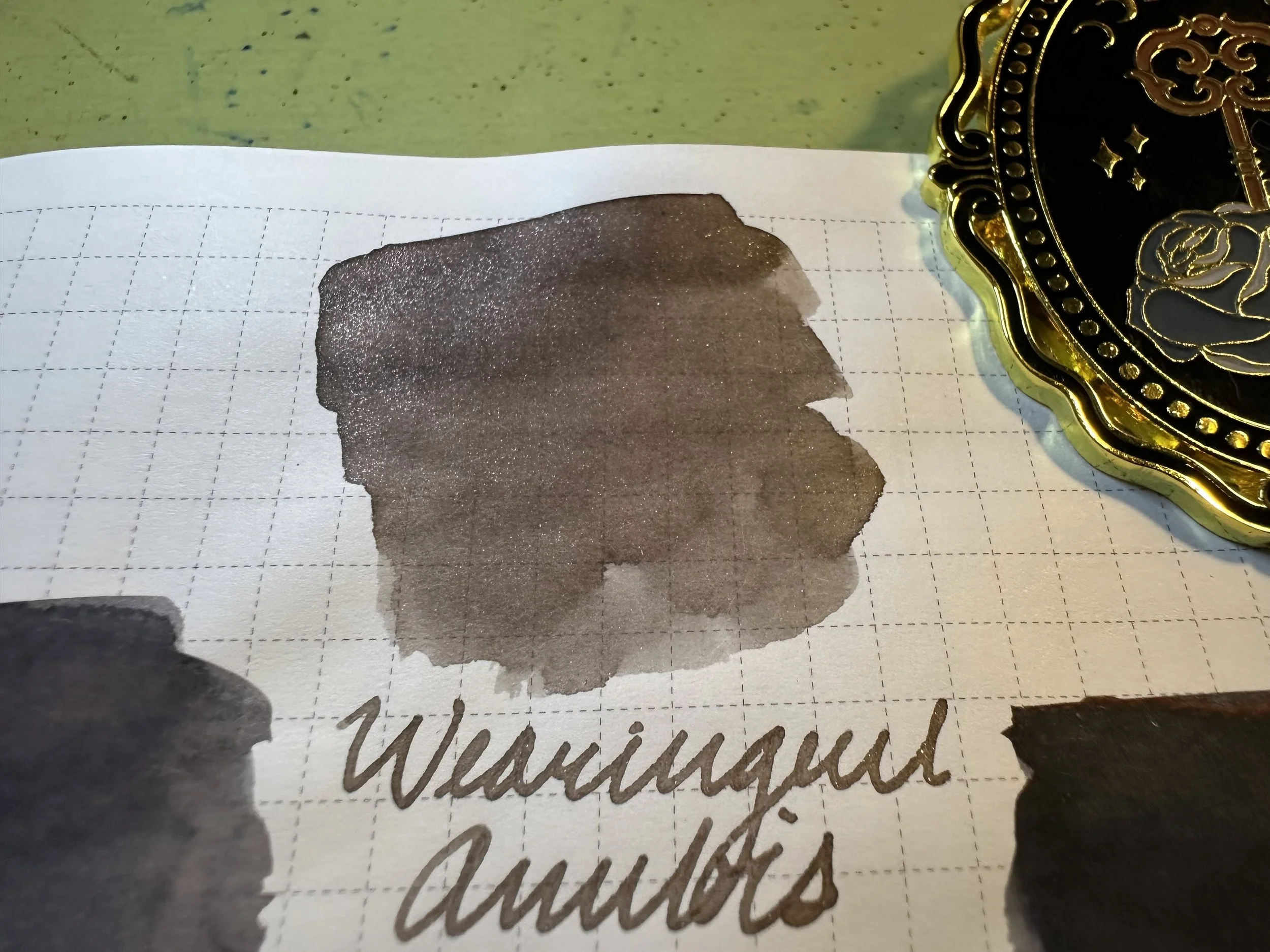
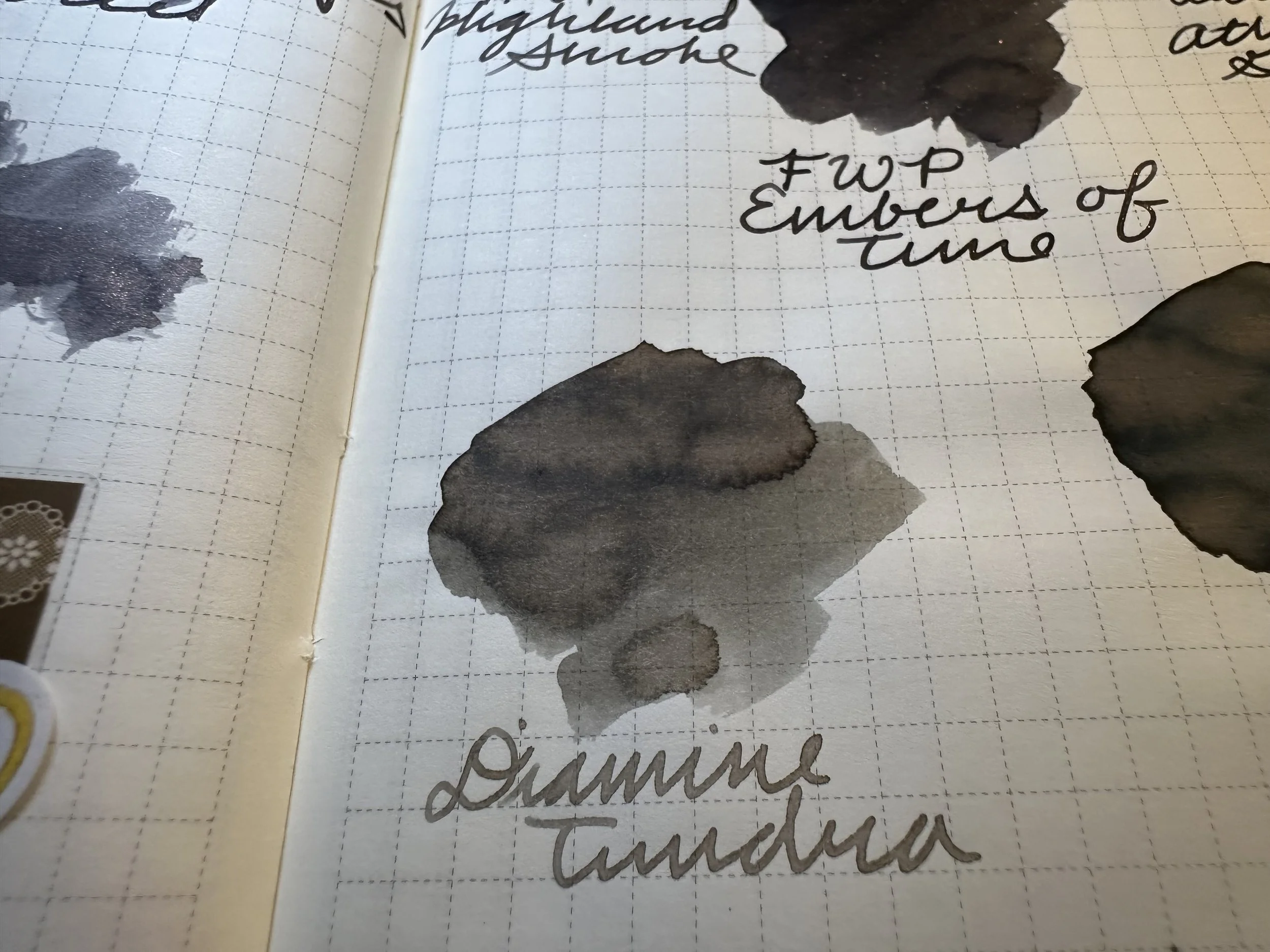
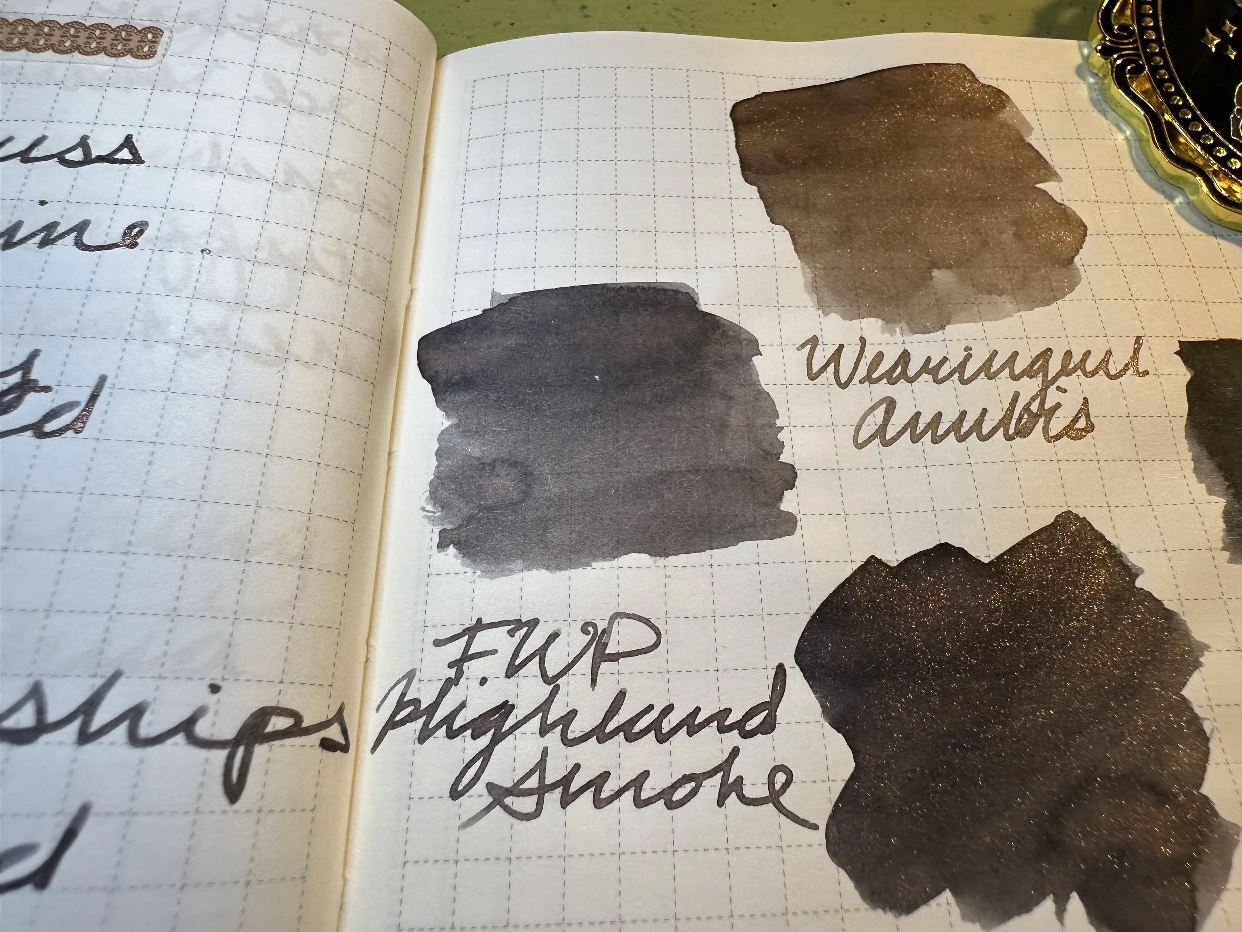
Wearingeul Anubis and Diamine Tundra: A lot more brown undertone than Embers of Time. Anubis looks downright taupe in comparison to these other grays.
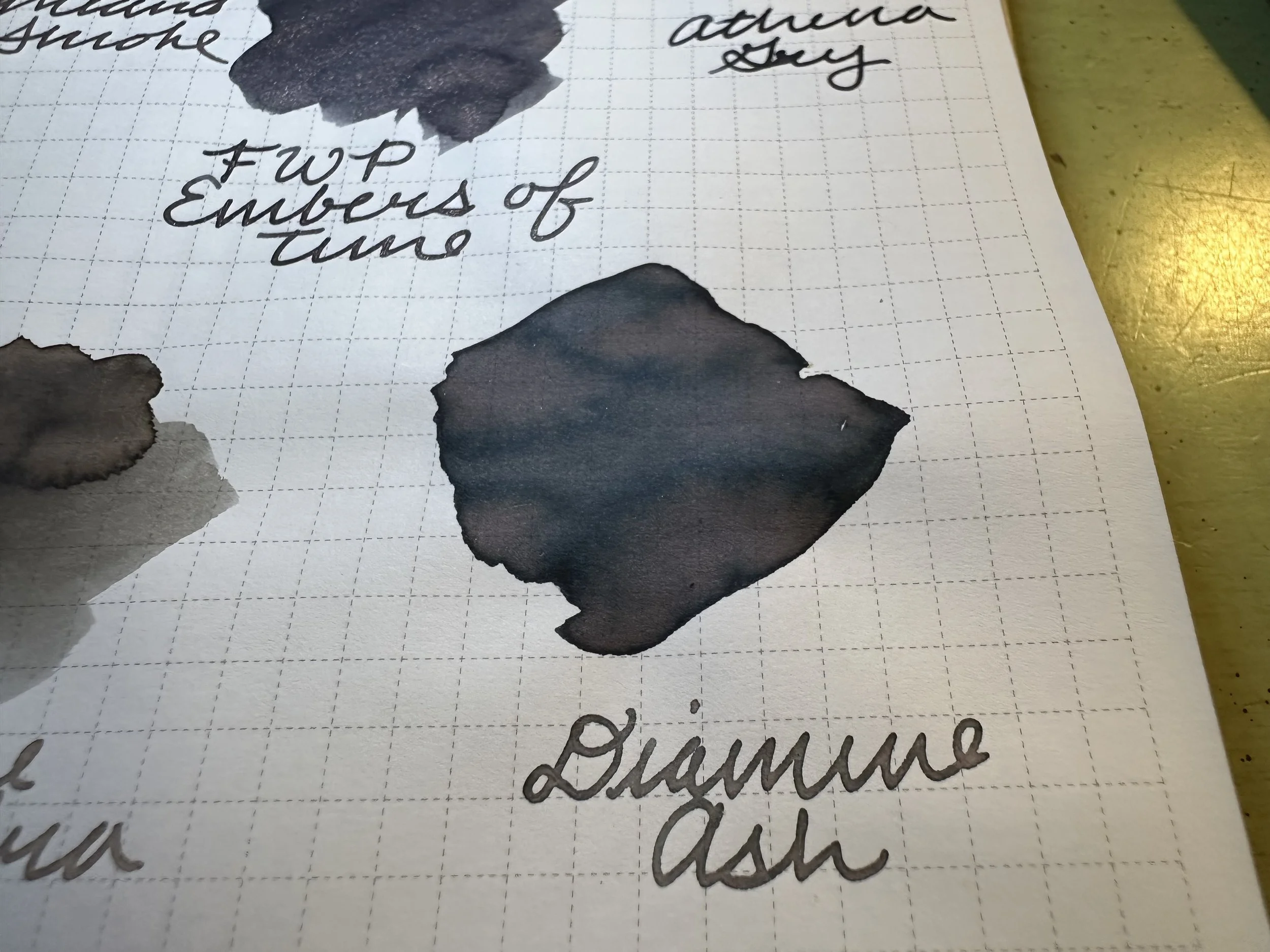
Diamine Ash: Not too far away in tone, but the shading is much more dramatic.
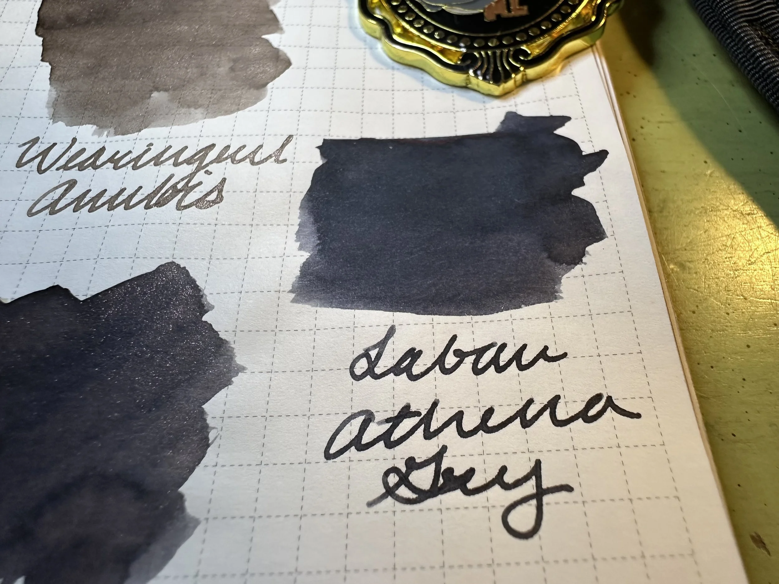
Laban Athena: Leans cooler and darker.
FWP Highland Smoke: This is probably the closest in base color, although it’s a shade of gray lighter. If you like the look of Embers of Time but don’t want shimmer Highland Smoke would be a good alternative.
Overall
I like this one. It might have to go in a head to head with FWP Granite Guardians, however. Embers of Time is like the darker big brother of that one. It’s one of those stealthy fun inks, just looks gray until it catches the light and the rose-gold shimmer pops.
Disclaimer: I received this ink from FWP in exchange for sharing. All opinions are my own. If you are interested in this ink or other FWP use my code JA-DIME on their site to save 15%.