
Lined Paper: Love it, can’t leave it

Lined paper doesn’t get a lot of love in the stationery community. It seems to evoke memories of crummy school paper that you would buy for 10 cents a ream at the beginning of the school year. Bright blue lines, ghosting even with ballpoint, and the pre-punched holes for your binder ripping off. Or worse, those wide lines in the university blue books (probably just aged myself, lol). When I first got into the stationery hobby I was after grid and dot grid paper before all others. Now that I’ve been in the hobby for a few years, I’m finding myself circling back to lined. Oftentimes, I will pick that up as the ruling when available, then blank (where I often use a lined guide), and then the grids.
So, why lined? I’ve been pondering this question and I’m starting to think that it provides a structure for me that I don’t have to think about. There isn’t much choice but to write on the lines when presented with a lined page (unless one is a true rebel). The page is set down and the pen can flow. It takes away some decisions that can be available on a blank or grid page (orientation, designs, where the words should start and end). When I’m stuck in a creative rut, this is just what I need. Something simple and straightforward.
Not to mention it’s available in a ton of different paper types. The best type of lined notebook for me is one with thin gray lines that help guide the writing, but don’t overpower the words once they are on the page.
Some of my favorite lined notebooks:

Muji A6 lined
I found these on Amazon a while back when needing to get to the free shipping threshold. And upon trying to look it up, it seems like the lined version has gotten a little tricker to get. They are fountain pen friendly and the cardstock covers hold up really well. The paper is cream with the lines a very light gray.

Paper Minds Cosmo Air Light notebooks
I did a review of these earlier this year and I am still enjoying them. The paper is white and the lines a light gray.
Paper Penguin A6 Tomoe River notebooks
These are so amazingly useful and even with the new iterations of Tomoe River paper they are a solid choice. I’m currently pondering a notebook for NaNoWriMo (going to get back into it this year) and one of the 160 page version might be the book for me.

Life Vermilion Lined A6
There is just something about these, cream paper with red lines. It breaks my rule about the soft gray lines, but the colors just makes me smile when I pop them open. While I have found some Life papers that don’t play nice with wide nibs (I’m looking at you Typewriter paper), but this one works very well. Unfortunately, I couldn’t take a pic of the innards of this one, since I only had a grid that wasn’t full of writing.

Odyssey Notebooks Tomoe River
I have been enjoying this as a brain dump and ink swatching notebook. The paper is thick, the lines are light gray, and it’s a just a joy to write in. Each page is also pre-numbered. The little dot shifts spots on each page creating a rotating planet or atom when flipping through pages quickly.
Some honorable mentions that have recently come into my hands, but need to spend more time with: Musubi Rasa notebook, B5 lined Stalogy, and Lamy A6 notebook. Any recommendations for other lined papers that I missed?
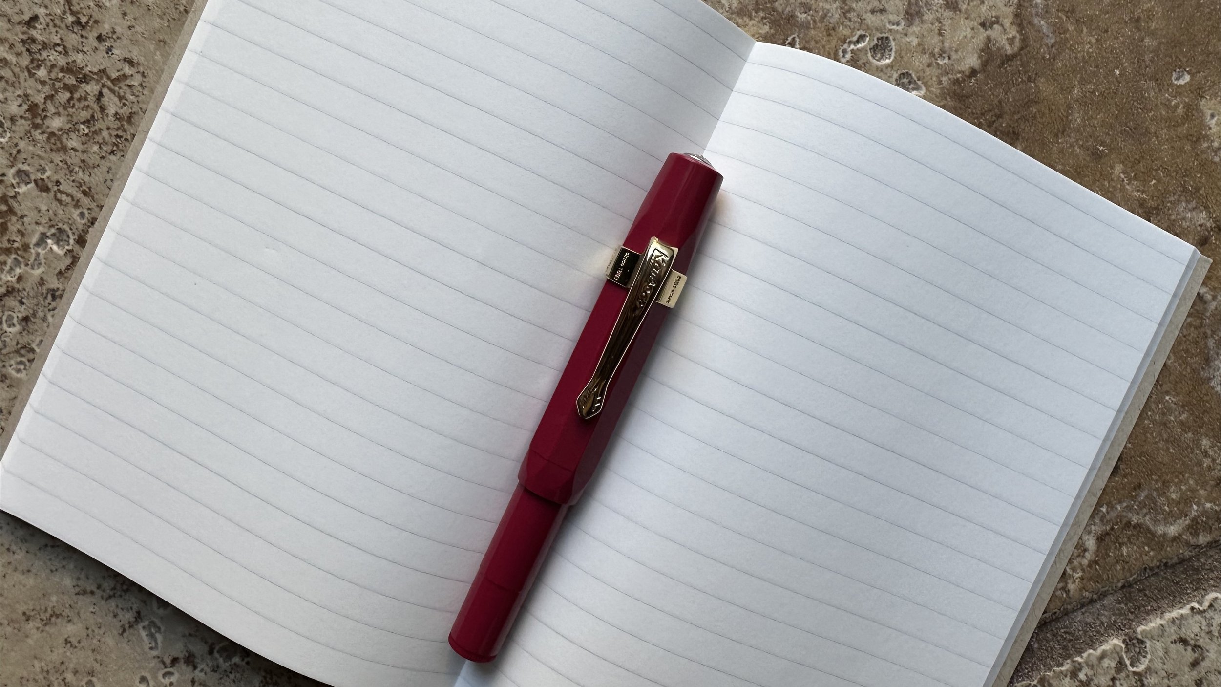
Currently Inked

In my Odyssey Notebooks lined book.
Papier Plume Iron Lace - Kaweco x Elite Royalty Sport Deep Red BB - I was finding myself in need of a black (something simple and straightforward just like lined paper) and decided to pull out one of my favorites. In the BB nib it has some nice shading to dark gray.
Ferris Wheel Press Hearty Harvest - Kaweco Collection Sport Dark Olive BB - This ink is releasing on Oct. 6th and this might be one of my favorite releases from FWP this year. It’s a nice burnt orange with copper shimmer. It’s just incredibly cozy. I did have it in the matching FWP Carousel that will also be releasing in October, and it also looked great in a narrower line.
Ferris Wheel Press Bumbling Blossom - Kaweco Sport Burgundy B - A pop of color was also needed this week to get the gears turning and I decided to try out one of my samples. First impressions is that it is a medium true pink with what looks to be a chroma-shimmer that changes color in different lights.
Ferris Wheel Press Glistening Glass - Kaweco Art Sport 14K M Nib Tailor selvedge - Still playing with this ink, it just is such a pretty color especially in this italic grind. It did experience some clogging this week that required me to take the nib apart to flush out the shimmer, but other than that hiccup it’s been a daily driver.
Diamine Candlelight - Kaweco liliput copper 14K B - I was craving a yellow ink and realized that I actually don’t have very many in my collection. I decided to reach for one of the Inkvent yellows that I have never really tried. I think this is from the 2021 Red edition. It’s got great shading and leans a little gold where the ink pools, but keeps the yellow tone as opposed to getting brown. A fun color.
Ferris Wheel Press Velvet Ballet - Kaweco liliput fireblue 14K M - While I wrote “velvet storm” in the picture, this ink is definitely much more elegant than that. It’s a deep red with silver shimmer that is giving me vintage vampire vibes at the moment - perfect for the story I’m working on.