
Project Enjoy Collection ‘23: Third Quarter Update

The leaves are starting to change…
I can’t believe we are already in the homestretch of 2023. The strange weather here in northern Minnesota continues with crazy rainstorms followed by muggy warm days and then dropping twenty degrees back down to proper fall temperatures (around 55-60 F/13-15 C). I’m starting to plan out some ideas for the last few months of the year for events like NaNoWriMo (considering taking another stab at it after not participating for several years). Part of that is reflecting on my ink usage this year.
Ink collecting and use is one of my favorite parts of the fountain pen hobby. Even when I was in the “things you can buy at Walmart/Office Depot/Target” part of my life, I always gravitated towards certain colors and then waffled between the basics. I had black ink phases, blue ink phases, red ink phases and then the delightful Bic 4-color multipen with the pastel colors phases. In short, I love having the variety. But, as we all know, ink collecting can get a little crazy and it’s easy to forget what you have (hence my recent post on swatching my 145 ink samples). For the past several years I have kept lists of my ink and ink swatch books (I make a new one each year usually) and have been calling this practice “Project Enjoy Collection” (you can find my intro post for 2023 here). I’ve recapped the first quarter and second quarter and now it is time for the third quarter.

A page in the ink passport. I use a date stamp on the page every time I ink up a pen.
So far this year I have used 154 different inks, with 38 different inks being utilized in the last 3 months. This was down from 57 inks in the second quarter, although it is important to point out that I did participate in the 30 inks/30 days in April, so that contributed significantly to second quarter numbers.

Blue was once again the most utilized color, followed by black/gray. My top multiple refill inks were Colorverse Office Blue (royal blue shade), Ferris Wheel Press Adventurine (light gray with copper shimmer), Colorverse Milky Lavender (soft purple) , Ferris Wheel Press Glistening Glass (soft blue with gold shimmer), Papier Plume Iron Lace (black). What this says to me is that I was after muted tones this summer (apart from sky blues) and was busy with work. Sometimes I want something bright and crazy for the day job to brighten things up, but this year I didn’t have all that much time to work on projects - just the day to day grind. Bright colors were relegated to accent pens or ones that I primarily used while at home.
My inks followed a similar pattern to my ink usage in 2022. My most popular colors for this time frame from last year, but leaned more brown, with blue only squeaking into the top spot by one fill. Summer seems to bring out the bright blues and browns for me.

Inks used:
Red/Burgundy/Pink: Robert Oster Blood Moon, Ferris Wheel Press Cabernet on the Lake, Colorverse Golden Gate, Ferris Wheel Press Bumbling Blossom (sample)
Orange: Sailor Pen Show 2023, Ferris Wheel Press Golden Gate Glow (sample), Monteverde Pumpkin Cake, Ferris Wheel Press Hearty Harvest
Yellow: Diamine Candlelight
Green: Ferris Wheel Press Brilliant Beanstalk, Ferris Wheel Press Goose Poupon (sample)
Blue: Colorverse Office Blue, Ferris Wheel Press Blue Yosemite Falls, Ferris Wheel Press Glistening Glass, Diamine Midnight Hour, Colorverse Eagle, Ferris Wheel Press Tumultuous Tides, Van Dieman’s Ghost Ship, Colorverse Apollo 11, Colorverse Witch by Starlight (sample), Sailor Shikiori Shito Shito, Kobe Nagasawa Do You Believe in Fairies?, Colorverse Sky-tinted water, Wearingeul Romeo, J. Herbin Kyanite du Nepal (sample)
Purple: Colorverse Milky Lavender, Ferris Wheel Press Poison Envy
Brown: Ferris Wheel Press Writing Desk, Utsunomiya Gyoza Brown, Bungukan Kobayashi Hirai Bridge, Ferris Wheel Press Majestic Maple Syrup
Favorites
I’ve been big into using my Tomoe River paper notebooks this last quarter. There was something about the smooth texture. I just found myself reaching for them time and time again.
As far as ink goes, I was really enamored of Colorverse Golden Gate (SF Pen Show exclusive) and I easily burned through my sample of Colorverse Witch by Starlight. I also revisited some perennial favorites like Papier Plume Iron Lace and Colorverse Office Blue.
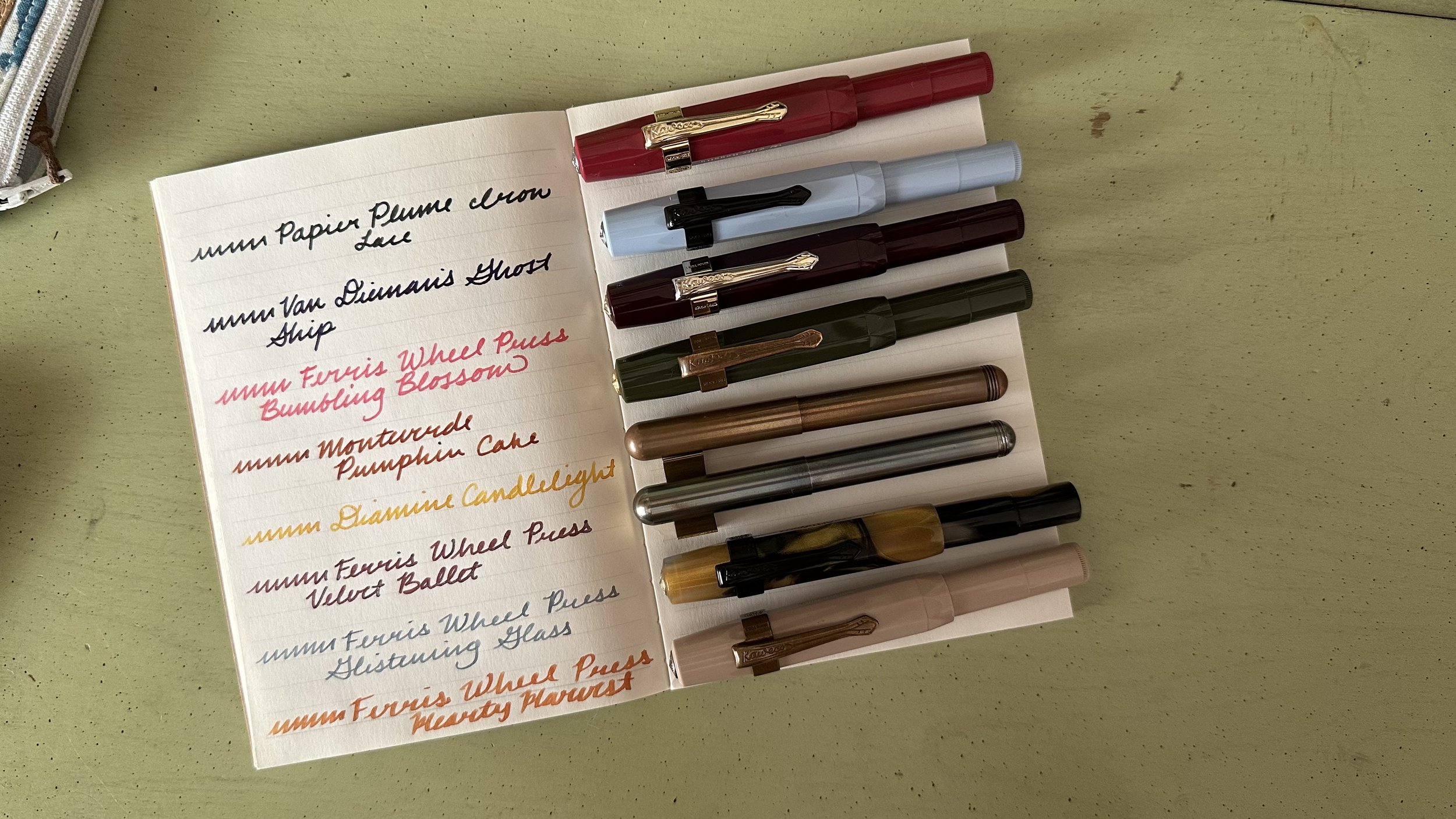
Currently Inked
Van Dieman’s Ghost Ship - Kaweco Sport Mellow Blue B - This is such a fun color, a deep blurple with copper sheen.
Ferris Wheel Press Bumbling Blossom - Kaweco Sport Burgundy B - My outlier color for the week. It’s a really fun pink and it’s growing on me.
Papier Plume Iron Lace - Kaweco x Elite Royalty Sport Deep Red BB - Refilled tis week. It’s such a well-flowing black that shades to a dark gray. Top 3 black inks for me for sure.
Ferris Wheel Press Hearty Harvest - Kaweco Sport Macchiato 1.5 - Liked this color so much last month I decided to give it a go for this month’s header color.
Monteverde Pumpkin Cake - Kaweco Sport Dark Olive BB - Had some leftover header ink from September and decided to write it out in this pen, a good combo that is very autumny.
Ferris Wheel Press Glistening Glass - Kaweco Art Sport Tiger’s Eye 14K M ‘selvedge’ - This ink just looks os beautiful and elegant in italic nibs. Still enjoying this color.
Diamine Candlelight - Kaweco liliput copper 14K B - Another pop of color from an ink that I’ve never actually tried. It’s got great shading so far!
Ferris Wheel Press Velvet Ballet - Kaweco liliput fireblue 14K M ‘journaller’ - Was deciding on a red and decided on one of my favorite muted reds.