
The Liliput and The Black Cat
My Kaweco liliput fireblue is my constant companion. Swapping a nib or switching up inks keeps it constantly fresh. It’s a pen that perfectly suits me. Small profile means I can take it everywhere in my pocket and, honestly, tiny things are always a draw. And I’m really good at not losing them. I remember as a kid that I was at the Colorado Renaissance Festival and bought a teeny-tiny gold cast duckling. My mother was sure I would lose it. Probably two decades later and I still have it tucked away in an old ring box. It’s fun to pull out now and again and remember spending time with friends and family. And it’s also really darn cute. Tiny duck is stored away on a high shelf in my closet with some other knick-knacks, so it can’t make a photoshoot, but the Kaweco sure can!

I’ve attempted to give this pen a break a time or two, but it has never lasted more than a day out of rotation. I have been bouncing around a bunch of different nibs and in September this pen saw both my 14K M ‘journaler’ and a standard steel M. Gold to steel and back nib swaps seem to be a theme for this year. Steel is my go to strategy for stopping myself from being precious about things. If I somehow screw up the steel nib (although I’ve never done that), it’s easy to replace.
Medium Kaweco nibs are my favorite middle of the road nib. They tend to behave well straight out of the box, not always true of the narrower nibs. I did end up tuning this one to make it smoother and wetter. Medium is a great size when one just wants a simple, no frills writing experience. Something to keep in mind about Kaweco nibs, however, is sometimes they can vary in both the size of the writing surface and feel. Some nibs I have are really firm and others have a little bounce. The gold-plated steel tends to feel softer to me than the chrome-plated.


In September I was working on a junk journal for a Halloween art gallery exhibition (my first art display since I was a kid!) and I needed some spooky inks to fill in the pages. For my fireblue I chose Wearingeul x Endless Pen The Black Cat, a limited edition from a few years ago. It was inspired by the Edgar Allen Poe tale. The ink is a dark purple (almost black) with purple shimmer. Wearingeul shimmers are some of the best, a lot of unique color variations and a smooth writing experience. Inks in this color range, dark-bordering-on-black, is probably one of my favorite categories thanks to its versatility. It’s a “serious” color, but it can have flair in the form of sheen or shimmer or even just that hint of the other color. Unfortunately, this ink is no longer available, but some similar and available (as of now) options are Diamine Deck the Halls (purple is much brighter but shimmer is the same) and Colorverse Chi-town (dark purple-black but with silver shimmer).


Left is The Black Cat, middle is Deck the Halls, and right is Chi-town.
Final thoughts:
There is no such thing as a bad ink pairing for this pen. It’s the blue jeans of my pen lineup. This ink was very enjoyable to use in both nibs and it really let it share its personality.
Currently Inked
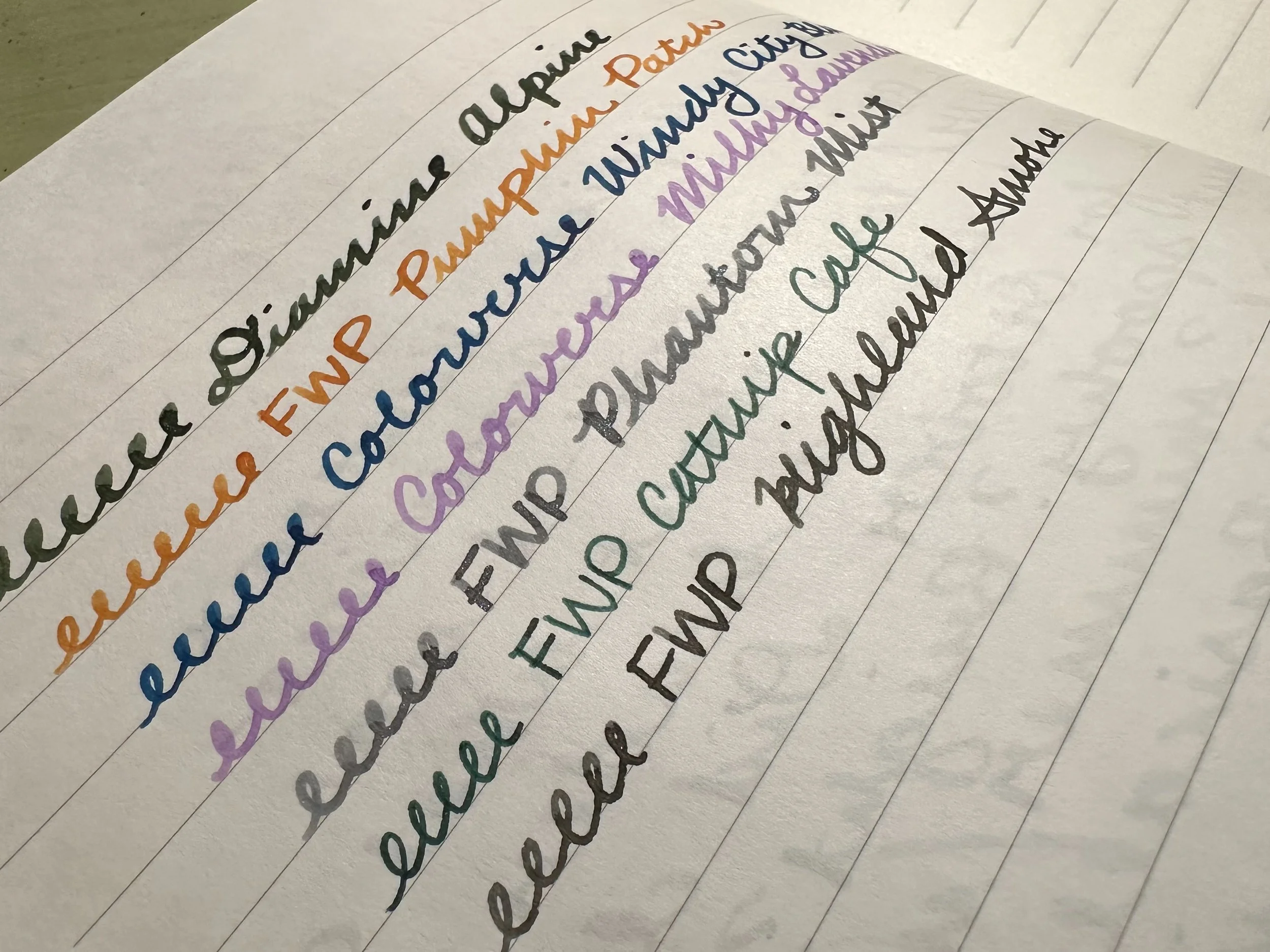
Diamine Alpine - Kaweco x Galen Leather Sport Carmine 14K BB ‘journaler’ - I was a little torn about what I wanted to use for a header ink for October. Do I go with a Halloween color? Should that be spooky? Bright? Neutral? Shimmer or no shimmer? Basically, I got caught in the indecision loop, so I went to the dusty ink list to find something I hadn’t tried. I’ve been into greens lately and decided to tap Diamine Alpine. It is a deep green with some shading and silver shimmer. It’s not love, but it may grow on me over the course of the month.
Ferris Wheel Press Pumpkin Patch - Kaweco liliput fireblue 14K M ‘journaler’ - Fall is always a great time to break out the orange inks and this is one of my top choices. For an orange this one is bright, readable, but not eye-searing like some others. It can write dry so I usually add a little drop of White Lightning and it works perfect. Unfortunately, it looks like this one has been discontinued, but it might still be floating around on retailer sites.
Colorverse x Chicago Pen Show 2025 Windy City Blue - Kaweco liliput copper B ‘imperial’ - Like my header color I knew that I wanted a blue but couldn’t decide what vibe I was after. Windy City Blue is subdued blue with red sheen. It’s a darker version of Colorverse Stars and Stripes. I’d only used this ink when I first got it and I’m enjoying watching it roll out on the page from my fun little ground nib from two Chicago Pen Shows ago.
Colorverse Milky Lavender - Kaweco Sport Macchiato M ‘monoline’ - I’ve been wanting to give this nib another chance after struggling with it when I first got it. It is a grind that has a sweet spot, otherwise it doesn’t work as intended. I decided to pull out one of my old favorite Kaweco Sports and an all time favorite ink and it’s been really fun. It’s almost out of ink… it may need a third fill.
Ferris Wheel Press Phantom Mist - Kaweco Collection Sport Dark Olive BB - I’m such a sucker for a funky purple, whether that is Milky Lavender or this one which is at the complete opposite end of the purple spectrum. Phantom Mist is a gray-purple with blue shimmer. It has really fun shading in the BB. I also used this one in the aforementioned Halloween art project.
Ferris Wheel Press Catnip Cafe - FWP Roundabout Rollerball - This pen is still going strong and has been put to use during some brainstorming sessions. I really like this tone of rich green with just a little bit of dark sheen to keep it interesting.
Ferris Wheel Press Highland Smoke - FWP Bijou Captain Earl Greyson M - This ink kind of came and went when it was sent to me for testing. While I love grays, I think I’ve gotten pretty saturated with them. I needed a neutral color so I decided to give this color another go. While cut from the same cloth as another FWP ink (Leadcast Letters), Highland Smoke is much darker and still shows off shading. It’s a nice neutral.