
Pens, Paper, and Ink
It’s only been two months, but it feels ages since I was in this space. My two months off were a very needed rest and really helped me settle into the projects that I have been working on and really getting back in touch with my passion for this community. I have a lot of blog posts from folks that I need to catch up on reading as well as some ideas that I want to explore more in-depth. In short, I’m happy to be back!
There are some new folks here and I want to say welcome! And to those that have been with me a while, welcome back! To kind of ease back in, I thought I would introduce myself via my collections.
The Pens
I am definitely on the small, utilitarian side of the pen spectrum. Most of my pens fit inside a 20-pen Esterbrook canvas case (unfortunately not available anymore it seems), with a few that I loan out and ones I keep in constant rotation. I enjoy this case because of its classic look and quality. Esterbrook is an amazing brand in making modern things feel old-fashioned. While I only own one Esterbrook JR, I do love a lot of their accessories, including the fun art they have on their blotting papers.

I keep a few things in the outer pocket of the pen case, namely two Zebra mildliners (Dark Red and Dusty Pink). The red is for marking my work schedule in my planner and the pink is the “color of the year” for marking inks used in 2025 in my ink logbook. Next to the mildliners is a bone folder. This is a tool I was introduced to as a baby archivist and it is excellent for making clean folds in papers. I use it every time I piece together one of my own notebooks or make my own envelopes.
What’s in the pen case?
One whole side is dedicated to my Kaweco Sports. This is my second favorite pen model behind my beloved Kaweco liliputs. I have had many more colors over the years, but I’ve sold quite a few over time because I simply never reached for them. Other than the Art Sports my two favorites are probably the cognac (one of the first international LE’s I ever got) and the Deep Olive which was a Kaweco Collection colorway from a few years ago. My Kawecos have a catalog of nib options that I swap between them quite often.
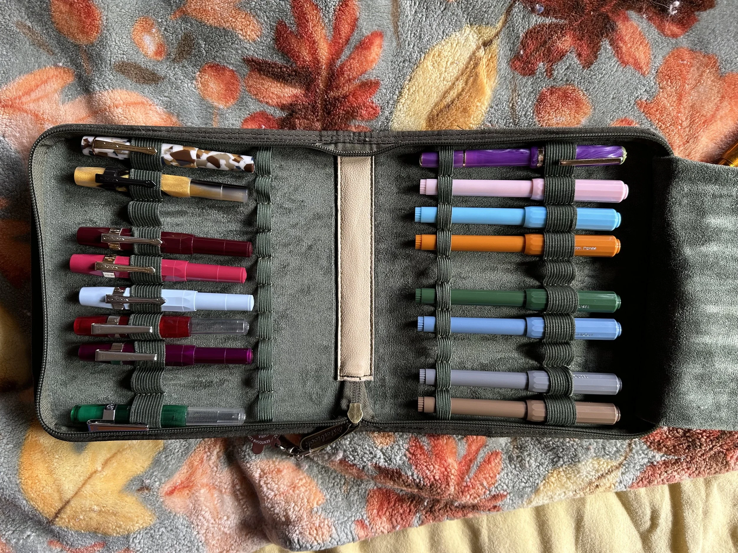
On the other side of the pen case are some gifted and some purchased Ferris Wheel Press Carousel and Roundabout pens. They are a bit controversial I suppose and most people like them or hate them. I think they are useful “cheap” pens (when FWP prices them below $20) and while the grip can be weird at first, it actually doesn’t bother me anymore. My favorite is probably the orange, Hearty Harvest, one from two years ago. I really wish more pen brands would get creative with their under $40 colorways (or if they are doing that, make them easier to get, so many LE/SE colorways are a pain to try and get a hold of). The aforementioned Esterbrook JR Paradise Purple lives here as well. It’s a great pen and a delight to use.
Other pens not in the pen case: a few other Kaweco Sports that are in rotation right now, a Lamy Safari (my first modern fountain pen!), and a FWP Bijou which I was sent for review (coming soon).
The Paper
Paper and notebooks are my weakness. Is it a paper I haven’t tried? I want to try it. Is it a pretty book with fountain-pen friendly paper? It is probably in my notebook box. There are actually some paper that I found about in the last two months that I am waiting to get my hands on. If it’s a widely known paper, I have probably used it. My favorite at the moment is onion skin because the translucency is just fun and unique. I don’t always use it, but it pops up quite often.

My A6 traveler’s notebook is at the heart of my collection. I bought it second-hand from a Facebook Buy-Sell-Trade group in 2019. The brand is Chic Sparrow and was part of their hand-tooled collection. Unfortunately, the artist who did their hand-tooling decided to retire so it’s no longer available. I wasn’t in the hobby when this design was initially available, so it was a massive surprise when it popped up and no one had claimed it yet. At the time I was deep into pocket notebooks and almost let it go, but then I realized I would probably never see this design available again (and I was right so far). This book has been through a lot of adventures with me now and I will probably use it until I wear it out (which will hopefully be a long time since it’s quality leather and every so often I make an effort to clean and condition it). I love leather covers because it gives me the opportunity of feeling like I have a leather tome, but with the flexibility of being able to constantly refill it or switch out what is inside. I like to use A6 notebooks as a consequence of my love for this cover, one of the reasons I started making my own notebooks out of larger ones.
I’ll have to give a tour of my notebook box and paper cabinet at some point. I have a LOT of paper to play with and I look forward to it.
The Ink
Oh, the ink. This is an even bigger weak spot than the paper. One of my favorite aspects of the fountain pen hobby is the endless versatility and personalization. Beyond the pen bodies, you can choose your nibs (or get them customized), and then you can change your ink. And I probably have 500+ ink options in my house right now…
Which is why I started tracking them. I am in the process of working on my 2025 Q3 ink roundup, aka my Enjoy Collection post (see 2025 Q2 here), which has been a lot less than I usually use. The three brands most represented in my collection are Colorverse, Diamine, and Ferris Wheel Press (for transparency I am a creative ambassador for FWP so they send me ink to show off - I do genuinely use it though, any I don’t I give away for others to try). I am eagerly awaiting the Colorverse Colorvent, which I decided I would do as opposed to what I did last year which was get both the Colorvent and the Diamine Inkvent. That was entirely too many inks all at once.

I keep my inks mostly on display. I use two antique letterpress trays, three wall shelves, a large decorative box and a shelf behind my desk. I’m currently working on how well my intention to use “dusty inks” was this year and decide whether some of the ones I haven’t touched in five years (since I started tracking) are worth keeping around or rehoming.

My Collection Intention
Ultimately, my love of pens, paper, and inks has always been about creating and learning. Those three objects working together can do anything. It can be a source of learning, discovery, keeping track, and pretty much everything. I think having an outlet that is not attached to a machine is so important, it was the impetus that go me into the hobby in the first place. Drafting things by hand has been such a major factor in my life.
And I love sharing that with others, thank you for being here!
In line with this passion I have for these tools, I have launched a pop-up business in my local community. You may have noticed the adorable raven at the top of the page (commissioned from the talented Kate Ammann). I have really wanted to spread my love of stationery more locally, considering that the nearest dedicated stationery shops are in Chicago (there are few spots in the Twin Cities, but they are primarily art stores). I’m starting up small with selling direct, but I do have a few projects I will be bringing to you all here as well (2026 planning is underway). I am also teaching workshops through local community partners. If you are near Duluth and would like to check out my pop-up or one of my workshops, you can check out my pop-ups & workshop page to learn more. I have been really enjoying this journey. Thanks to all of the awesome folks with Anderillium Ink, Luxury Brands USA, JPT America, The Gentleman Stationer, Stickii, CoraCrea Crafts, and many more for helping me get started on this. It’s been so amazing to see the response of my community neighbors, people have been super excited when I tell them what I’m up to. It’s not a full-time gig yet (and may never be), but it really fills up my heart. Our beloved tools are little joys, and the world needs little joys right now.
I look forward to seeing what gets created.
Currently Inked

Ferris Wheel Press Whispers of Twlight - Kaweco Sport x Galen Leather Carmine 14K BB ‘journaler’ - This was my header ink for the month of September and will be getting swapped for a more October color soon. I really like this purple. It leans towards mauve tones and has a silver shimmer. It provided some whimsy for a month that went by way too fast!
Diamine Waxed Seal - Kaweco liliput copper B ‘imperial’ - This was a sample I picked up during the Pen Social at this year’s Chicago Pen Show. It’s one of 160th Anniversary inks. It’s a true red. It’s not particularly unique amongst other reds so I won’t be getting a bottle, but it was a fun one to play with. If you’re looking for a red that isn’t leaning pink or orange, this one is worth a try.
Wearingeul x Endless Pens The Black Cat - Kaweco liliput fireblue M - Spooky season started for me in the second half of September this year. I love this ink for evoking “spookiness.” It’s a gray-purple-black ink with copper shimmer. This one was a Special Edition from a few years ago, which means I’m going to have to enjoy it while I have it.
Colorverse Milky Lavender - Kaweco Skyline Sport Macchiato M ‘monoline’ - I needed more purple in my life this month and so I pulled out one of my favorites. This ink is just a joy to use every single time. I also pulled out the macchiato which I haven’t used in ages (it used to be my header pen before the Carmine) and I decided to fit it with the monoline grind I got earlier this year. I’m still on a learning curve with this grind, but I’ve been enjoying this combo so much it got inked twice!
Ferris Wheel Press Catnip Cafe - FWP Roundabout Little Miss Jubilee RB - Sometimes life calls for a rollerball, and I really appreciate that there are some available out there that take fountain pen ink. They save me from buying rollerballs at the store (and man, is that temptation real). I am really digging the tone of this ink right now. It’s a dark blue leaning green.
Ferris Wheel Press Sprouting Pastures - FWP Bijou Earl Greyson M - I have a longer review coming of this pen, so I’ll focus on the ink here. I think it would have been better as a spring release because it’s a nice leafy green with brown shimmer. It’s pretty though and I’ll have to revisit it when it feels more in season.
Diamine Good Tidings - Kaweco Collection Sport Iridescent Pearl 2.3 - It’s been a while since I busted out my largest stub nib. I wanted to see if I could get into a small local Halloween art show with a junk journal ‘zine’ and I did! Even though this ink was from last year’s winter holiday/Christmas Inkvent it’s a great Halloween color. It’s black with one heck of a green sheen. I plan on sharing more about this art soon (I need to remember to photograph it before it goes on display)!
Ferris Wheel Press Browned and Buttered - Kaweco Sport Cognac B - This is a very fun ink. It’s a warm brown with brown-gold shimmer. It’s part of the same collection as Catnip Cafe and I think they work really well together. Despite the shimmer being pretty heavy it’s been well-behaved so far.