
Some thoughts: Ferris Wheel Press Ferritales Ink
Beyond paper exploration continuing this year, I also expanded my ink collection by quite a lot. November is when I start taking stock of my collection and thinking of my Enjoy Collection project for the next year. The core of “Enjoy Collection” is this, I focus on one aspect (usually ink related) and then utilize my collection or add to my collection in various ways. One of the delights of this year was getting introduced to the Ferris Wheel Press Ferritales collection, which I believe started in 2022 with their “Down the Rabbit Hole” series based on Alice in Wonderland. They have now expanded to the “Once Upon a Time” collection to include all sorts of folk and fairy tales.
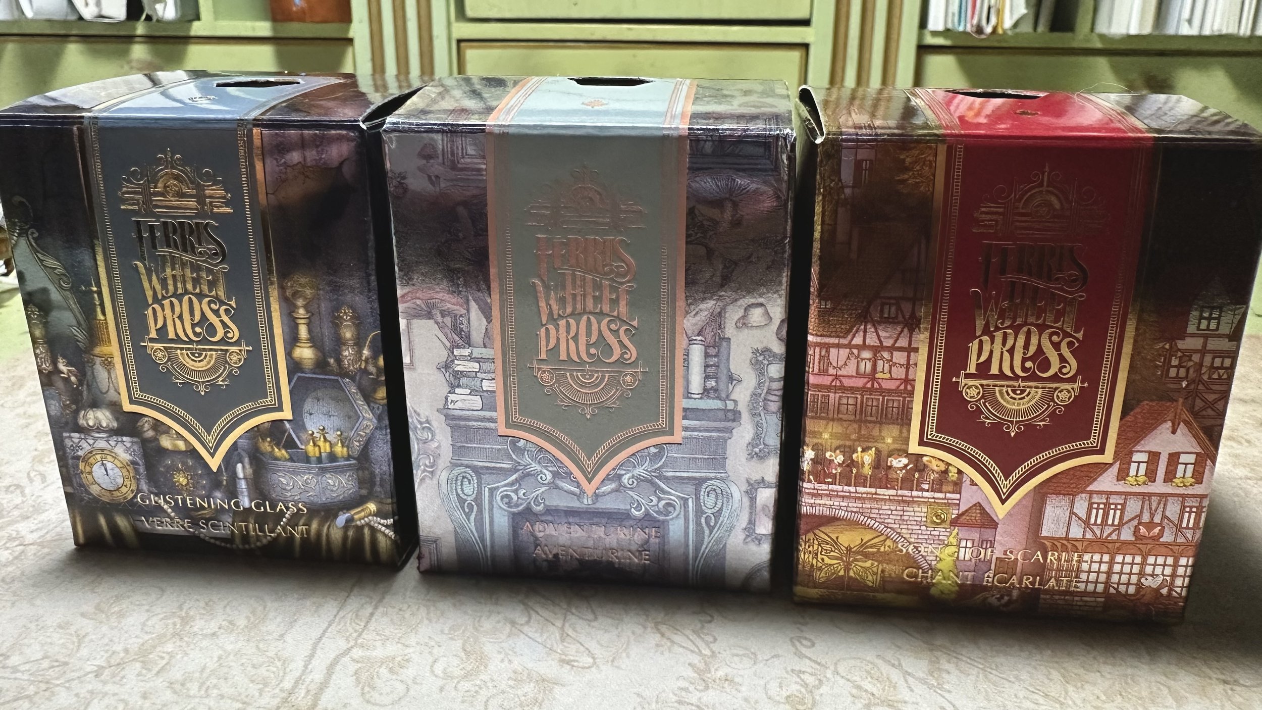
The packaging is reflective with the designs shining in the light.
These inks come in 20 mL bottles that are round with gold branding and the signature Ferris Wheel Press cap. These generally retail for $20 to $22 and can be found at a variety of retailers. Therefore, it is about roughly $1 per mL/ink fill for most pens which is on the more expensive end, but keeping them in the same sphere as brands like Wearingeul (~$0.75 per mL), special edition Colorverse inks (ex. Apollo set, $1.04 per mL), Montblanc (ex. Purdy & Sons Whisky, $1.60 per mL), and Dominant Industry shimmer inks ($0.80 per mL).
These ink bottles work best when filling a converter directly from the bottle or using a syringe. The necks can be too narrow for some piston filling pens. For me, this isn’t a problem as I only have cartridge-converter pens at the moment, but might be something to consider for those with piston filling pens that require the nib to be dipped into the ink bottle.
For full disclosure, I am part of their Jubilee Creative Ambassador program and have received some of these inks from the company. However, I have also purchased several for myself as I personally enjoy this company’s inks. All thoughts in this post are my own.
These are my top three Ferritales inks that I’ve acquired this year. I could have certainly chosen more than three, but then we’d be here for a while, haha! These are in no particular order.
Song of Scarlet

On Cosmo Air Light paper
This ink was inspired by the Pied Piper of Hamelin fairytale in which a man comes to town wearing a multicolored (pied) cloak and, at first, uses his music to lure away all of the rats. When the townspeople refuse to pay him, he leads the children away with his music instead. The packaging of the ink pays nod to this story by portraying a German village with a cat playing the role of the Pied Piper leading the children (in this case, mice children) out of the town.
The ink itself is a deep red that can sheen yellow/gold with a blue shimmer. The shimmer was well-behaved in wet nibs and performed as expected in drier nibs (in other words, shimmer just doesn’t work well in dry pens).
So far, this is the best red ink that Ferris Wheel Press has created. It is a true red (not leaning pink or burgundy) and the sheen/shimmer give it a magical quality. I used this ink extensively in October and I nearly inked it up again for November. I loved how deep and rich this color was and smiled whenever I saw my words scrawled over the page.
I recently cleaned out this pen for another ink and it was very easy to clean out. Some richly colored inks like this one like to hang around for rounds and rounds of rinsing, but this one came out with just a few flushes.
Glistening Glass

Very similar in color tone to FWP Storied Blue (although that one is warmer) with shimmer!
Inspired by the story of Cinderella, this ink was a total surprise for me about how much I liked it. It’s not alone in the category of Cinderella inspired inks, Bungubox has one too, but I like that they went for blue-grey as opposed to just light blue. This ink really invokes the Disney version of Cinderella’s ball gown for me, with an added touch of gold shimmer. The box design shows Cinderella sitting in front of a looking glass, the clock about to strike midnight. She is about to lose the fairy godmother’s magic, but she is still beautiful and kind without it.
This is one of those stealthy shimmer inks that I think you could go away with in a more serious setting as the glitz of the gold is only visible at certain angles. The box says that the ink has a red sheen, but I have never been able to achieve that effect. It’s a beautiful ink even without sheen, and I actually like it’s more subtle tones. It feels grown up while still being shimmery.
Another very easy ink to clean out of pens, this one takes almost no time at all to clean.
Adventurine
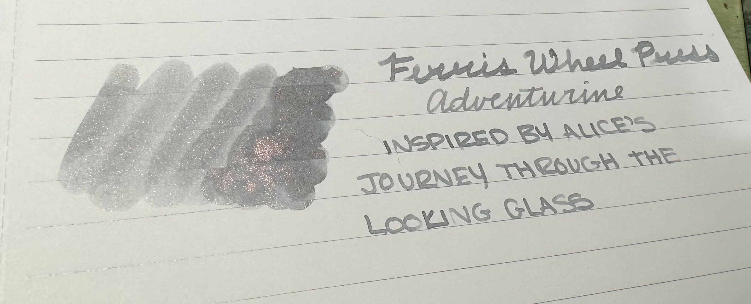
Very legible despite being a light grey.
This ink is part of the Alice in Wonderland group and it’s just such a cool color. The box shows the upside down room that Alice finds after climbing through the looking glass complete with mushrooms growing from the mantle and quirky paintings facing the wrong direction. The ink itself is a light grey with rose-gold shimmer with excellent shading. I inked this one up for a friend while I was using it extensively myself and she fell in love immediately and wanted a bottle for herself.
It’s not the only grey I own with copper/rose-gold shimmer - I have a special edition of Colorverse Anti-matter that was a Black Friday gift years ago and while the same idea, there is a world of different between the base colors. The grey tone of Adventurine is elevated by its shimmer making it legible and, frankly, magical. It’s very unique in my collection and well-behaved in my pens. I prefer using this one with a broad nib or a stub to get the full character of this ink.
Like the other Ferritales inks that I’ve mentioned, it cleans out easily with a few flushes to get all of the shimmer out.
Shimmer inks have been growing on me the past few years as the formulas that ink brands are using have greatly improved the experience of using them. For fans of shimmer ink, I put Ferris Wheel Press up there with the Diamine shimmer inks (which have been around a little longer). They also put so much care into their packaging and design that they make great display pieces as well as useable inks.
If you’d like to try out any Ferritales inks you can use my code DIME to get a free ink charger from the “everyday inks” lineup alongside your purchase. For the month of November, Ferris Wheel Press is also hosting an sale with discounts on pens and inks.
Currently Inked

Dominant Industry November Leaves - Kaweco Sport Macchiato 1.5 - As we head into winter I wanted to use this ink as a header, it’s definitely one of those colors that you have to be in the mood for and using the right paper when doing regular writing as it is a very light brown. It really evokes the colors of the vegetation going to sleep and I think it will serve me well for the month.
Ferris Wheel Press Treasured Manuscript - Esterbrook JR Paradise Purple B - Another light brown ink that I picked up from a generous destash at the San Francisco Pen Show. This ink is an interesting one, really evoking the colorway of old paper. It’s another light brown, and I’ve learned that it does not play well with the thinner Tomoe River paper. It thrives on more absorbent paper that can sow off its color and shading.
Ferris Wheel Press Peter Moss - Kaweco liliput copper 14K B - Decided to give another green ink a try. This one is a good dark green that leans to the olive tone. It shades from a very dark green to a light green depending on the paper. I think I might like this one better in a stub nib than a round one.
Colorverse Office Grey - Kaweco liliput fireblue 14K M ‘journaler’ - I’ve shared my soft spot for Colorverse Office Blue and I decided to pick up samples of several of the other colors back in May when I visited Anderson Pens in Appleton, WI (random history fact I just learned, Harry Houdini grew up in Appleton - thanks Jillian of Noted). Office Grey is a pretty standard cool grey. Definitely the least interesting ink on my currently inked list this week.
Sailor Ink Studio 280 - Kaweco Sport Mellow Blue B ‘premium’ - I bought a bottle of this ink during a FOMO phase I had about 2 years ago. Time and again though it was escaping my collection destashes. I cannot remember the last time I used this ink… and now having used it, I don’t know why that is. Sailor 280 is a very fun chroma ink with a green-brown that becomes pink-brown where it pools. It usually plays somewhere between green and brown depending on the paper. Definitely one I’d forgotten about and I’m glad that I decided to take a chance on it this week.
Colorverse Brunch Date - Kaweco Sport Cognac M stub - When people ask me about my favorite inks, Brunch Date makes the top 10. I love this ink… and yet haven’t used it for over a year. It was nowhere in the ink passport that I started last November. And that’s a shame because it’s such a pretty earthy pink with wonderful shading, especially in the stub nib. I think it might be time to revisit more of my old favorites.
Diamine Snow Storm - Kaweco Sport Iridescent Pearl M CSI - Since it’s almost Diamine Inkvent season I am continuing with revisiting or inking for the first time some of the past editions. Snow Storm was from the Blue Edition in 2019. It’s a nice dark grey with bright silver shimmer. I have a few shimmer greys in my collection and I love how each of them bring something else to the table.
Ferris Wheel Press Roaring Patina Black - Kaweco Art Sport Tiger’s Eye 14K M ‘selvedge' - This was the 2022 special edition Ferris Wheel Press ink and might be the first bottle I ever bought (it’s either this one or Writing Desk). I sometimes feel like I shouldn’t use this one because it’s discontinued… but that’s such a silly reason. This ink needs to be enjoyed. It’s a dark blue-black that has red sheen and gold/rose gold shimmer. It’s just a stunning ink and I hope FWP tackles a black again for their standard lineup, because I love what they did with this one.