
Switching it up

This week was all over the place. I ended up stuck in my room thanks to the need to quarantine and trying to keep my housemate from catching the virus that I’ve managed to evade for 3 years. I thought I just had a seasonal cold since spring made a short visit and then shifted abruptly back into winter in my neck of the woods. Nope. I actually started and deleted this paragraph quite a few times, because I hate reminding everyone that the virus is still out there. But it is and I hope everyone is safe.
The one thing I managed to do between bouts of rest was to still work on the story that I’d hoped to get done last Sunday, but gave myself some grace because of “my cold” and I think I get a pass on not meeting my deadline this week either. This is a major improvement for me because I am the sort of person who has a tendency to beat myself up when I’m sick. That “but I’m not at work, I should be doing something” kind of thing. I have to remind myself that I am doing something - getting better.
I did a little bit of organizing of my traveler’s notebook. That book is my external brain and I’ve needed all the brain support I could get this week. The A6 Cafe Notes with Tomoe River Paper was retired this week as a journal. It still had some pages left, but I was ready for a change. My current TN lineup is:
my Hobonichi A6 weekly calendar insert
an A6 dotted Tomoe River paper notebook from Paper Penguin which is half-full of half-baked stories
a stitched together notebook I made with paper from the Pelikan pad which given away at last year’s Pelikan Hub
a stitched together notebook with View Corona cream colored paper
and a stitched notebook with Yamamoto Typewriter paper
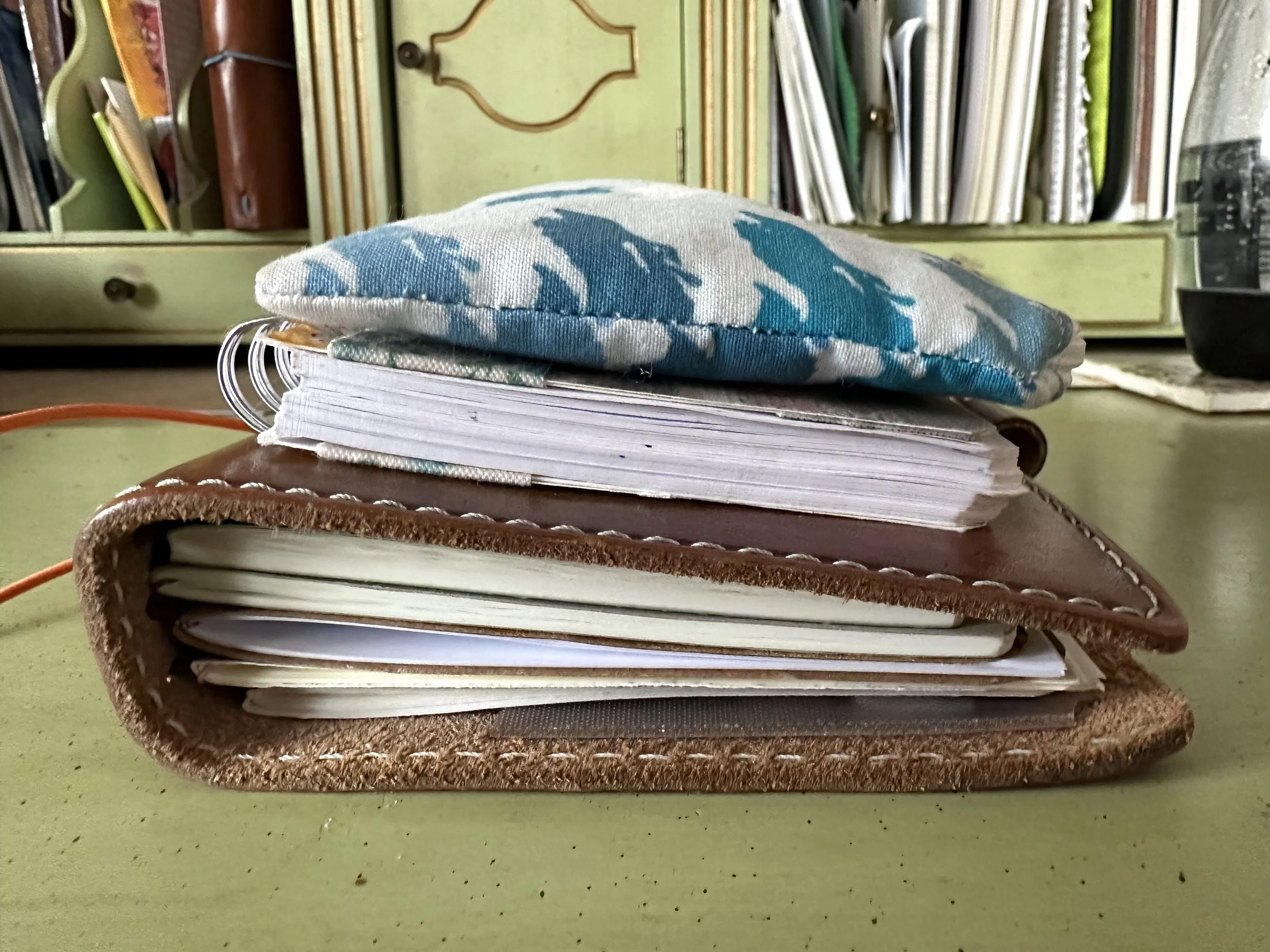
A very manageable stack.
Without the bulk of the Cafe Notes, the entire notebook is a lot slimmer. If I’m better by the Chicago Pen Show I will probably add a notebook with Cosmo Air Light paper for playing with ink samples and trying out pens. I’ve also been playing with my Kokuyo Perpanep Tsuru tsuru notebook (the really smooth one), the paper lets the nib just glide and I really love the size of the grid lines. Sorting through my papers and selecting some new ones was a great brain reset for me since I was stuck at home and there wasn’t a lot of work-from-home that I could do.
I also added some different tools for the week. I added in my Kaweco Sport Olive with a BB nib and my Kaweco Sport Cognac with a M stub to change things up.
And now, about the inks that I played with this week:

Colorverse Constellation Series CMa
I enjoyed this ink way more than I thought I would. It’s a blue-gray and ended up being a great match for my Kaweco Sport Iridescent Pearl (this pen always looks great with pastel inks with shading). This ink is named after a star in Canis Major and it does capture some of the feel of light at dusk. Definitely one to play with some more.

Diamine Ruby Blues - Red Edition Inkvent 2021
This is a very sheeny dark blue. On Cosmo Air Light paper it was completely taken over by sheen. Even on cheap paper the sheen appeared. As a result it had a slightly longer dry-time, but it did dry without smearing for me. Not super unique, but it would be a really good option when looking for something sheeny.

Colorverse Mystic Mountain
This one was my favorite of the week (closely followed by Colorverse CMa). It’s a really unique color with an uncommon shimmer. This is a soft blue with pink shimmer that could be a little dry, but was fun when paired with a wet nib. This one was just a lot of fun to create with. (I promise I’m not biased because it was in my favorite fountain pen.

Diamine Subzero - Red Edition Inkvent 2021
Another ink that I’ve discovered I’ve never played with. I suppose I always thought it was similar to Diamine Blue Peppermint from the 2019 calendar - nope, not at all! It has a more “grown up” light blue shade with blue shimmer. This is an ink I might have to return to next winter or when it’s really hot this summer and I need to cool off.

Coloverse NGC 1850
Another space inspired Colorverse ink this week (and also available in its own bottle now, like Mystic Mountain - affiliate link). This ink is a dark teal with blue shimmer and was originally packaged with Extreme Deep Field (another great sheener). It’s a really rich color that was fun in this CSI nib, but I think would look great in a round nib too.

Colorverse Rocky Blue
Part of the USA Collection (which hasn’t had anything new recently… I hope they haven’t abandoned it) which represents Colorado, the state where I grew up. I’m guessing it’s a “purple mountain majesty” kind of color and it does have that blurple feeling that reminds me of the petals on a Colorado Columbine. The ink is a shader as it ran a little dry in the nib.
Diamine Silent Night - Green Edition Inkvent 2022
Definitely the most sober of the inks I used this week and I actually enjoyed it for its quiet. Blue-blacks just feel so solid, that they don’t get talked about very often. I think I would have to make more direct comparisons with other blue-black inks to really determine if this one is unique or not, but for my purposes it was a fine choice and I’ll definitely use it again in the future.

Some dystopian world-building… not something I usually write and a fun challenge.