
So many blues!
I had some goals at the beginning of April. I would write four short stories to shop to publications and I would write each day with a different color blue as part of Inkjournal’s #30inks30days challenge. I ended the month with one short story, two half-finished ones, and 30 new blue ink swatches. I’m gonna call that a win.
I will put the caveat in here that I was loose with the designation of “blue ink”, I did allow turquoise and teal. Basically, I was on the blue spectrum this month. I added a little bonus challenge to myself too, the inks during the month couldn’t be any blues that I’ve used since I started my ink passport in November ‘22. Basically, I was forced to pull out blue bottles and samples that I haven’t touched in at least six months. There were some, I realized, that I have never touched at all.
I’m always amazed by the sheer number of blue inks that exist. Atlas Stationers lists 151 different blue ink options. Goulet Pens has 166 options. Vanness Pens has a whopping 468 blues. That variety is one of the things I love most about this hobby. I currently have 67 blues and xx teal/turquoises.
I used blue inks from 7 brand including: Ferris Wheel Press (4), Diamine (11), Colorverse (10), Monarco (1), Sailor (2), Montblanc (1), and Robert Oster (1).
Thirteen of the 30 inks had a secondary ink quality. There were 3 shimmer, 3 sheen, and 7 shimmer & sheen.
My top 3 from this month (in no particular order) are:
Colorverse First Moon Landing Eagle
Colorverse Standard Model Up
Diamine Green Edition Serendipity
Colorverse is definitely my favorite brand by sheer usage. They got me with the space theming early on (I was working at a small science museum that did a lot of astronomy programs at the time) and then they kept me with their great inks. A great theme and a great ink are a winning combo for me. Some other noteworthy Colorverse blues are Supernova (really bright with sheen), Apollo 11 (Limited Edition from the First Moon Landing set - a dusky navy-esque blue), and Colorverse Strelka (a light blue). As soon as I finished the challenge and re-inked my pens, Strelka was a must ink.
And now for the inks of the week (the last 9 of the month):

Ferris Wheel Press Edward’s Gardens
I kind of think of this one as FWP’s Emerald of Chivor - it’s a green-teal base, red sheen, and gold shimmer. It’s really beautiful and I enjoyed giving it a try.

Sailor Ink Studio 143
This is a really pretty blue in the Ink Studio series. It’s soft and chromashades. It can be pinky-purple where a lot of ink is laid down.
Sailor Ink Studio 243
A duskier version of 143. It’s a sober multi-shading light blue with some pinks where the ink pools. Much subtler than it’s brighter counterpart. Of the two, I like 143 better.

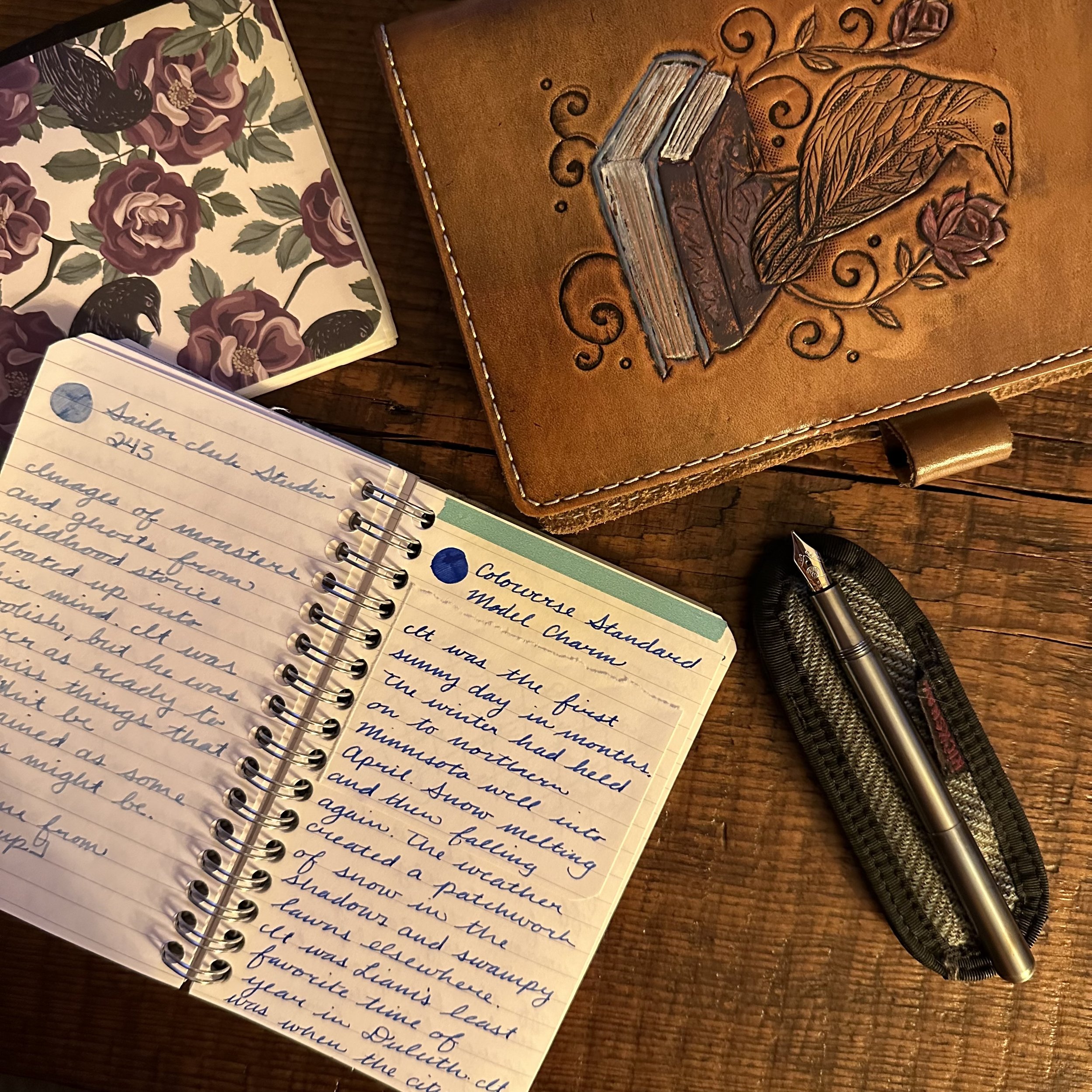
Colorverse Standard Model Charm
Back in my suitcase full of 15 mL bottles of Colorverse ink. This one is a bright blue with some sheen. It’s darker than Colorverse Supernova (as mentioned, one of my favorite Colorverse blues) and fits in that same “I need a pop of blue that I can use at work” category. A fun option.
Diamine Serendipity - 2022 Inkvent Calendar
Okay, I love this one. It’s a dark teal with copper shimmer and red sheen. I couldn’t stop writing with it and have fully inked up my M stub nib. Just super fun. My second fill did get a bit of nib clog, but once I flushed it through and flossed with as brass shim it wrote flawlessly.
Diamine Regency Blue
This color is classic dark blue. It’s well-behaved, has a little bit of sheen, and looks tidy. I had some fun with it in my architect nib, it was one of my first ground nibs and I don’t use it very often now that I write in cursive as opposed to printing most of the time.

Montblanc Midnight Blue
This was a “I want to buy something at the Montblanc store in Las Vegas but can’t afford a pen” purchase, lol. This is very unsaturated blue-black and kind of surprised me. Definitely offers some fun shading, but it’s almost a little too sober for me.
Robert Oster Muddy Water
I was so excited when the Robert Oster “Mudpack” was released to retailers and I could try out the colors. Muddy Wine is definitely my favorite of the set, but this one is probably the second that I’ve tried so far. It’s a river blue to me and has a little bit of haloing where the ink pools which is really fun.

Ferris Wheel Press Tumultuous Teal
Releasing on May 5th (I got early access as part of the Jubilee Creative Ambassadors program). This is a pretty one. It’s a bright turquoise with silver shimmer. The box says it has a black sheen, but I haven’t seen that in the fine nib, will have to try it in a wider nib to see if I can get that.
Thank you for reading, I never imagined so many people would stop by! If you’re coming to the Chicago Pen Show, drop me a line!