Ink Review: Ferris Wheel Press Land of Shangri-la
I first saw this ink last November, not long after it had come out. I was testing out a lot of brown inks around that time after discovering how variable and interesting that they can be. I’d gone through the bright ink phase (and I still love them), but I was drifting towards more “classic” colors and I’d been cultivating a black ink appreciation for at least a year.
I kept wanting to get this one, but I was trying to limit new inks that I was bringing in to actually give some attention to my existing collection, but also because I was saving up money to have some fun at the Chicago Pen Show. Well, the Chicago Pen Show came around and I picked up this ink from the Atlas Stationers table.
The story behind this ink is that it is a collaboration between Ferris Wheel Press and the Shangri-La Hotels Canada. They drew inspiration from the story of the mythical land of Shangri-la and James Hilton’s 1933 novel, Lost Horizons. Hilton was a prolific author, publishing his first novel in 1920 and writing until his death in 1953. Apparently Freud thought the man had wasted his talent by being too prolific… sure Freud, haha.
Back to the ink. The box design and artwork draws from the features of these luxury hotels and the story of Shangri-la. This is a really interesting box to look at. There are so many little details hidden in the design that I find something new every time I look at it (Ferris Wheel Press you should sell these as art prints, it would look great at my desk!). The little orcas leaping out of golden waves and the gold-feathered blue jays might be my favorite features.
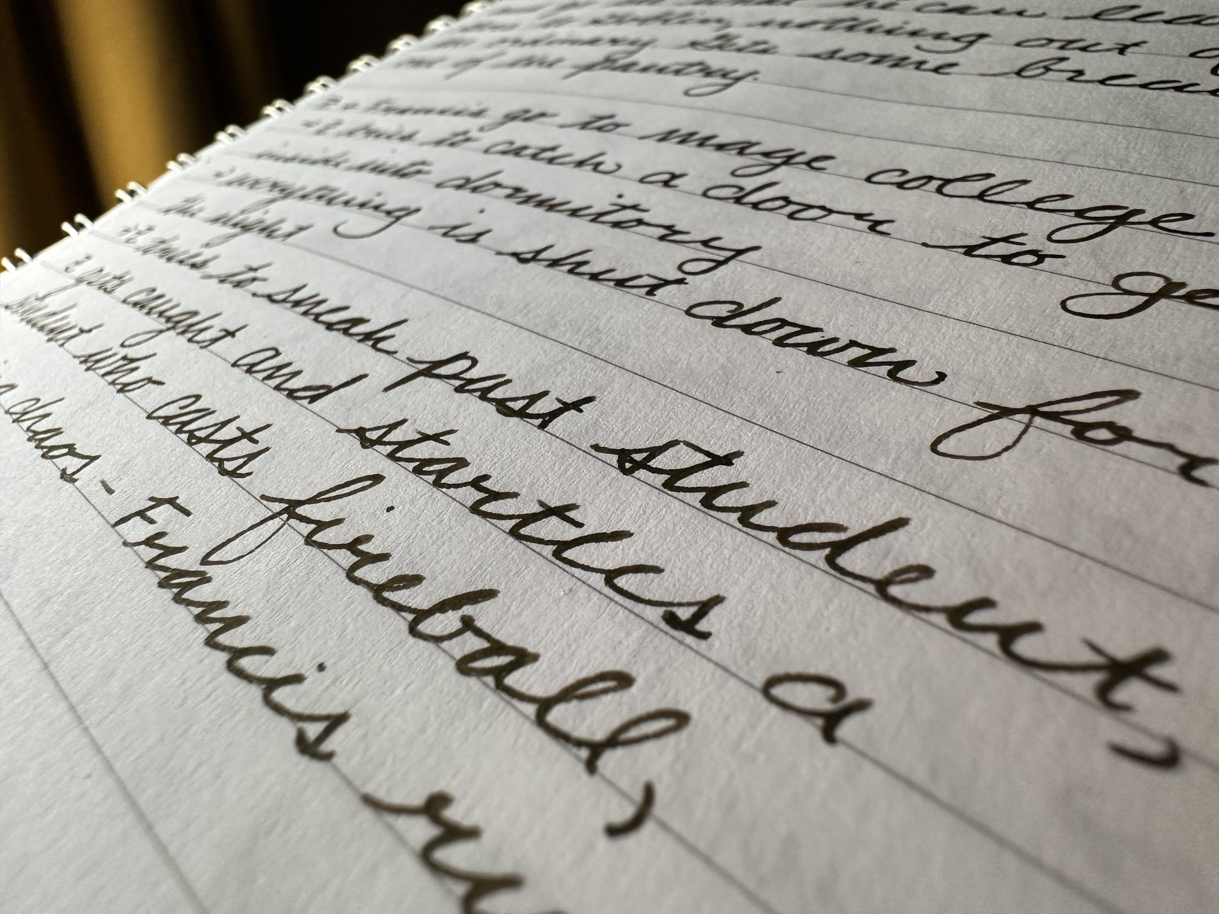
The ink itself is just up my alley. The ink color is a cool brown that can look almost black in some lights and where the ink pools from a wetter nib. It has a champagne shimmer - similar to Velvet Ballet - which can be silvery, but also takes on some of the character of the ink. Overall, the effect is a soft glow to the words. I tested out this ink in my favorite pen, a Kaweco Liliput Fireblue with a 14K M ‘journaller’ nib and it behaved well with a pretty quick dry time on most papers. Coated papers, like Cosmo Air Light and Tomoe River, had longer dry times, which is pretty typical of those papers.
The following writing samples are from a whirlwind Pathfinder session where I was scribbling up a storm. This paper is Colorverse Nebula Note paper in the Colorverse Casual Note notebook. It’s a slightly textured paper and holds up really well to fountain pen ink.
The Chicago Pen Show was so much fun! I’m still working on my wrap up post to share more of the fun things I got, saw, and did while I was there.
If you’d like to pick up any Ferris Wheel Press inks, follow this link and you’ll get a free ink charger with the purchase of a bottle!


